What is composition
Composition is an essential concept in design, and some consider it to be the foundation. It is almost universally acknowledged among designers that one must know how to work with composition.
When an art director quickly glances at a designer's layout, they might say, “Cool composition,” or conversely, “The composition here is crooked and unbalanced; please fix it.”
Although designers may nod their heads as if they get it, not all of them have a deep understanding of the basics of composition.
Even the definition of the word “composition” itself remains a mystery to many professional designers.
Is composition a property of the layout, or is the layout itself a composition?
Why do some layouts seem unfinished while others look perfect?

In this course, we will provide answers to each of these questions, starting with the main one: what is a composition in general?
The term “composition” comes from the Latin word “compositio,” which means “putting together,” “arranging,” “combining,” or “connecting.” Therefore, according to its literal translation, composition refers to the process of assembling a whole from distinct parts.
These whole and separate parts can be anything.
For example, a bouquet composed of individual flowers is a flower composition. A melody made up of different motifs and sounds is a musical composition. This article is also an example of composition, being a text composition made up of separate words. It's somewhat ironic that this course on composition is, in itself, a composition.
But for separate parts to really become a whole composition, you need one more ingredient — an idea.
The idea as the basis of composition
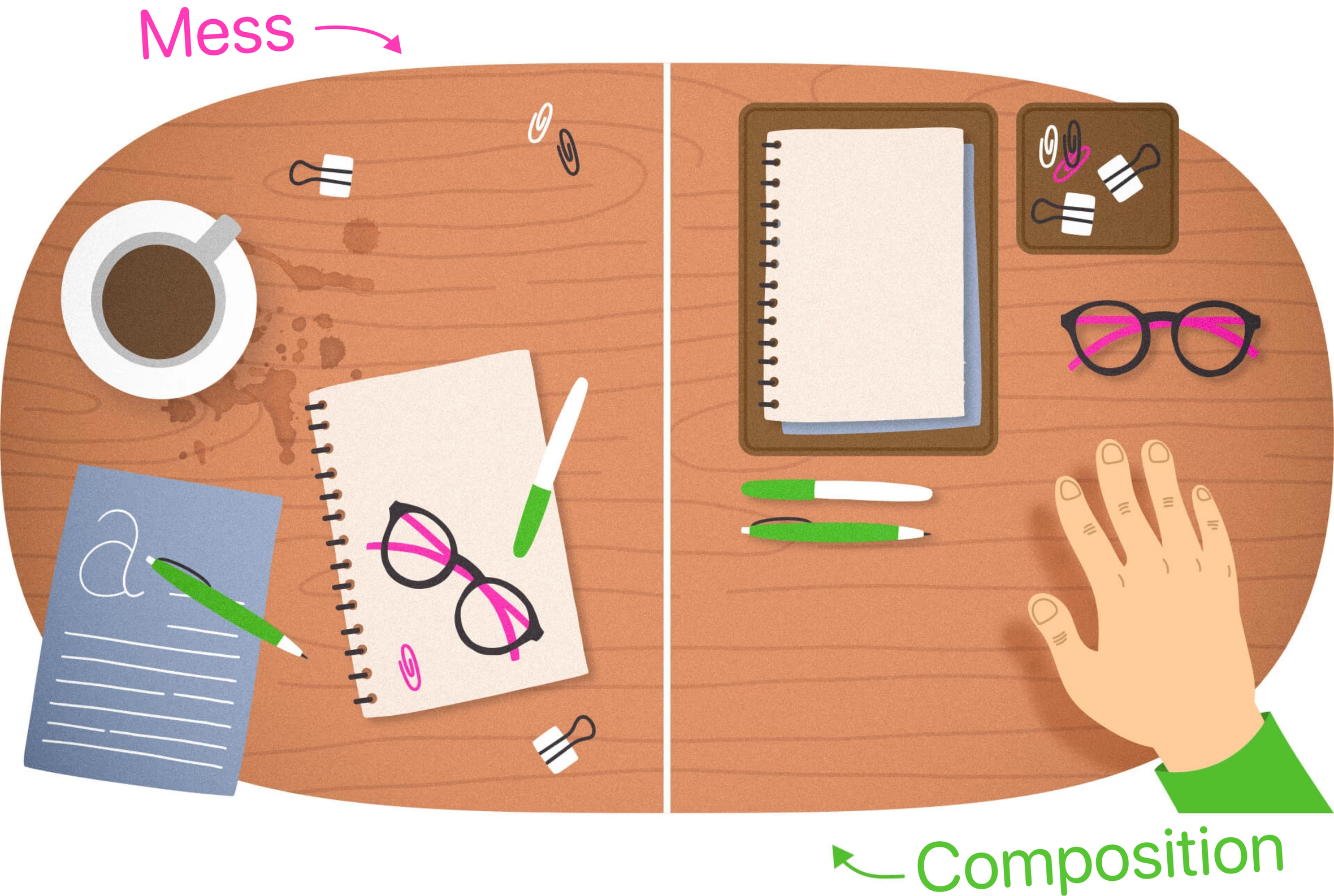
Imagine that you've decided to tidy up your desk.
As you begin the cleaning, you realize that your desk is a mess, cluttered with papers, paper clips, pens, pencils, an unfinished coffee cup, stickers with notes, and other items. The sight of this chaos prompts you to organize the items.
You gather up the scattered papers and arrange them into neat piles, and place the pens and pencils in a pencil case.
Gradually, your desk transforms from a zone of destruction into a comfortable workspace where everything (well, almost everything) is in its place, and unnecessary items have been removed. Now, your desk is organized, and this set of objects can be called a composition.
But why wasn't the previous mess considered a composition, even though it consisted of almost the same parts? This is because it lacked order and meaning. The order you created, on the contrary, embodied your idea of convenient organization of space.

So a more complete and accurate definition of the term composition is as follows:
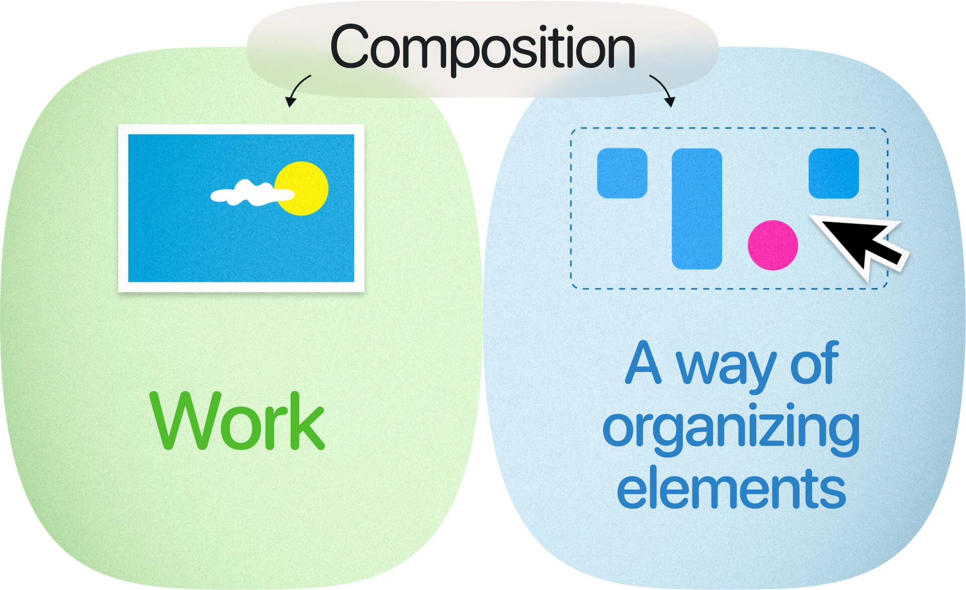
A composition is a combination of separate elements into a whole work that embodies a particular idea.
The idea behind a composition can be anything.
For example,
- Billie Eilish's goal is expressing certain ideas and emotions through her songs.
- The purpose of navigation signs is in directing people through a space quickly and clearly.
- The objective of the landing page for the “Web Design Fundamentals” course is to persuade individuals interested in the subject to sign up for the class.
As a result, Billie Eilish’s songs, navigation signs, and the landing page of our course are all examples of compositions.
Interpretation as a form of an idea
However, an idea doesn't necessarily have to be the starting point for creating a composition. It can also arise as an interpretation of an existing composition, and this is also valid.
For instance, the French and American artist Marcel Duchamp was known for creating an art movement called “Readymades,” which positioned existing objects as artistic works. The most well-known work of this trend is the sculpture “Fountain.” It is just an ordinary urinal, to which Duchamp added the inscription “R. Mutt,” which translates from French as “R. Fool.”

“Fountain” was created for the Society of Independent Artists exhibition, and while the committee didn't reject Duchamp's work due to his monetary contribution to the exhibition, it was not displayed. Nevertheless, the artist published a photo of his work in "The Blind Man" journal, and it eventually gained popularity despite not being exhibited.
So, if Duchamp had decided that the clutter on the table represented the idea of, say, creative freedom, then that clutter would have magically turned into a composition.
In graphic design, just like in art, the idea behind a design is not always straightforward. For instance, when American designer Carolyn Davidson was tasked by a client to create a logo for a brand named after the Greek goddess of Victory, the brief was rather vague — the emblem had to convey a sense of movement, look great on products, and stand out from competitors' logos. Not very clear brief, is it?
After countless attempts and the customer's rejections, the logo was finally created. It was later given the name “Swoosh” (evocative of the sound of someone rushing past you). Davidson was paid a modest $35 for her work, and her exacting client was initially not completely satisfied with the result. Nevertheless, the Nike logo has remained largely unchanged ever since.

Compositional structure as another definition of graphic composition
In the context of graphic design, your work constitutes a graphic composition.
Business cards are graphic compositions.
The website layout is also a graphic composition.
And an advertising billboard is definitely a graphic composition.
What do you think the interface of a mobile application is? Of course, a graphic composition.
A photo? Also a graphic composition.
A drawing is a graphic composition as well.
However, in graphic design, the term “composition” also refers to the arrangement of separate elements, their proportions, and other such factors, which could alternatively be called “compositional structure” or “composition organization” to avoid confusion. But using the word “composition” to mean compositional structure is pretty correct.
Depending on the context, “composition” can refer to a work as a whole or to its individual characteristics.

How the graphic composition embodies the idea
So, we've learned that every composition, whether it's a work of art or a design, represents a specific idea. But how exactly does it do that? Well, each type of composition has a variety of tools to achieve this goal.
We'll delve into these tools in the next article!


