

Although the composition in front of us appears static, the images on it can still create a sense of movement, and even a small photograph can capture the grandeur of the Eiffel Tower. How is this achieved, you may wonder?
It is due to the interaction between the graphic composition and our perception.
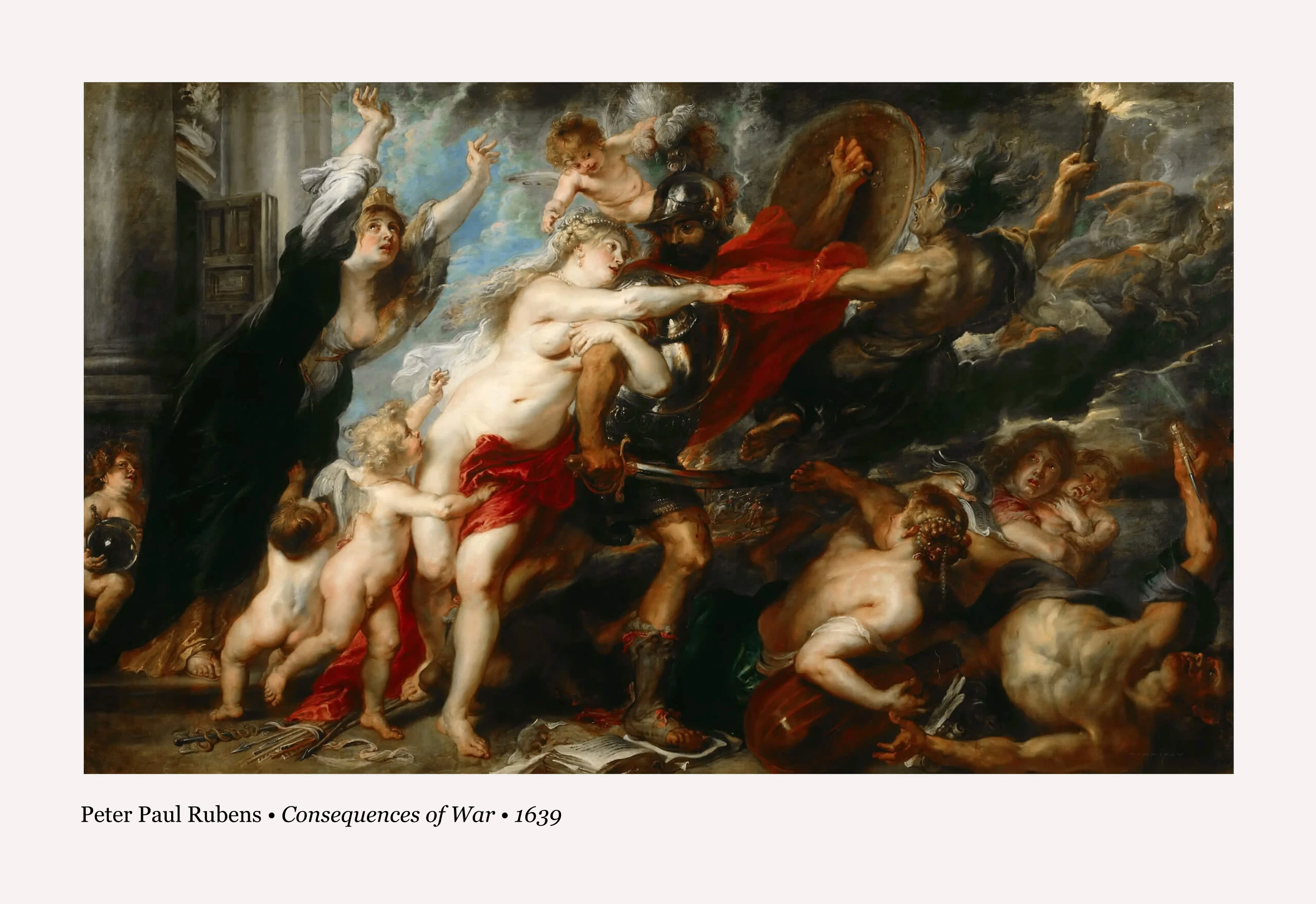
A graphic composition is created on a plane using inscriptions, visual images, decorative elements, and colors. Together, these elements can convey both simple concepts and intricate narratives. Take, for instance, Salvador Dali’s painting “Dream Caused by the Flight of a Bee Around a Pomegranate, a Second Before Awakening,” where he skillfully employs these elements to construct a surreal dream-like reality. In this composition, the bee’s sting, approaching the artist’s slumbering muse, transforms into a rifle bayonet flowing out of a cracked pomegranate with tigers and predatory fish.
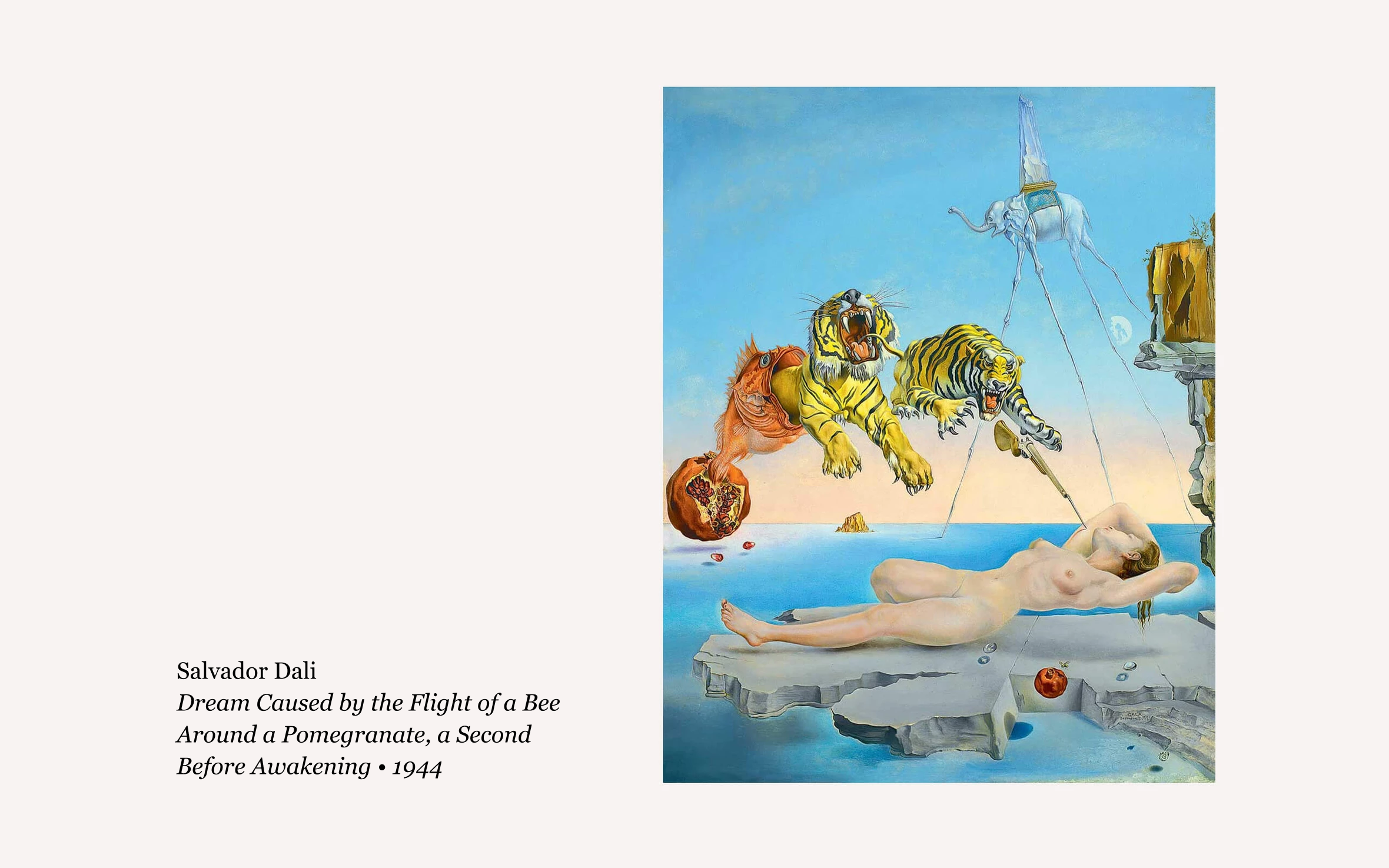
It’s important to note that the artist purposefully arranged these elements within the painting’s space to bring his peculiar and somewhat unsettling idea to life. The size, position, and direction of each element are not arbitrary. Thus, for a collection of elements in a graphic composition to transform into a narrative, simply adding them to the composition space is not enough. They must be orchestrated in a deliberate manner to express themselves.
To do this, there are a number of techniques, or expressive elements of graphic composition.
There are seven pairs of them:
- Dimension and Rhythm
- Symmetry and Asymmetry
- Commensuration and Proportionality
- Size and Scale
- Likeness and Difference
- Contrast and Nuance
- Consonance and Dissonance
- For example, Dimension and Rhythm are responsible for infusing a sense of dynamism.
- Symmetry and Asymmetry contribute to the perception of symmetry within the composition.
- Commensuration and Proportionality strive to achieve proportional balance.
- Size and Scale convey a sense of magnitude.
- Likeness and Difference facilitate the grouping of elements into visual clusters.
- Contrast and Nuance highlight the strength of disparities between elements.
- Consonance and Dissonance dictate whether your narrative leans towards serenity or restlessness.
Dimension and Rhythm
The pairing of Dimension and Rhythm is closely related to conveying a sense of dynamics in a composition. It allows for the depiction of movement, including its direction, intensity, and strength. These elements are interconnected as dynamics are inherently linked to measurement and proportion.
The term “dimension” derives from the Latin word “dimensio,” which explicitly signifies “measurement.”
To assess rhythm, we first need to establish a dimension. For instance, for gauging the speed of movement, we require two parameters: a dimension, such as meters, and time, such as seconds. This pairing creates the dimension of time (meters per second) and enables us to estimate the movement speed.
Once we have a dimension, we can convey a sense of rhythm by illustrating how an element interacts with this dimension. The rhythm can be uniform, ascending, or descending. Ultimately, the primary objective of pairing Dimension and Rhythm is to visually represent dynamics.
While it may appear that you’re encountering these concepts for the first time in this course, we assure you that this expressive tool is quite familiar to you. In fact, any graph depicting a specific trend is a prime example of utilizing this pairing.
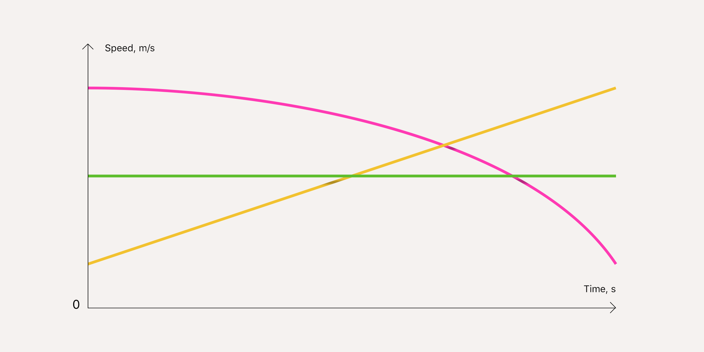
In graphic design, we may not employ vertical and horizontal scales explicitly. Nevertheless, even without them, you can effortlessly visualize dynamics. For instance, you can demonstrate the strength of a cellular network signal, the brightness intensity, or the sound volume settings. To achieve this, simply depict a gradual progression of elements in relation to one another.

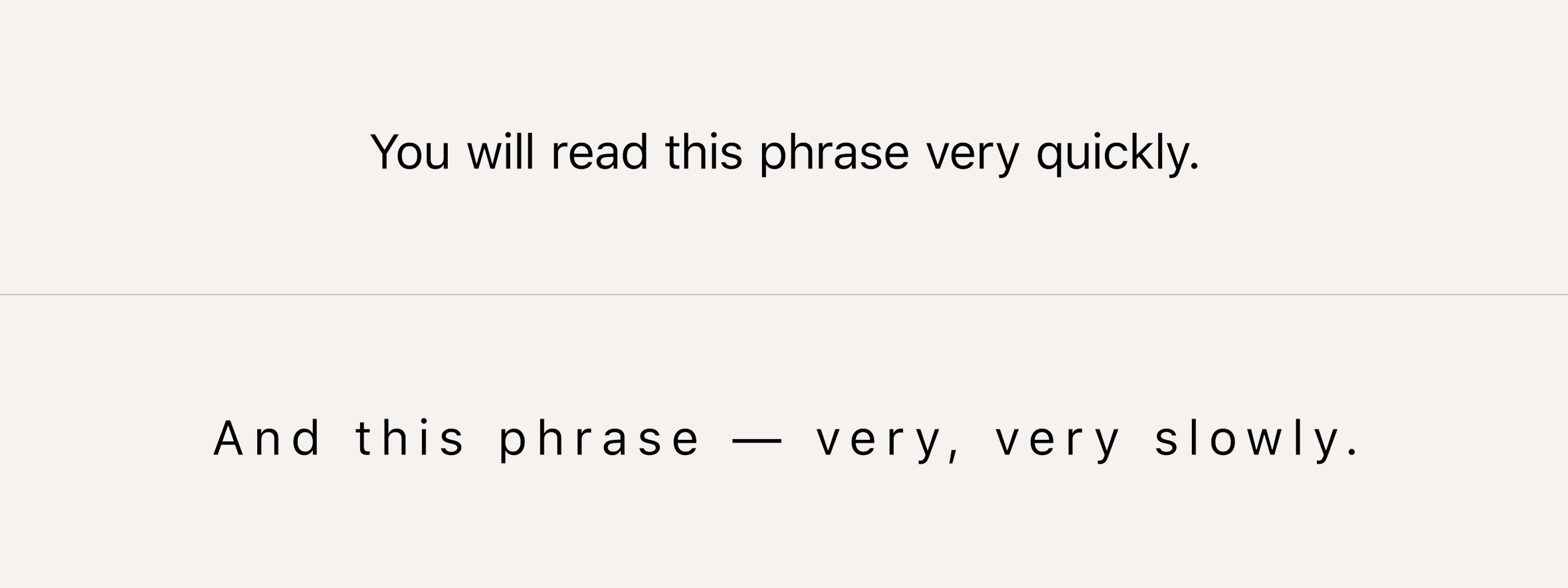
The Dimension and Rhythm pair can also be employed to manipulate the pace at which information is perceived. Take note of how the spacing between individual letters and words influences the speed at which phrases are read:
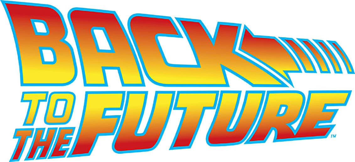
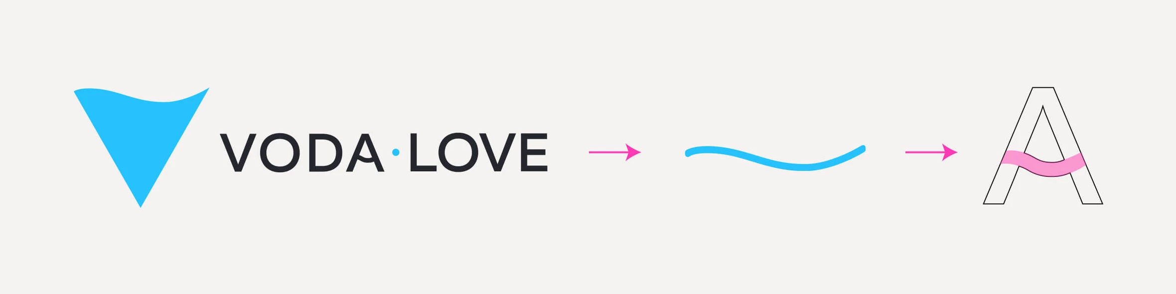
Furthermore, a notable example of utilizing this pair of expressive tools can be observed in the well-known movie franchise, Back to the Future. In its logo, Dimension and Rhythm play a crucial role in conveying the metaphor of moving both forward and backward in time through the clever arrangement of the two inscriptions.
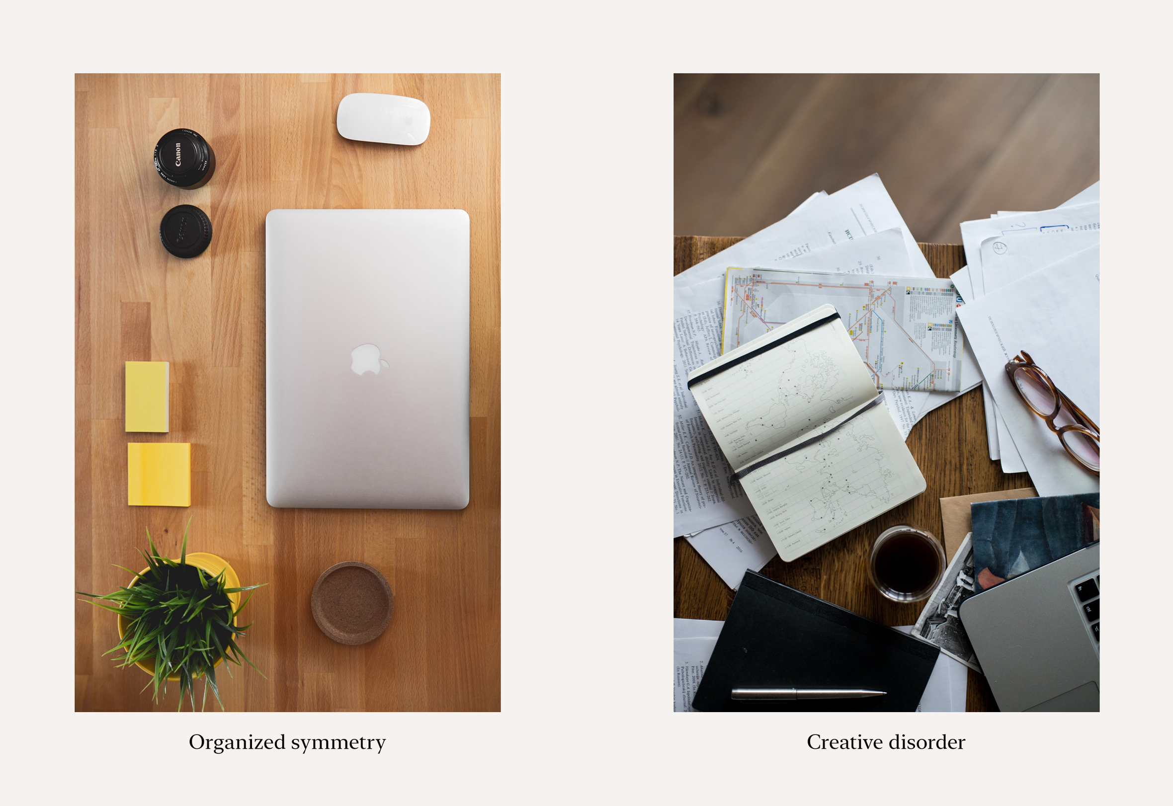
Symmetry and Asymmetry
The name of this pair of graphic design elements is quite apt, as it defines the degree of symmetry present in the composition as a whole or its individual elements.
Throughout ancient times, symmetry was regarded as a hallmark of beauty, and architects in the ancient world strived to achieve it. This comes as no surprise, as symmetry inherently conveys a sense of visual equilibrium. Consequently, the closer a composition is to a state of symmetry, the more visually balanced it appears.
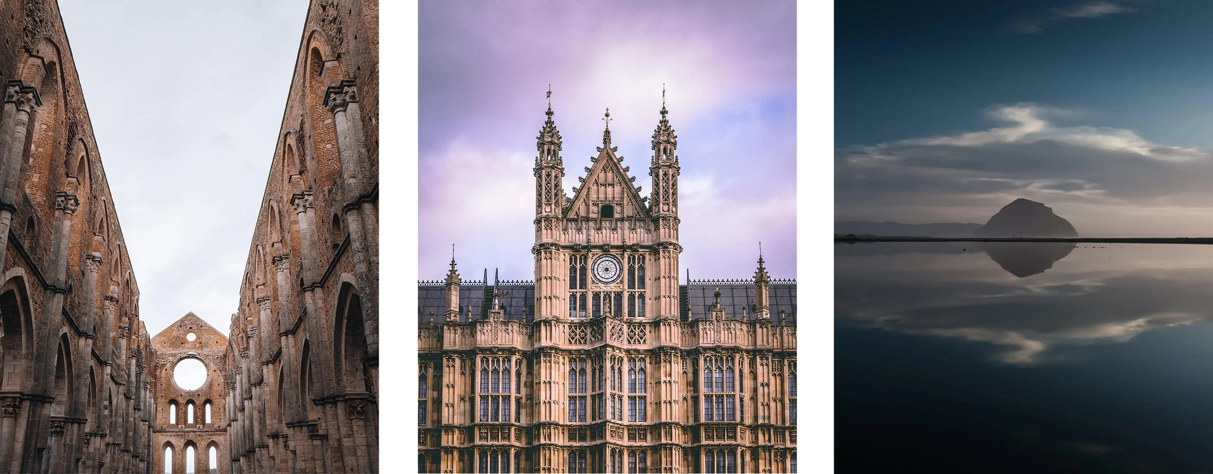
However, not every design aims to evoke a sense of balance in its elements. There are instances where the creative intention is to showcase inequality, imbalance, or contrast between different elements, and that’s when asymmetry becomes an excellent tool for expression.
For instance, asymmetry can portray the numerical superiority of one army over another, the size difference between David and Goliath, or the disparity between the effort exerted and the resulting outcome.
While symmetry is often associated with organization and order, asymmetry serves as a powerful visual representation of creative disorder.
Commensuration and Proportionality
Proportionality holds significant physiological importance for humans. We intuitively perceive it as we ourselves embody the concept of proportion. This observation was made by the ancient Roman architect Vitruvius in his renowned treatise “On Architecture.”
Vitruvius wrote: “Without symmetry and proportion there can be no principles in the design of any temple; that is, if there is no precise relation between its members, as in the case of those of a well shaped man.” (Vitruvius. The Ten Books on Architecture. Book Three. Chapter One, https://bit.ly/3nLtvur). He goes on to point out that the human body is amazingly proportional. Thus, the face, from the chin to the top of the forehead and the lowest roots of the hair, is a tenth part of the whole height; the open hand from the wrist to the tip of the middle finger is just the same; the head from the chin to the crown is an eighth, and so on.
By the way, it was on the basis of this treatise that Da Vinci created one of his most famous works, the Vitruvian Man.
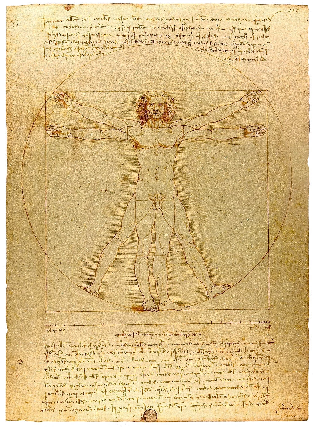
Therefore, according to Vitruvius’ treatise, in order for an architectural building to be properly arranged, it must contain a basic proportion at the heart of the entire composition. One element of a building must be proportional to another element. And every size of an architectural element must be based on proportion.
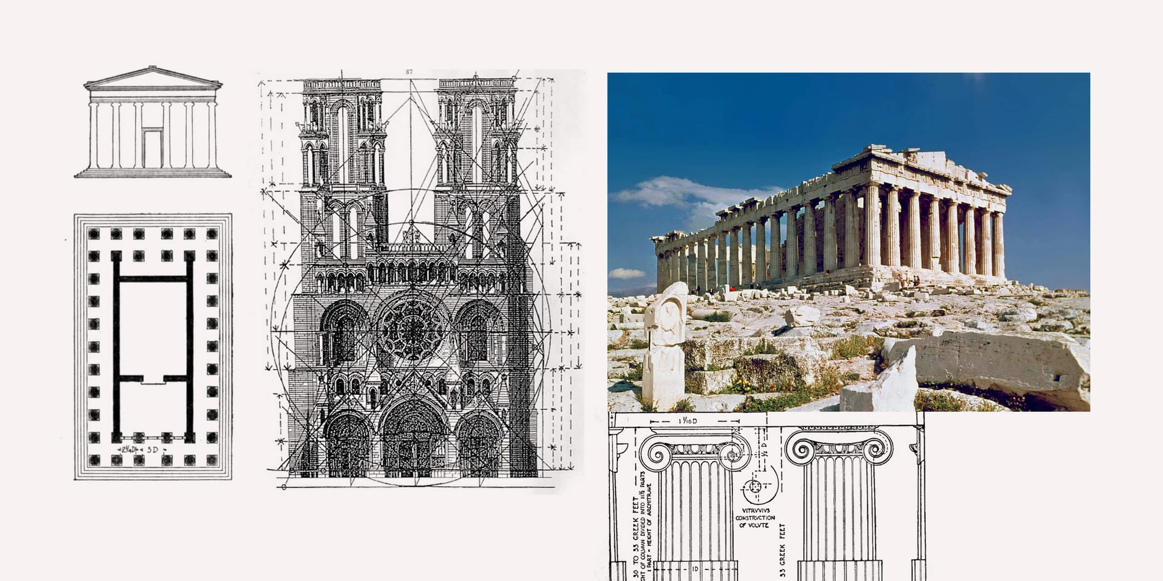
The same principle applies to graphic design. To achieve a harmonious perception of your composition, it is beneficial to establish a fundamental proportion and construct the composition in relation to it.
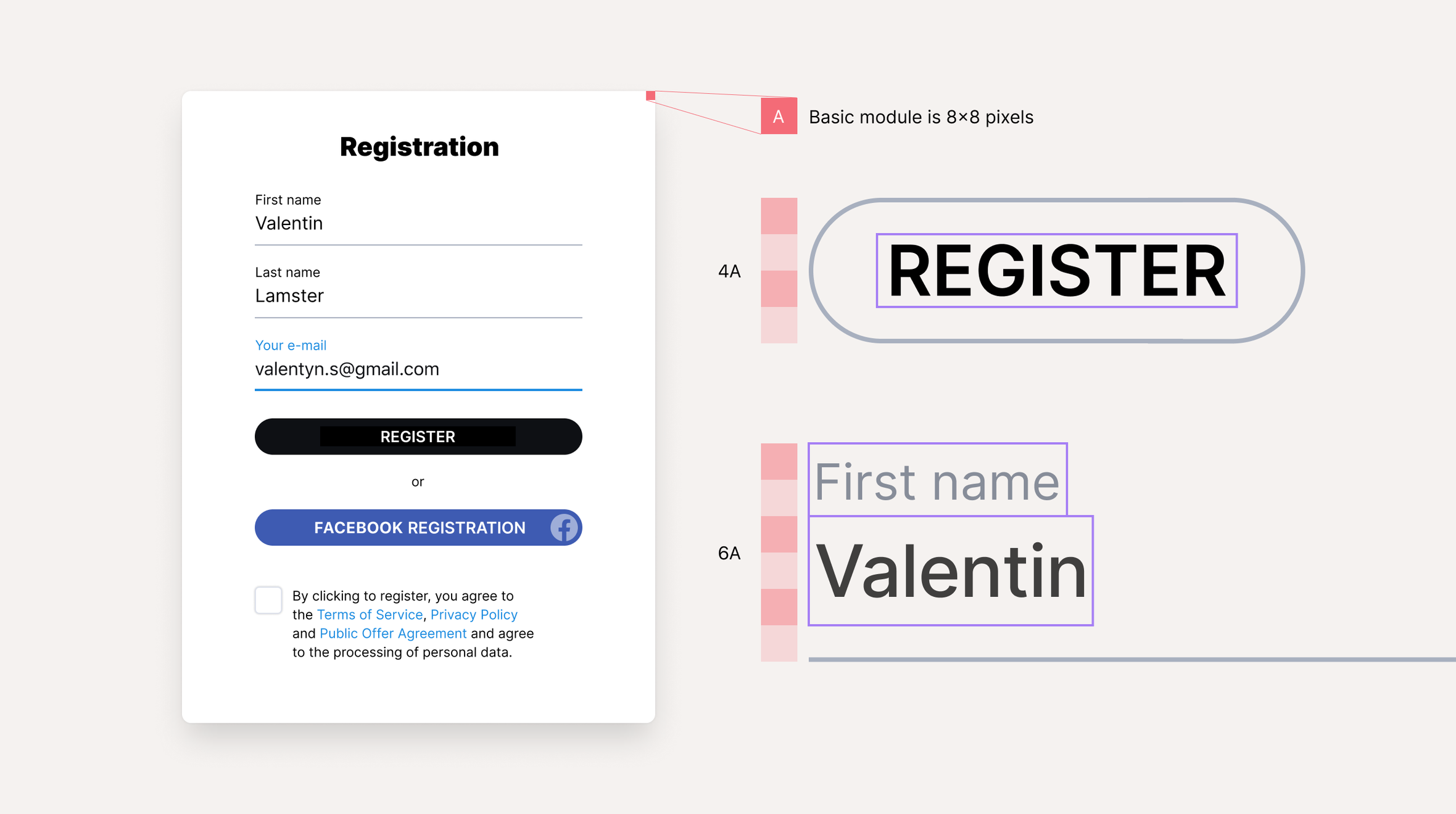
Designers frequently utilize modular grids as a tool to ensure the proportionality of graphic composition.
Size and Scale
Geographic maps often represent scale using a ruler-like element, providing an understanding of how the map corresponds to the actual size of the territory. This scale ruler indicates, for example, that one centimeter on the map represents a kilometer in reality. We can easily estimate distances on the map with our knowledge of real-life distances.
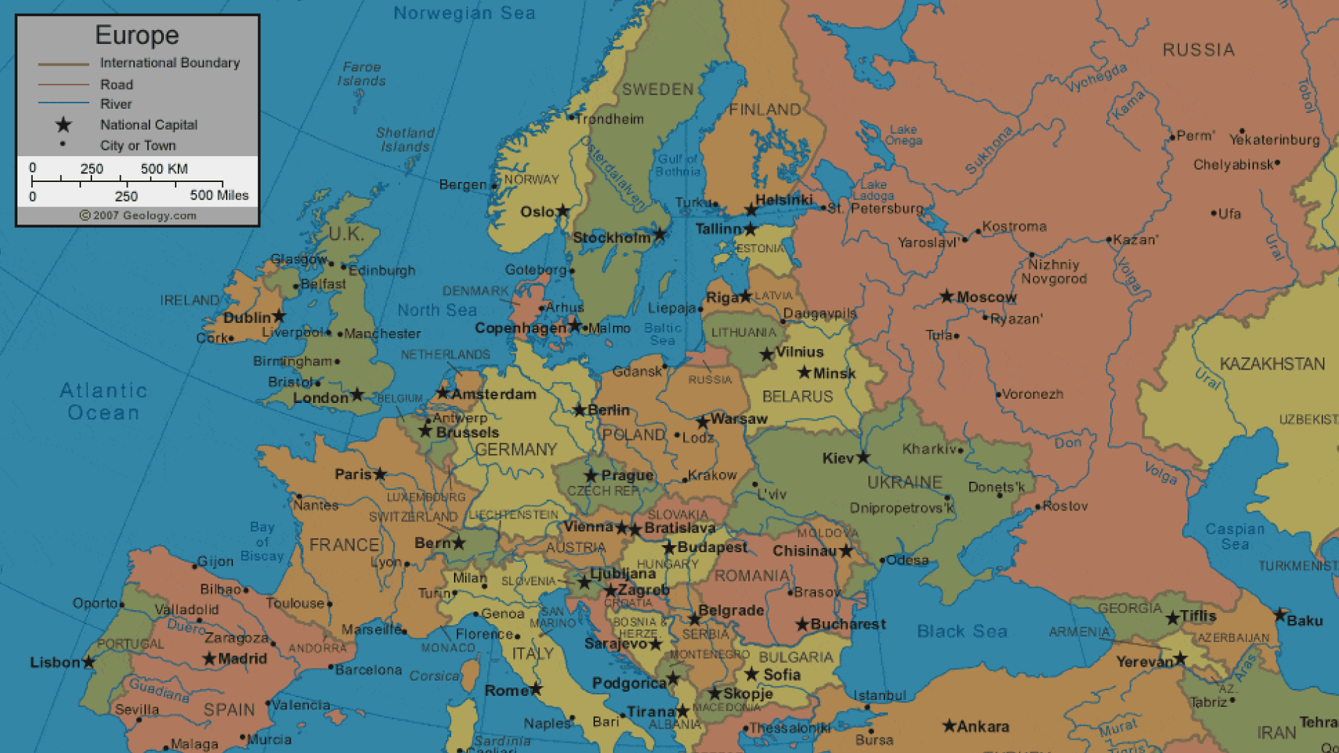
But how can we convey the size of a large object on a small piece of paper, such as a postage stamp? Let’s imagine a person who has no concept of the actual size of the Eiffel Tower in Paris. If we were to show them a picture of the tower alone, it would be difficult for them to grasp its scale. However, if we include figures of people standing next to the tower in the drawing, it becomes immediately evident just how tall it is!
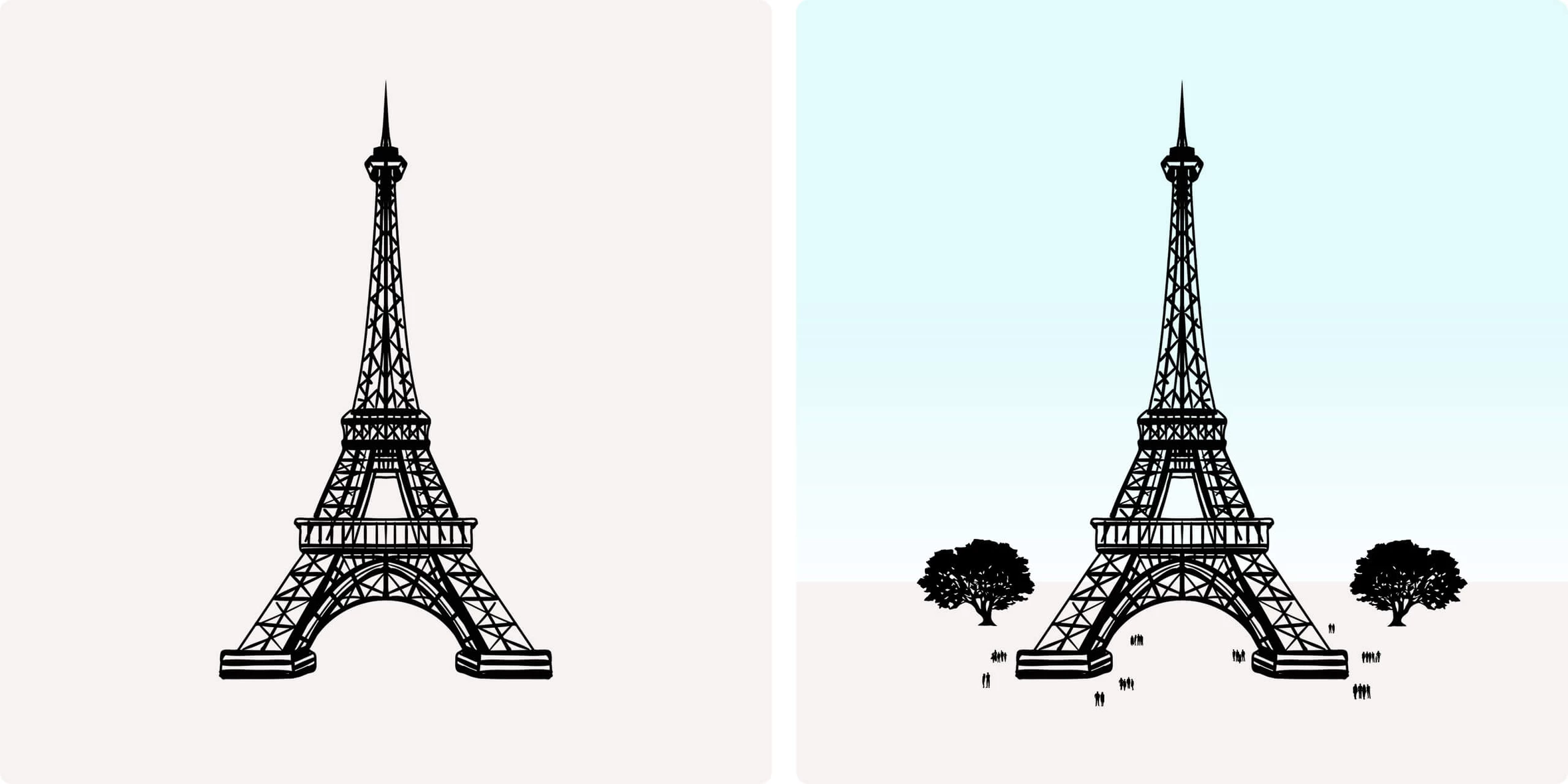
In other words, to depict the immense size of one object, we rely on another object with a well-defined size. This principle is commonly employed in graphic design. For instance, Elizabeth Holmes, the founder of the notorious medical startup Theranos, claimed that her company had developed a method to conduct comprehensive blood tests using only a few drops collected in a tiny test tube called a nanotainer. While the incredibly small size of the nanotainer could have been demonstrated with a ruler, the impact was more emotionally powerful when a photograph showed Holmes holding the nanotainer with her two fingers.
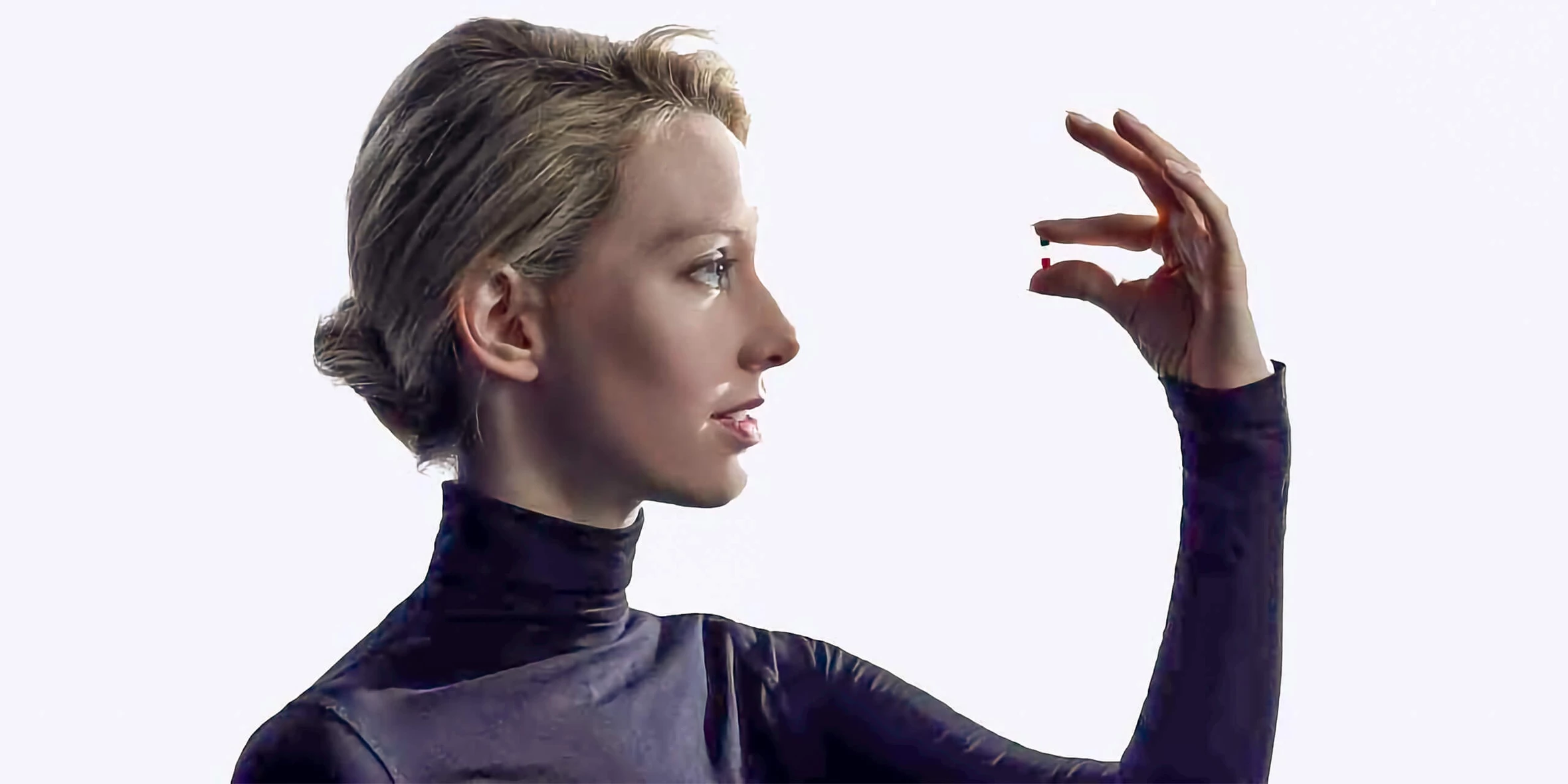
Regrettably, it was later revealed that Theranos’ technology did not function as claimed, leading to numerous lawsuits. However, it is worth acknowledging that the project’s visual communications were remarkably impactful.
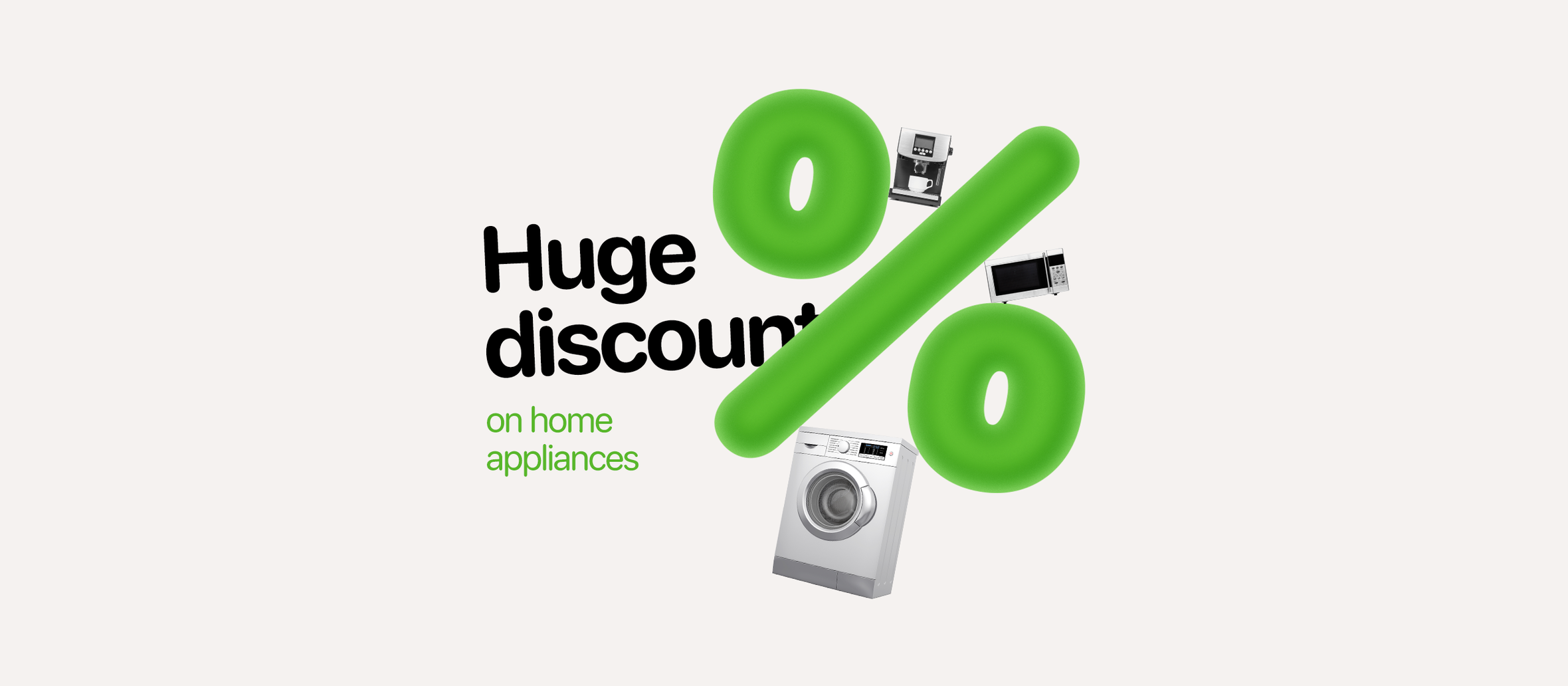
Moreover, this pair of tools can also be utilized to visualize the scale of abstract concepts. For instance, it can be employed to demonstrate the immense magnitude of discounts.
Likeness and Difference
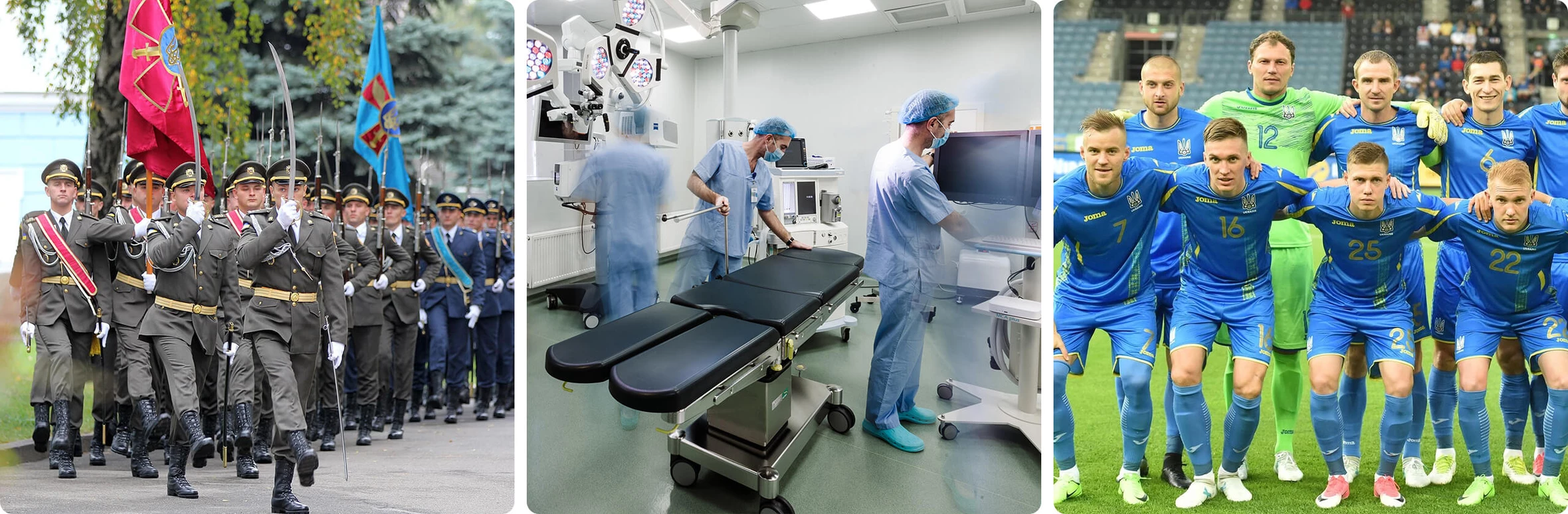
The pairing of Likeness and Difference aids in portraying shared characteristics through visual similarity. Conversely, when elements are visually dissimilar, their inherent differences are accentuated.
This principle finds frequent application in the design of uniforms for civil servants, military personnel, doctors, and football teams.
In graphic design, the principle of likeness and difference is commonly utilized. For example, all menu items have the same icon type and font. In graphical interfaces, elements that have the same function have similar visual features.
By the way, the pairing of Likeness and Difference is closely related to an important design technique known as creating visual rhyme.
To achieve harmony between your lettering, graphic images, and decorative elements, it is crucial to develop the ability to identify shared characteristics among them. These shared characteristics can be small elements that possess visual similarities and naturally complement each other.
Contrast and Nuance
The pairing of Contrast and Nuance enables us to convey the extent of difference between elements and to achieve visual expressiveness.
Nuance refers to subtle distinctions between an element and similar ones, while contrast represents a significant difference. The greater the disparity between elements, the higher the level of contrast.
Visually, contrast can be expressed through the shape of elements:
… as well as through the use of colors:

Additionally, contrast can take on emotional or symbolic significance. For instance, the metaphor of cold (represented by an ice cube) contrasts strongly with the metaphor of heat (represented by fire), while the metaphor of joy contrasts with indignation.

Consonance and Dissonance
Lastly, we have a pair of graphic design elements known as Consonance and Dissonance. The term “consonance” derives from the Latin word “consonantia,” which means “harmony” or “agreement,” while “dissonance” stems from “disonantia,” referring to a “discrepancy” or “unstable sound.”
The idea behind these expressive means is straightforward: they allow you to evoke either a sense of harmony or unease in the viewer. Which of these states you aim to stimulate depends on your creative intention. For instance, it is typical for social advertising to prompt viewers to contemplate a particular issue or even instill a sense of concern.
To accomplish this objective, you can employ unsettling imagery, somber color schemes, or slightly unconventional compositional choices.
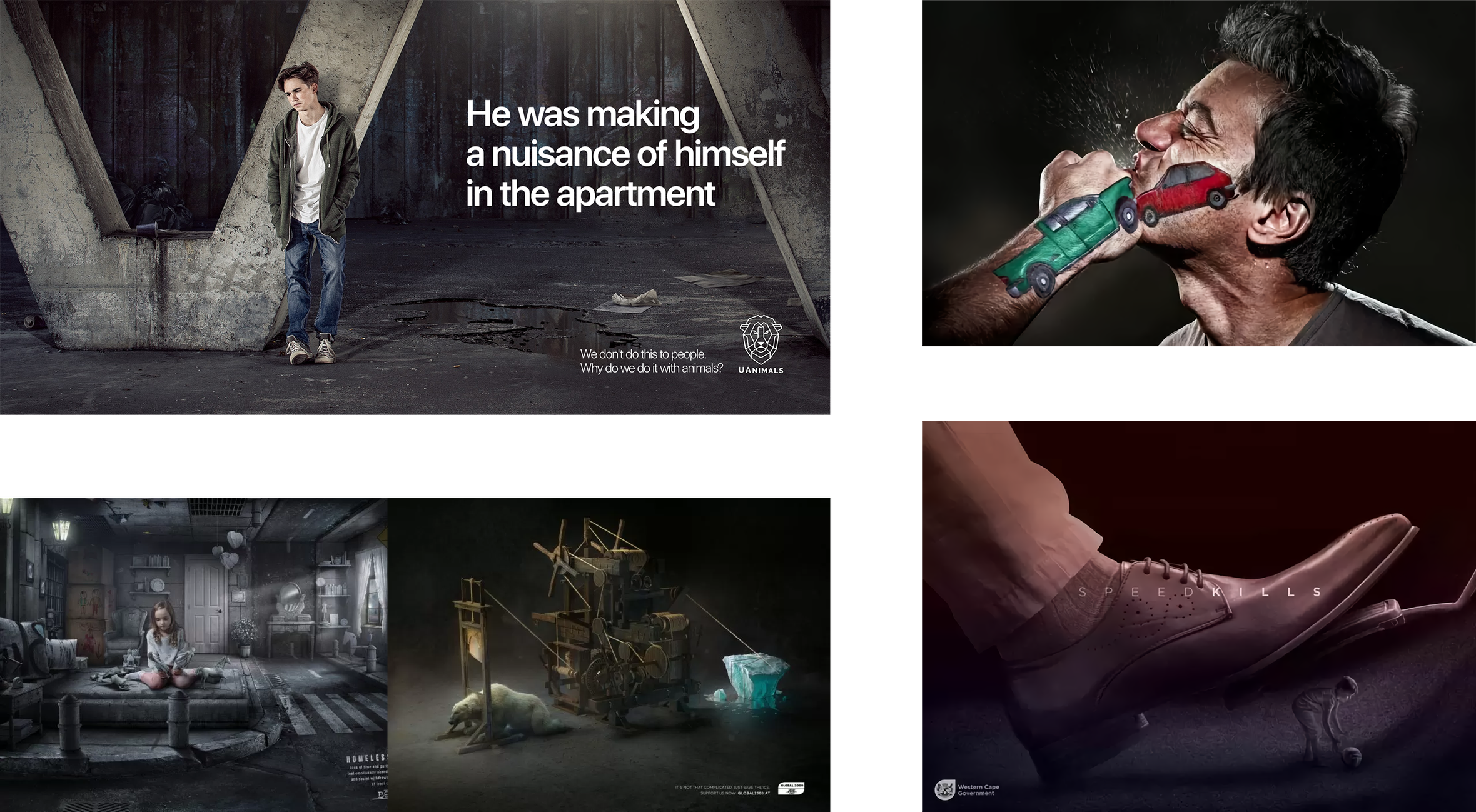
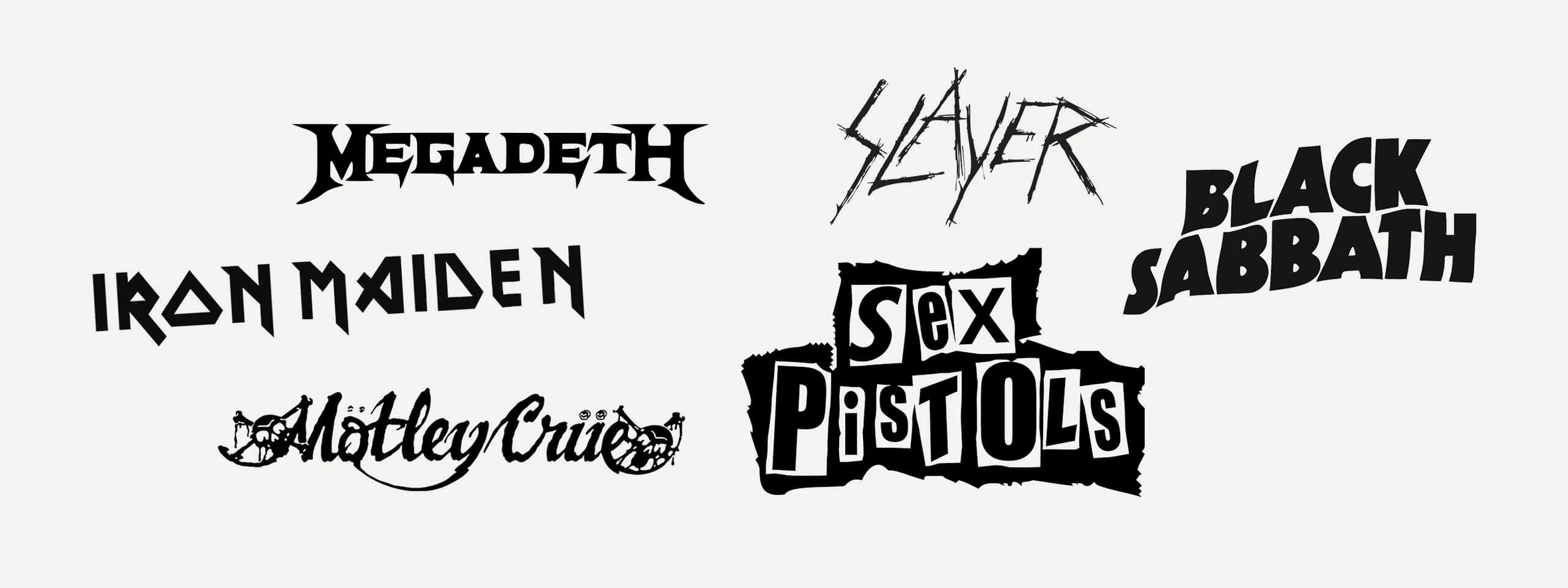
Rock artists like Rammstein, Trent Reznor, and Marilyn Manson frequently employ dissonance in their music.
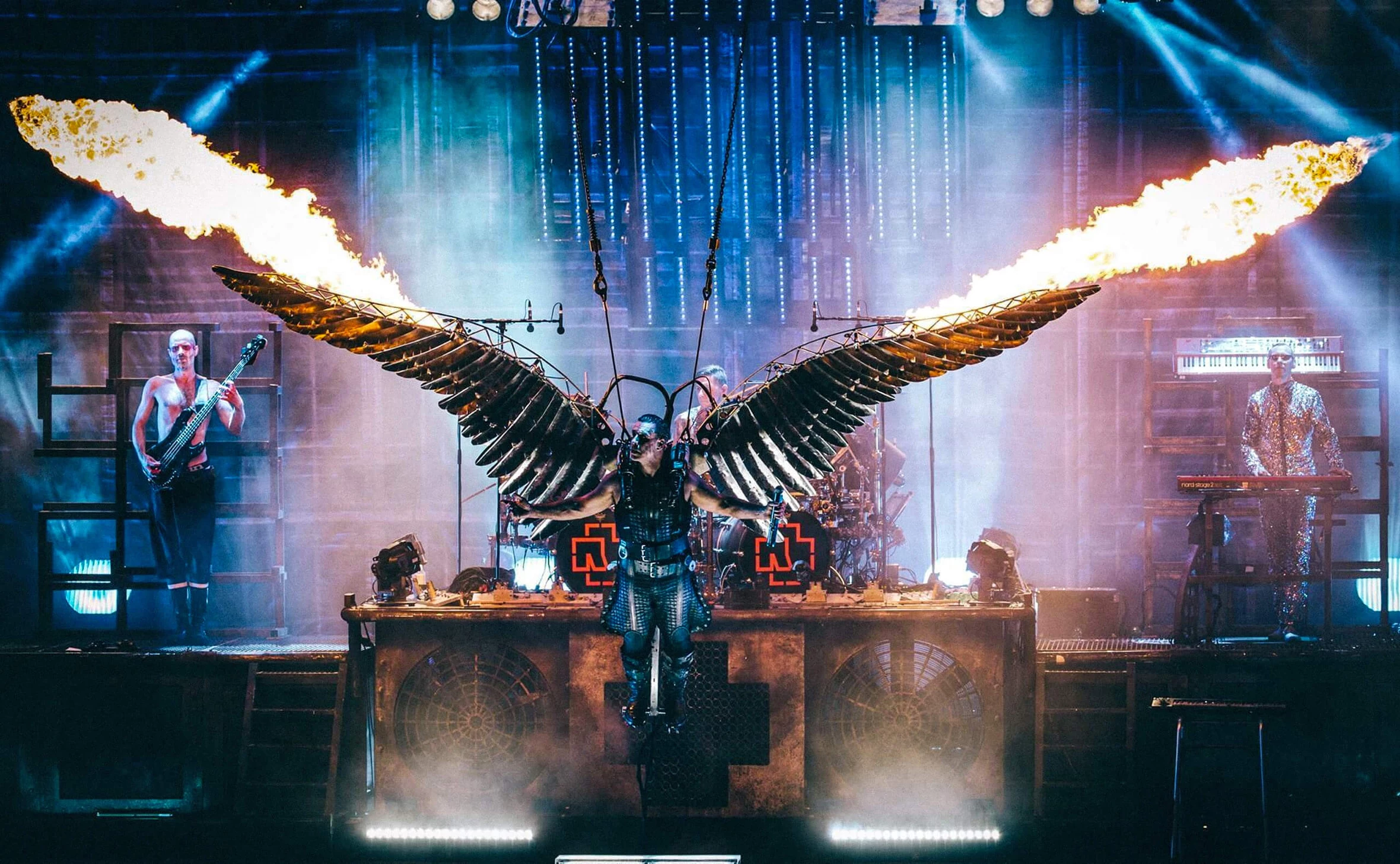
The inclination towards dissonance can be observed in the logos of rock bands.
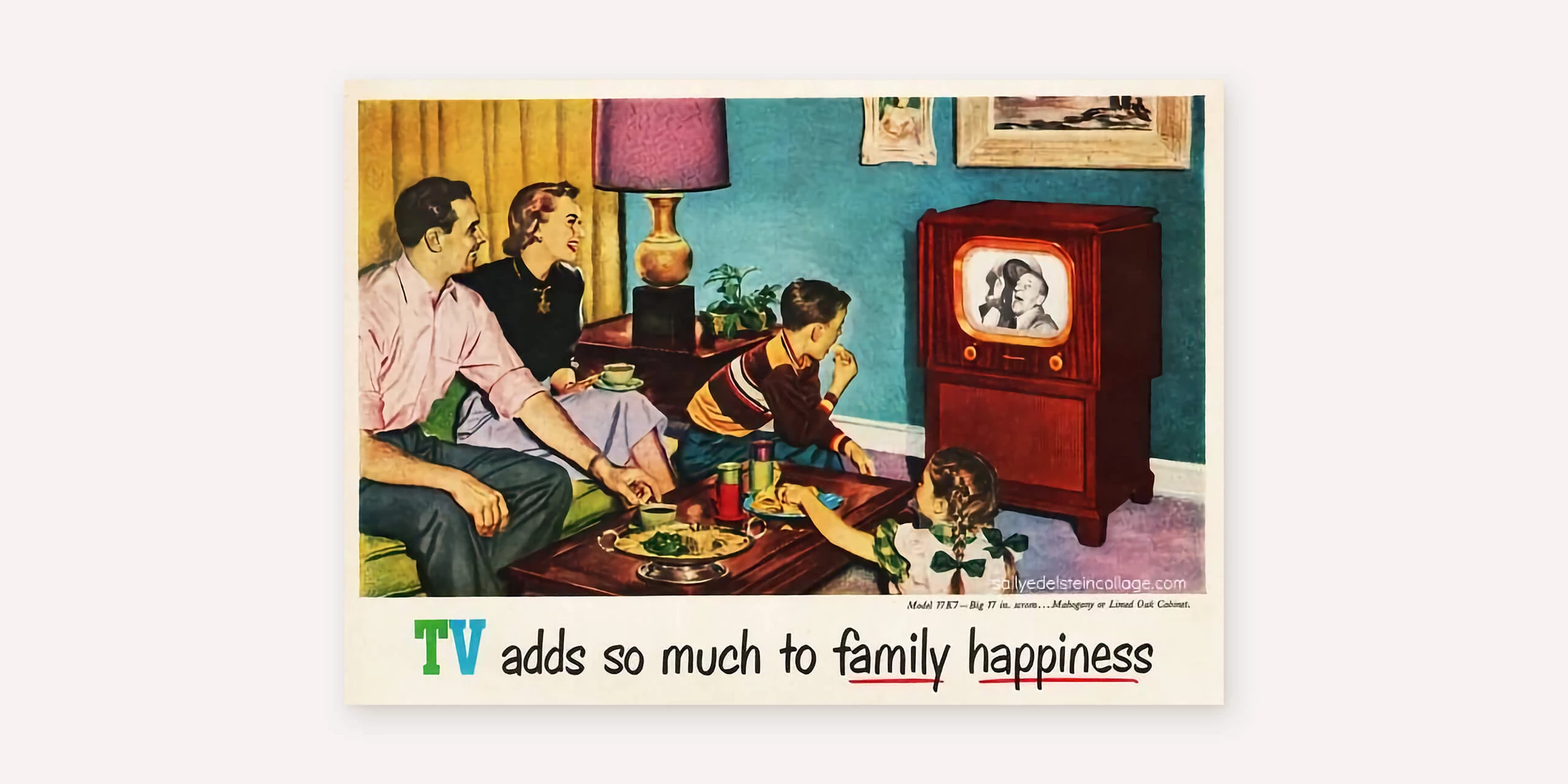
Conversely, designers use joyful people imagery, pleasing color palettes, and clean typography to achieve consonance.
In conclusion
There are various visual techniques that enable you to evoke specific emotional or meaningful effects, both in the overall composition and its individual elements.
These techniques assist in achieving harmony within your composition.
The term “harmonization,” although peculiar, refers to assigning each element in the composition a shape, size, position, and color that aligns with your intention while enabling viewers to perceive the composition as a coherent and balanced whole. In other words, the composition adheres to the requirements of the three composition rules.
We will delve into these rules in the upcoming article.


