We have a natural tendency to perceive things as a whole. Don’t believe it? Let’s put it to the test!
Take a look at these images.
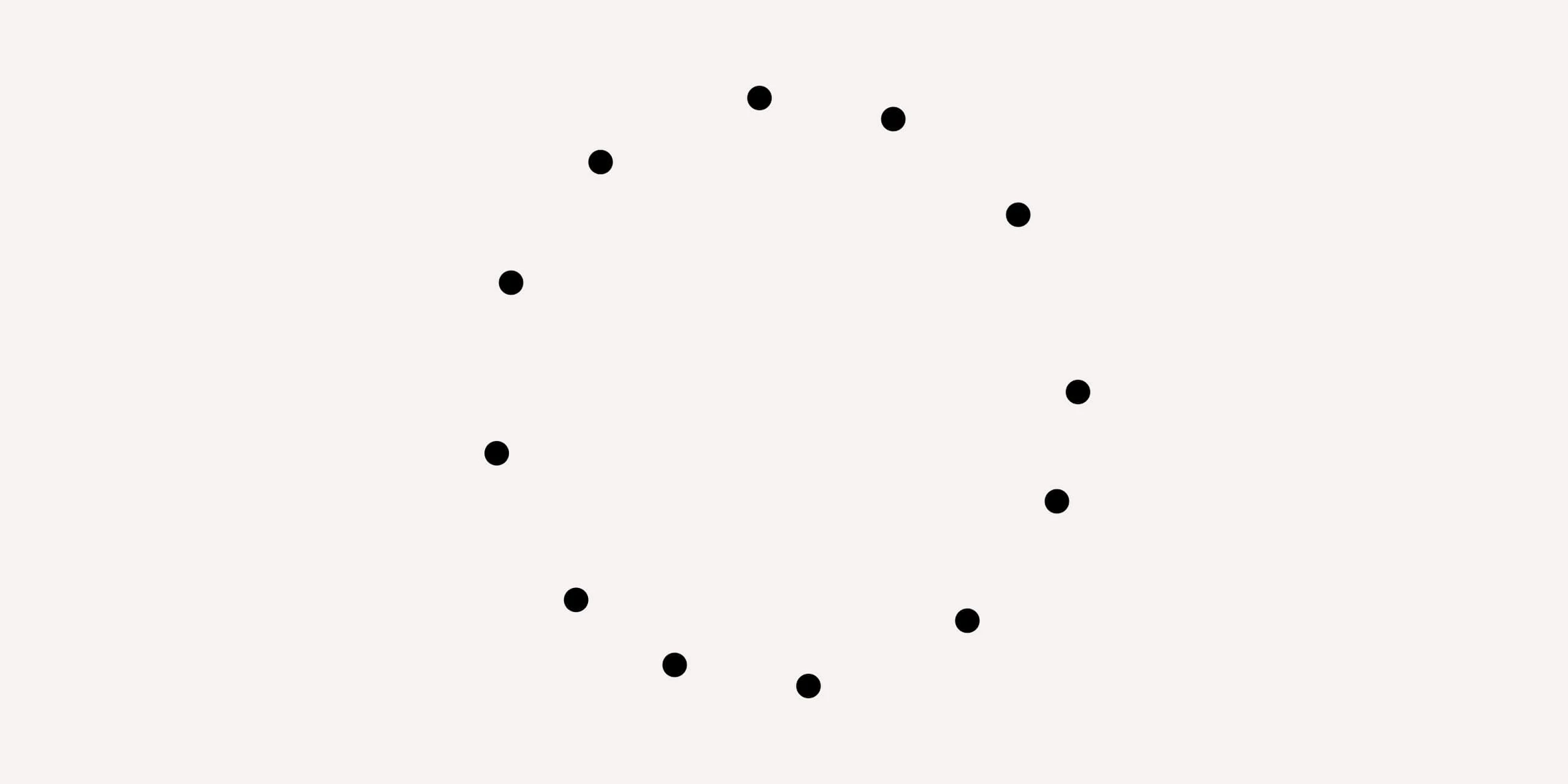
In this illustration, there are 12 individual dots, but your mind is likely to perceive them as a circle, filling in the missing parts automatically. It’s fascinating how perception works!

Similarly, in this illustration, the word “design” is not explicitly spelled out; only some consonant letters are present. Yet, your perception effortlessly fills in the missing vowels, completing the word where it should be.
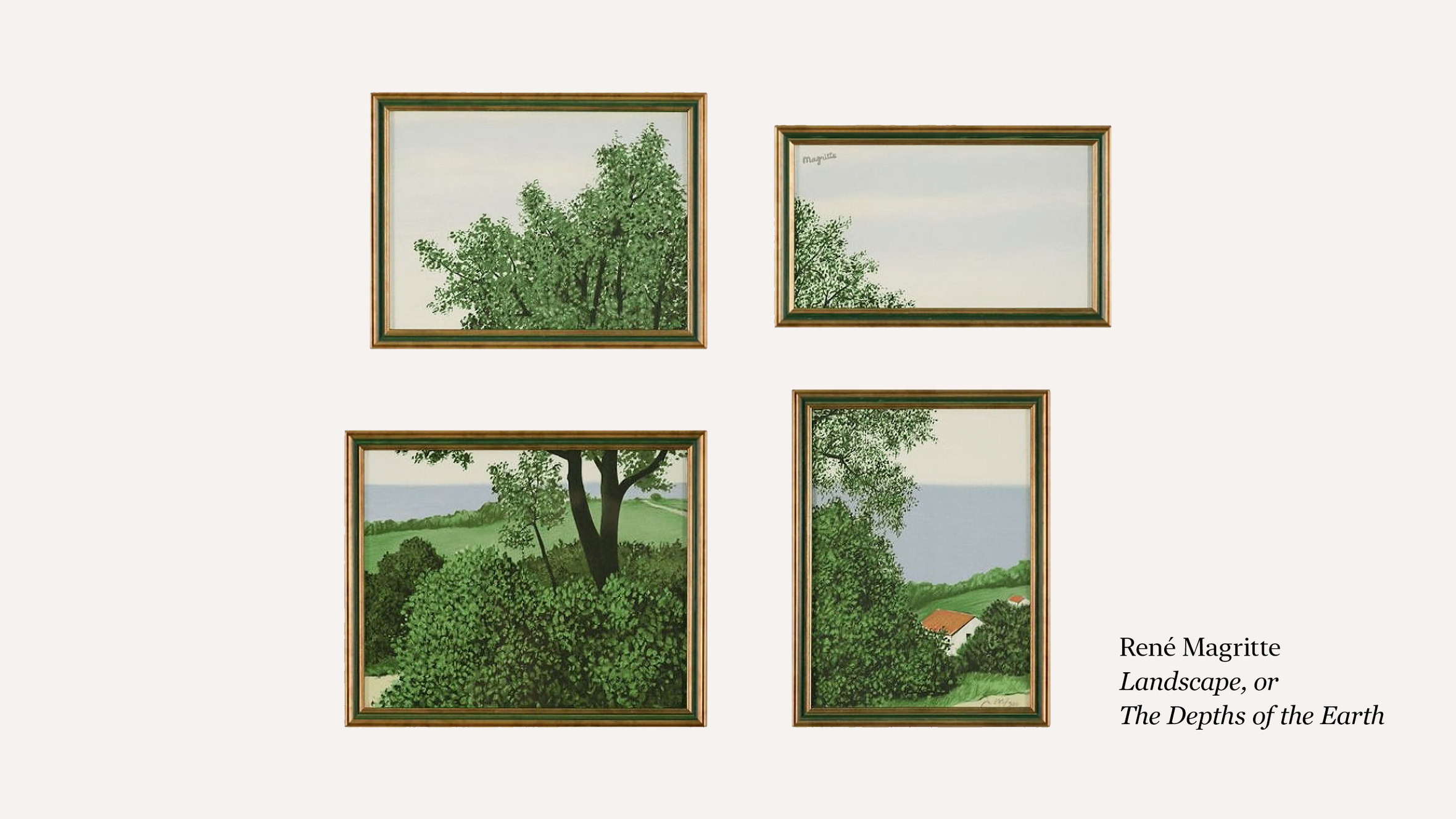
The same principle applies to more intricate systems as well. Take, for instance, the ensemble of four paintings called “The Depths of the Earth” by René Magritte. Rather than perceiving them as four distinct landscapes, your mind naturally merges them into a cohesive painting, filling in the gaps.
Perception also tends to organize and make sense of visual information. Observe this image:
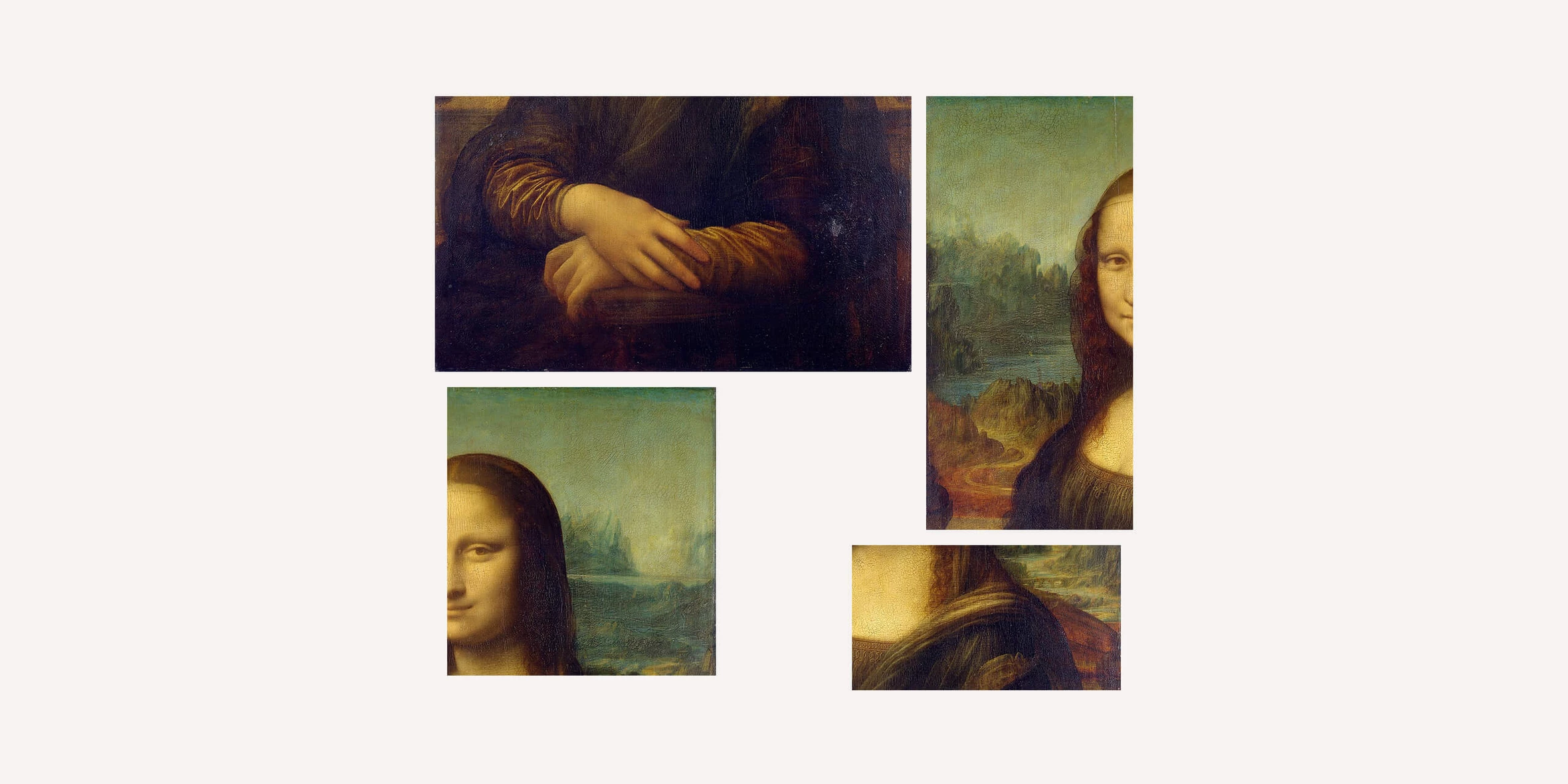
It’s the renowned “Mona Lisa” by Da Vinci, but we’ve intentionally rearranged it into four fragments, disrupting its original order. Yet, astonishingly, your perception seeks to reconfigure the fragments into their correct arrangement as soon as you lay eyes on the image.
The same phenomenon applies to written words as well:

In these three examples, the letters are jumbled up. However, you still perceive and read “Gestalt” instead of “Getsalt,” “Composition” instead of “Copmosition,” and “Design” instead of “Dsegin.”
It’s almost magical! It’s as if a tiny person inside your mind automatically corrects errors and arranges things in the proper order before transmitting the visual information or words to your consciousness. But how does this process actually occur?
Let’s delve into it and uncover the workings behind this fascinating phenomenon!
About Gestalt
The reason behind our inclination towards wholeness and order in perception is quite simple: it is inherent in human nature. Our consciousness, as well as our subconscious, feels discomfort when faced with something incomplete or out of place. This innate sense of integrity and order is known as Gestalt.
The term “gestalt” is derived from the German language and can be translated as “form,” “shape,” or even “whole,” representing the idea of a complete entity.
In psychology, there is a concept called Gestalt closure. It describes the process of completing a task or fulfilling a commitment, bringing about a satisfying sense of wholeness and fulfillment. Conversely, unfinished book leaves us with a feeling of incompleteness, so we keep it in a visible place as a constant reminder.
"Wait a minute," the most impatient among you will say. "This is all fascinating, but how does Gestalt theory apply to design?"
Well, in a direct way! The natural inclination to closure can be harnessed to enhance and complete the composition beyond its physical boundaries — within our perception.
For instance, designers often utilize a solid frame to create a sense of enclosure and closure.

Take a moment to observe how the principles of Gestalt can effectively convey a sense of enclosure using just four dots!
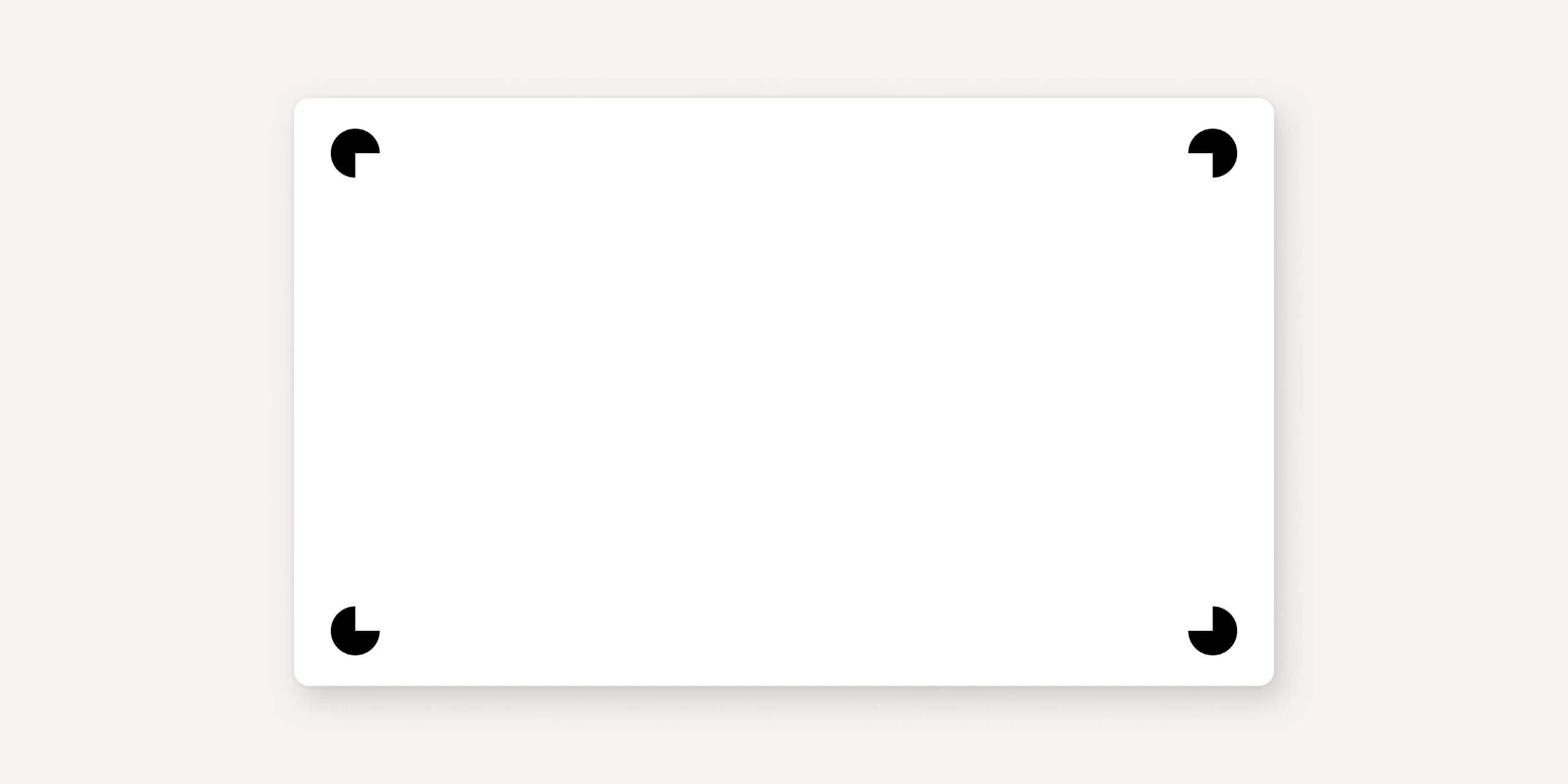
This illustration vividly demonstrates how Gestalt enhances and finalizes the composition, filling in the missing pieces.
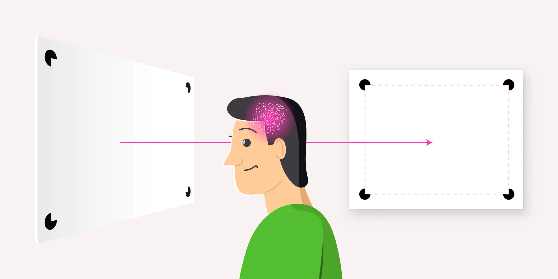
And this means something important: the list of composition means we provided earlier is clearly incomplete.
Perception of a composition
One of the Gestalt theory founders was the Austrian psychologist and philosopher Christian Von Ehrenfels.
In his 1890 publication “On the Qualities of Form,” he emphasized that the whole surpasses the mere aggregation of its individual parts.
Consider a musical composition as an example. It encompasses more than just notes, instruments, or keys. While cover versions of songs often alter the structure, mood, sound, and arrangement, they still retain certain elements that enable us to recognize the original work, assuming we are familiar with it.
These elements can encompass various aspects: ideas, subjects, and content. They reside between the notes of a melody and among the diverse elements of a design product. We previously discussed how graphic compositions are crafted on a two-dimensional plane using visual images, text, and decorative elements. However, there is an additional component at play — perception. Perception is a vital and highly engaged participant in the compositional structure. It interprets the images you create, fills in the gaps, and assimilates the designer’s intended idea.
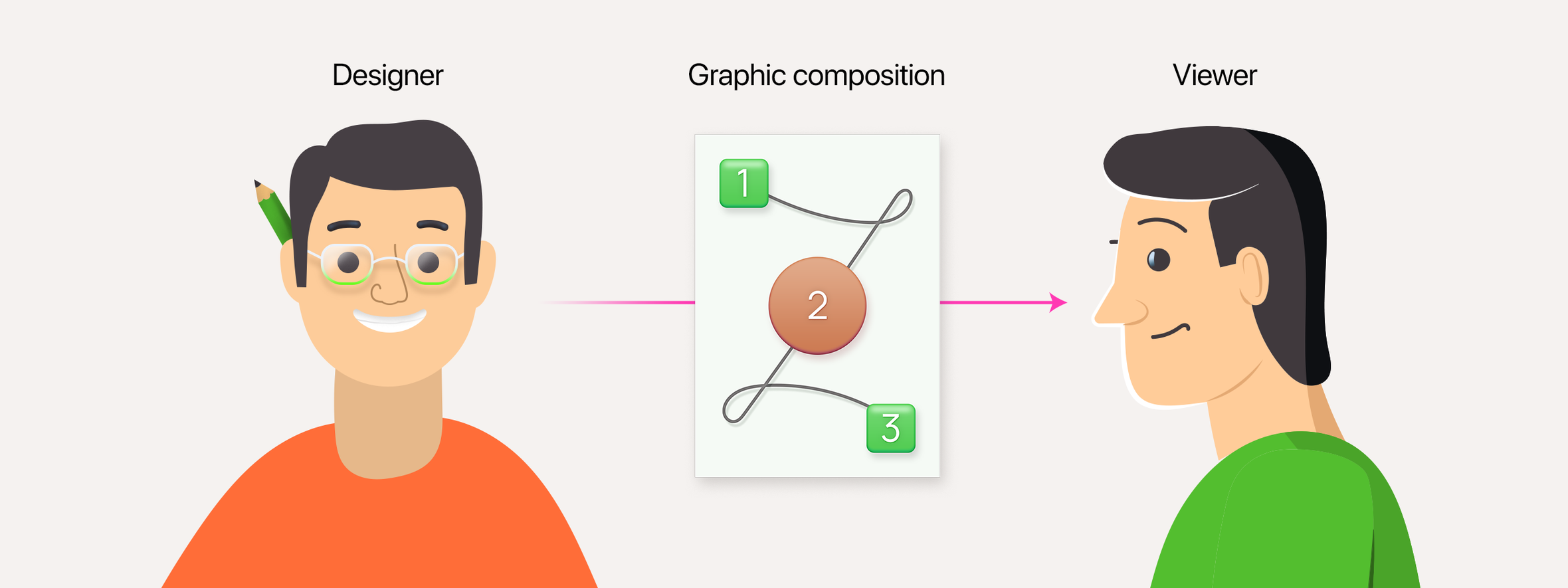
And the idea travels from the designer to the viewer through the design.
When an author conveys their idea through text, it is readily comprehensible. In graphic design, however, ideas are expressed not through words but through images, metaphors, and visual solutions. While we are taught to read conventional texts from a young age, no one explicitly teaches us the language of graphical images. Yet, somehow, we still grasp their meaning.
This is where a visual dictionary comes into play. The following sections will explore what it entails and where to access it.
Visual dictionary and perception constants
A visual dictionary is a compilation of visual information accumulating throughout your lifetime. Thanks to this collection, you assign specific interpretations to colors, shapes, and visual metaphors, enabling you to recognize objects even with significant stylistic variations.
While the concept of a visual dictionary may seem abstract, its contents function astonishingly!
You are presented with two buttons: one labeled “Buy an item,” and the other labeled “Delete an order.” Which button corresponds to each action?

Instinctively, you are inclined to associate the green button with purchasing an item and the red button with deleting an order. However, how did you arrive at this conclusion when the labels were unreadable?
This is because your visual dictionary has established color associations that guide your understanding.

The same principle applies to metaphors. We don’t require explicit labels on these buttons to understand their functions upon clicking.

Our prior experiences have already established associations with these images, allowing us to comprehend their intended actions.
In Gestalt theory, our perception not only stores information about visual images but also retains knowledge about the inherent qualities of objects.
These qualities, known as perceptual constants, are connected to the physical attributes of objects, such as
- size,
- shape,
- and brightness.
In simple terms, our perception retains the original image of an object. Even if we encounter a distorted, inverted, reduced, or poorly illuminated version of the object, we can still recognize it and know what it really is.
To grasp how this functions in practical terms, attempt to answer a straightforward question: what is the size and color of this object?

It’s a white cup. However, in the image, it appears bluish. Nevertheless, we interpret the color accurately because we possess an image of a white cup in our visual dictionary. Despite the evening lighting depicted in the picture, we still recognize the true color based on our prior knowledge.
In this instance, it will be effortless for you to determine which of these two objects is larger:

Again, our perception recognizes the actual colors and shapes of the objects, not just those depicted in the picture.
However, this is only possible if you have previously seen the object or have some knowledge of it.
In conclusion
Therefore, it can be concluded that our perception does not merely passively observe graphic design but actively engages with the designer’s intended perception through it.
To establish a mutual understanding, our perceptions rely on visual dictionaries, which reside within our minds and continuously evolve with new information. These dictionaries enable us to interpret images of objects accurately.
Furthermore, we can perceive non-existent objects! We have the capacity to mentally construct and visualize objects that are not physically present in the composition.
Isn’t that amazing? Of course, it is!
But here’s another intriguing aspect: with the help of our perception and visual dictionary, we can not only complement the composition. We can differentiate between two or more compositions within the same graphic composition, even when the elements remain unchanged in their position. In our upcoming article, we will delve into how this phenomenon operates.


