

When creating a graphic composition, you often intuitively feel whether you're on the right track or if something is off with the layout. Perhaps an element is too large, doesn't fit, or seems unnecessary.

As soon as you find the right place, shape, and size for an element of the composition, you immediately feel: this is it. Novice designers often rely on intuition in this creative process rather than understanding it logically. Some may believe this is the only way to determine the correct positioning and sizing. Still, fortunately, there are other methods available.
However, three specific properties contribute to a sense of perfection in a composition:
- the hierarchy (or the dominance),
- the unity,
- and the balance.
Let's delve into them and start with the concept of dominance.
The hierarchy
The concept of hierarchy refers to the need for a clear and well-defined visual and content hierarchy within a composition.
It might be a bit confusing, so let’s clarify what it entails.
The term “hierarchy” originated from the Greek words ίερσς (hieros), meaning “sacred,” and άρχή (archi), meaning “power.” In the past, the “hierarchy” was the office of the supreme clergyman, which determined the order of subordination among the clergy. Interestingly, hierarchs are still used to refer to supreme clergymen today.
However, in our times, “hierarchy” generally refers to the arrangement and relative subordination of elements within any given structure.
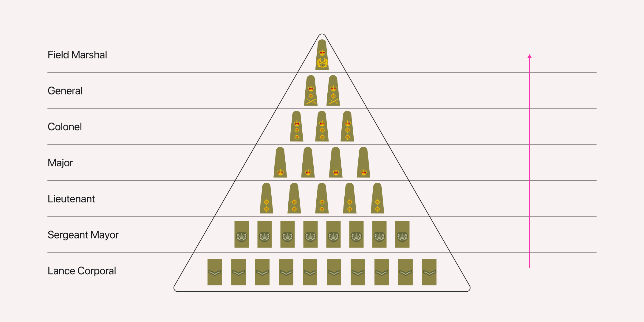
Hierarchy is a crucial aspect of the military, as it helps to determine who has the authority to make decisions in a given situation and whose decision holds more weight in case of disputes.
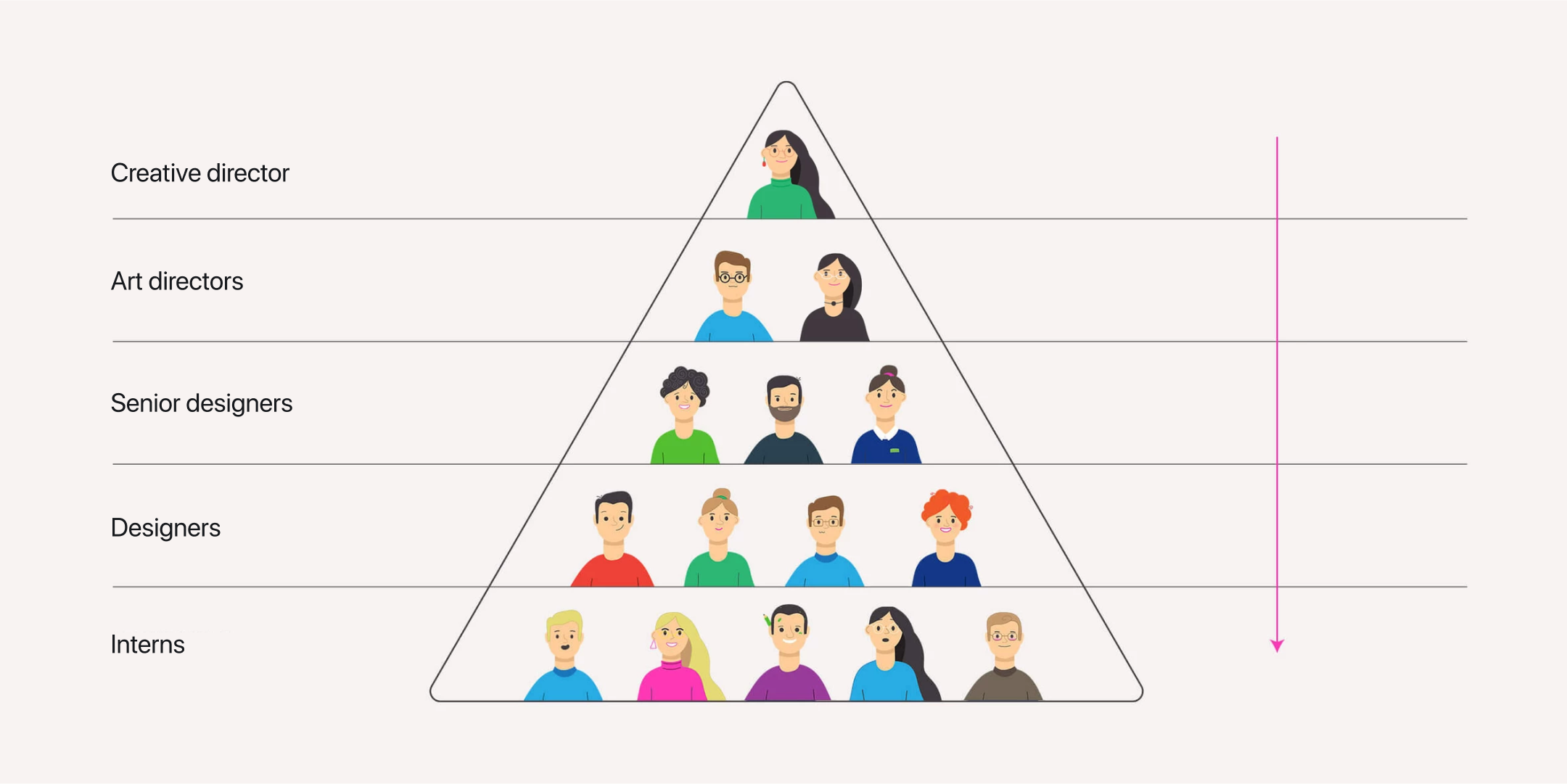
Similarly, in a design studio, hierarchy helps define subordination levels. For instance, in the diagram presented, the hierarchy is structured such that the intern reports to the designer, the designer reports to the senior designer, the senior designer reports to the art director, and finally, the art director is subordinate to the creative director.
And if the concept of the team hierarchy is more or less clear, how does the hierarchy work in the composition?
Here it consists of two levels:
- content (or ideological).
- formal (expressed through visual form).
To effectively convey hierarchy in a graphic composition, a designer must first establish it at the content level, determining what is primary and what is secondary. Then, they can use various visual techniques to communicate this hierarchy on the formal level.
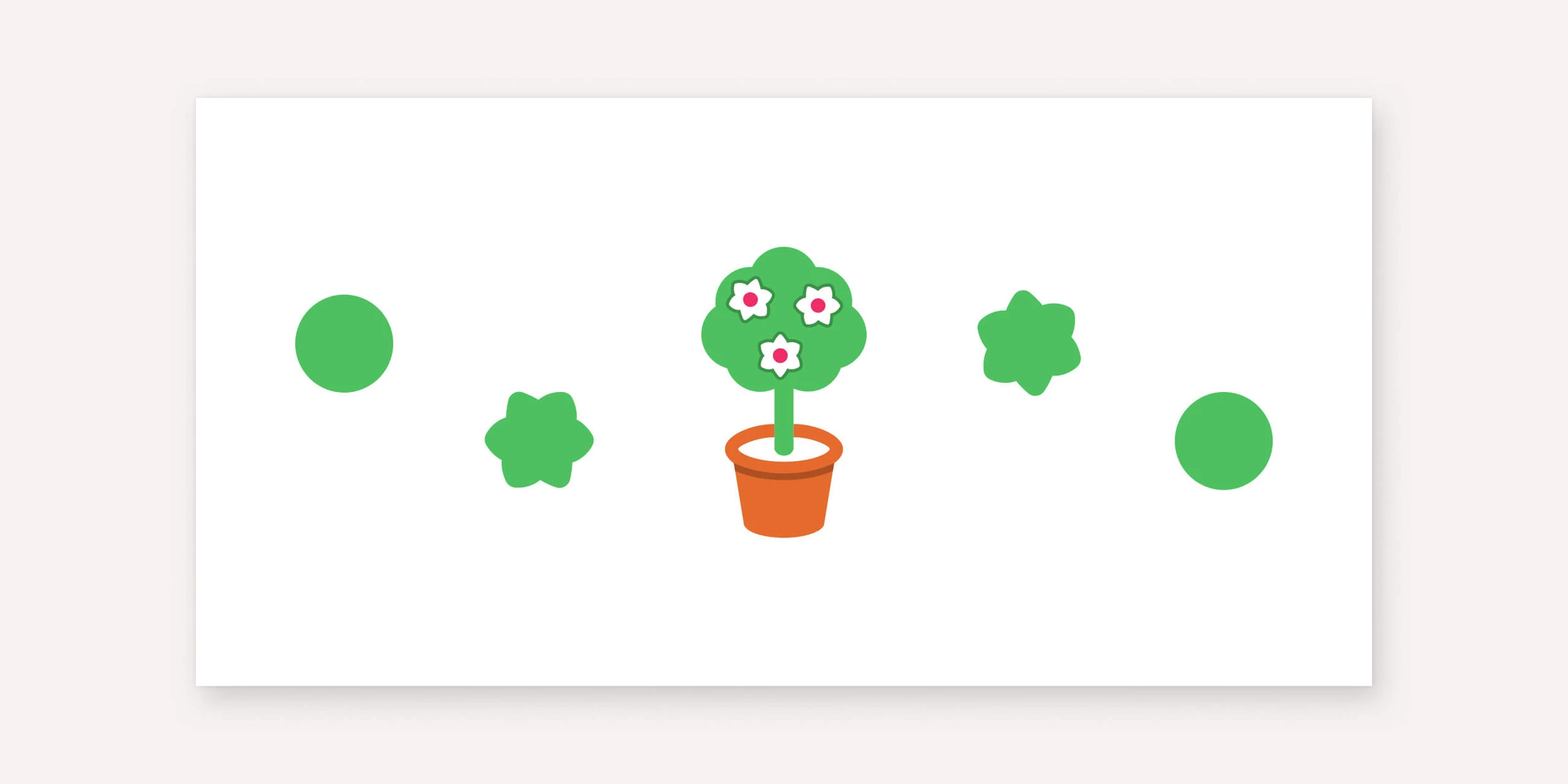
There are many specific techniques that help convey hierarchy through form, such as
— positioning elements within the composition:
— adjusting their size:
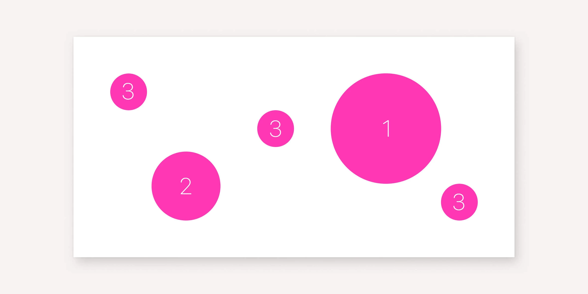
— color saturation:
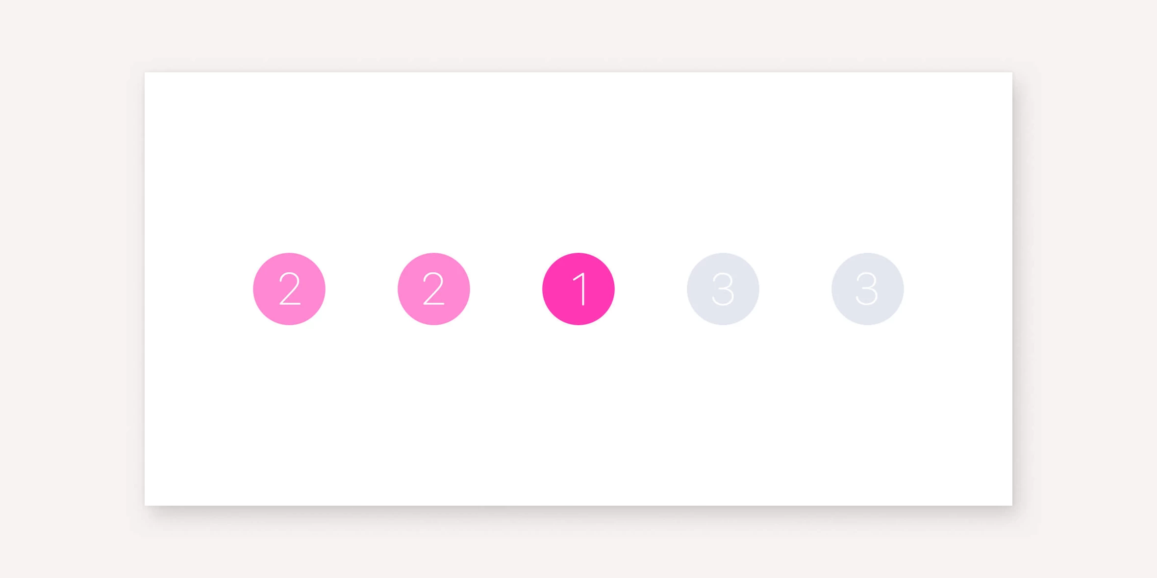
— and level of detail:
The key requirement of this concept is that the meaningful hierarchy must be easily distinguishable by the viewer.
They should be able to easily identify the key image or idea from the total set of elements:
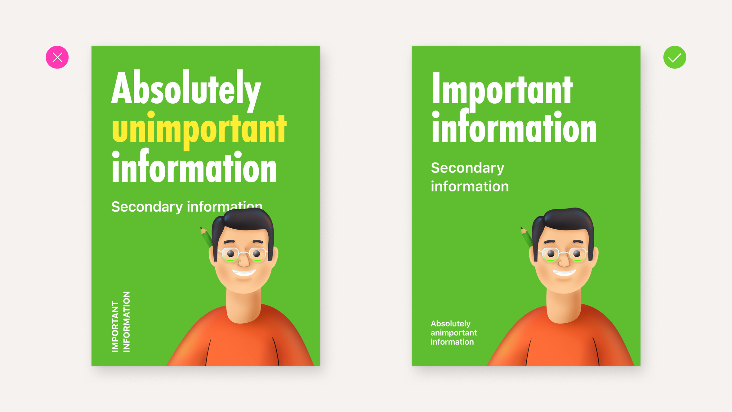
Failing to balance the hierarchy will result in a composition that fails to clearly express the intended message.
However, observing the other two concepts of composition is equally important for ensuring the effective perception of form.
The unity
Let's discuss the principle of unity in design. It can be defined as follows:
A composition must be ideologically complete, and its components must be visually harmonious.
Regarding ideological completeness, it's a straightforward concept. Just think about a sentence that isn't finished. It is…
Irritating? That's precisely what it is. A composition is best perceived when it's complete at the idea level, which is what we call ideological integrity.
Incompleteness in a composition is felt on a physiological level because humans are naturally drawn to completeness.

Similar to the concept of hierarchy, integrity also requires the formal aspect of a composition. For a design to be perceived as complete and unified, it must meet specific criteria regarding its presentation, genre, style, and overall execution.
If these elements are not addressed, the final product can leave a sense of incompleteness or lack of unity.
We, as viewers, tend to feel this sense of incompleteness intuitively while reading books, watching movies or TV shows, and looking at advertising or corporate identity.
Achieving visual integrity involves a variety of techniques, such as visual rhyme, maintaining internal proportions of the layout, and choosing the appropriate type of composition, among others. However, it primarily relies on the designer’s meaningful approach to creating a composition, carefully considering every element’s position, shape, size, and color.The balance
The balance
The principle of balance can be formulated as follows:
The composition should be visually proportionate.
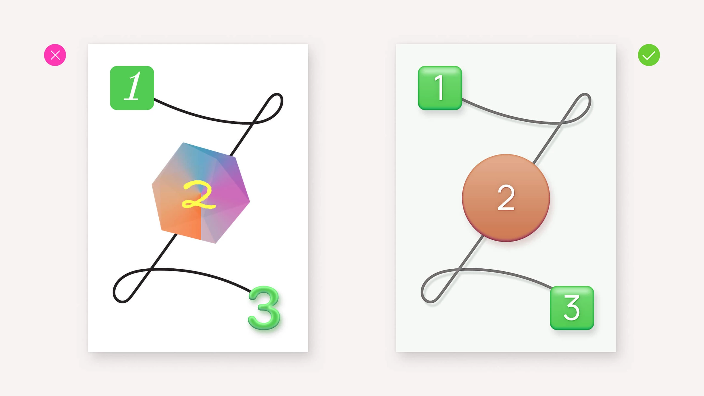
When it comes to physical weight, the concept of balance is straightforward: it is a state when two objects have equal weight. To better understand how optical weight works, imagine a white square plane with its centre at the tip of a cone. Exactly at the intersection of the axes of symmetry. In this state, this white plane is in equilibrium, so it is balanced.
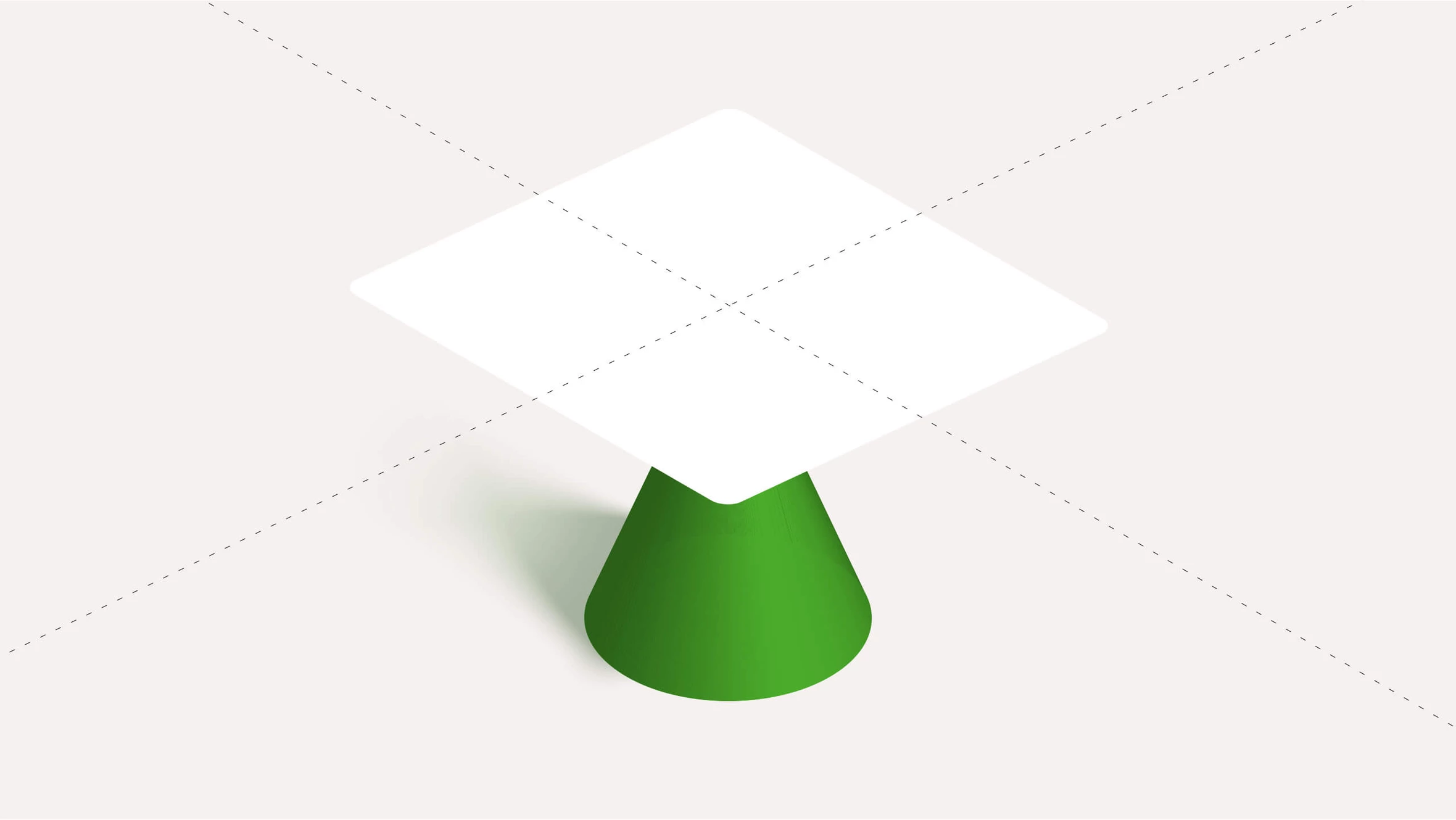
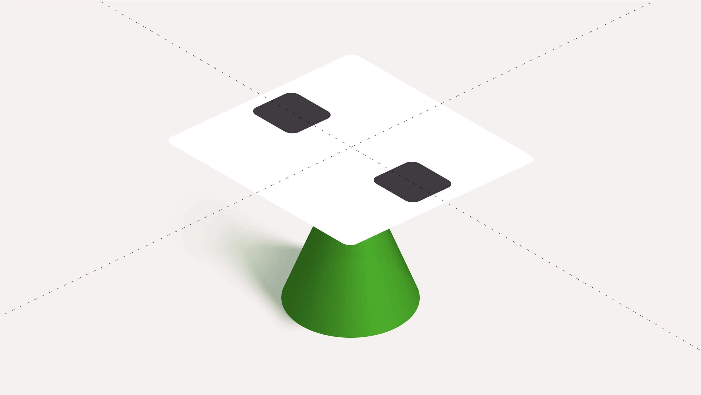
If you add a black square to this plane, it looks like an object with mass. But the balance is maintained as long as the center of the square is at the intersection of the axes of symmetry. If you move the square to the right of the axis of symmetry, the plane will tilt to the right.

To balance the composition, we can add an identical square or several smaller squares of the same total volume on the left. This way, we restore the balance.
Making the right square gray instead of black will cause the left side of the composition to become dominant.
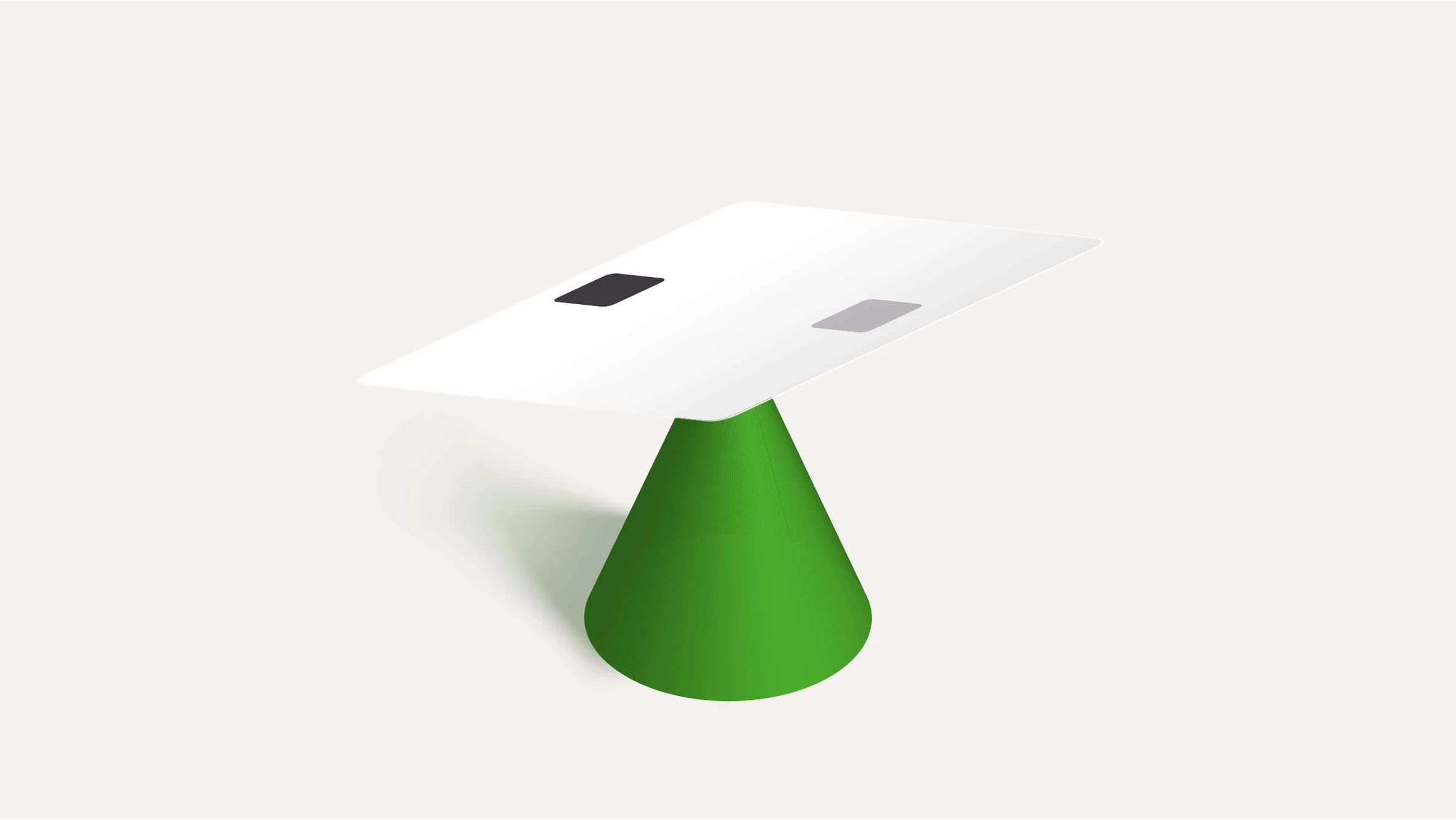
So, the saturation of color affects its optical weight. In English, the word “lighter” is a play on words, as it can refer to both “less heavy” and “brighter in tone.” Thus, the darker the color, the heavier it appears. You can balance the composition without changing its color by simply enlarging the area of the square on the right.

Accordingly, we can achieve optical balance in our layout by combining the shapes of the elements, their positions, and color saturation.
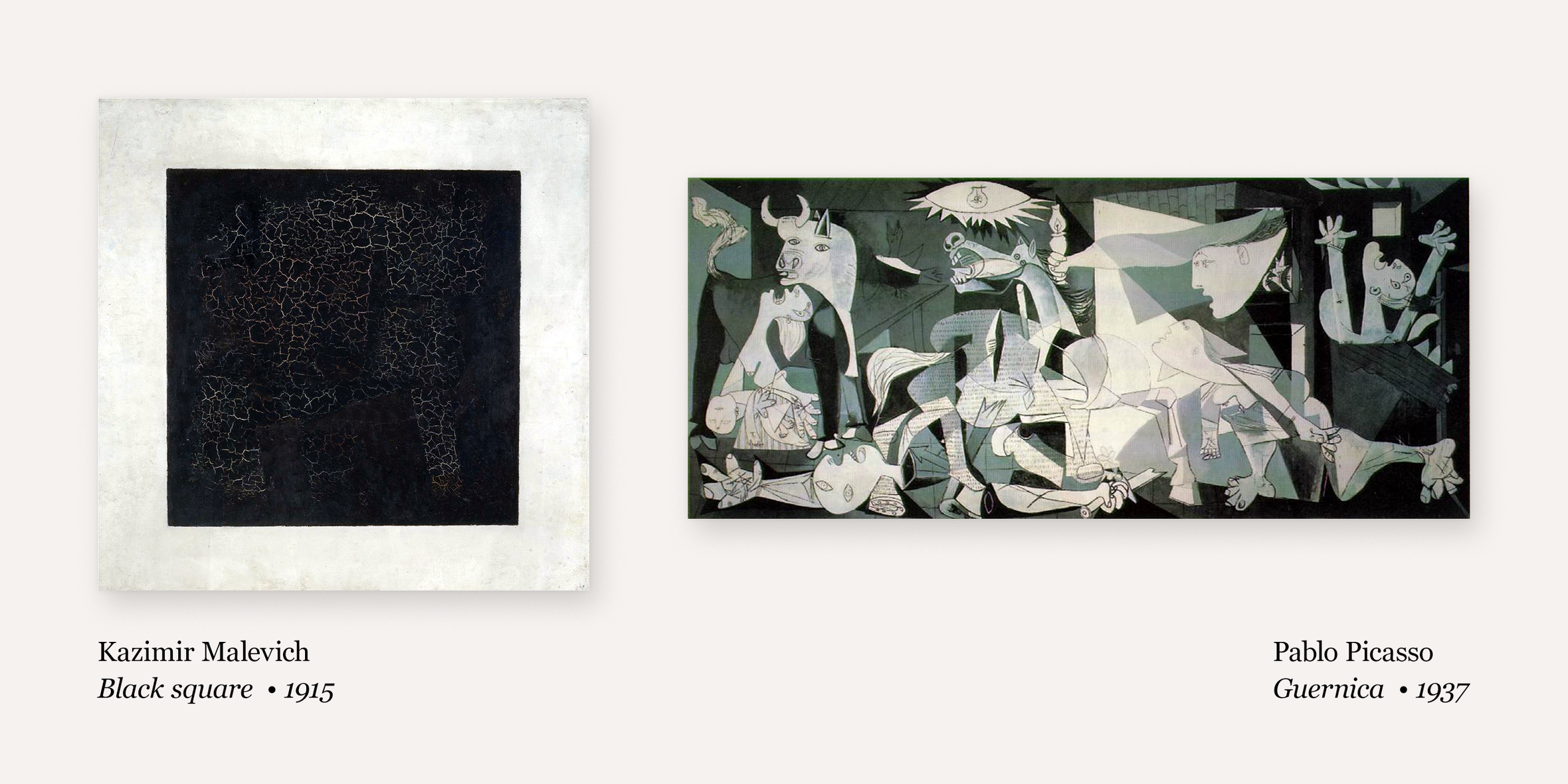
This explanation is somewhat simplified, but it should suffice for now to understand the general principle. This principle applies to very simple compositions, such as Kazimir Malevich's “Black Square,” as well as to more complex ones, such as Pablo Picasso's “Guernica.”
Not only visual images but also inscriptions and decorative elements in a graphic composition carry weight and contribute to the overall balance of the composition. We can create a more or less balanced layout by manipulating their shape, size, position, and color.
Visual balance is particularly evident in layouts that use symmetry lines, which many designers add to a new composition to help achieve optical balance more easily. Thus, it is easier to achieve balance in compositions that have a structure based on symmetry lines because it is more apparent.
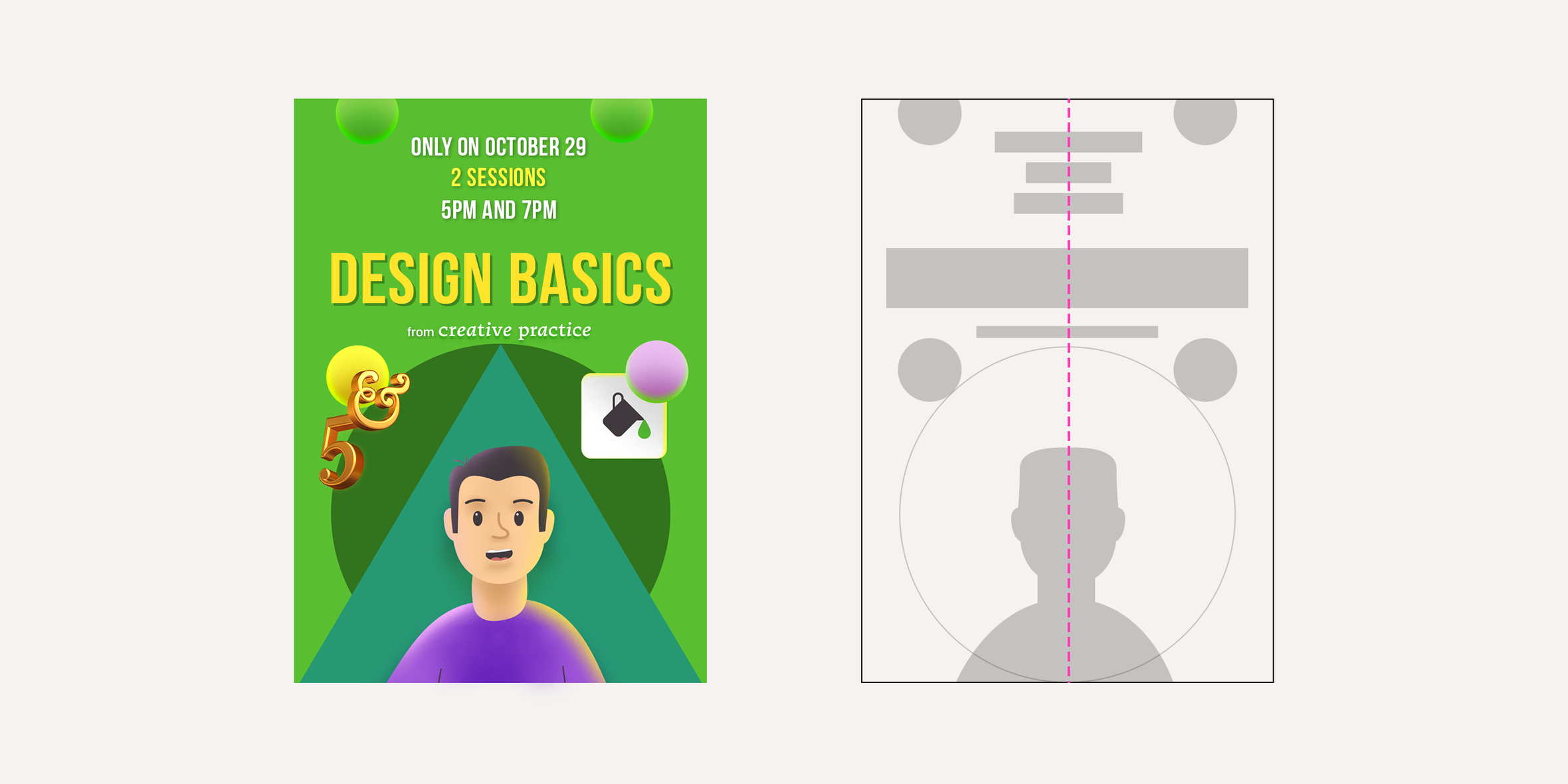
However, even without a symmetry axis, the general principle of optical balance applies to asymmetrical compositions. The top and bottom, as well as the right and left parts of the composition, should feel optically balanced.

Use of hierarchy, unity, and balance in composition
Even if you create a design layout without consciously thinking about the principles of composition, you still intuitively strive to follow them.
However, consciously applying these three principles will help you better understand the strengths and weaknesses of your layout.
Once you've completed your layout, you should ask yourself the following three questions:
- Does the visual hierarchy in this layout make it clear what is primary and what is secondary?
- Is the composition visually unified?
- Is the composition optically balanced?


