Fudi & more — Food Delivery Ecosystem
The ambition to enhance "Fudi & more" service offering led to the inception of three interconnected digital projects: the development of a user-friendly mobile app, a responsive and engaging website, and an efficient admin panel. Each component was meticulously designed with the end-user in mind, aiming to streamline the food ordering process, improve operational efficiency, and foster a deeper connection between "Fudi & more" and customers.
Research Results
Based on the synthesized insights from the comprehensive user research, including surveys and focus groups, we identified four key expectations that users have from the digital offerings of Fudi & more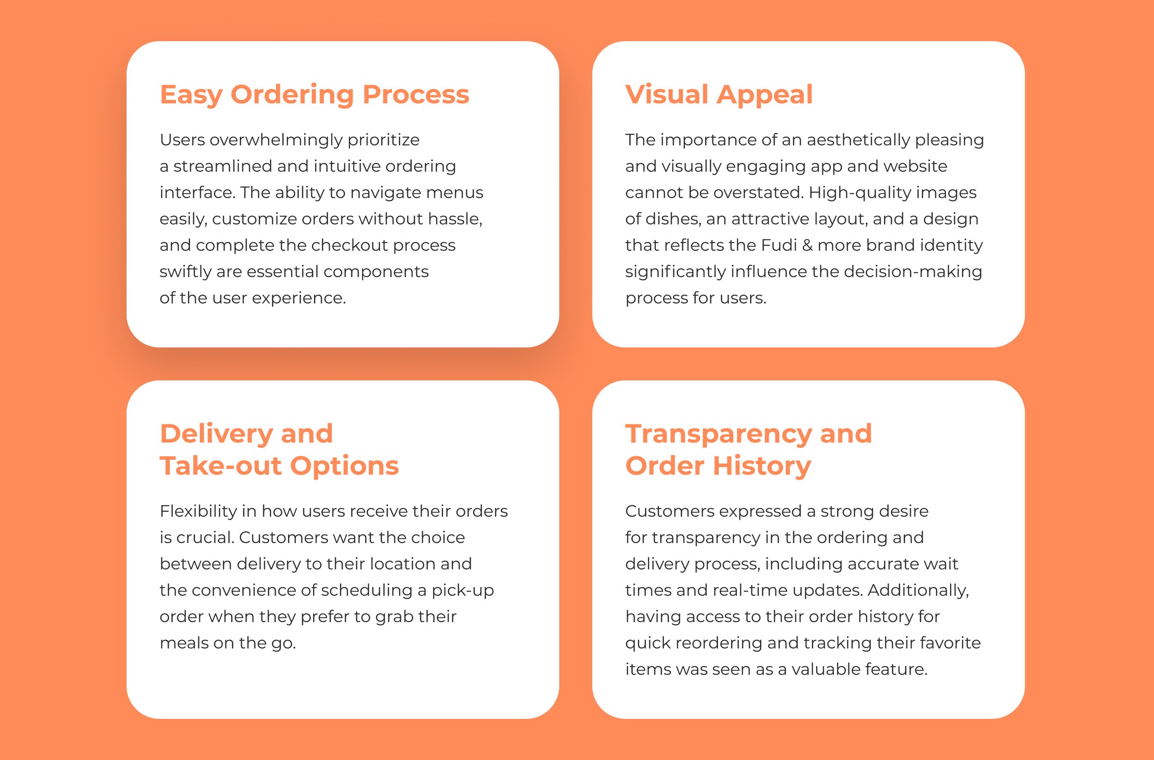
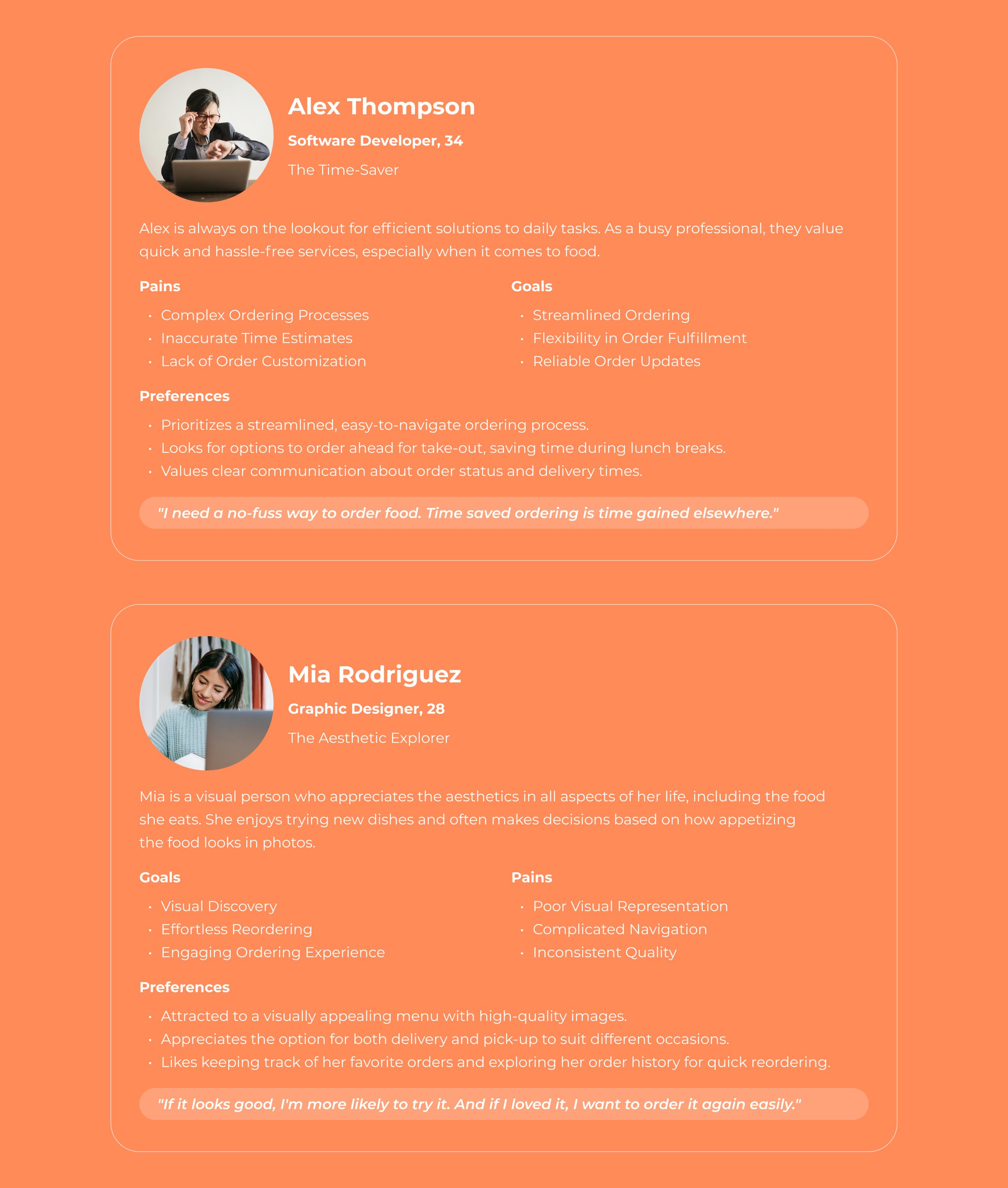
User Personas
These personas reflect the diverse yet specific needs identified through the user research, guiding the design priorities for Fudi & more's digital ecosystem to ensure an optimal user experience that meets these expectations.
User Flow
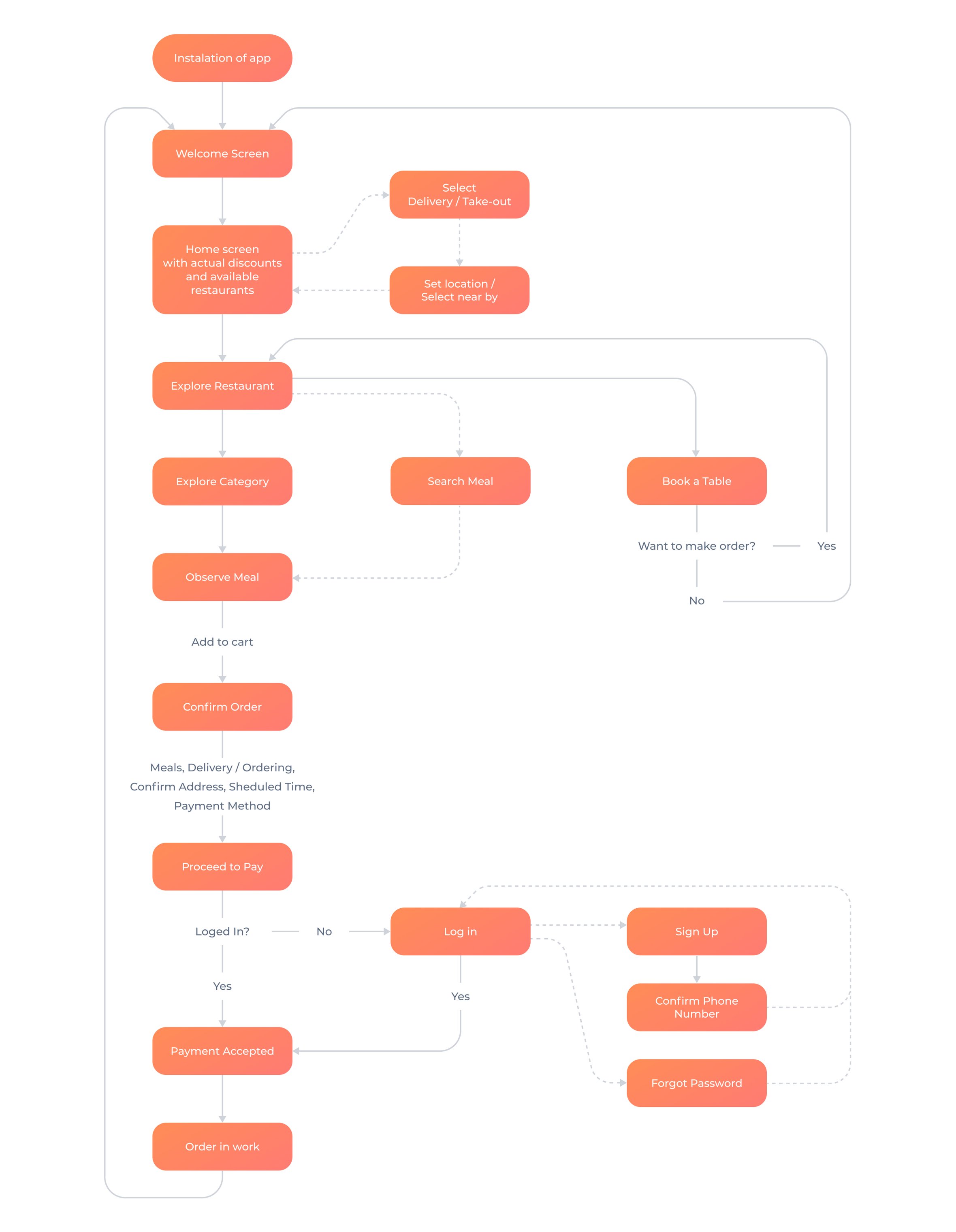
The digital transformation of Fudi & more is anchored in a user-centric design philosophy, ensuring that every touchpoint within the mobile app, website, and admin panel is intuitive, engaging, and efficient. Here's a breakdown of the user flow that highlights the seamless integration and thoughtful navigation pathways crafted to elevate the user experience across the digital ecosystem.
Visual Style
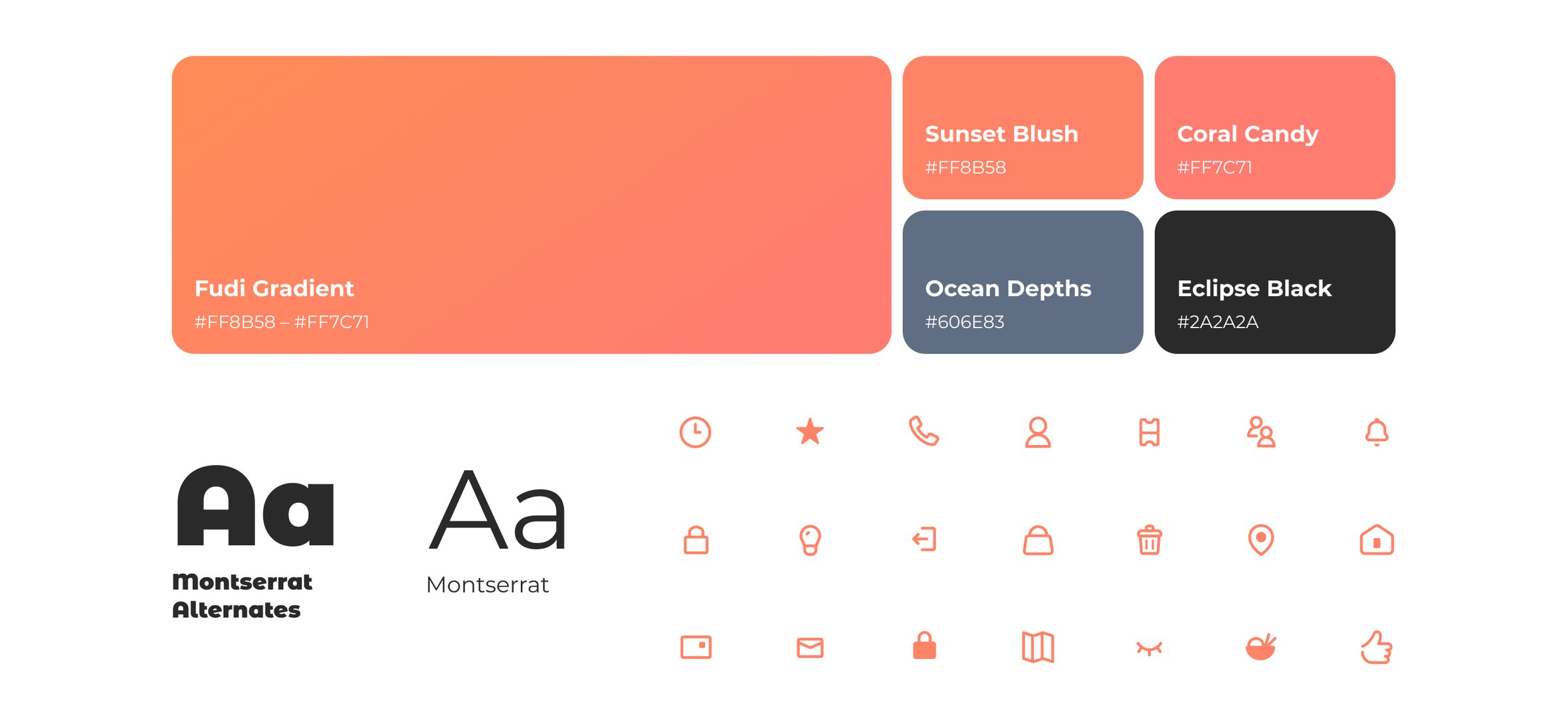
The visual style is a fundamental component of the Fudi & more. It's designed to be inviting, warm, and reflective of the restaurant's quality dining experience. The chosen palette and icons play a critical role in the product's overall user experience, contributing to the intuitive use and brand consistency.
Wireframing
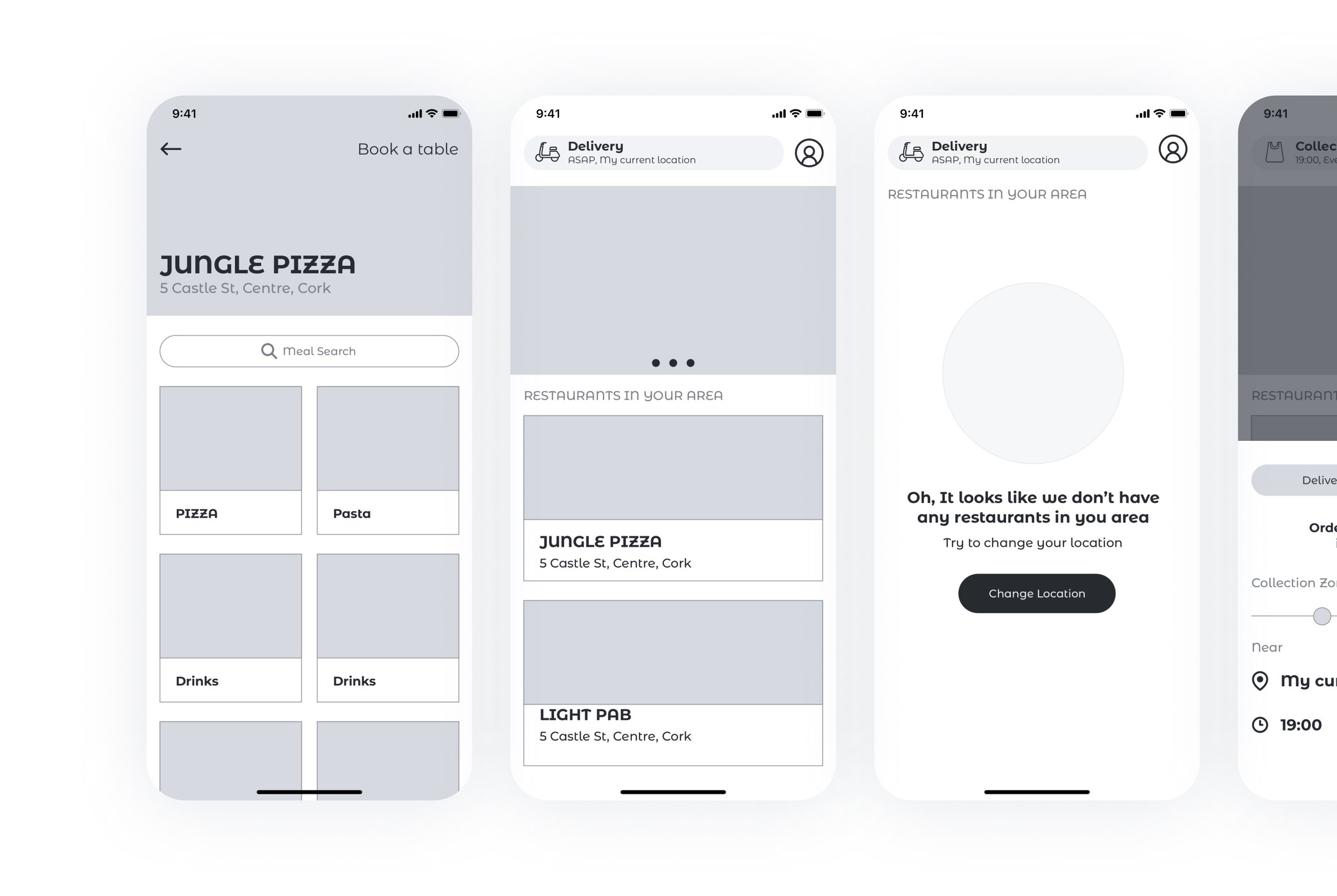
The development of the Fudi & more mobile app commenced with the creation of detailed wireframes. These wireframes served as the foundational blueprint, guiding the design and development process to ensure that the app not only met but exceeded user expectations for functionality, usability, and aesthetic appeal. Here’s an insight into the wireframe process and its pivotal role in crafting the Fudi & more mobile experience.
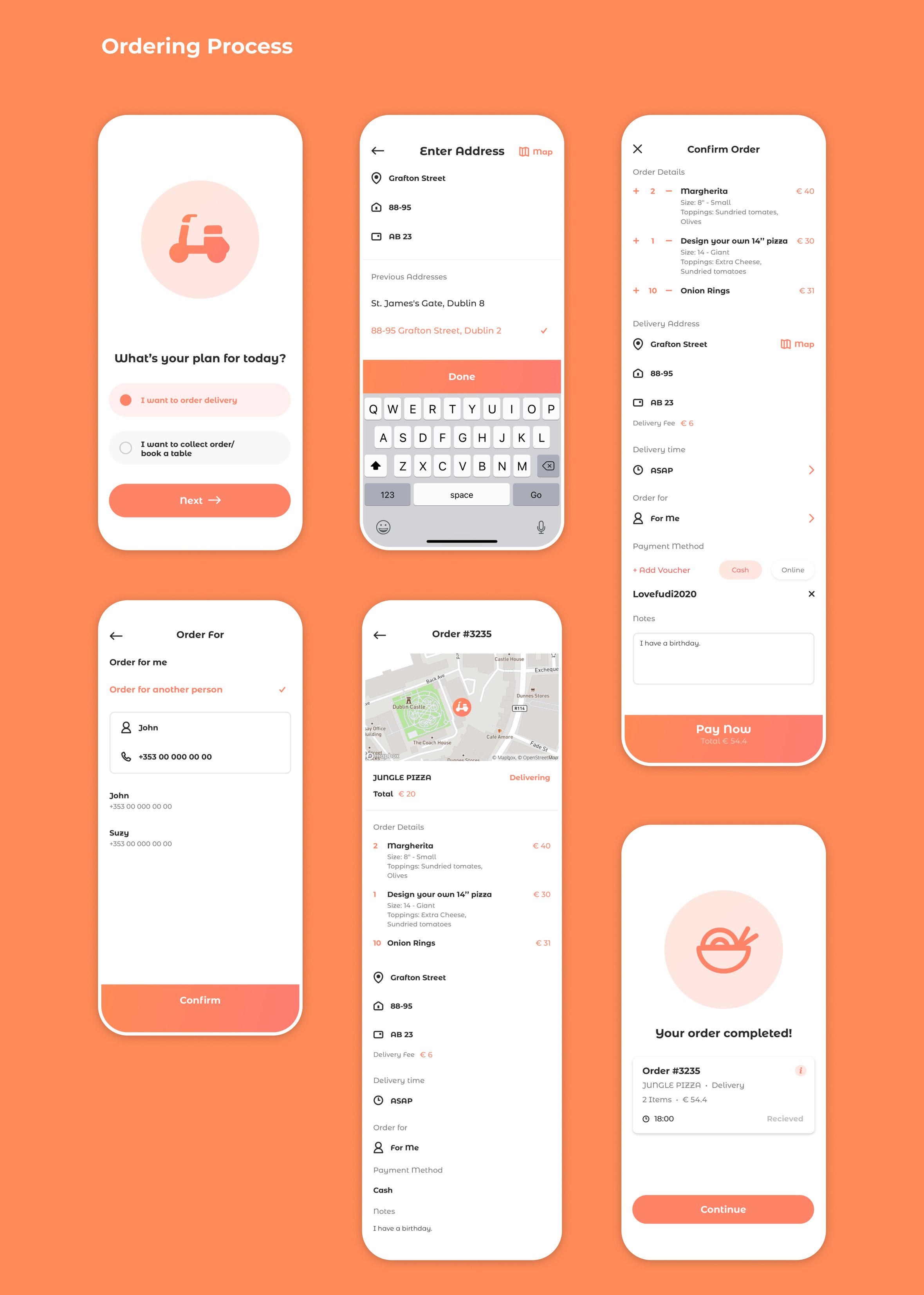
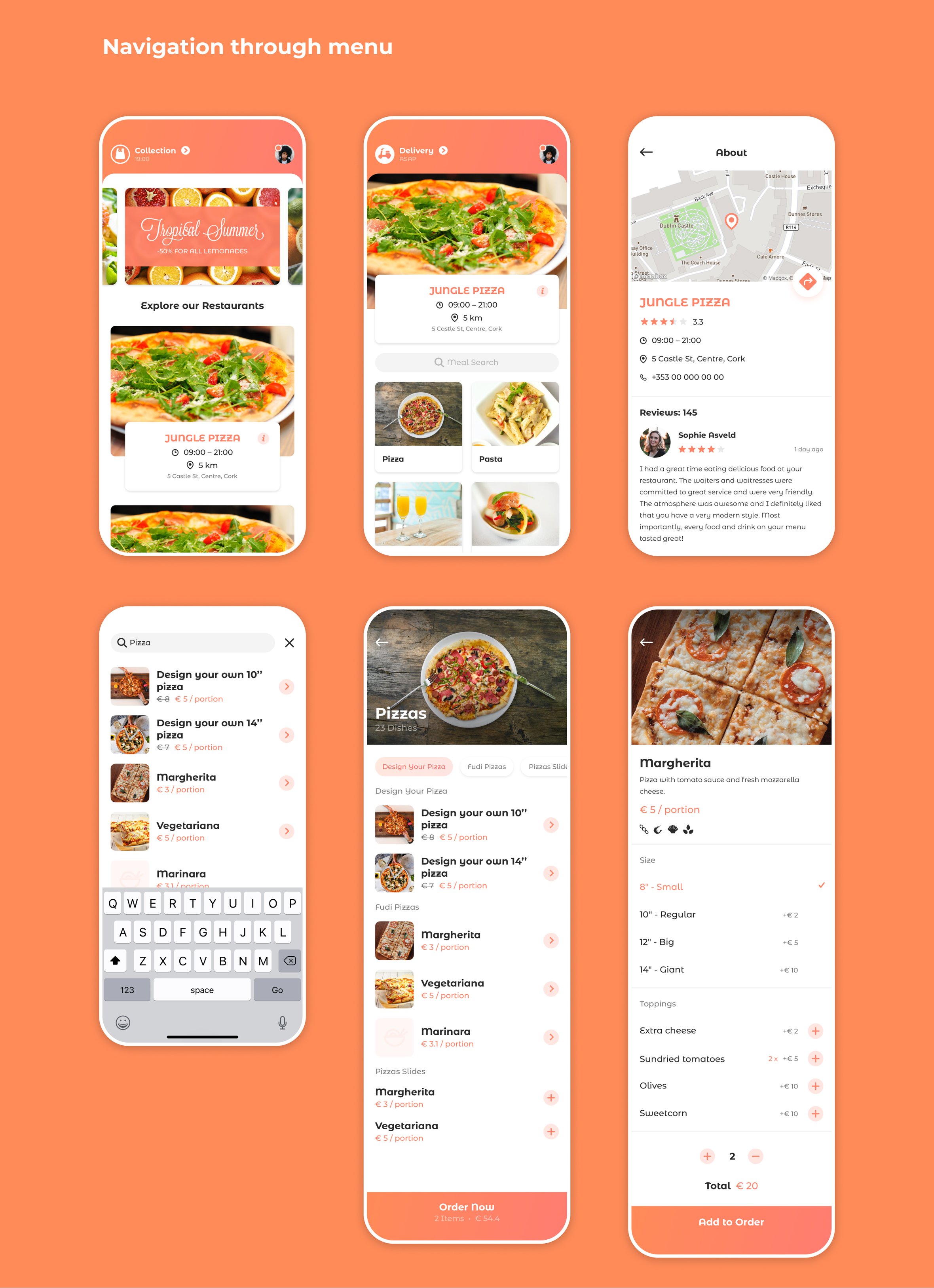
Final Design
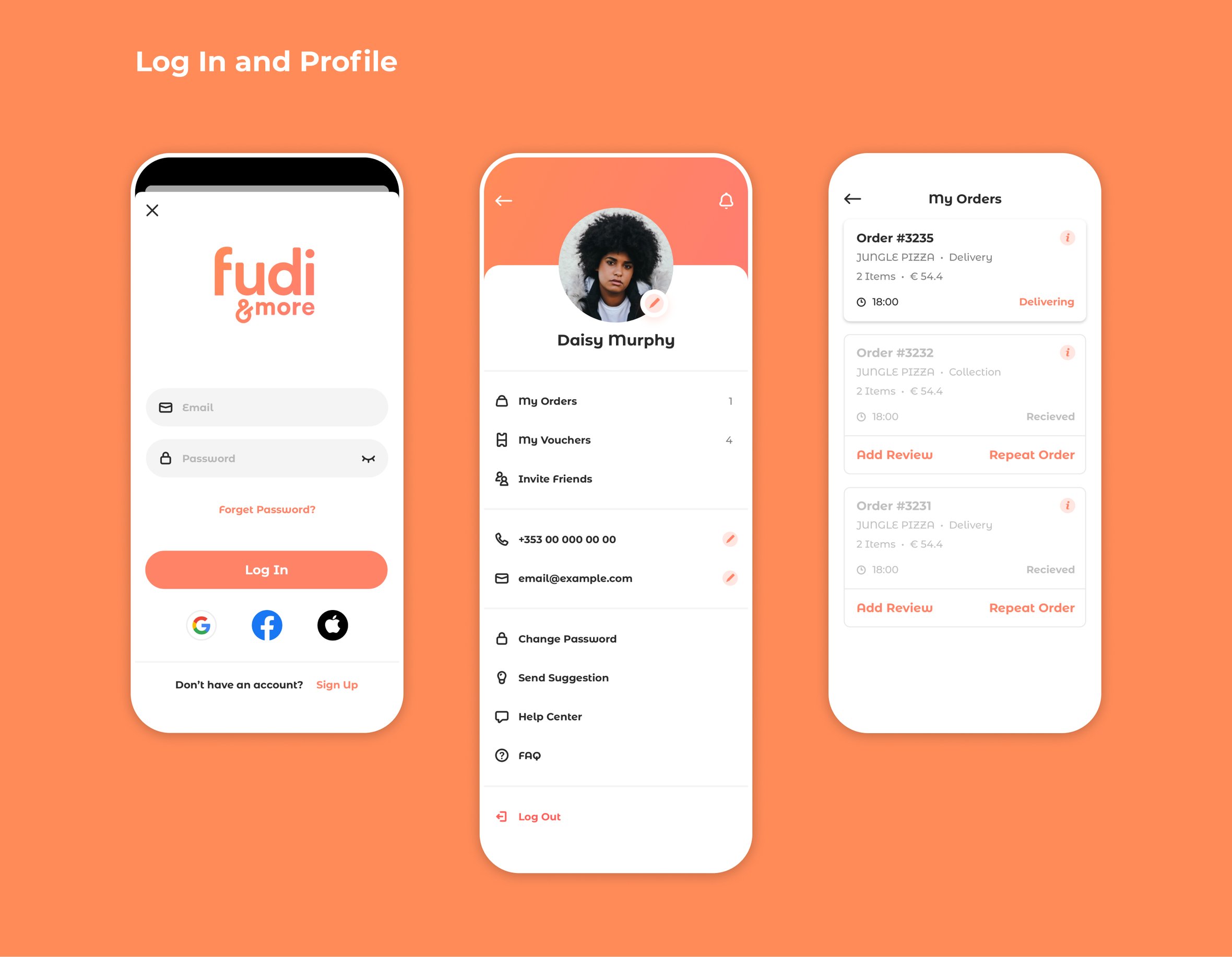
The visual style of the "Fudi & more" mobile app is designed to convey warmth, friendliness, and modernity, aligning with the restaurant chain's inviting atmosphere. Here is a breakdown of the color palette, typography, and iconography that define the app’s aesthetic.
Website Design
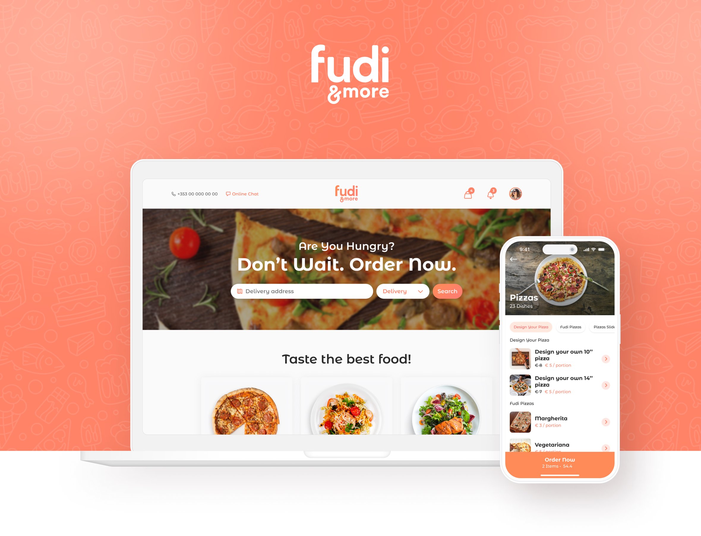
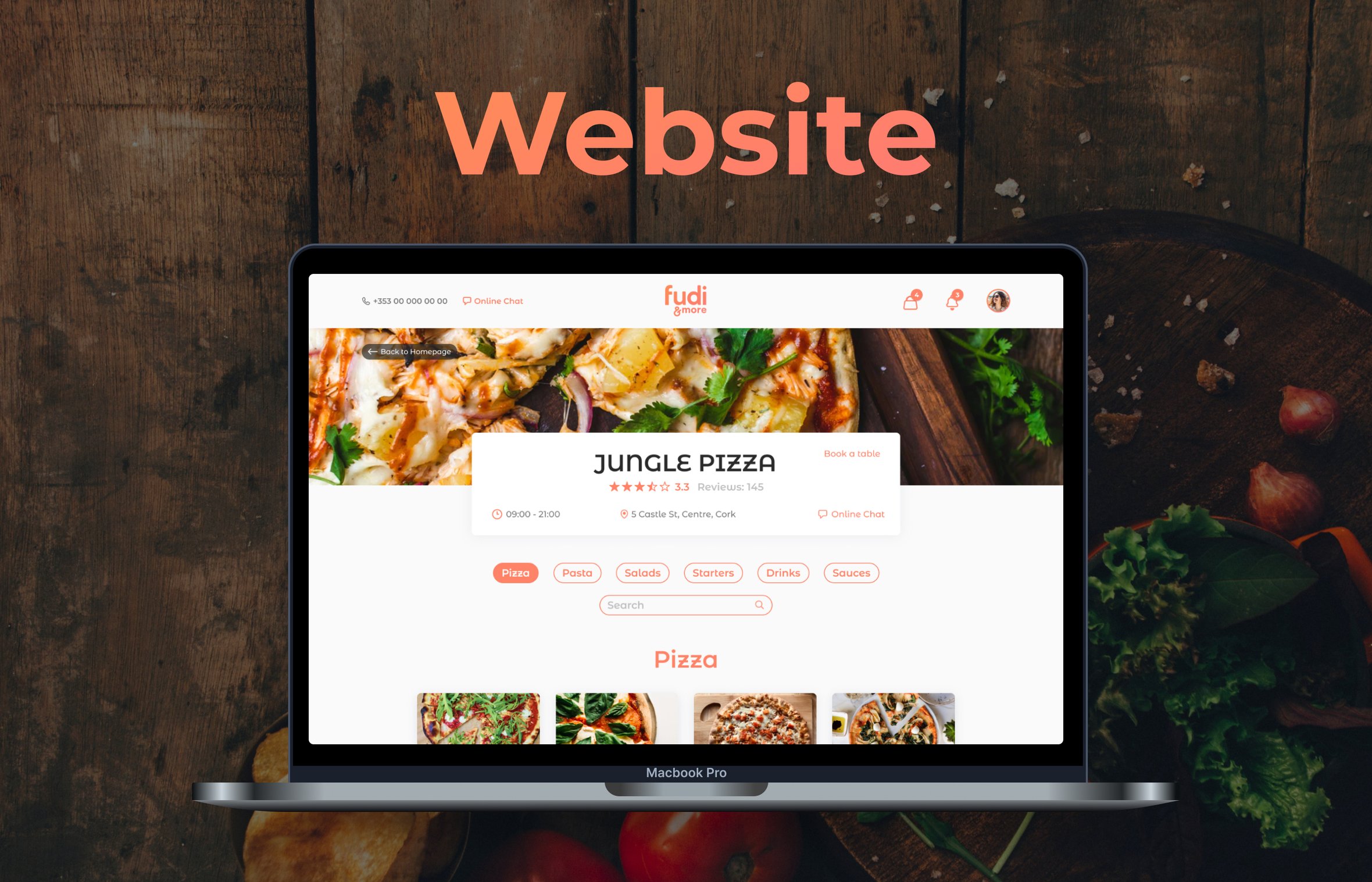
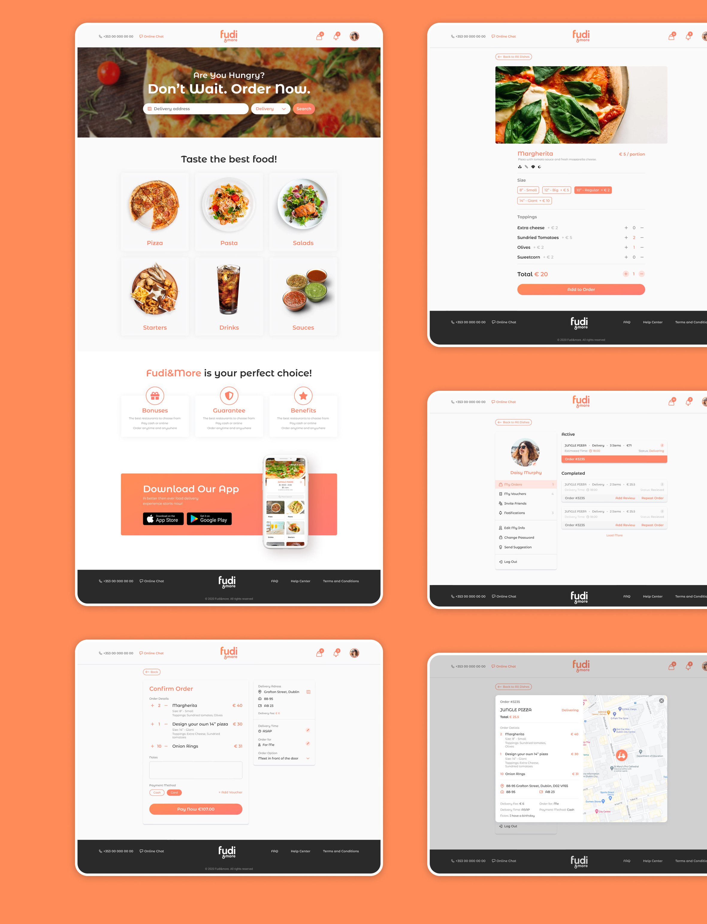
The website design for "Fudi & more" serves as an extension of the brand's philosophy, offering a digital dining experience that's as meticulously crafted as the cuisine itself. By mirroring the aesthetics and ease of use found in the mobile app, the website provides a familiar, yet distinct, interaction with the brand for users preferring a larger screen.
The responsive nature of the website guarantees an optimal viewing experience across all devices. Whether on desktop, tablet, or mobile, the layout adapts fluidly, ensuring the quality and accessibility of content is consistent, and the user journey remains uninterrupted.
Behind the Scenes
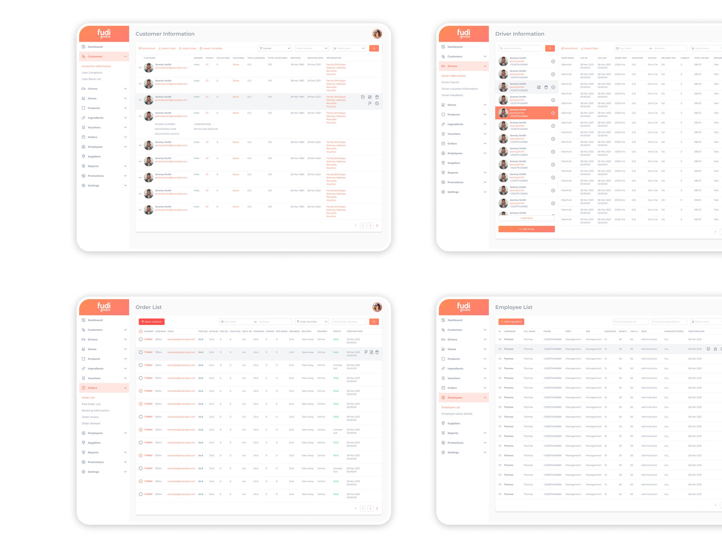
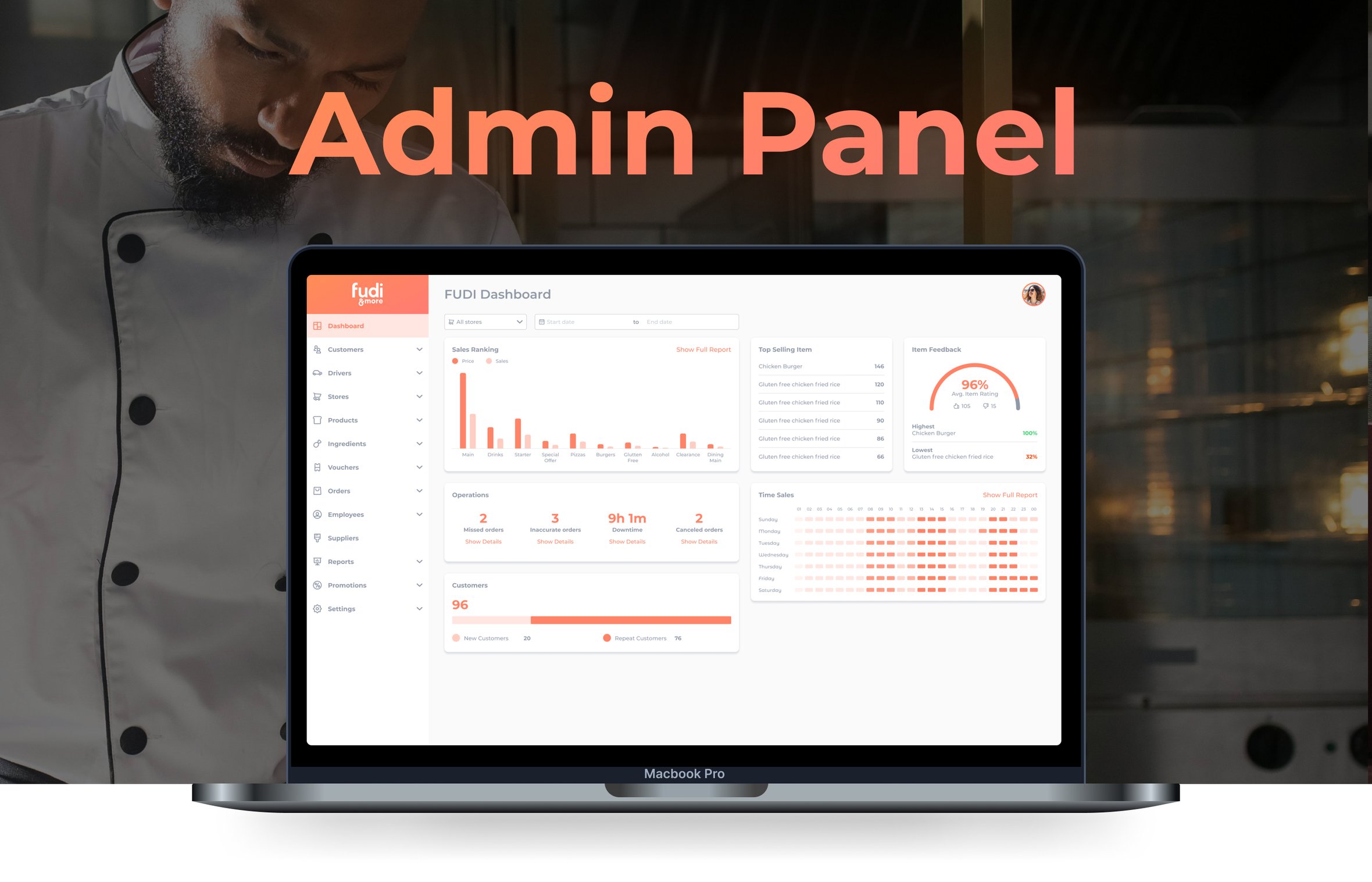
The "Fudi & more" admin panel is a robust command center designed
for simplicity and efficiency, empowering the restaurant staff to manage
and oversee the digital experience effortlessly. This critical component
of the digital ecosystem prioritizes functionality and control, providing
the team with the tools they need to maintain the excellent service
standards that "Fudi & more" is celebrated for.
