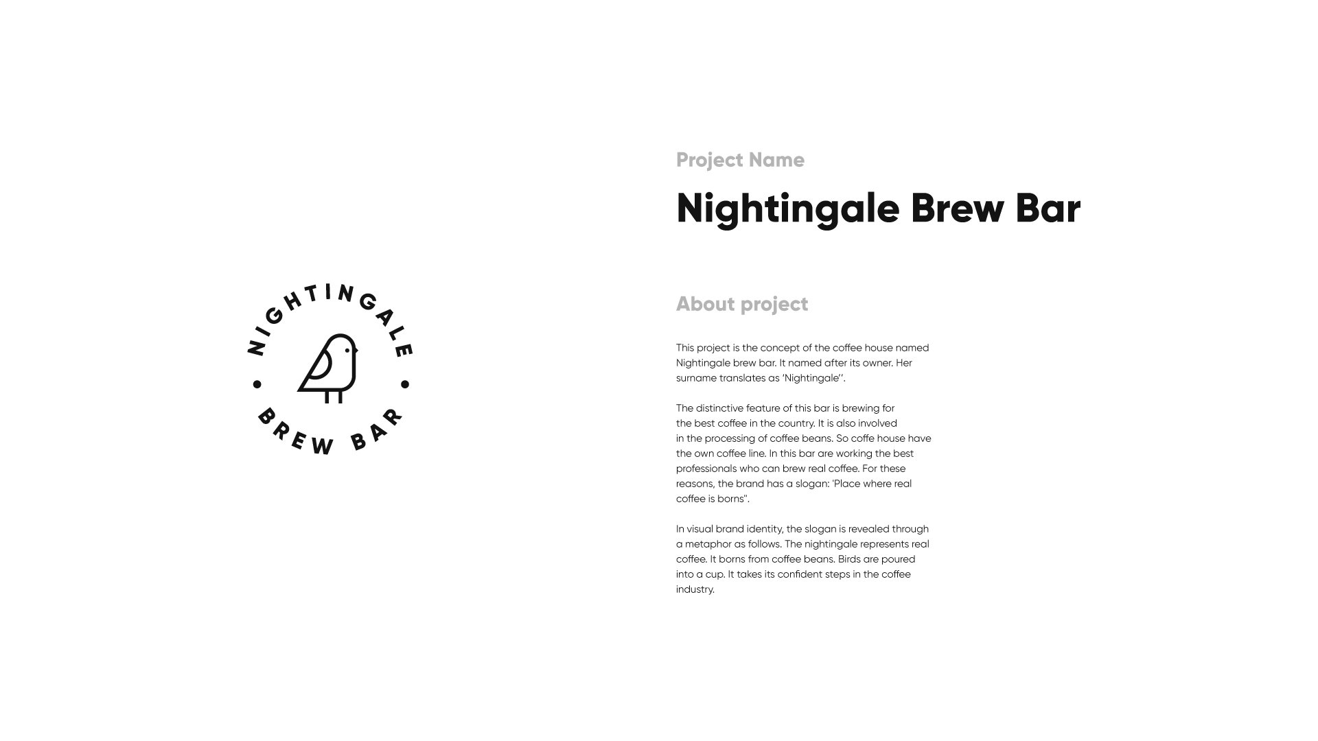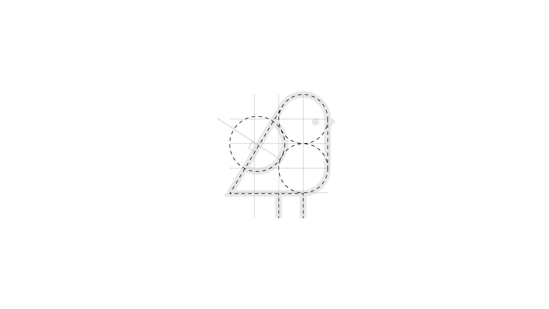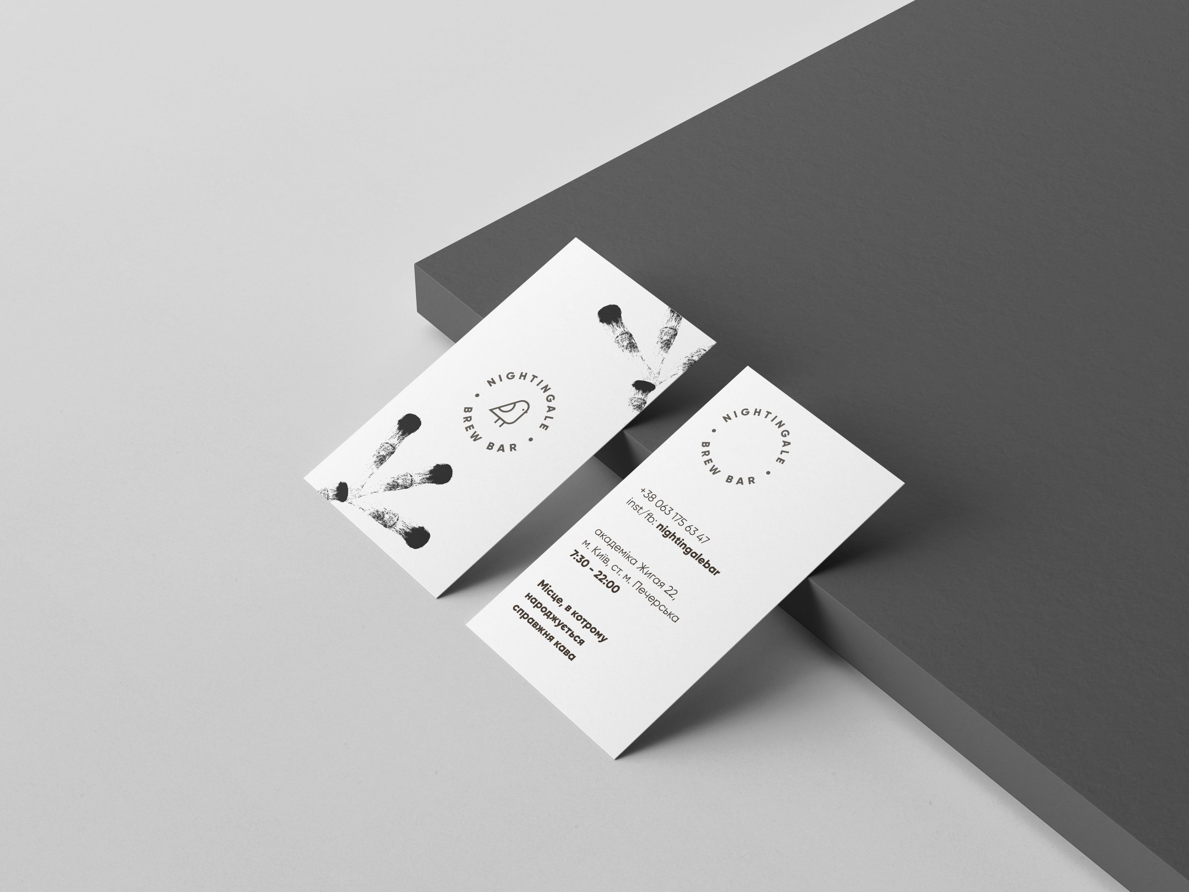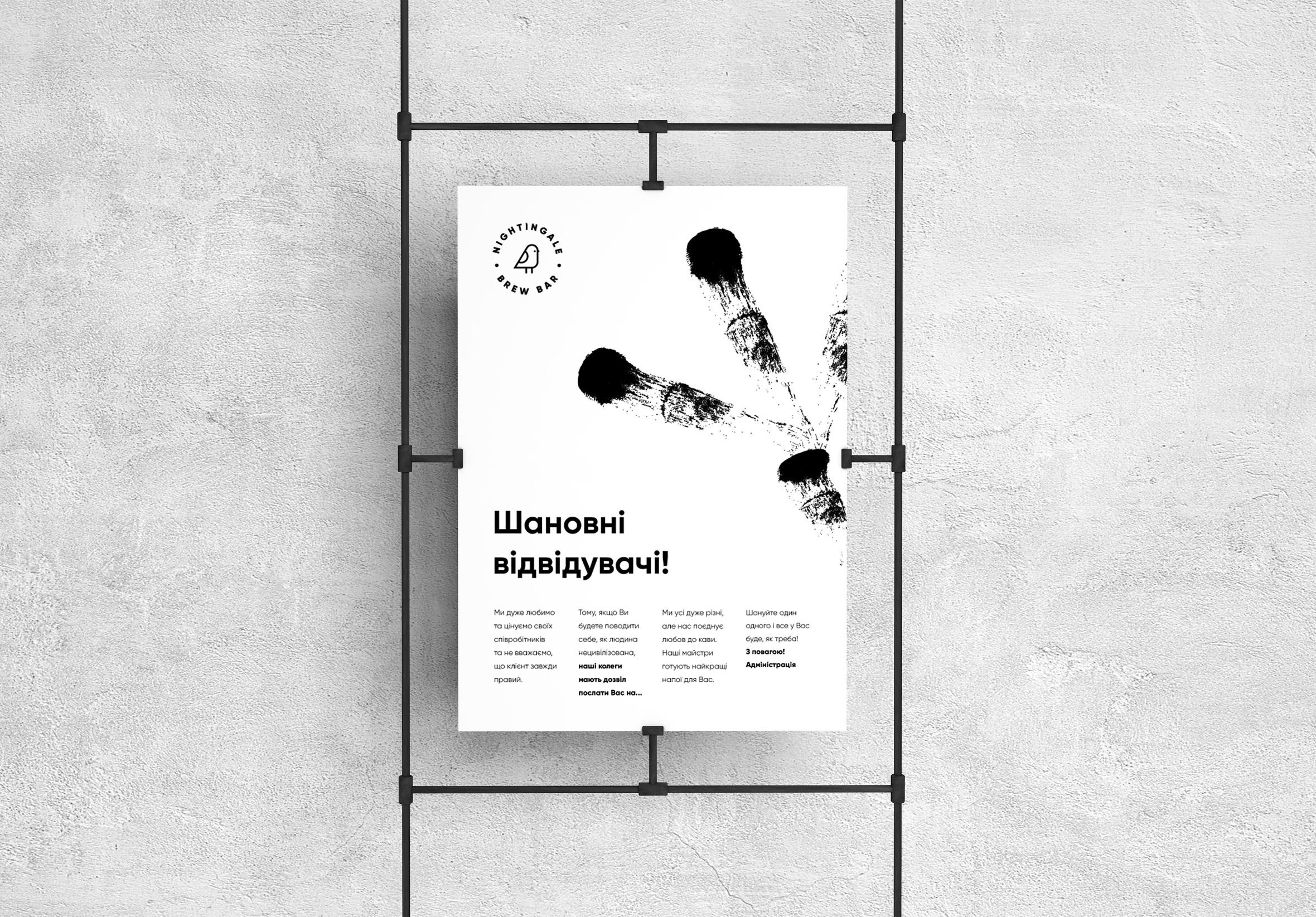
'Nightingale Brew Bar' visual identity
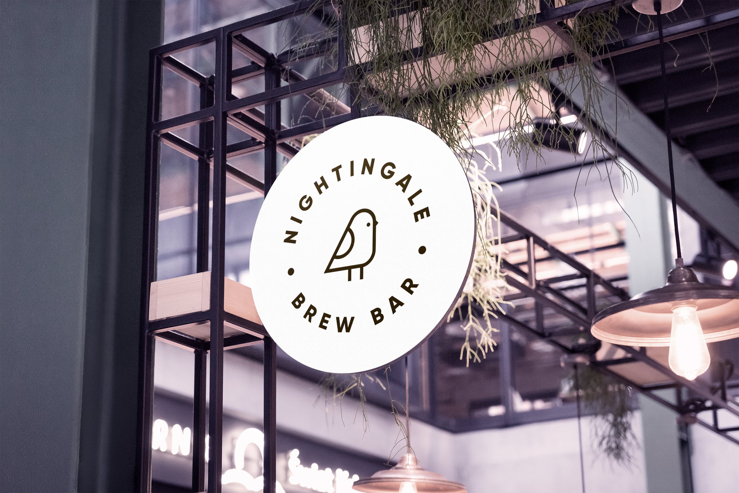
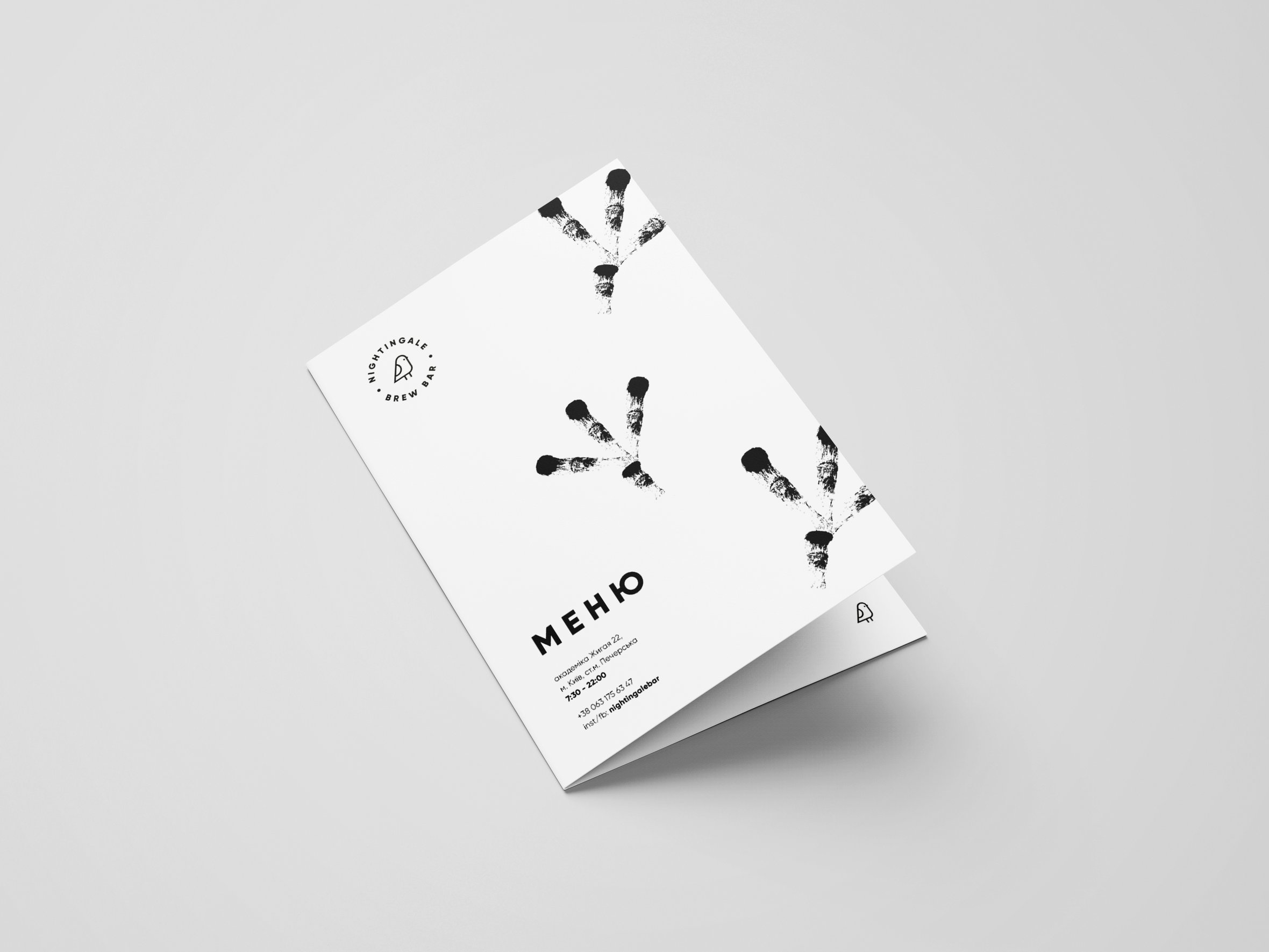
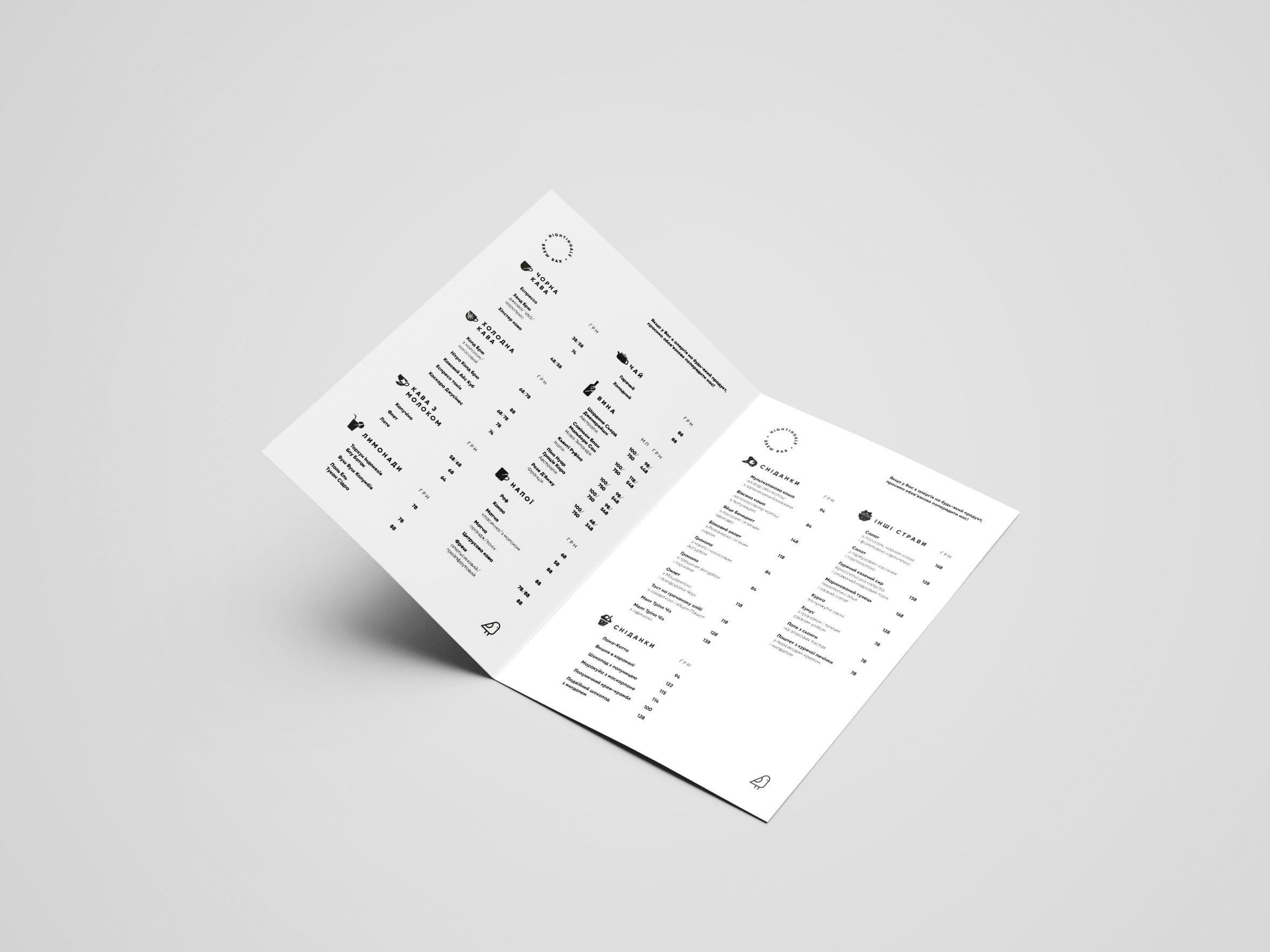
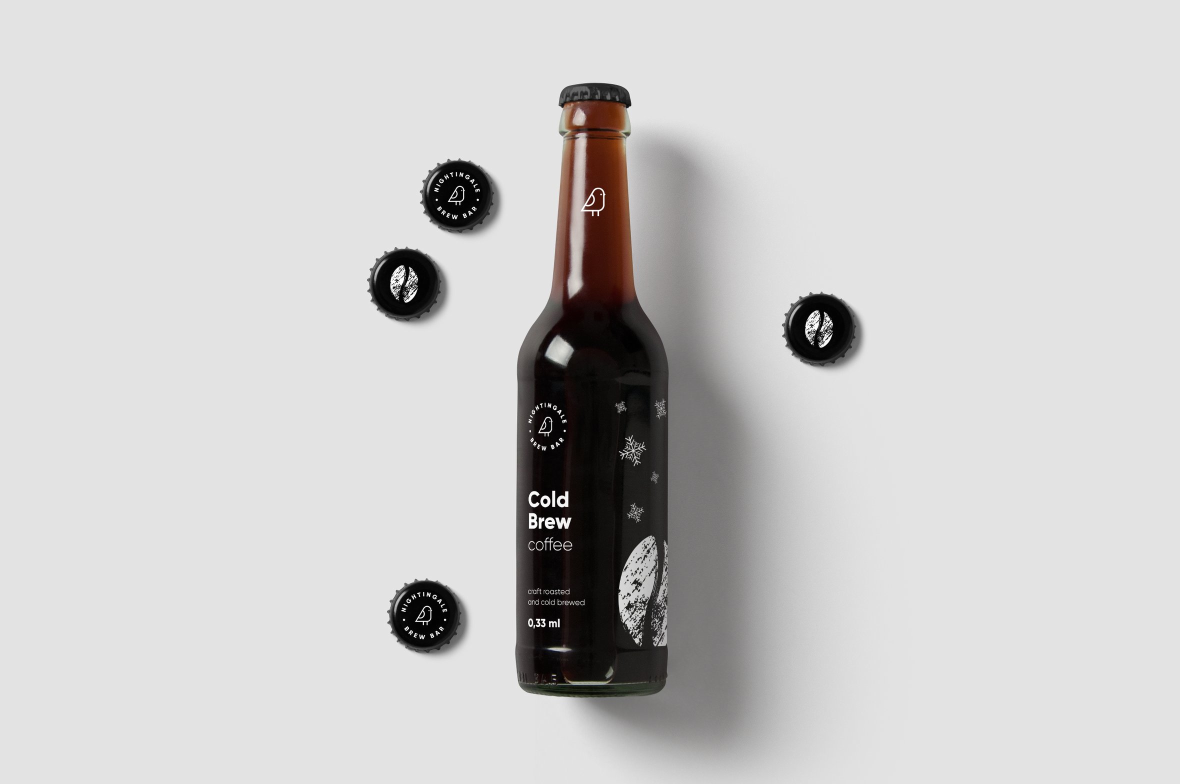
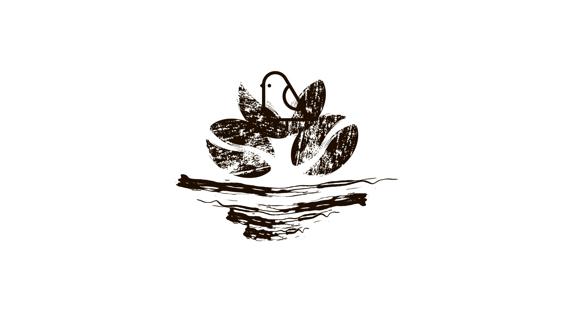
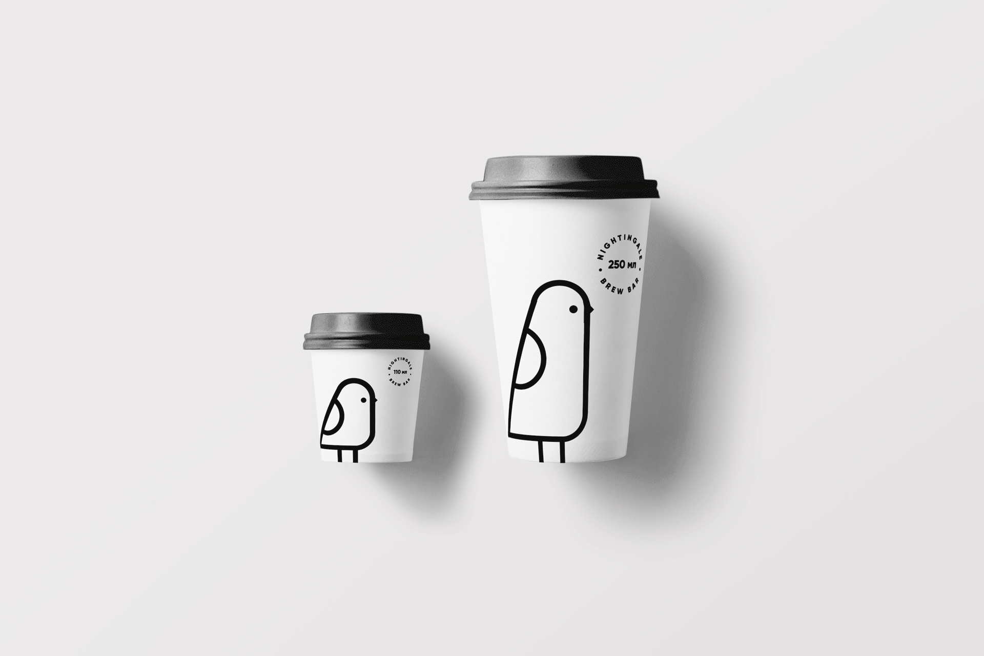
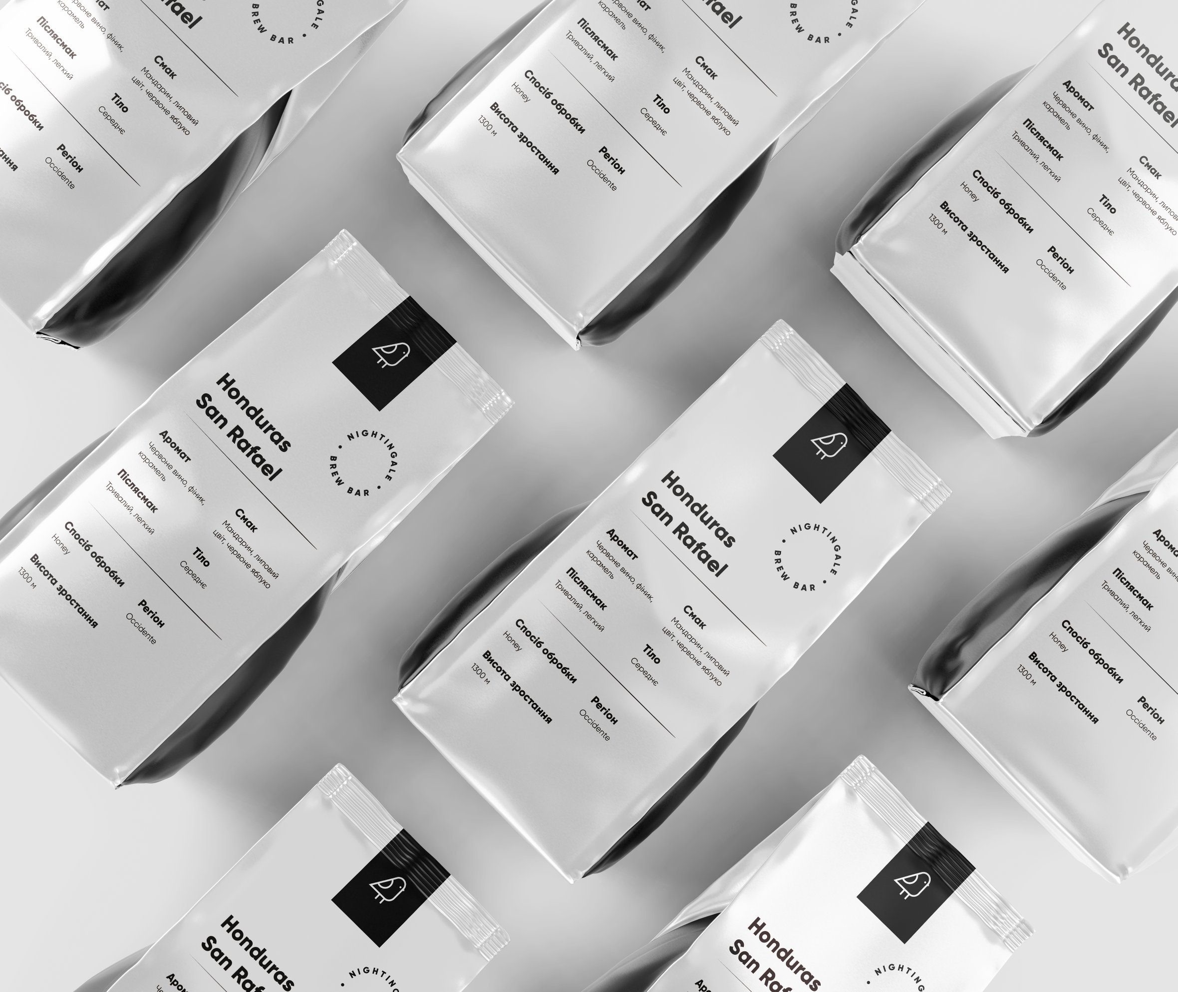
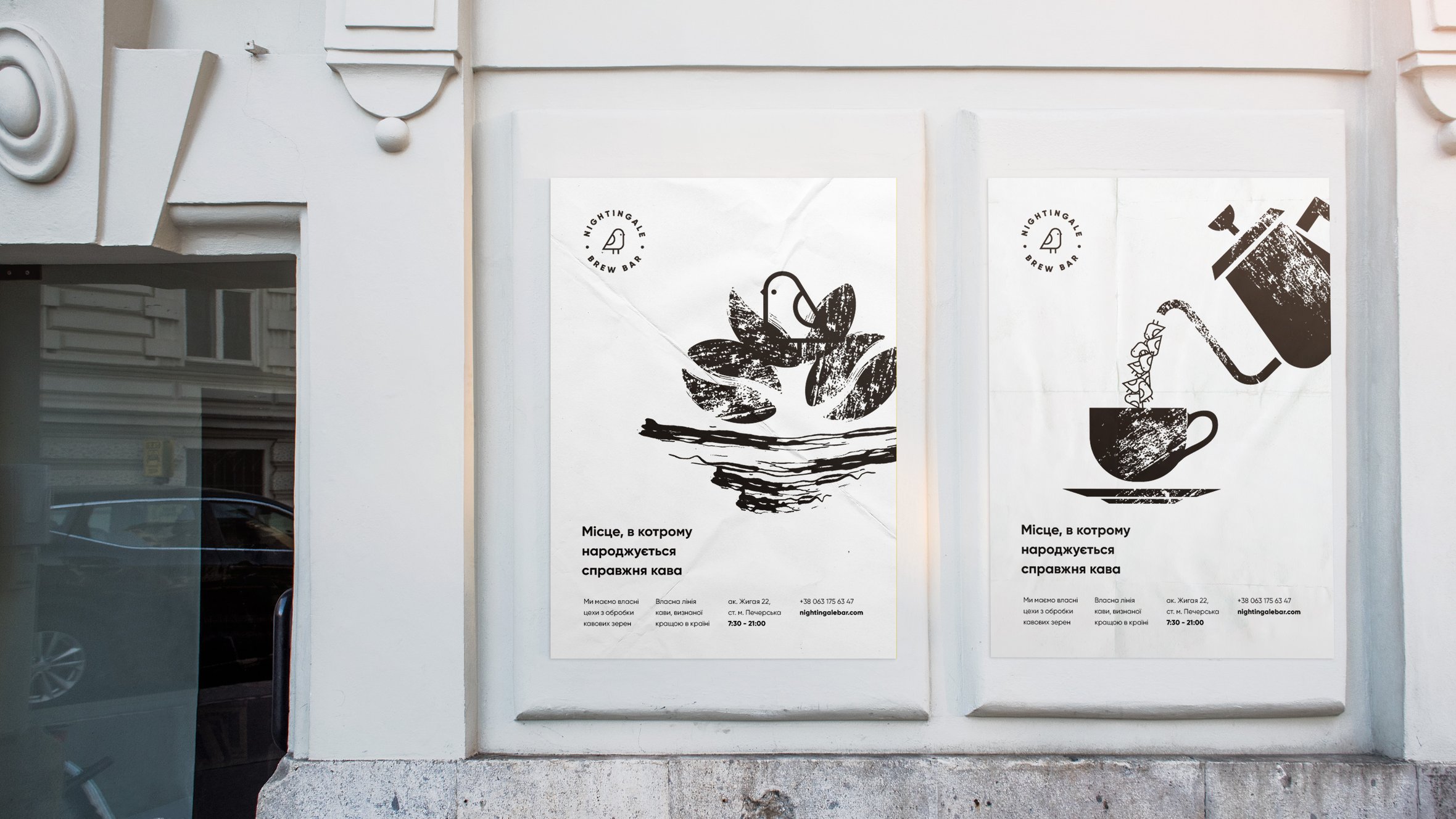
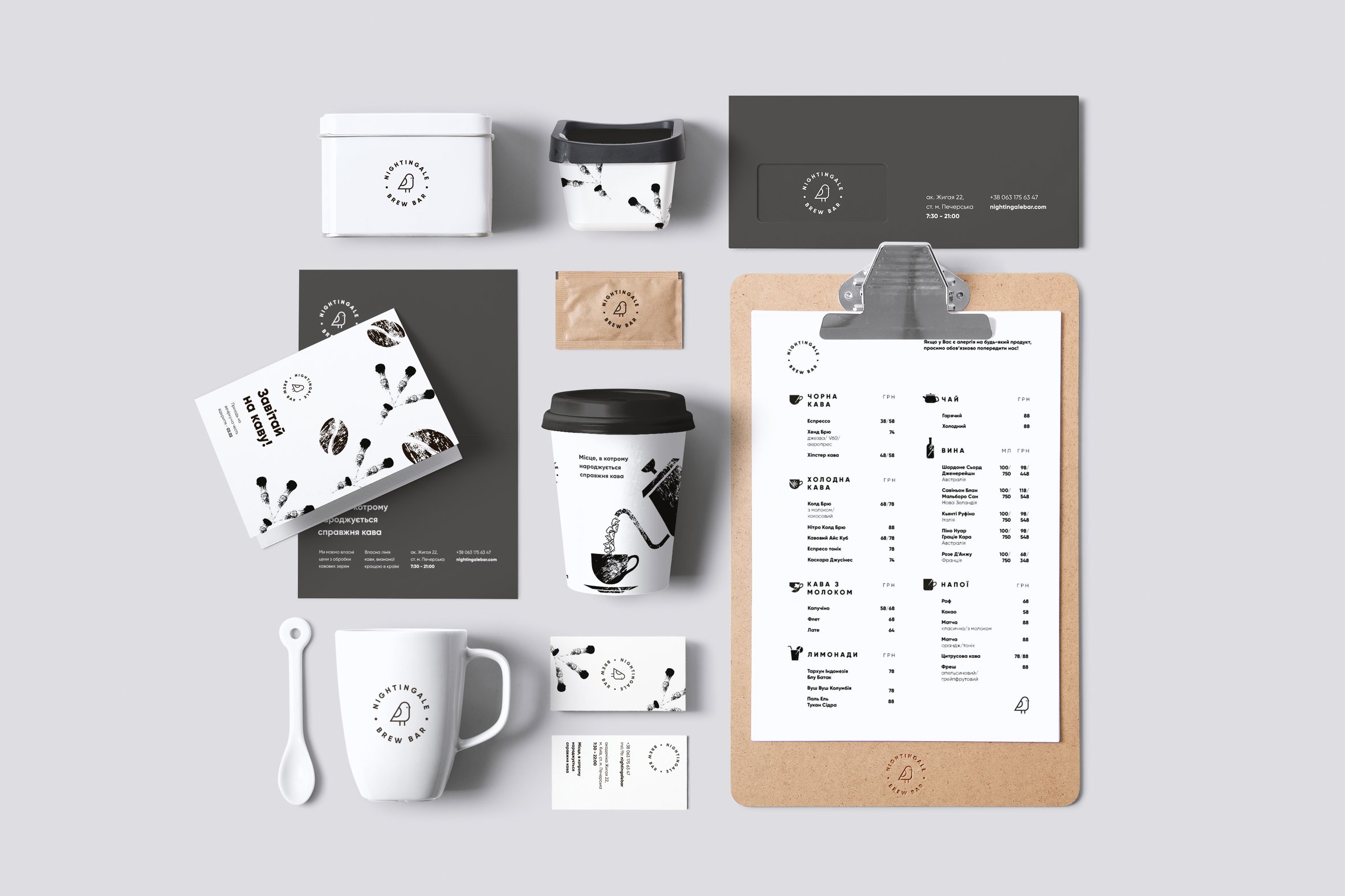
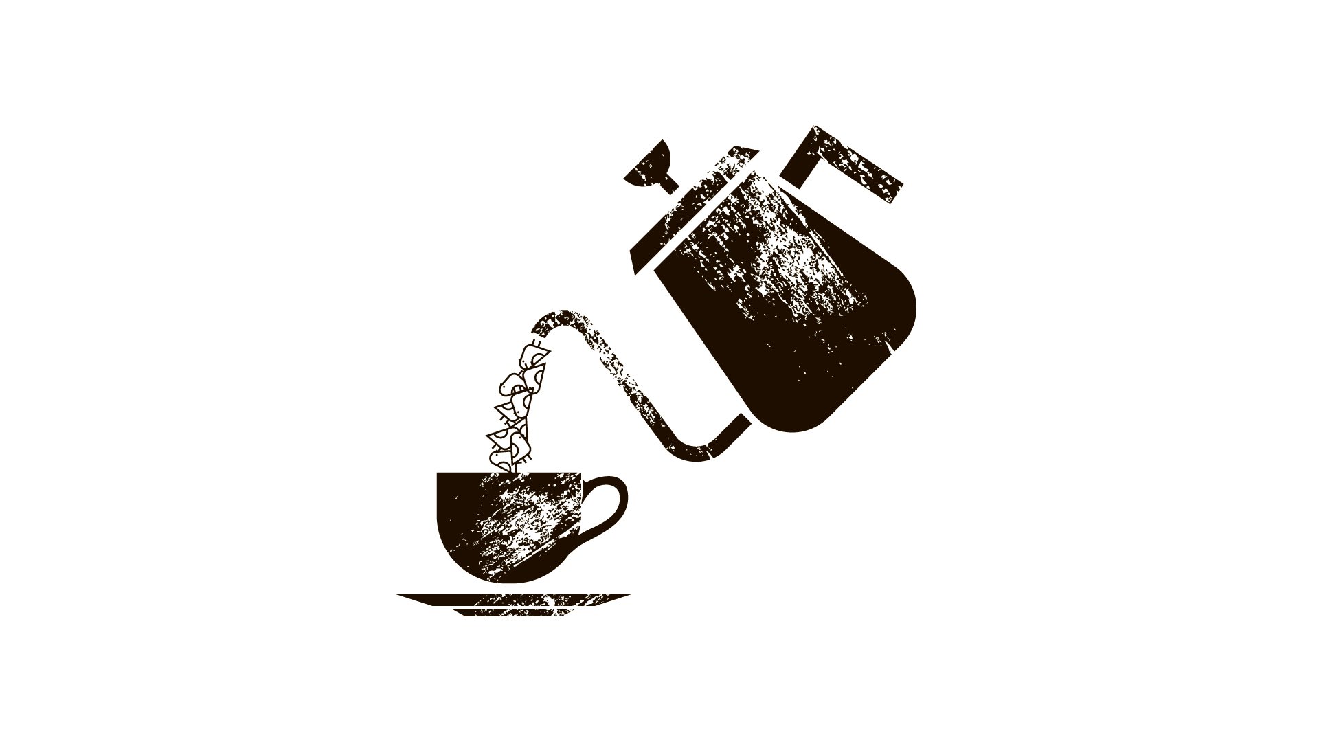
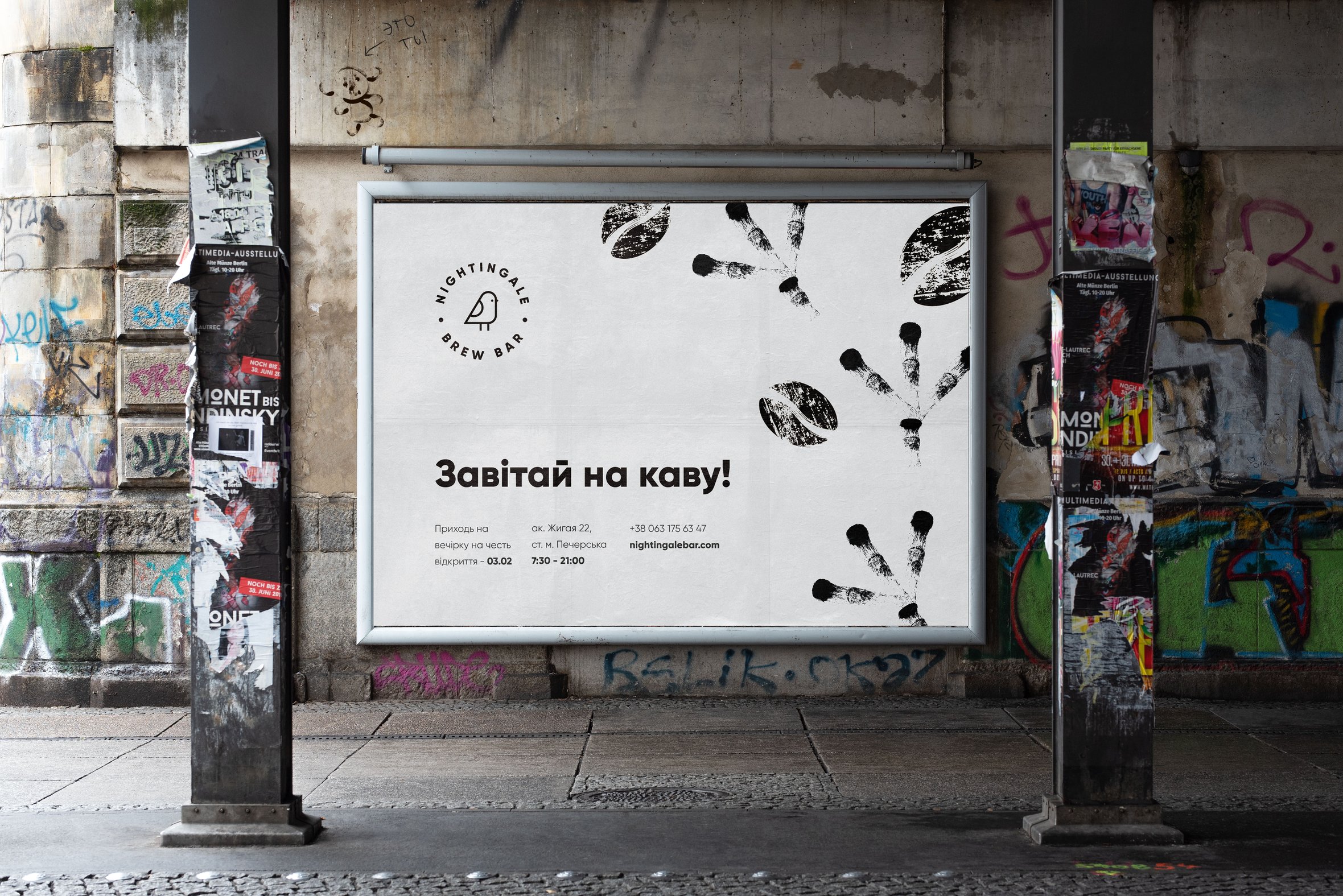
This project is the concept of the coffee house named Nightingale brew bar. It named after its owner. Her surname translates as ‘Nightingale’’. The distinctive feature of this bar is brewing for the best coffee in the country. It is also involved in the processing of coffee beans. So coffe house have the own coffee line. In this bar are working the best professionals who can brew real coffee. For these reasons, the brand has a slogan: 'Place where real coffee is borns''. In visual brand identity, the slogan is revealed through a metaphor as follows. The nightingale represents real coffee. It borns from coffee beans. Birds are poured into a cup. It takes its confident steps in the coffee industry. Свернуть