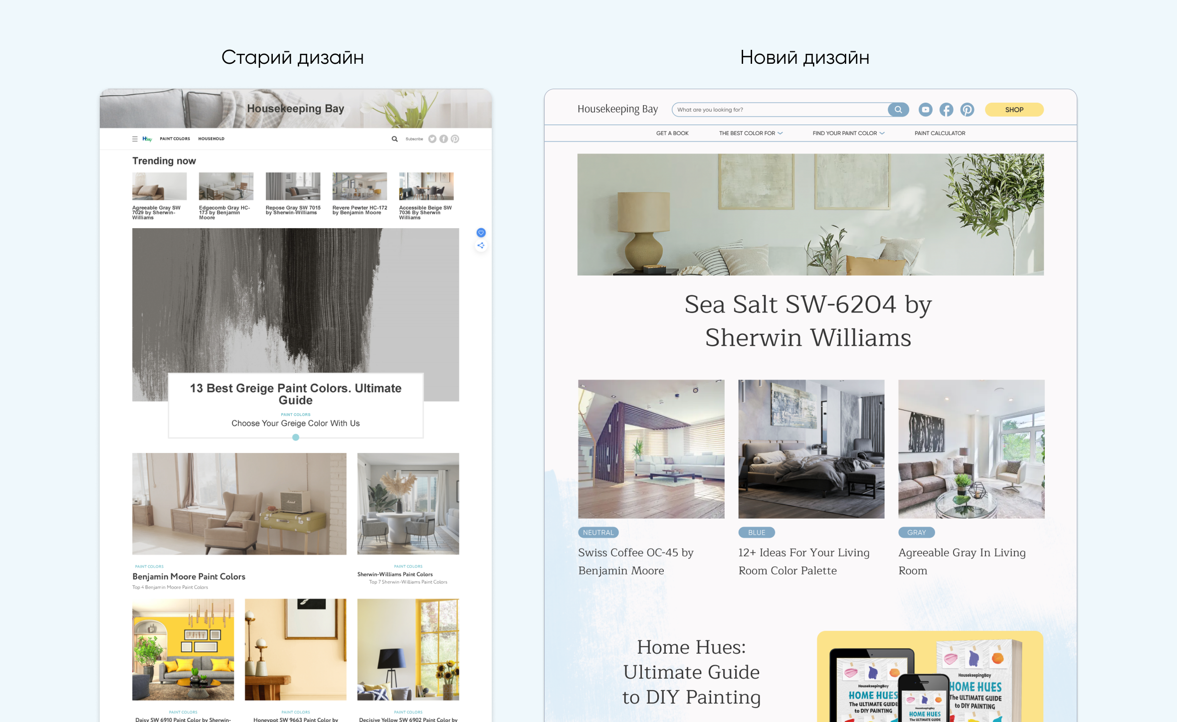
Redesign of the Housekeeping Bay website
Housekeeping Bay defines itself as the largest review catalog of Sherwin Williams and Benjamin Moore paint colors and combinations. On the site, users can find color inspiration, interior design, DIY ideas, and renovation tips.

The task was to redesign the site, make it lighter with a bright accent. The selected Maitree header font adds elegance, while the grotesque Gilroy font makes the body text easy to read. The yellow accent color of the buttons contrasts well with the main calm blue color.
For this project, I designed 3 unique pages and 1 landing page.

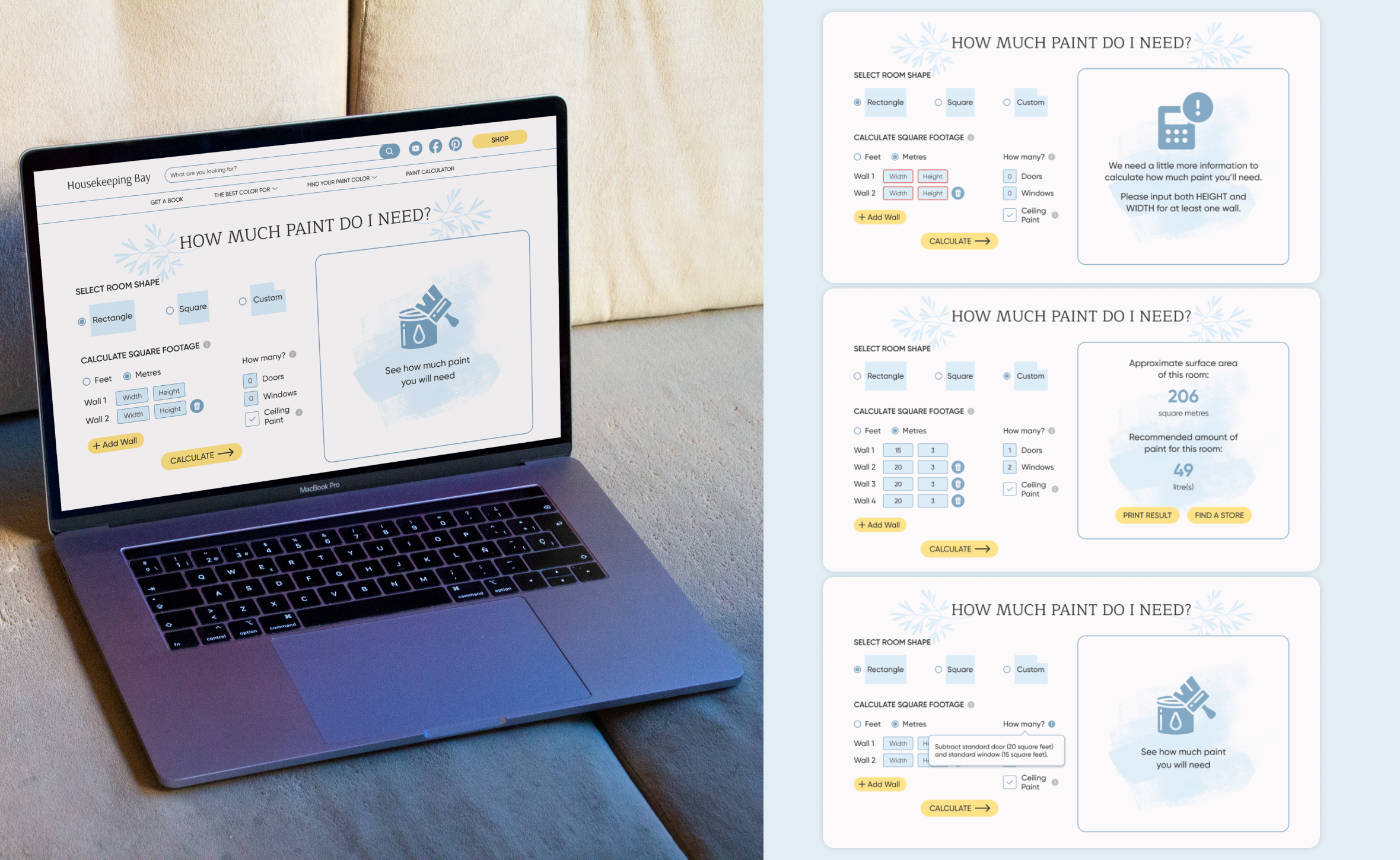
One of the pages was a Calculator that helps users calculate the required amount of paint according to individual room sizes. I also developed different states of the elements depending on the user's action.

The landing page was created to increase the conversion rate of the sale of the home improvement advice guide. Adaptive mobile versions were also created for all pages in this project.


