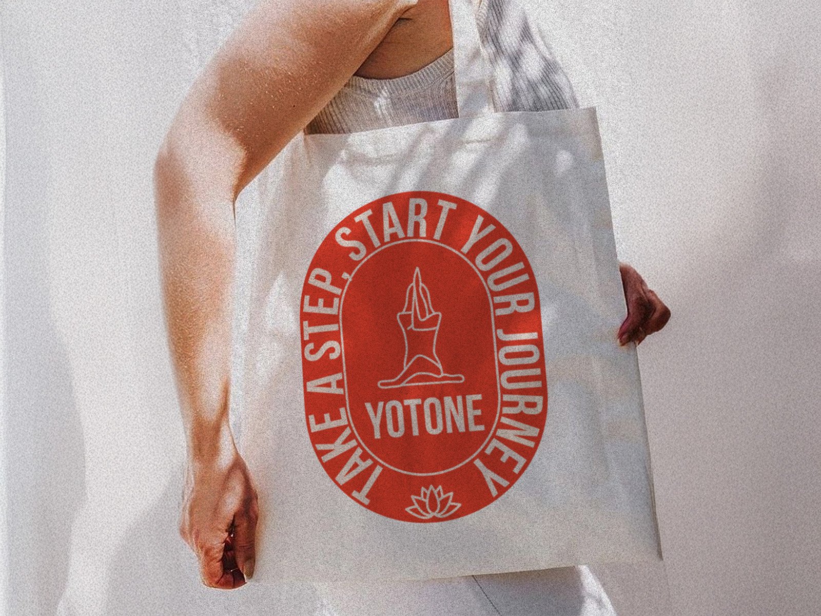
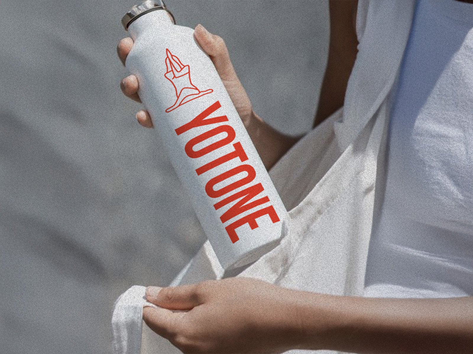
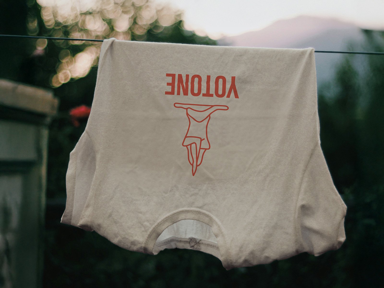
YOTONE | brand identity | 2025 | yoga studio
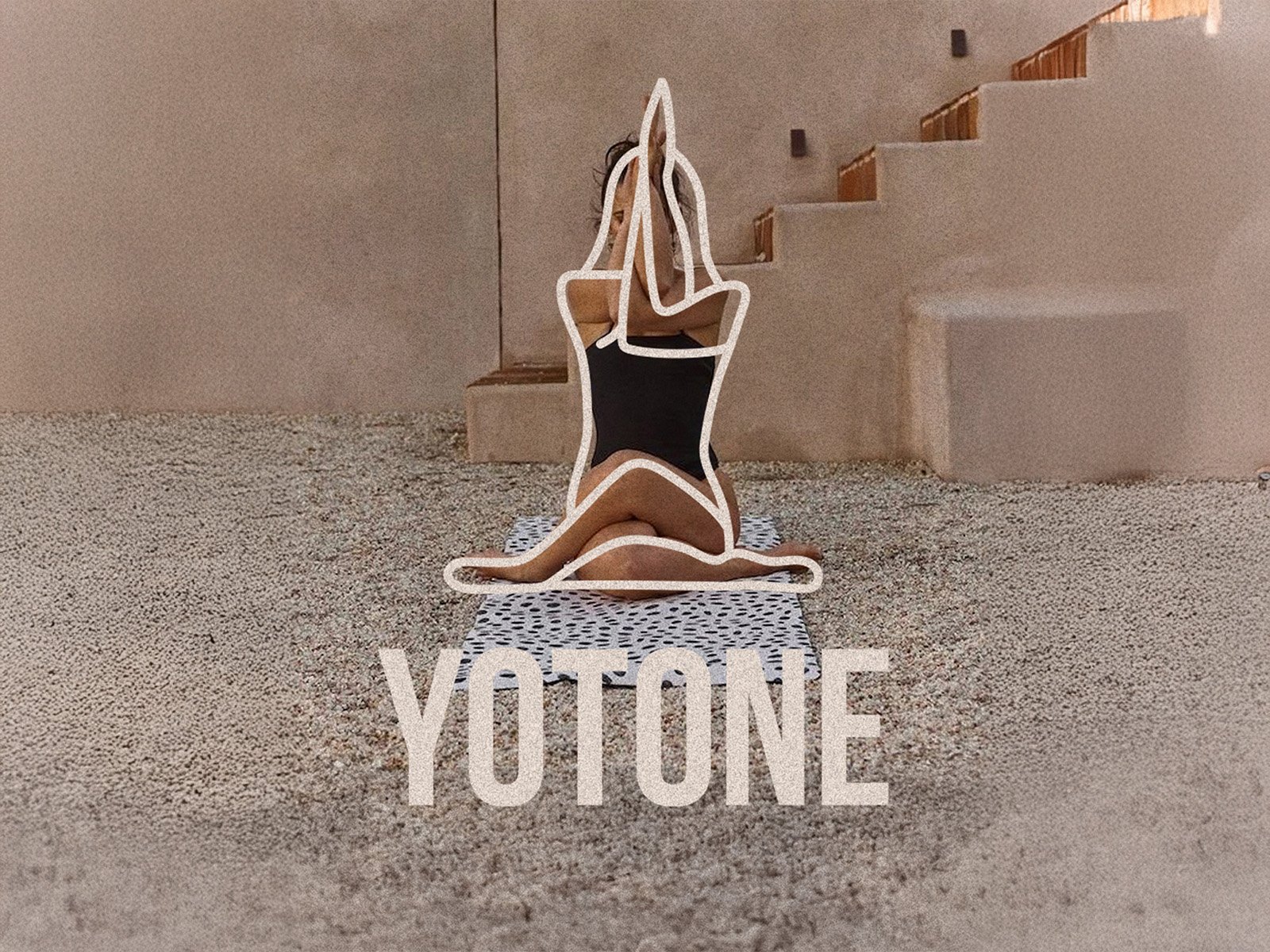
YOTONE is more than just a yoga brand — it’s a mindful lifestyle concept built around connection, grounding, and personal evolution. The visual identity is rooted in calm, earthy aesthetics and invites users into a world of softness, intention, and presence. At its core is a hand-drawn logo depicting a seated figure in a meditative pose, arms raised in prayer — a symbol of balance, surrender, and inner clarity. This minimal, organic illustration not only reflects physical posture, but embodies the emotional space yoga offers: a return to self.
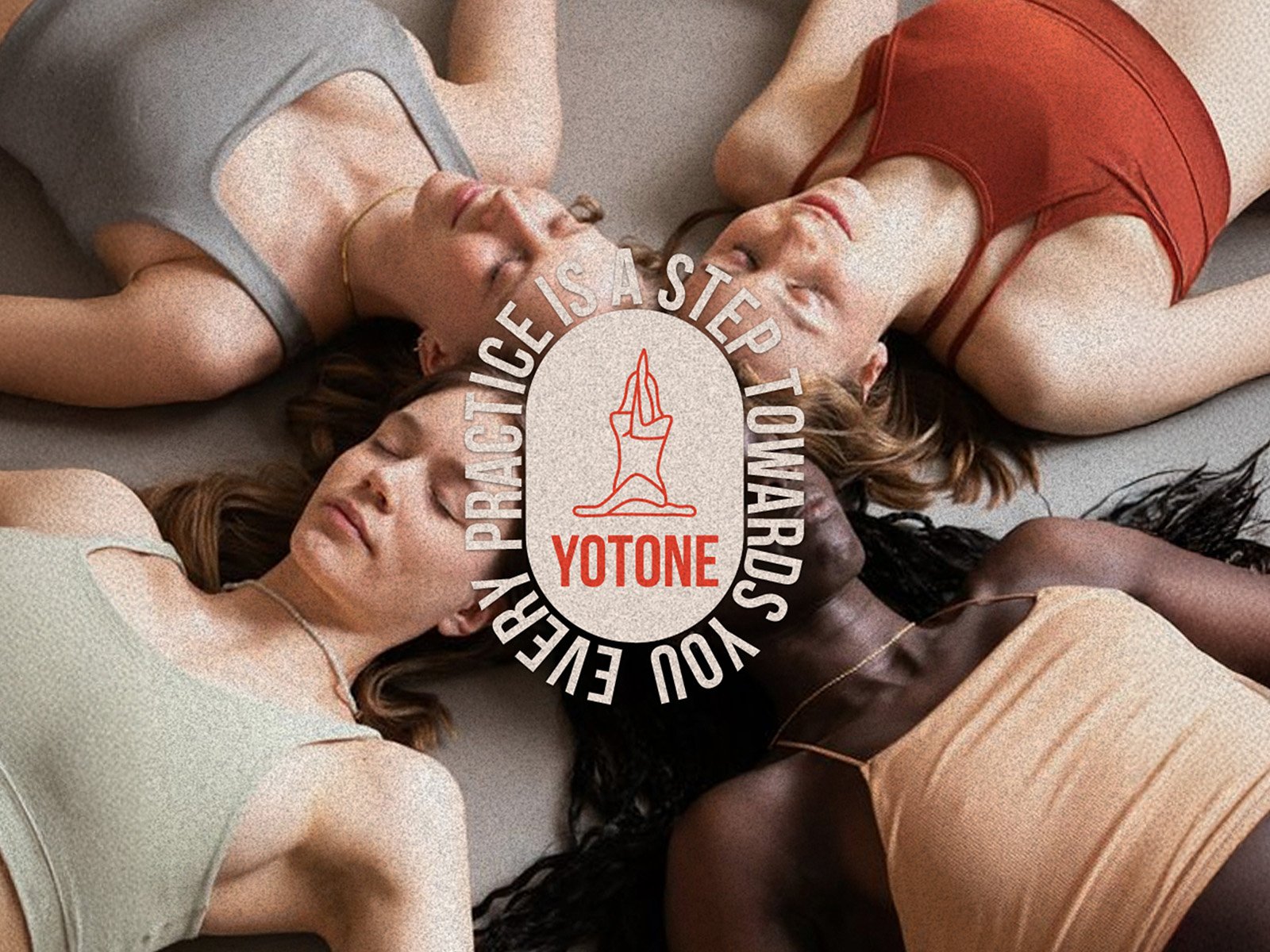
The color palette embraces warmth and natural tones — sand, stone, and skin — with a bold red accent that injects vitality and direction into the brand. This red becomes a visual reminder of energy and focus, contrasting gently against the muted, peaceful backdrop. The typography is clean and modern, using a confident sans-serif font that adds clarity and structure without overpowering the softness of the brand. The overall design language feels spacious, breathable, and gentle, encouraging reflection and stillness.
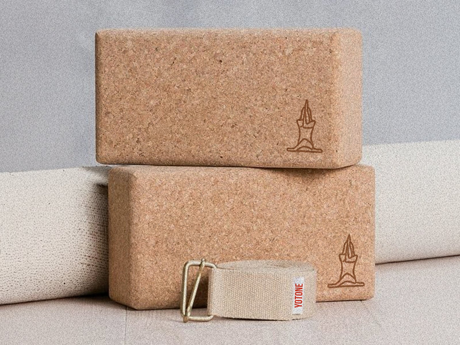
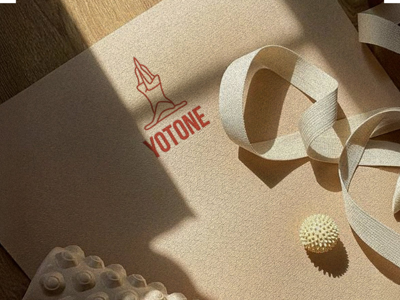
YOTONE’s identity lives across every brand touchpoint — from screen-printed apparel and reusable bottles to yoga mats, cork blocks, and mobile interfaces. Each application reinforces a message of mindful movement and intentional living. Motivational taglines like “Every practice is a step towards you” and “Take a step, start your journey” act as guiding mantras, reinforcing the brand’s role as a supportive companion, not a teacher. Whether in a class, scrolling online, or stretching solo at home, YOTONE becomes a trusted presence — quiet, grounding, and real.
This isn’t just a visual system. It’s a visual sanctuary.