Introduction
Human perception naturally seeks coherence and order. This sense of coherence and order is referred to as Gestalt. Our perception is strongly inclined to arrange things in a structured manner within any graphic composition. One of the fundamental mechanisms that our perception employs in this process is the grouping of objects.
Simply put, when we observe a collection of objects, we instinctively o combine them into groups. For instance, imagine a table in front of you with a laptop, a cup of coffee sitting on a coaster to the left, and a notebook with a pencil on the right.

Do you notice it? Your perception automatically divides the objects on the table into three distinct groups.
How exactly does this grouping happen, and why?
The world we inhabit is immensely complex and seemingly boundless. And in order not to go crazy from this enormity, our perception seeks ways to orient itself. So it simplifies what it sees.

Simplification becomes a crucial aspect of our perceptual process, and one of its guiding principles is to focus on the familiar.
For instance, when presented with an array of words, some of which are in a language you understand while others are not, your attention naturally gravitates toward the familiar ones.
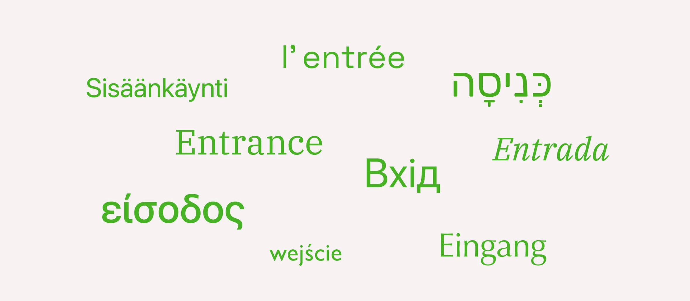
Similarly, amidst a crowd of faces, we instinctively recognize and notice those familiar to us. We can discern familiar voices amid bustling street noise. And we are happy to see a McDonald’s sign in an unfamiliar city.
The second principle of simplification involves grouping a set of individual elements together. After all, it is easier to perceive a single rain instead of a million drops, a solitary desert instead of billions of grains of sand, or a starry sky instead of an infinite number of stars.
In Gestalt psychology, this perceptual tendency to simplify through organized grouping is also called the Principle of Pragnanz (from the German word prägnanz, which means “precision,” “orderliness”). But how exactly does perception group objects and interpret them?
The research of Gestalt psychology pioneers Max Wertheimer, Wolfgang Köhler, and Kurt Koffka revealed that there are specific visual principles that affect how groups are perceived. These principles are associated with the distances between elements, their visual similarities, and the sense of continuity, closure, and coherence.
Subsequently, several Gestalt principles of visual grouping were formulated:
- Proximity
- Similarity
- Closure
- Symmetry
- Common fate
- Continuity
- Past experience
Each of these principles establishes a unique approach to perceiving and interpreting a set of elements. This article will delve deeper into each principle, exploring its applications in graphic design.
Principle of proximity
The principle of proximity states:
When presented with a set of objects, people perceive those objects that are closer to each other as a group.
In other words, if there are three elements in front of you, but two of them are closer together, those two elements will be perceived as a group.

The same principle applies to larger arrays of elements. The spacing between the elements helps us to perceive them as part of a unified group. For instance, in the image below, there are 54 dots of identical shape and color. And thanks to the spacing between them, we can clearly perceive three groups:

One of the most recognizable examples of this type of grouping is found in the text. Individual letters come together to form words, and words form paragraphs, and so on.

Principle of similarity
The principle of similarity states:
Individuals tend to group objects based on their visual similarities.
These similarities can include shape, color, size, transparency, saturation, and other visual qualities.
Let’s revisit the example of the 54 dots. However, this time, let’s make some of them pink and others green:

This forms new groups in our perception based on visual similarity.
Perceiving visual similarity also leads to another outcome: viewers attribute similar qualities to objects with similar shapes. This attribute lets us emphasize headings, quotes, and main text in various designs.
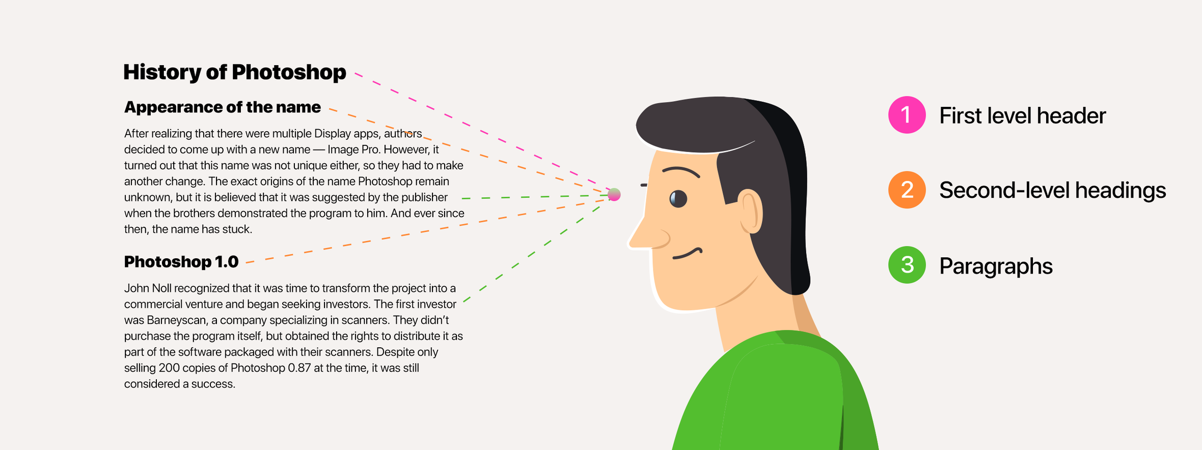
Additionally, in interfaces, it allows us to establish a consistent visual design for elements with similar functions, such as buttons.

Principle of closure
The principle of closure states:
Even when certain elements are missing from the overall shape, our perception tends to fill in the gaps and perceive the complete figure rather than its individual parts.
In other words, if there is even a hint of what the complete shape or inscription should look like, our perception will fill in the missing parts.
This is why you can read the seemingly meaningless inscription “Gstlt prncpls” as “Gestalt principles.”
Similarly, you are more likely to perceive a circle rather than a collection of dots in this image.

Principle of symmetry
According to the principle of symmetry:
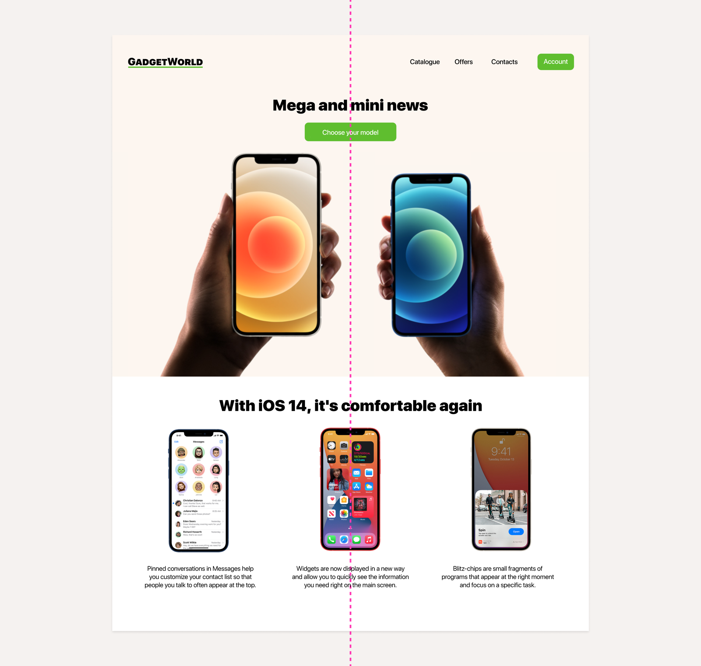
Humans tend to subconsciously perceive groups as being organized around a line of symmetry.
It’s pretty fascinating! Designers often instinctively incorporate a line of symmetry into their layouts, even without an apparent reason or purpose.
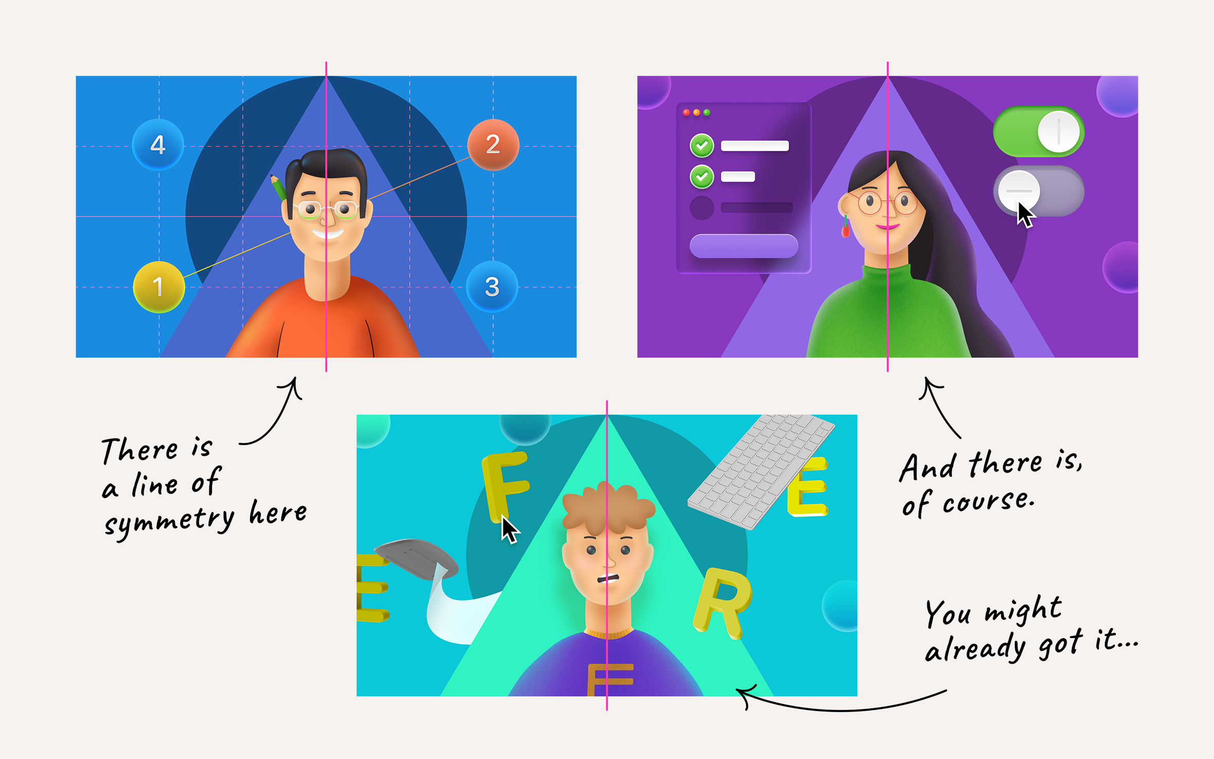
Similarly, when we observe any graphic composition, we automatically perceive an implied line of symmetry within it.
The consequence of this principle for composition is that symmetry aids in visually uniting elements into cohesive groups and harmonious compositions.
Principle of common fate
According to the principle of common fate:
The direction of movement of all elements is perceived to align with the overall direction of the group.
This principle finds frequent application in two contexts: rows and groups.
A row represents a cohesive arrangement of elements. When elements are positioned in a line, whether straight or curved, our perception interprets them as moving along a shared trajectory. This phenomenon is particularly beneficial in reading, as each line in a text consists of a sequence of words forming a row, and our reading trajectory follows the implied direction of movement.

The same concept applies to groups of non-linear shapes. For instance, the directional movement of a V formation of birds is influenced by the shape of the formation itself.

This principle can be extended to more abstract shapes as well, such as dots:

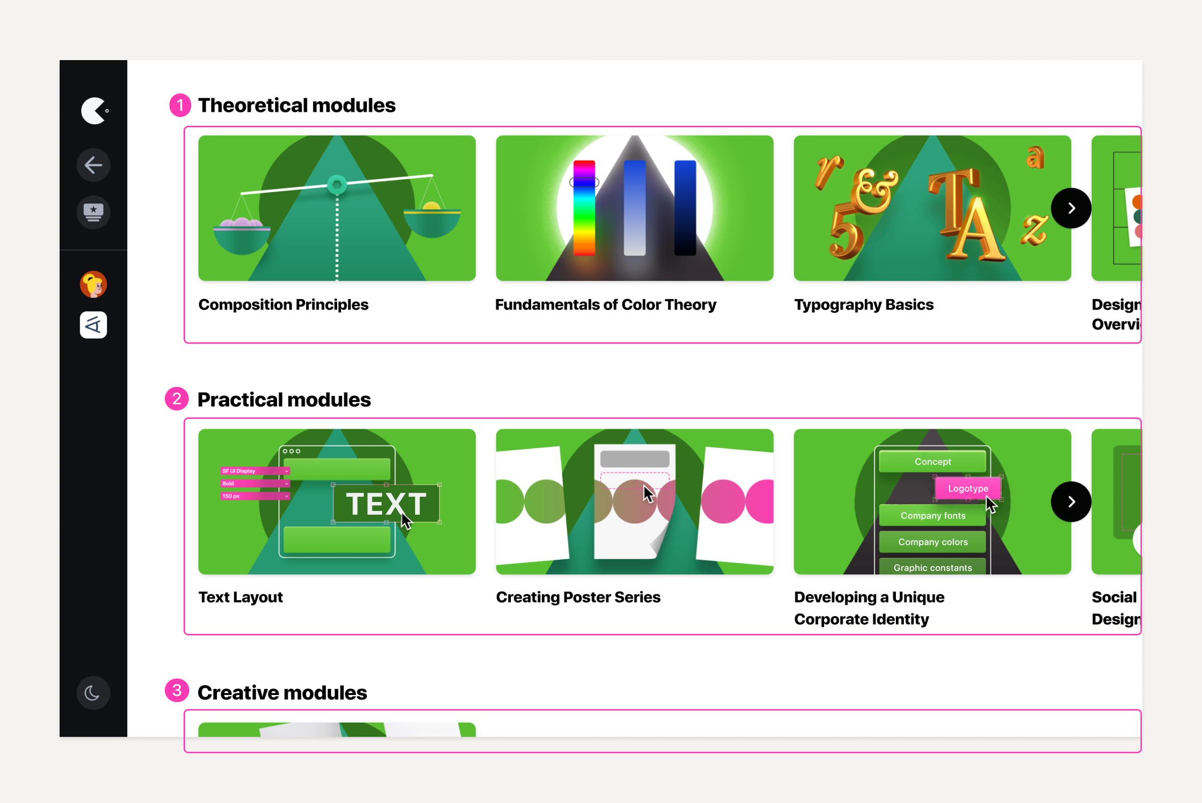
By understanding this principle of perceiving movement within a group, you can strategically project the trajectory of perception in your design:
Principle of continuity
According to the principle of continuity:
Individual elements are perceived as a group if they can be connected by a smooth and continuous path.
In other words, our perception naturally groups together a row of elements that exhibit a continuous flow without any breaks or sharp corners. Even if it’s a long row with gentle curves, we tend to perceive it as one cohesive entity.

But when an optical break occurs in a row of elements, and a distinct corner is present, our perception instinctively divides the row into two separate entities.

This perception characteristic implies that when you have two intersecting curved rows of elements, you will readily perceive each row as distinct due to the gentle slopes of each.

Principle of past experience
The principle of past experience can be described as follows:
When grouping objects, human perception takes into account previous experiences.
While most of the Gestalt principles discussed in this article are universally applicable and rely on general features of human perception, this principle is distinct. It factors in individual peculiarities of visual grouping based on factors such as ethnic and cultural characteristics or even culinary preferences.
For instance, let’s attempt to create two groups from this color set:

Some of you may form groups like this:

Why? It’s because of individual associations. The combination of red and yellow brings to mind the McDonald’s logo. And white and blue are the corporate colors of the Nivea brand.
The challenge with this principle is that previous experience is not always universally applicable in perception. At the same time, certain associations remain fairly consistent (archetypal). Take, for example, the colors red, yellow, and green associated with traffic lights.
In conclusion
Applying the grouping principles derived from Gestalt principles is a highly effective method to engage with the viewer’s perception. However, it is crucial to recognize that every element in a graphic composition contributes to the overall impression of your work. Consequently, perceiving groups is an additional technique for enhancing the impact of graphic composition.
In this composition series’s upcoming and final article, we will endeavor to integrate all the tools, techniques, and principles covered throughout the course into a cohesive algorithm. This will serve as a comprehensive summary of the concepts described.


