
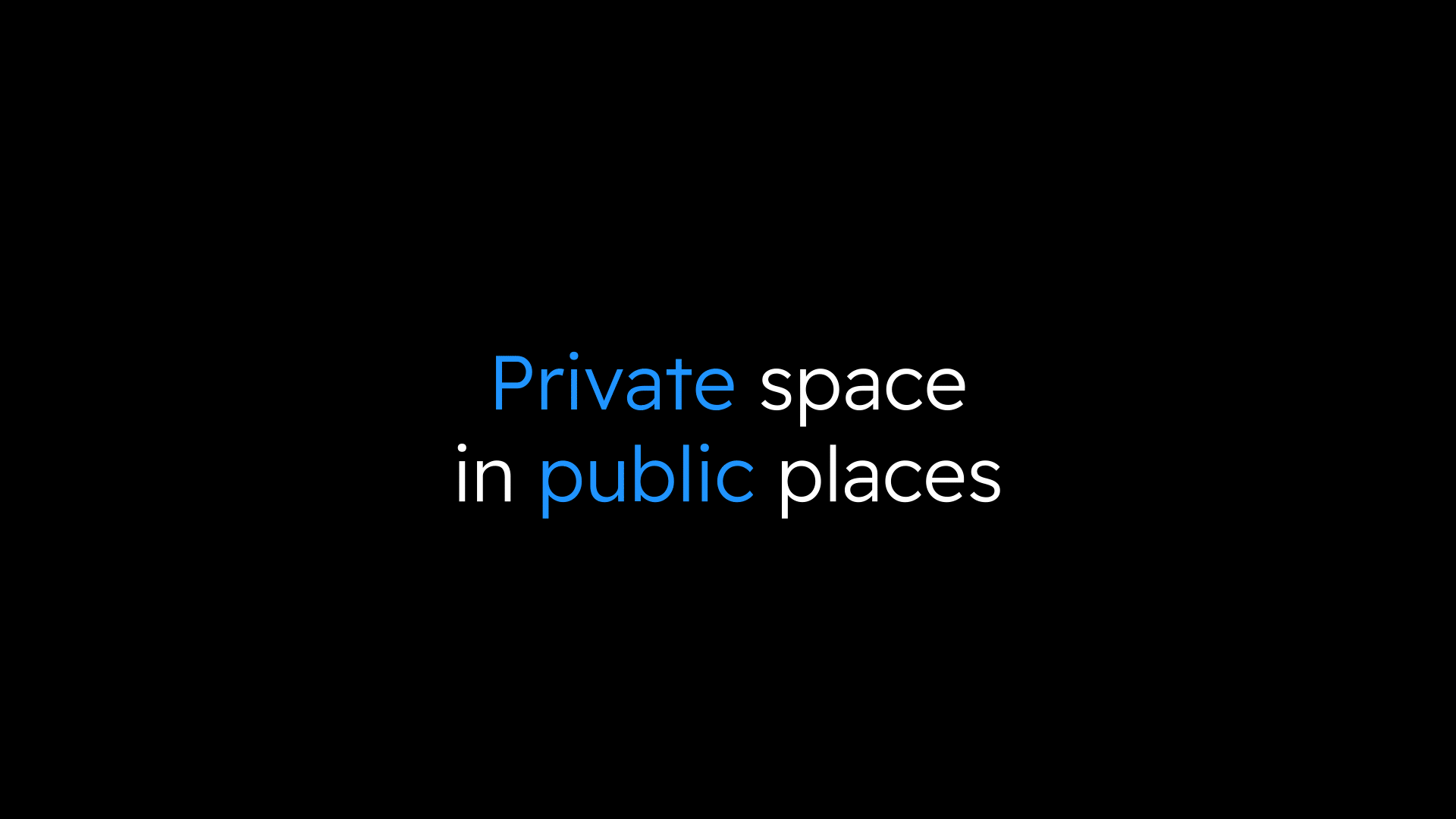
qoob – особистий простір у громадських місцях
У 2023 році The Pew Research Center провів дослідження, яке показало, наскільки важливим є особистий простір у сучасному світі. Ми щасливі співпрацювати з проектом qoob, який допомагає людям знайти цей важливий простір.

ПРО ПРОЕКТ
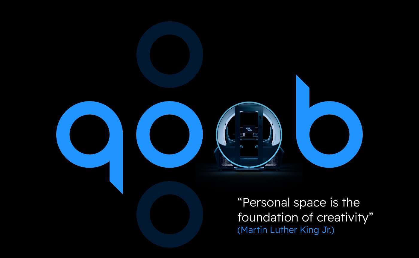
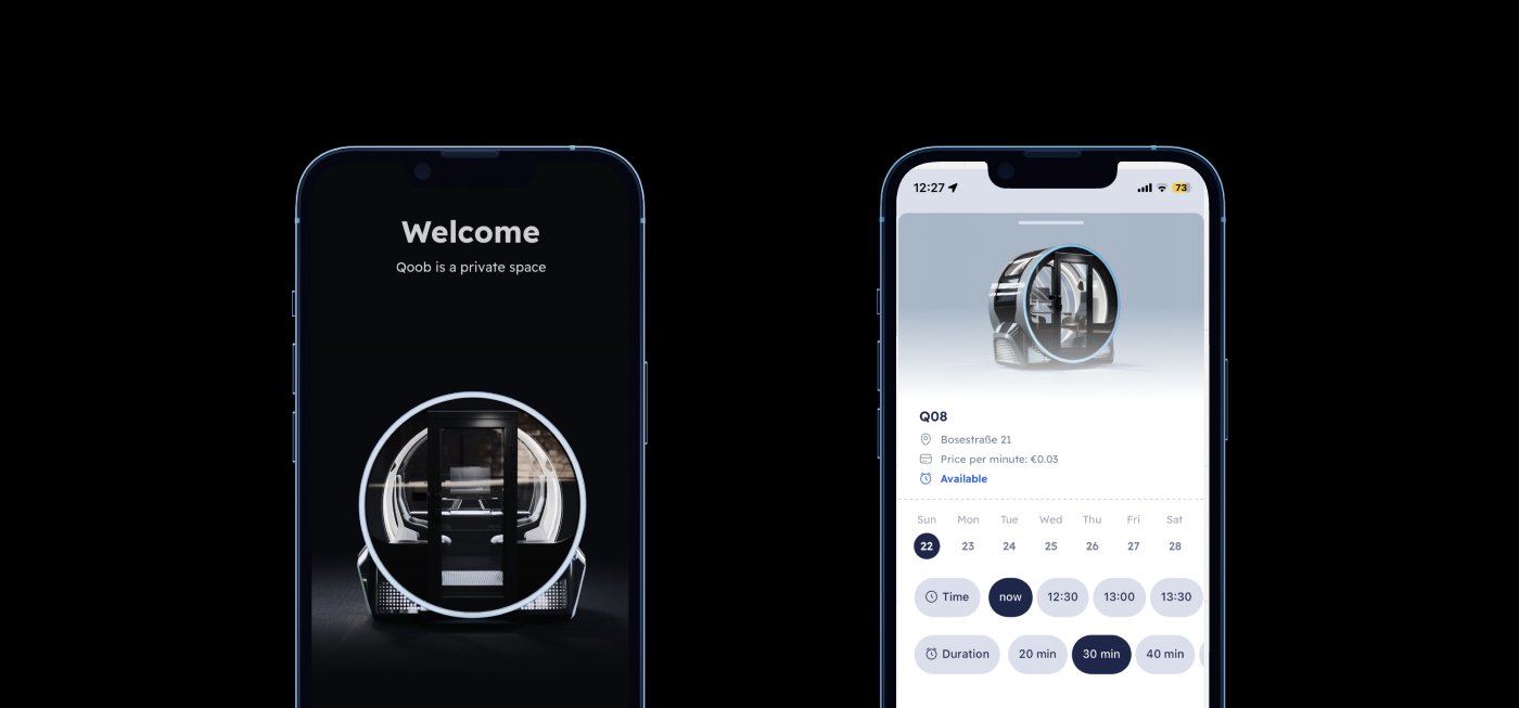
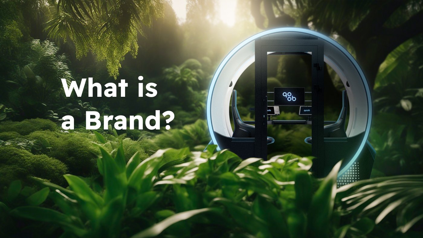
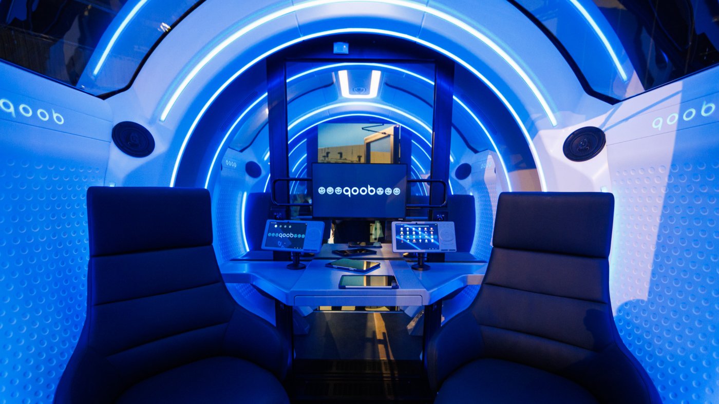
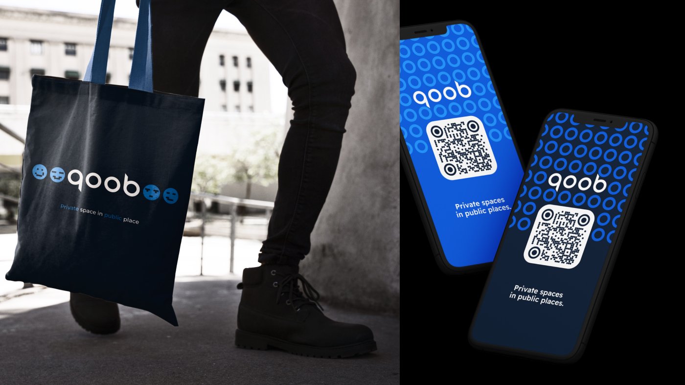
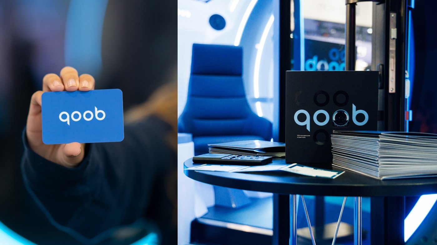
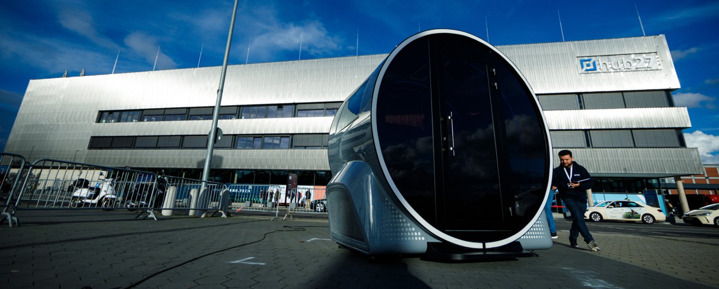
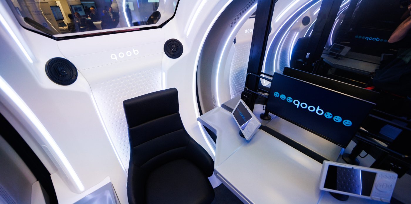
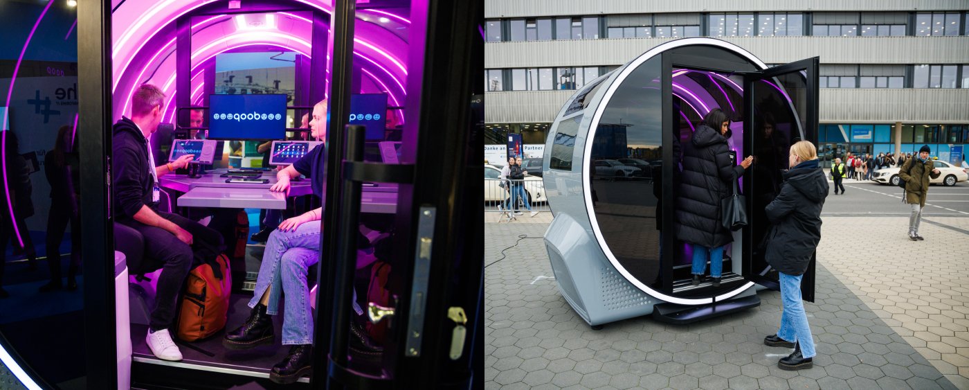
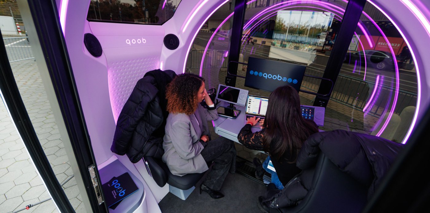
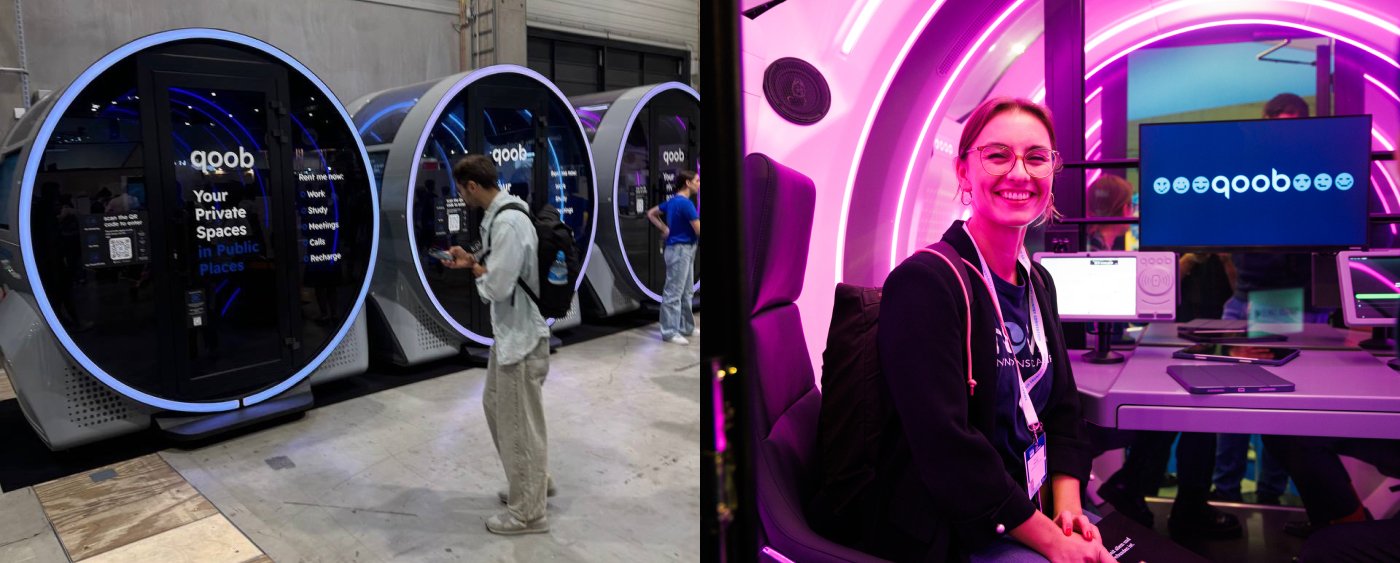
qoob — це інноваційна компанія з Берліна, яка створила міні-зони для роботи, спілкування та відпочинку. У них ви знайдете сучасні інтерактивні екрани, клімат-контроль, регульоване освітлення та комфортні меблі. Міні-зони будуть доступні в громадських місцях через спеціальний додаток.
Команда Superheroes.Marketing взяла на себе маркетинговий супровід проекту. Ми провели аналіз ринку та конкурентів, що дозволило нам визначити унікальні переваги бренду. На основі цього ми створили логотип, повний брендинг, а також розробили стратегію виходу на ринок. А саме назву «qoob» придумав безпосередньо керівник проектної групи Тарас Горбул.
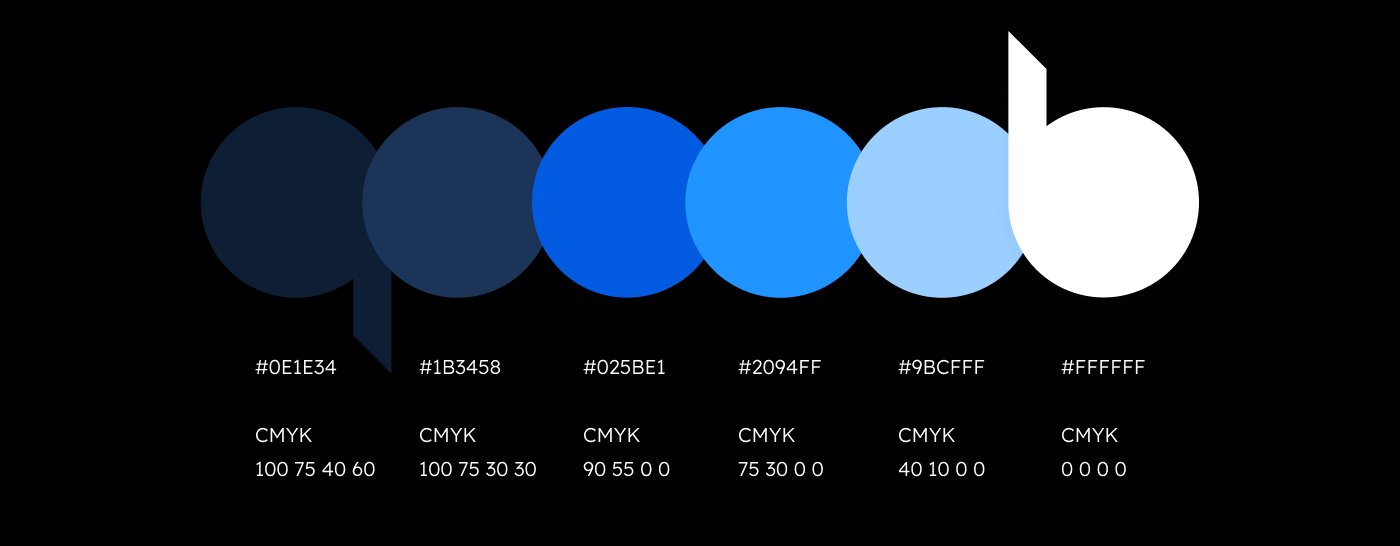
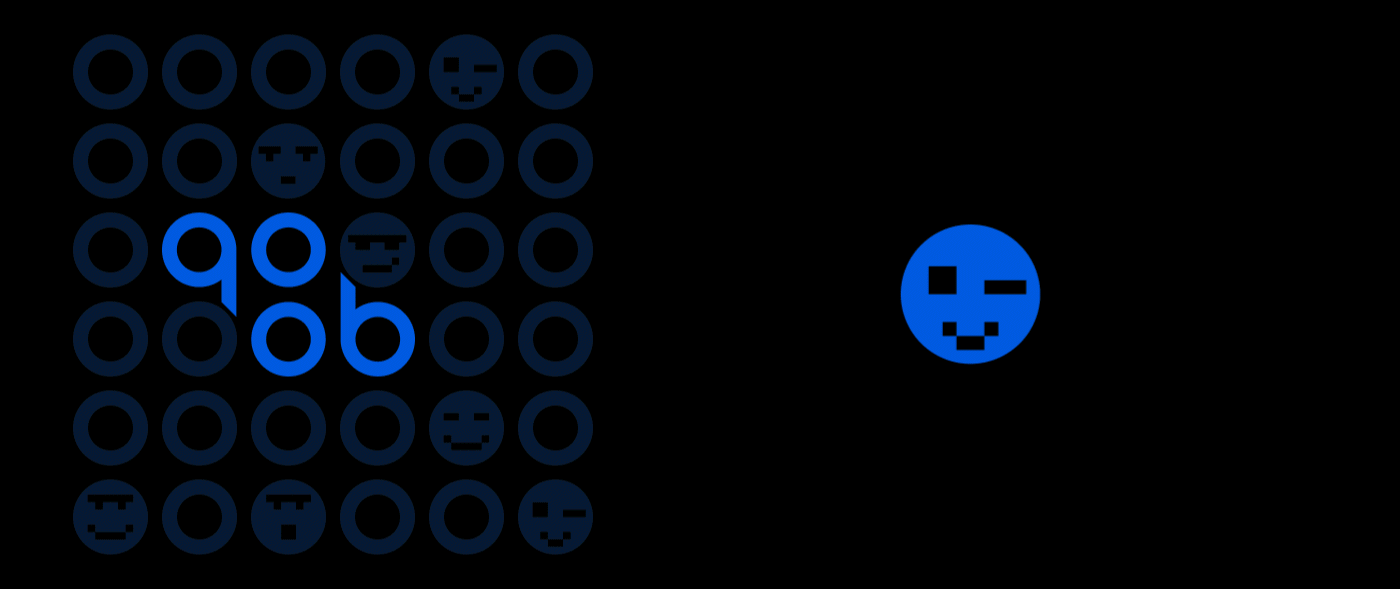
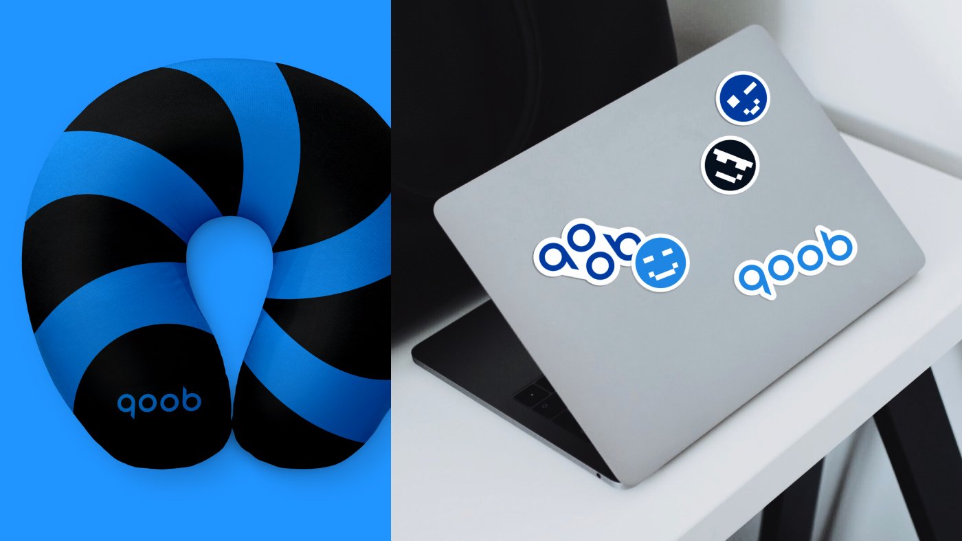
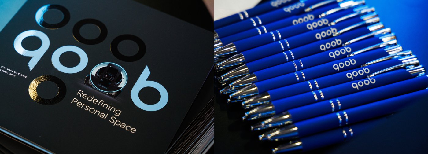
"Логотип був створений з округлих форм, які відображають форму продукту. Він складається з чотирьох кругів, які символізують приватність кожної людини. Палітра кольорів, зокрема синій, обрана не випадково — вона викликає асоціації зі спокоєм і технологіями."

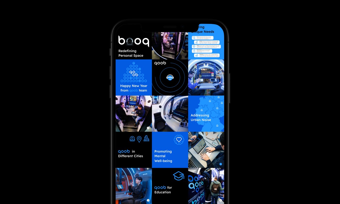
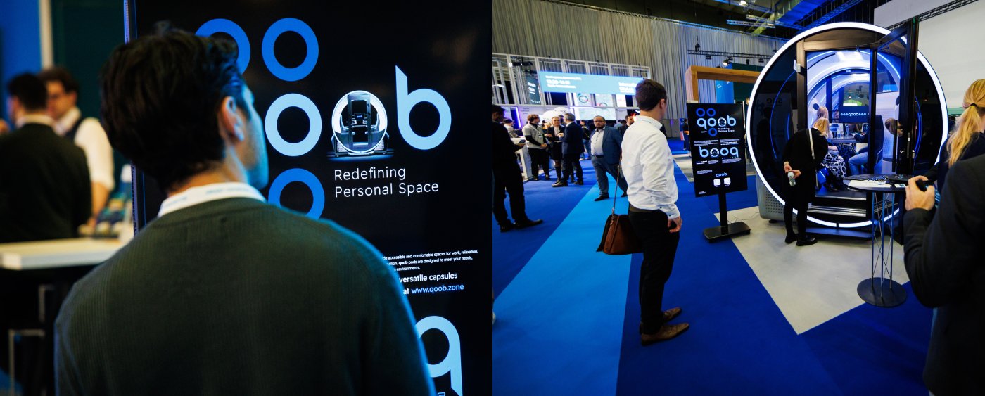
Ми створили контент для соціальних мереж, пітчдек для інвесторів та супровідні презентації. Також ми забезпечили інформаційний супровід офіційної презентації продукту у Барселоні та Берліні, розробивши усі необхідні матеріали.
Робота з проектами, що змінюють світ, — це завжди натхнення. qoob пропонує кожному знайти свій особистий простір у сучасному світі, і ми раді бути частиною цього.

КОМАНДА ПРОЕКТУ:
Ідея, концепт – Тарас Горбул
Проєктний менеджмент – Юлія Буніна
Креативний директор – Андрій Веретинський
Арт-директорка – Анна Круш
Графічний дизайн – Ніка Новікова, Михайло Кашульський, Анна Круш
3Д Моушен Дизайн – Валентин Бокій
Digital-просування – Альона Дригайловська
SMM-супровід – Світлана Мельник

