In the world of design, picking the right fonts for headings and body text is essential. Young designers often overlook the nuances that make a big difference in readability. Let's dive into how to choose fonts that work.
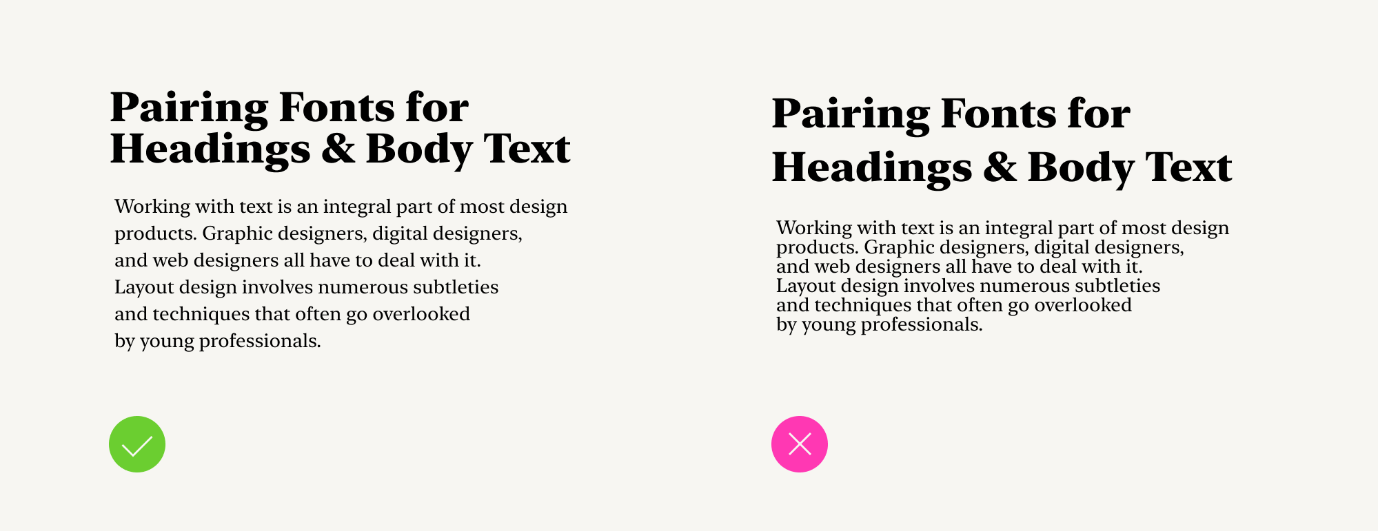
Look at these two examples:
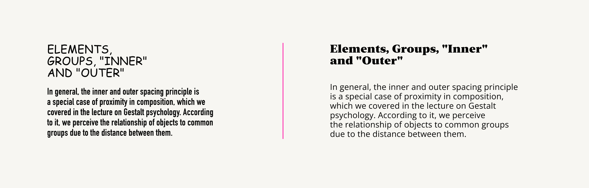
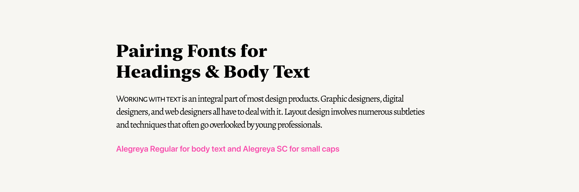
The key difference between these two designs is the selection of fonts and their parameters. It's because of these factors that the left-hand text is uncomfortable to read. The body text letters are too narrow, the line spacing is too small, and the headings appear inorganic.
To create neat and readable text, we'll explore:
- Principles of choosing fonts for headings
- Principles of choosing fonts for body text
- Principles of selecting basic font parameters for headings and body text
- Principles of combining fonts
This is the topic we're diving into today.
But first, let's clarify what body text, headings, and subheadings are, along with the different levels of headings.
Understanding Body Text and Heading Types
In our previous article, "Content Hierarchy," we discussed how font sizes in layout indicate the hierarchical level of the text.
We also explained that hierarchy in design exists at the content and form levels.
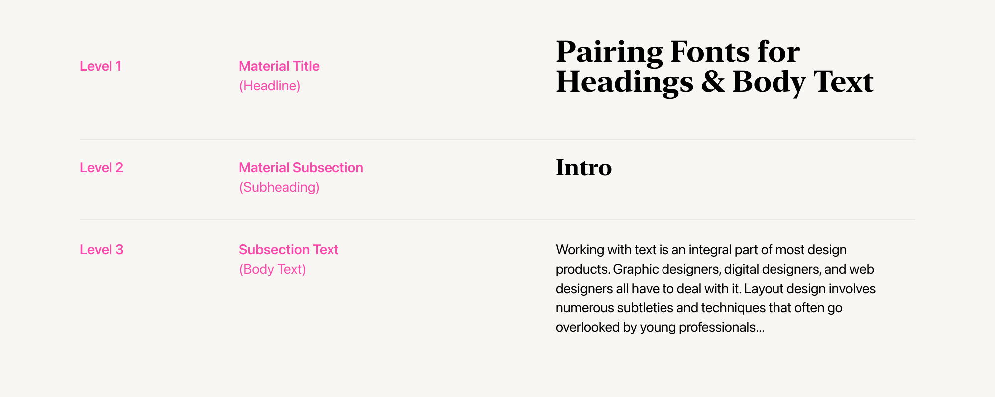
At the top level is the text's title, which conveys the essence of the entire piece.
We often divide our texts into separate semantic blocks. Each of these blocks has its own name, which we call a subheading. In this case, this is the second level of the hierarchy.
Body text is the base level of the hierarchy.
Each of these text elements serves a specific purpose, both in terms of content and design.
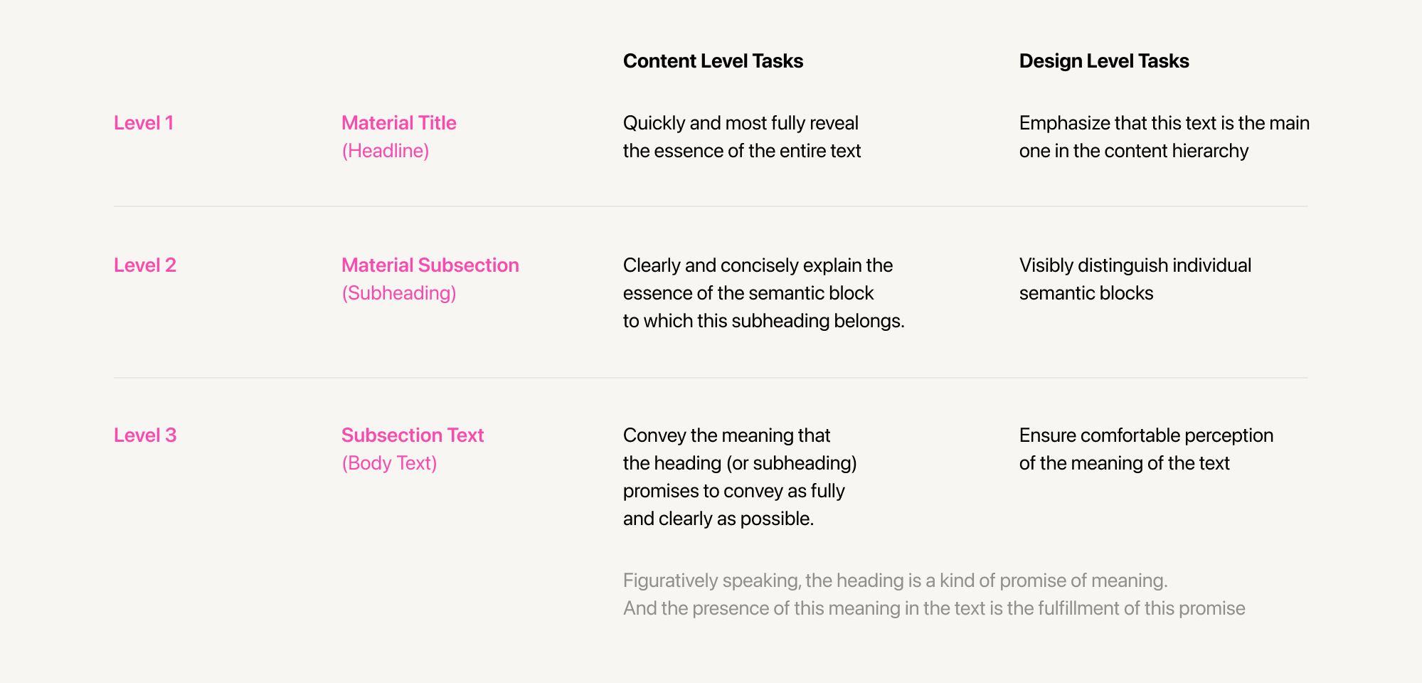
When selecting fonts and their parameters during text layout, we must consider the design role of each element. And if you're the author, you should also consider its content role.
For short articles like ours, two heading levels are sufficient. However, for a book, this won't be enough. Books can be divided into volumes, which can be divided into parts, chapters, subchapters, and so on. Each of these levels may have its own headings.
Now that we've understood the design considerations for text layout, let's move on to more practical questions: how can we achieve these goals by selecting specific fonts and applying appropriate font parameters?
The primary goal of body text is to ensure comfortable reading and comprehension of its content.
The font size for body text varies depending on the type of content you're working with. For websites, it typically ranges from 15 to 20 pixels. For newspapers and magazines, a font size of 8 points (also known as petite) is commonly used. For books, a font size of 10 points (also known as long primer) or 12 points (also known as pica) is more suitable.
Under these conditions, not all fonts are equally readable. Texts set in display fonts can be difficult to read due to their often intricate designs. When reduced in size, these fonts tend to appear blurry or fragmented.
But how do we identify fonts that are well-suited for body text? There are several key characteristics to consider. Let's explore them.
Distinguishing Features of Body Text Fonts
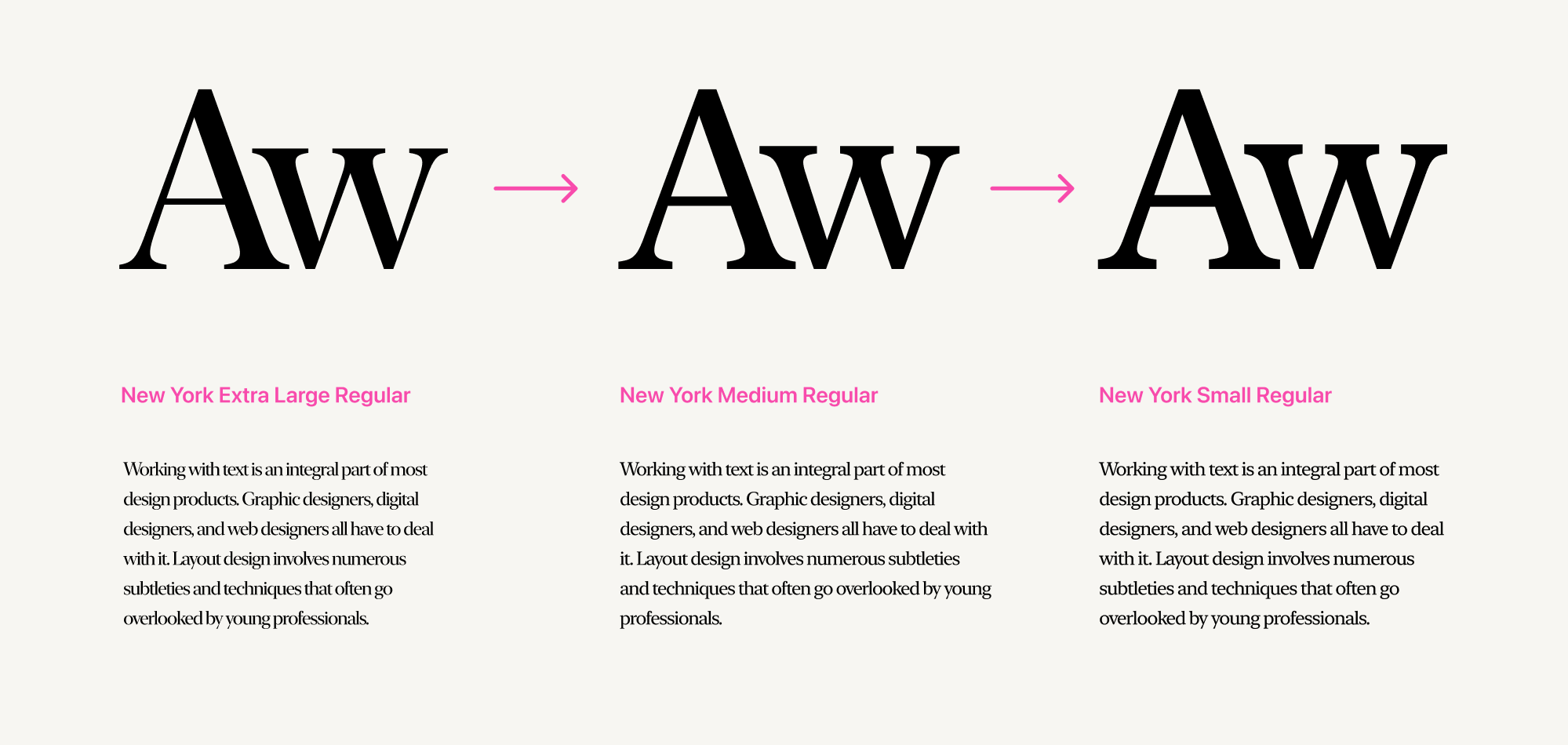
Simplified Design
Body text fonts typically have a simplified design. They feature fewer (or almost no) decorative elements, intricate serifs, or stark contrast between primary and connecting strokes.
Furthermore, some fonts even have dedicated styles specifically designed for use in smaller sizes.
For instance, in the "New York" font family, there's the "New York Small Regular" font, where the serifs and connecting strokes are slightly thicker in appearance. This helps prevent excessive contrast in smaller point sizes.
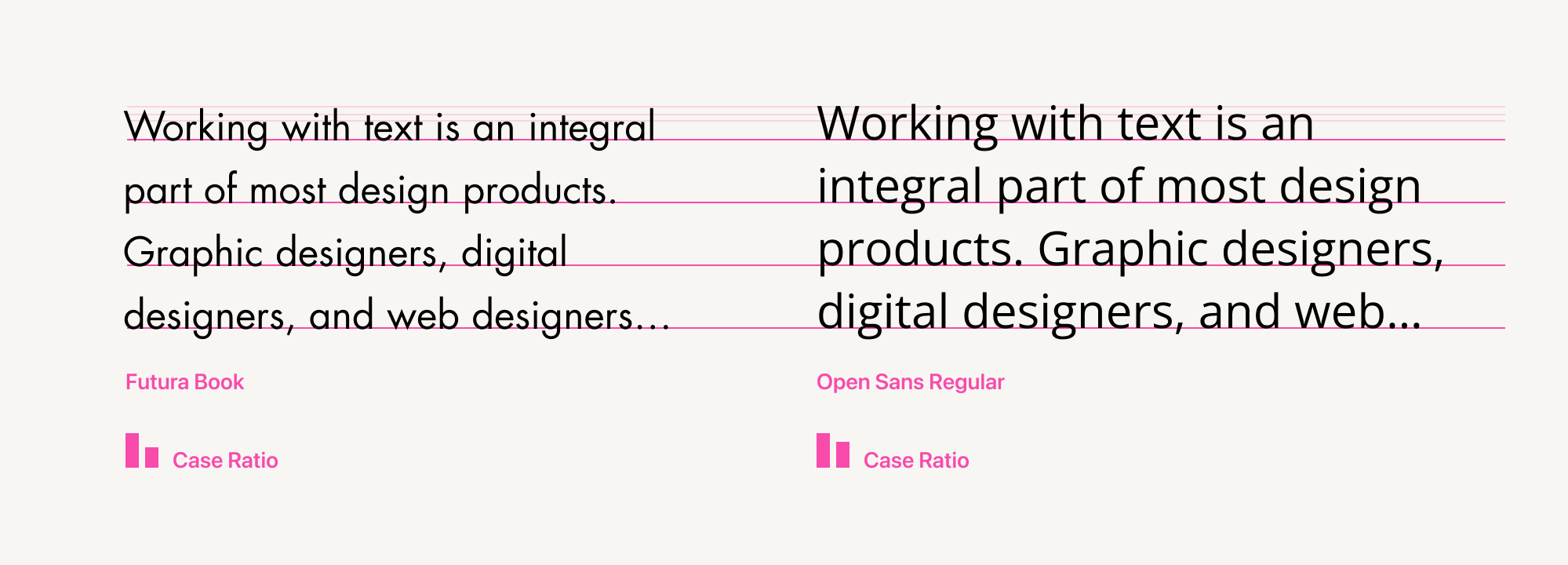
Wider Aperture
Body text fonts typically have a wider aperture. This design feature allows them to adapt better to smaller sizes.
Larger Lowercase Letters
Fonts suitable for body text often have slightly larger lowercase letters. This makes it easier to read lowercase letters in smaller sizes, especially at smaller point sizes. The height of lowercase letters is sometimes referred to as the x-height.
Wider Tracking
To improve the readability of individual characters at smaller sizes, body text fonts typically use wider tracking. This means the space between letters is increased. As a result, each individual letter becomes more distinct.
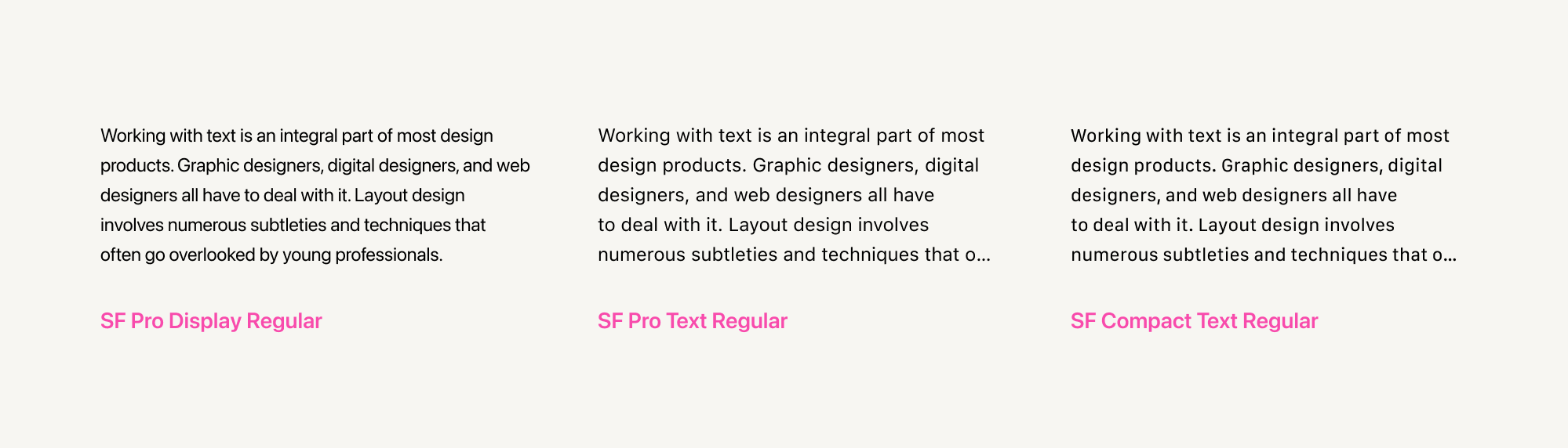
Narrower Character Widths
Body text often appears in relatively narrow formats, such as on smartphone screens. In such cases, to accommodate more text per line, it's preferable to choose fonts with narrower character widths.
Examples of narrow body text fonts include PT Sans Narrow and IBM Plex Sans Condensed.
Don't Forget the Context
It's crucial to consider the context when choosing a font.
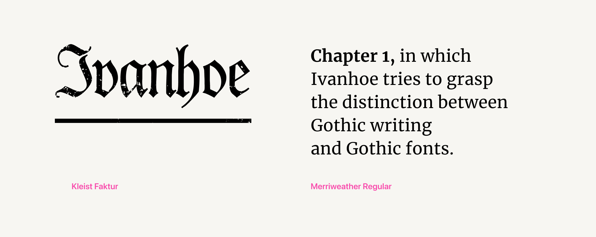
For instance, while the "Lora" font might be comfortable for body text, it wouldn't be suitable for setting a translation of Tschichold's "The New Typography." The author would likely disapprove, as this book was a manifesto advocating for the use of sans-serif fonts.
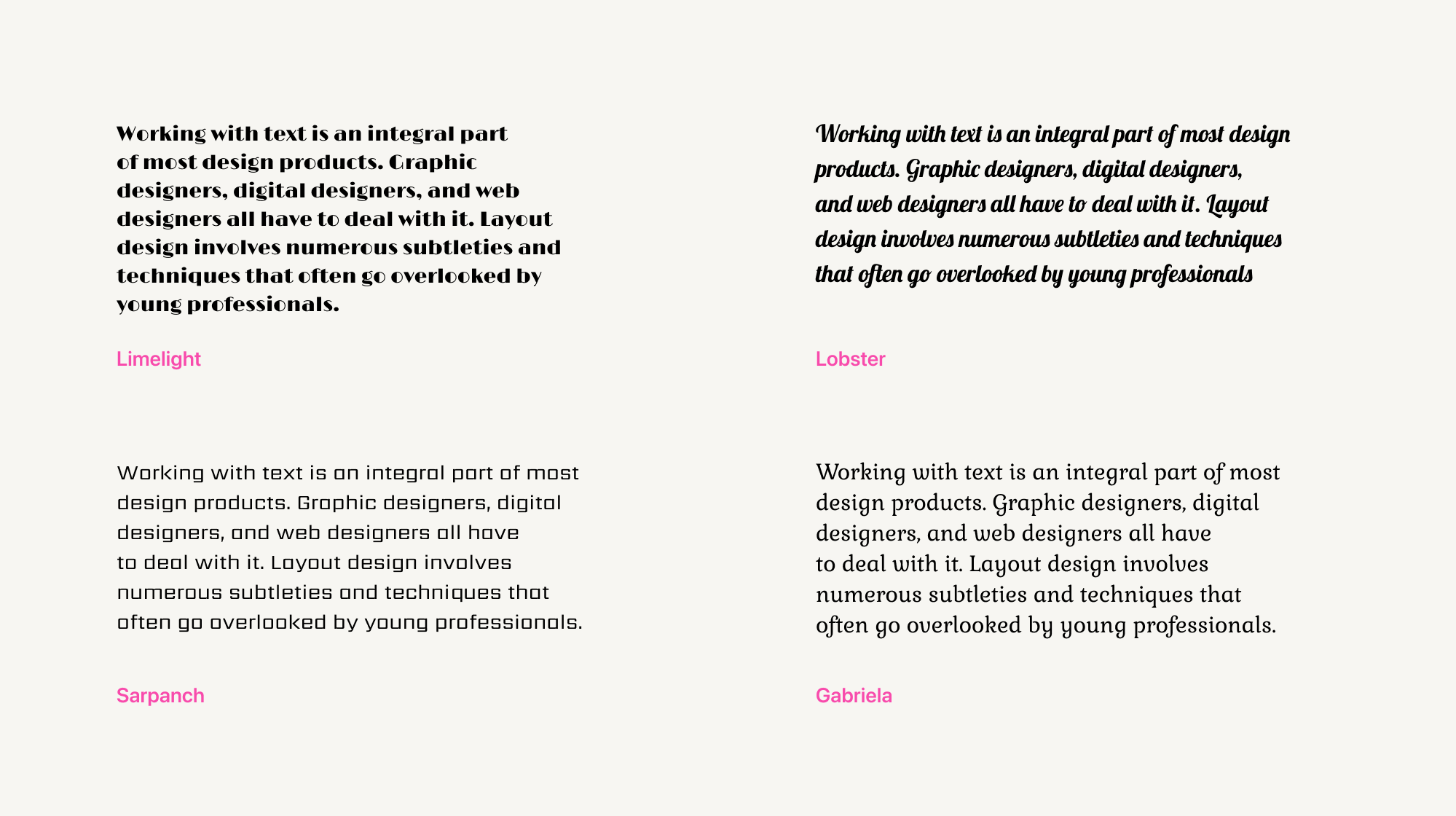
Heading Fonts
Headings and subheadings play a crucial role in conveying the essence of the content they introduce and stand out amidst the surrounding body text.
Achieving this is primarily accomplished through font size.
For headings, we use larger font sizes. On websites, this size typically starts at 20 pixels. For setting headings in books, a 16-point size (also known as pica) is commonly used.
Larger font sizes enhance the visibility of a font's design elements and subtle nuances.

Headings often employ a bolder weight than body text. If a text includes subheadings, the weight increase should correspond to the content hierarchy:
the thinnest weight in body text → bolder weight in subheadings → the boldest weight in headings
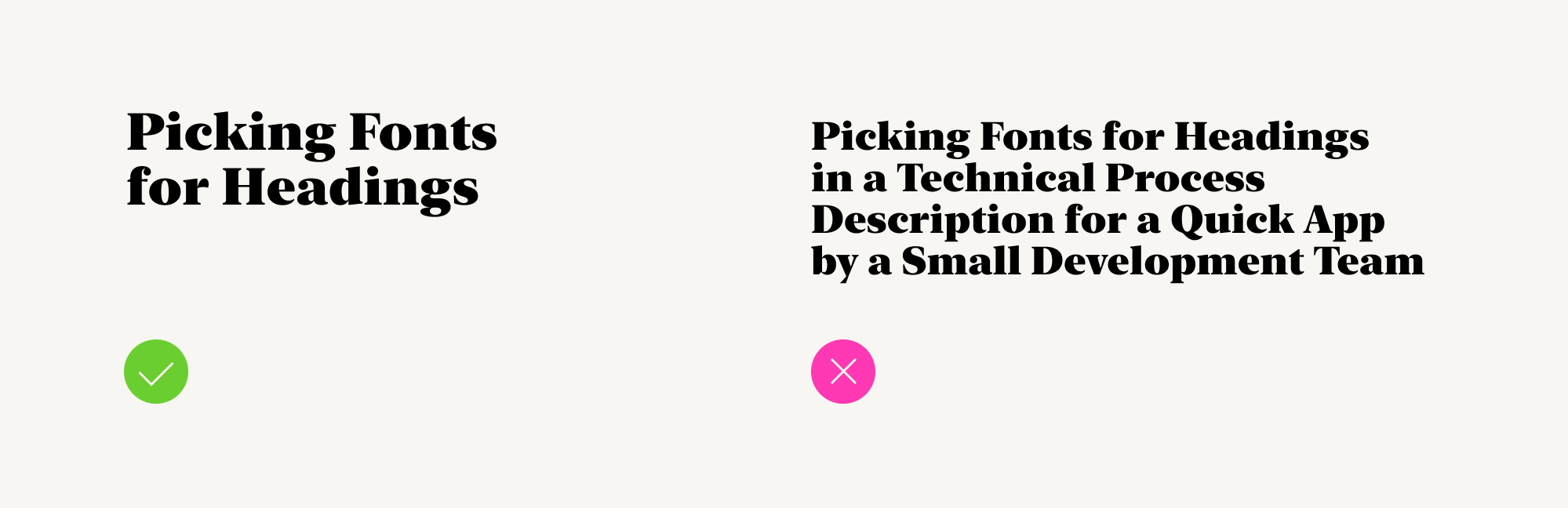
For optimal readability, it's preferable to keep subheadings and headings concise, typically within 3-5 words. Longer headings can make reading less comfortable.
Larger font sizes in headings allow designers to convey not just the meaning of the words but also the emotion, style, and underlying context of the message.

However, in practice, heading fonts differ from display fonts.
When a text contains numerous subheadings, excessive ornamentation in their design can make them difficult to read.
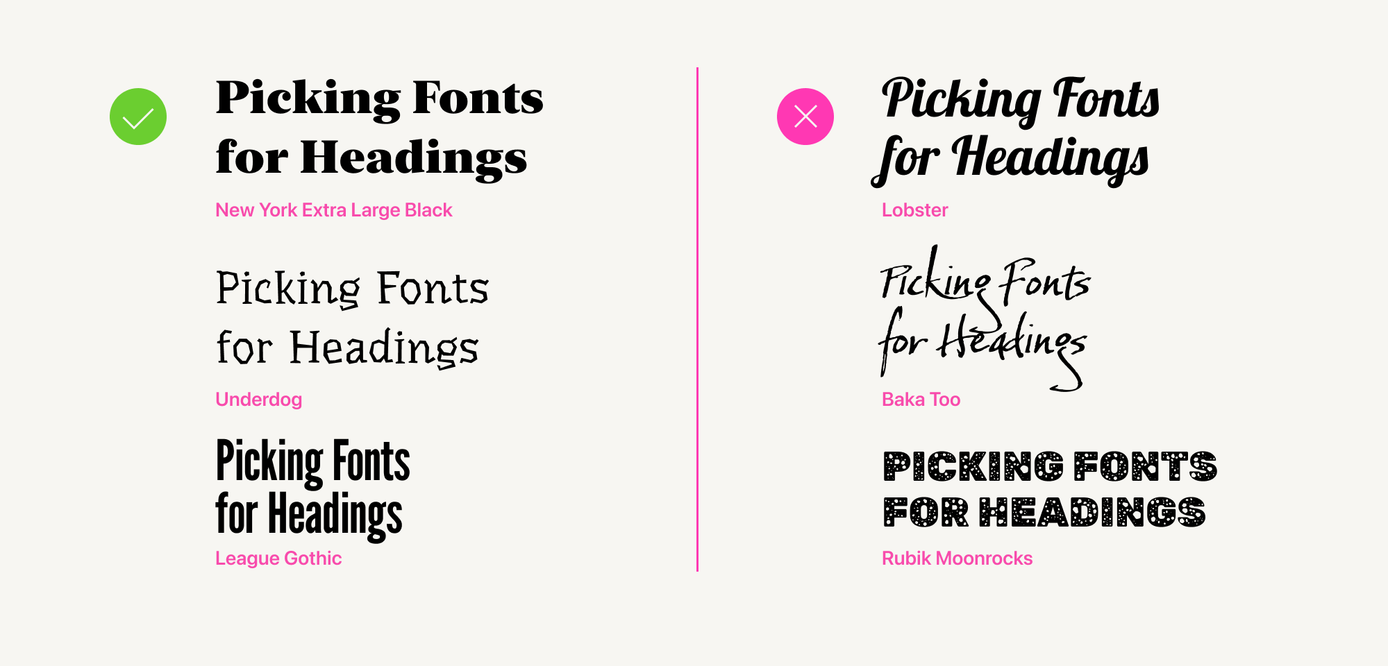
This doesn't imply that display fonts are entirely unsuitable for headings. It's simply more appropriate to use them for first-level headings, while opting for simpler fonts for subheadings.
Choosing fonts for headings, subheadings, and body text is just the beginning. Adjusting font parameters is equally important.
We've prepared some tips on how to work with them.
6 Tips for Effective Text Layout
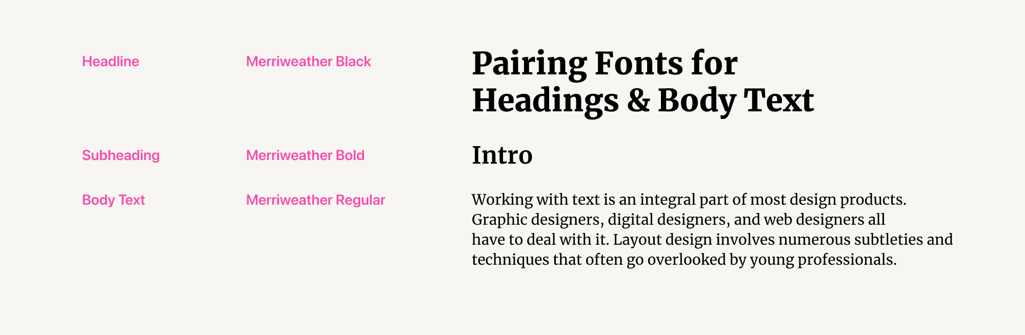
Tip #1: Create Your Own Font Style Guide
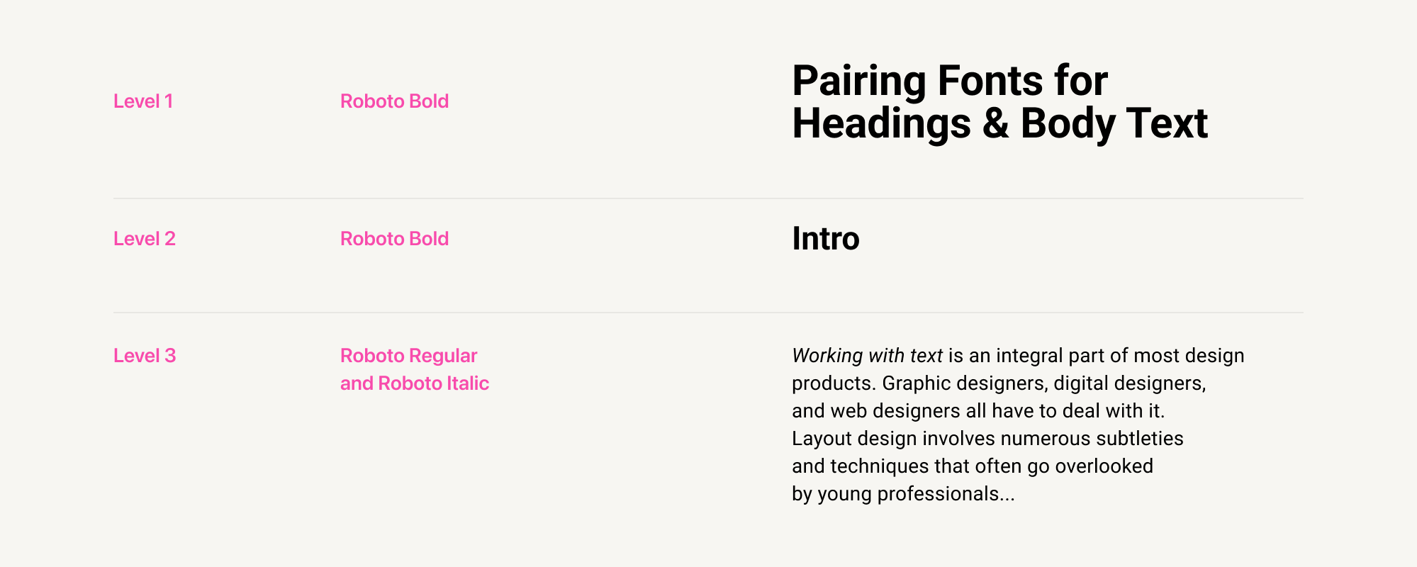
A font style guide is a system of proportional sizes for all levels of text found in a layout, from small image captions to first-level headings.
It's helpful to create such a guide as soon as you start working on a layout. It will be useful for any project - website, brochure, book, poster, etc.
In this guide, you record the fonts and individual parameters (weight, size, leading, tracking, color, etc.) chosen for each text level.
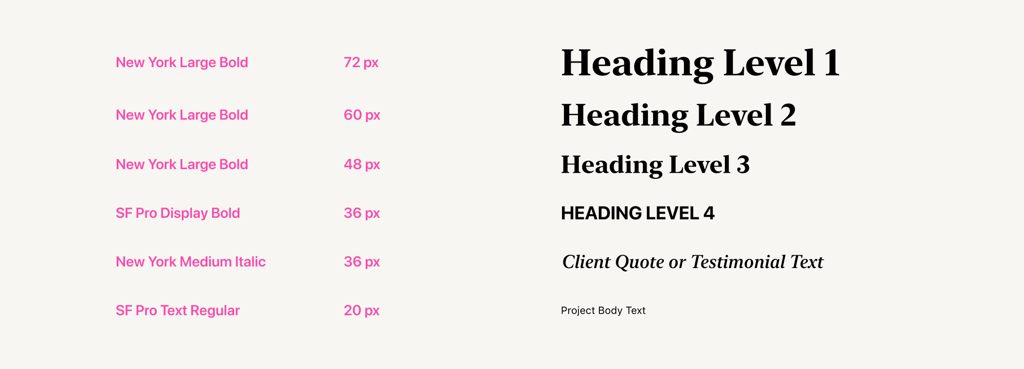
In many modern graphic editors, you can create such a font style guide within the text settings. This is possible in Figma, Sketch, Adobe Photoshop, and Adobe InDesign.
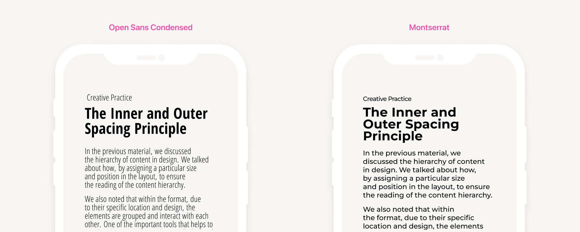
Tip #2: Choose Individual Leading for Body Text and Headings
Leading, also known as line spacing, is the distance between the baselines of two lines of text. In our article on the inner and the outer spacing principle, we mentioned that for body text, a leading of 1.2 to 1.6 (or 120-160%) is considered comfortable for perception.
Designers often use the same leading for all text in a layout. However, it's important to adjust leading for headings, subheadings, and body text.
The principle is as follows: the larger the font size of the text (such as a heading or subheading), the smaller is the leading that should be used. Otherwise, you will end up with too much white space between lines in the headings.
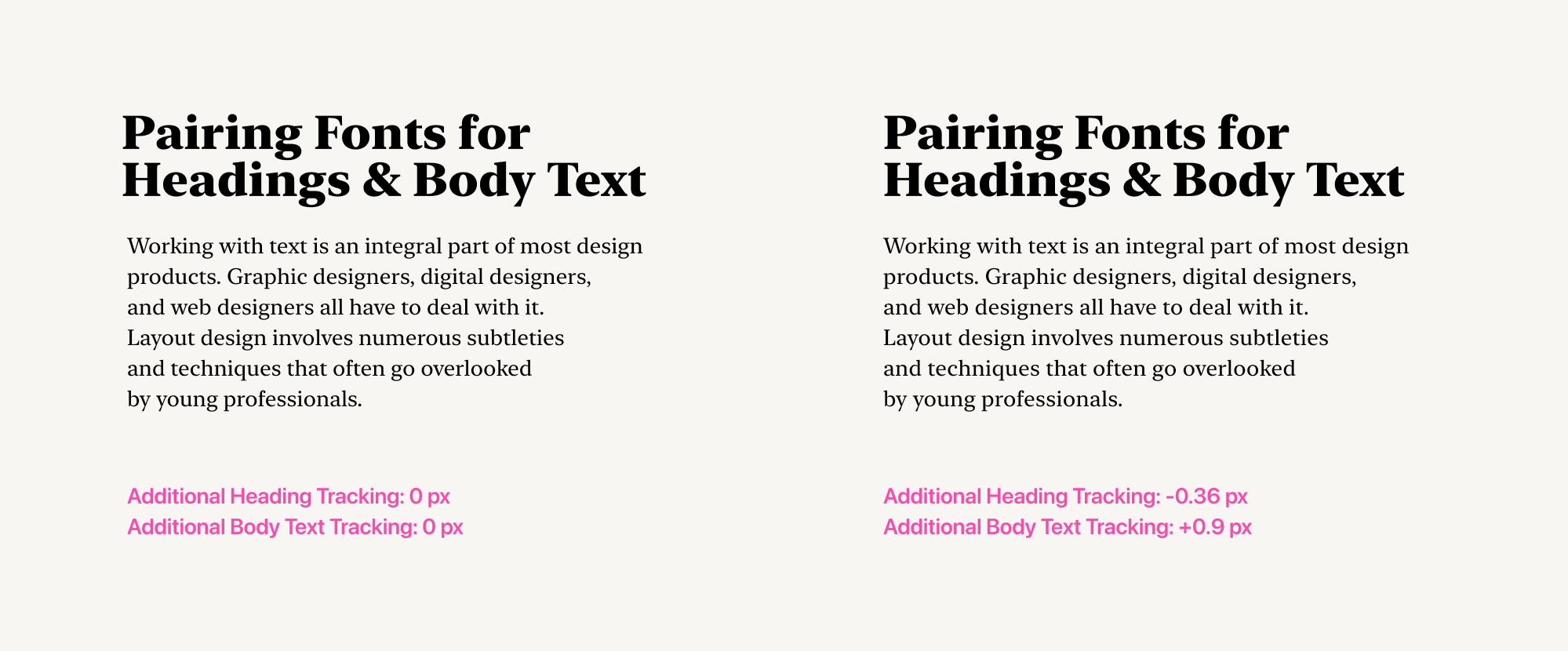
Tip #3: Pay Attention to Tracking
Tracking is the distance between letters. It is also known as letter spacing. Reducing tracking makes the text more compact, resulting in a narrower appearance. Increasing tracking makes the text more spaced out, lighter, and "airy."
For large headings, tracking can be reduced to increase contrast with the body text. This also allows for more characters in the heading line.
For body text, tracking can be increased. This can improve the readability of the body text by adding extra space between letters.
Tip #4: Choose Word Styles Thoughtfully
For word styles, designers can use lowercase, uppercase, and small caps. Small caps are letters that have an uppercase appearance but are slightly larger than lowercase letters.
Designers often use all-uppercase text in layout. This is acceptable for headings and small subheadings, but not for paragraphs of text. Paragraphs set in all uppercase are difficult to read.
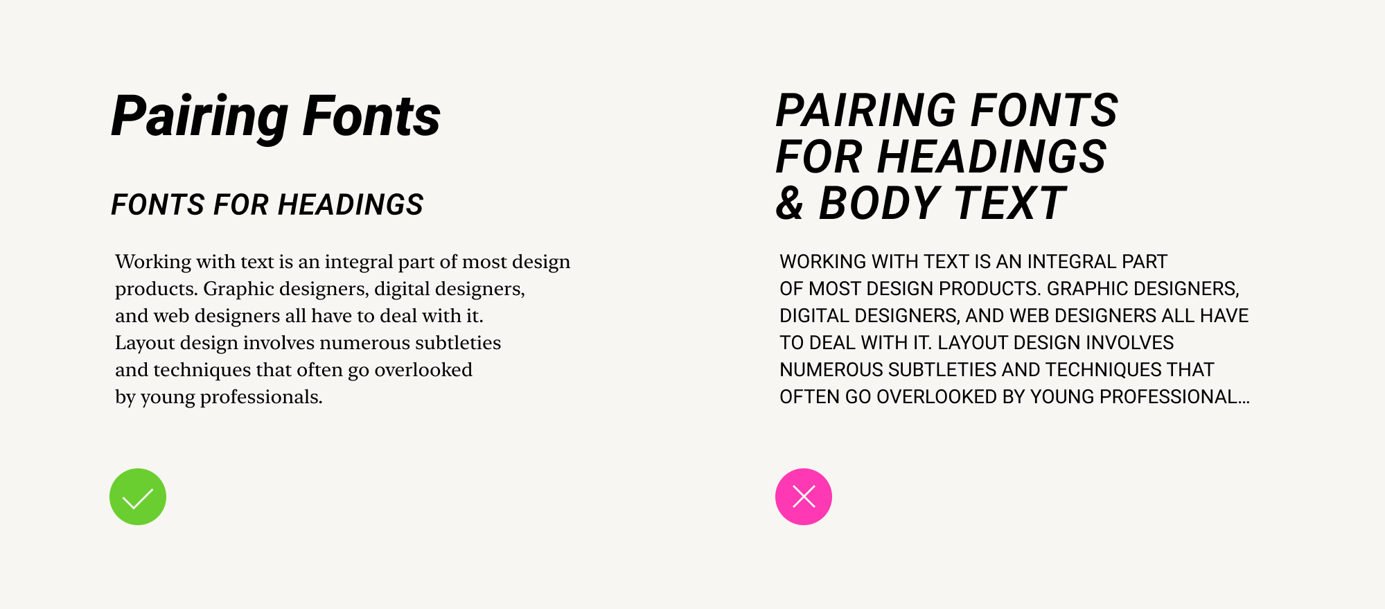
However, this style is perfectly acceptable for highlighting individual words (such as terms).
Tip #5: Limit the Number of Heading Styles
If you have at least three levels of text elements—for instance, a first-level heading, a second-level heading, and body text—you can set them all using fonts from the same font family.
A font family is a collection of fonts that share a common design foundation but differ in weight. Roboto is an example of a font family.
Fonts from the same family will interact harmoniously, and the text formatted with them will appear more cohesive.
For example, you could use Roboto Bold for both level headings and Roboto Regular for body text.
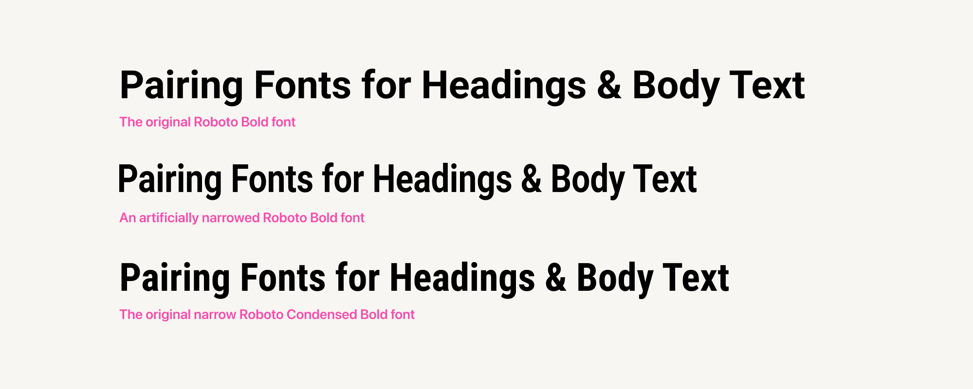
Tip #6: Resist Modifying Fonts
Some designers attempt to manually alter the shape of fonts. For instance, they might make the font height taller and the width narrower. In most cases, such modifications detract from the font's appearance.
Each font is the result of meticulous work on each individual element. Font designers carefully select the fonts' sizes, proportions, and weights. They do so thoughtfully and meticulously.
When a graphic designer simply stretches or condenses a font, the painstaking work on the font's composition is nullified.
Therefore, if you want the text to appear narrower or bolder, find an appropriate ready-made font. It surely exists! And it will be a respectful approach towards font designers.