
Composition Tools in Graphic Design
Rational and emotional information in graphic design
Every graphic composition is rooted in a specific concept or idea. When we observe a graphic composition, we interpret it both intellectually and emotionally.
In other words, we analyze and experience it simultaneously.
To illustrate this, we can use the example of a movie poster.
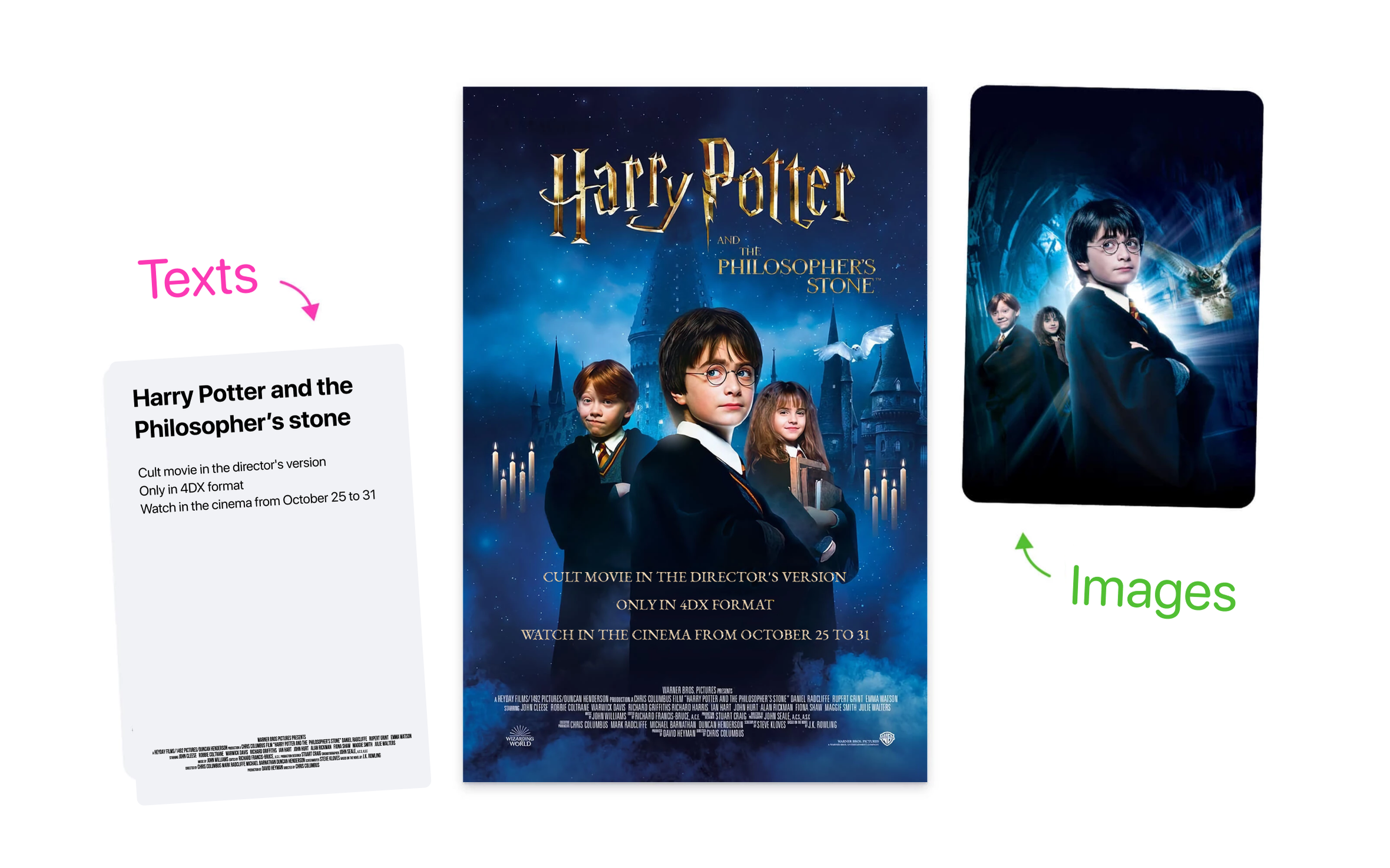
Imagine that you've had a stressful week at work and decided to unwind by watching a movie. Let's say you've chosen to watch the movie about the young wizard Harry Potter, which, for some strange reason, you haven't seen yet.
Before even reading the synopsis, you look at the poster…
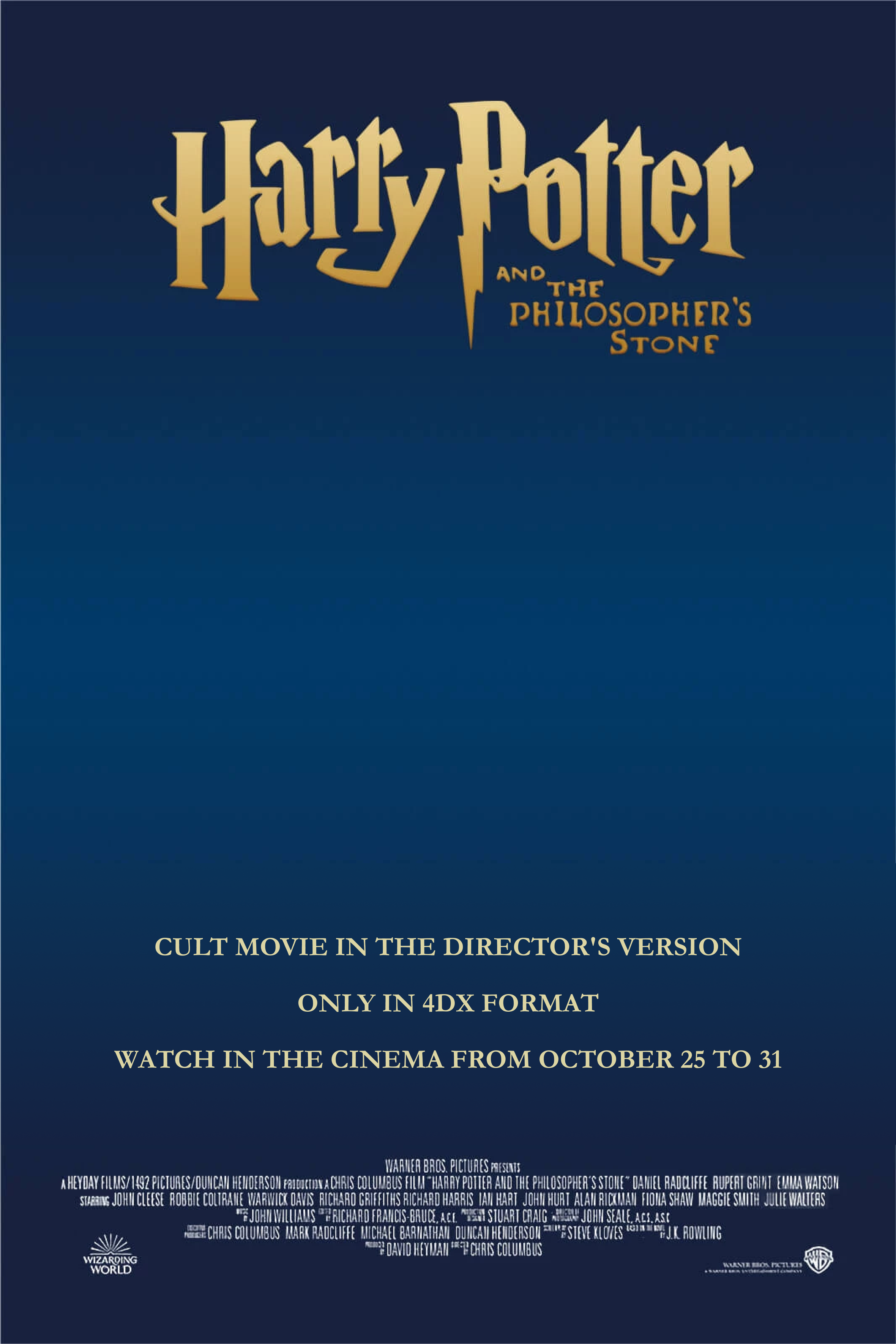
… and perceive the following information on a rational level:
— the movie's title,
— the premiere date,
— the starred actors,
— the director.
All of this information is clearly written on the poster.
While the written information on the poster is important for setting expectations, it is often not enough to convey the genre, story, and mood of the movie.
That's why designers put additional elements to the poster, such as the color palette, characters, and thematic fonts.

When these visual elements are combined with graphic design that complements the text, the result is a more impactful impression of what to expect from the movie.
A composition can be compared to a mosaic, comprised of individual structural elements.
In music, such elements include notes, instruments, keys, and rhythm. In literature, these are words, plot, and metaphors. In visual arts, these are graphic images formed from dots, lines, spots, and colors.
But what elements make up a graphic design composition? Let's explore!
Components of graphic composition
The term “graphics” originated from the Greek word γραφική which can be translated as “painting,” “sketching,” “writing,” or “drawing.” Therefore, in graphic design, we use visual elements and text to convey ideas, staying true to the original meaning while generalizing the definition.
The main components of a graphic composition are as follows:
- Space.
- Texts.
- Graphic images (such as illustrations, icons, photos, etc.).
- Artistic and decorative elements.
- Color palette.
Let's examine each of these components more closely, starting with the composition space.
Composition space
When people say “start with a clean sheet,” they often refer to a fresh start with no previous constraints. However, the sheet of paper itself can be considered a constraint.
Every composition exists within certain boundaries. For instance, a movie (which can be seen as a film composition) exists within a time limit and a specific frame size, such as 1920x1080 pixels.
Interior compositions are limited by the area of the room.
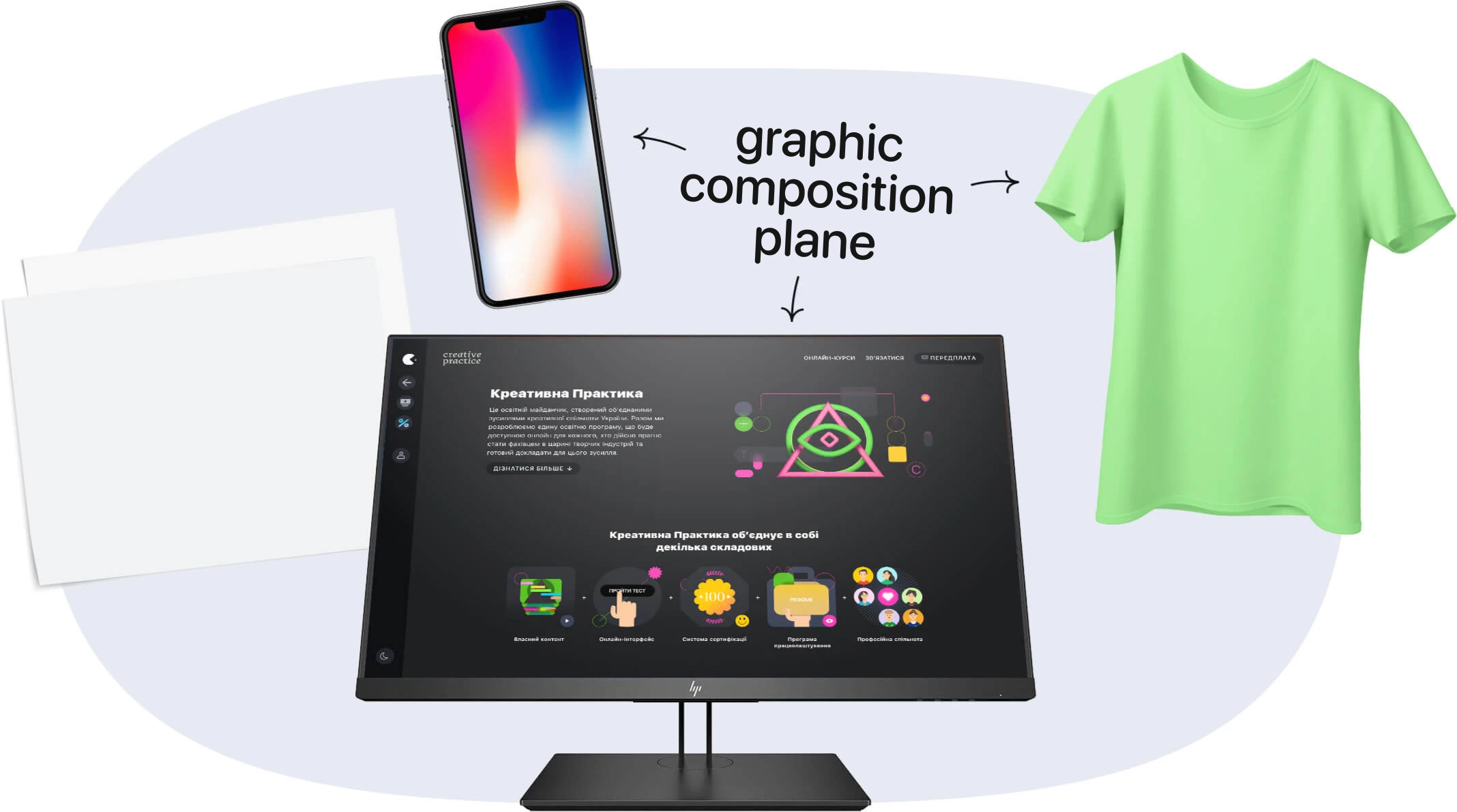
Graphic compositions are limited to the plane on which they are created (that is why they are classified as planar compositions).
This plane can be anything, such as a monitor or smartphone screen, a sheet of paper, a wall section, or the surface of a T-shirt.
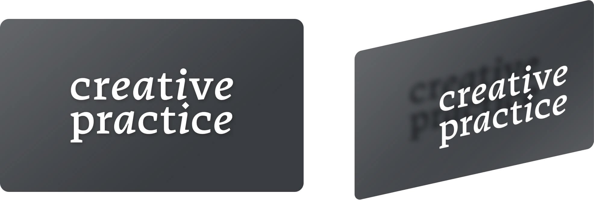
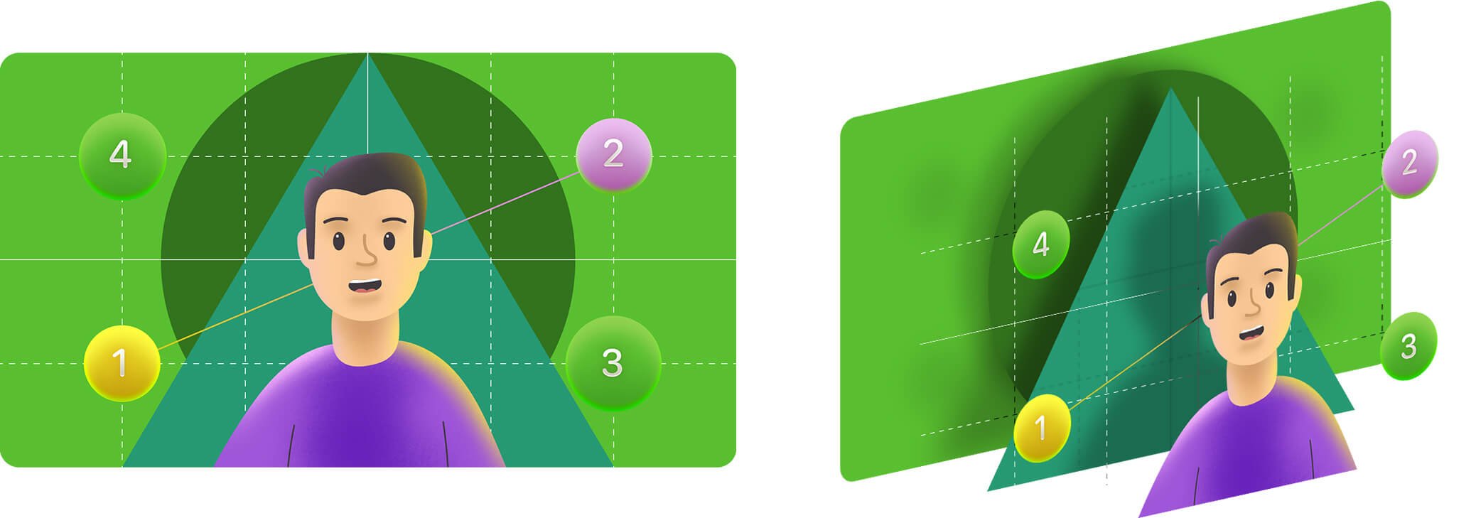
Looking purely from a geometric perspective, a graphic composition is two-dimensional, with only height and width. However, we are accustomed to perceiving depth in planar compositions.
For instance, a photo is a planar graphic composition. When we look at it, we can easily distinguish which objects in the image are closer to us and which are farther away. With a graphic composition, we unconsciously divide its space into depth levels, often referred to as the foreground, middle ground, and background.
Every graphic composition consists of at least two depth levels, even the simplest ones, like a white logo on a dark background.
The more complex the composition, the more depth levels it has.
Texts
Texts are the main difference between graphic design and fine art. They are typically incorporated in various design products, such as advertising posters, packaging, magazine spreads, and website designs.
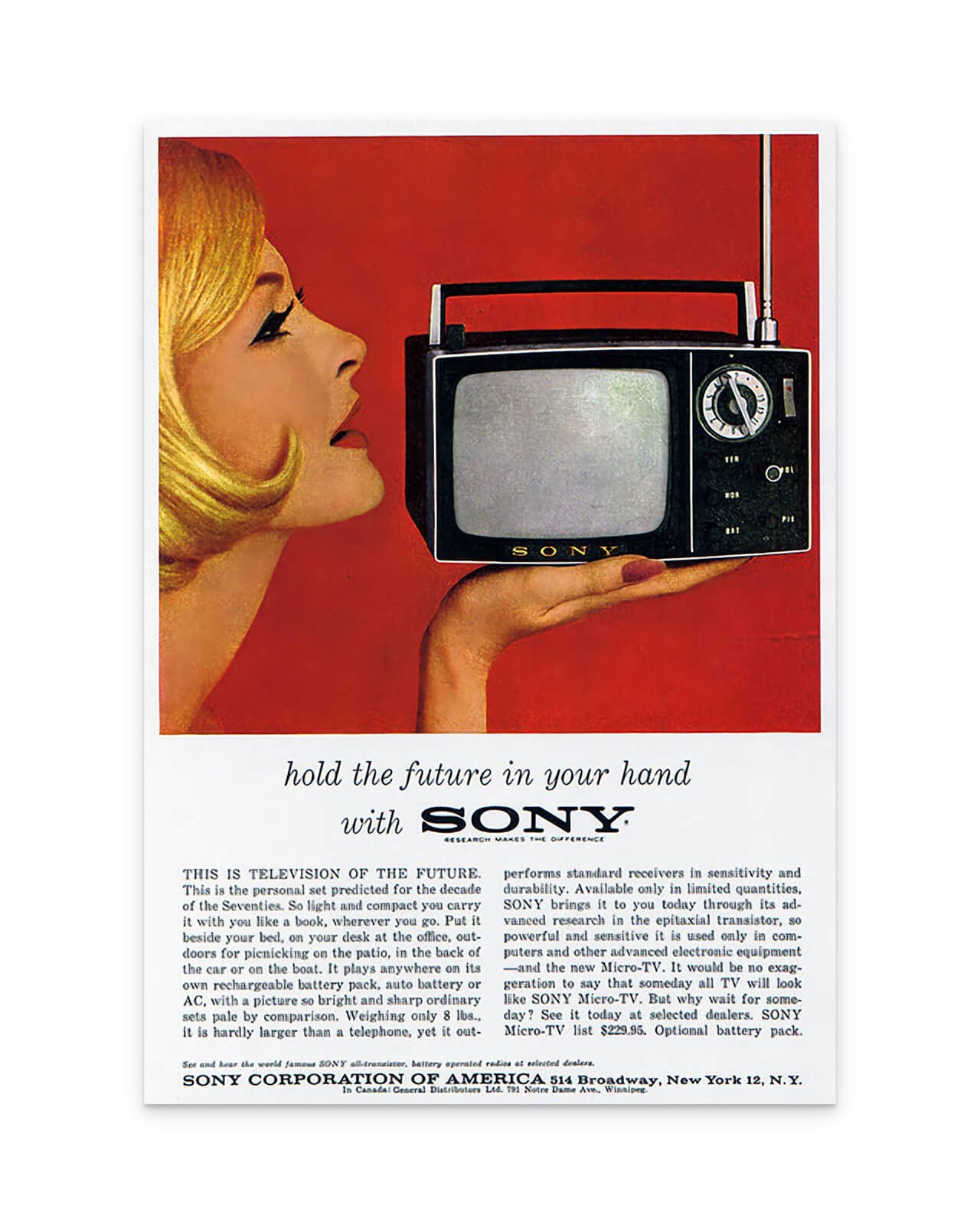
For example, in advertising, texts can convey the features and benefits of a product or service clearly and quickly. In the 1950s and 1960s, the marketing copy often had several paragraphs.
Text is an effective tool for conveying ideas, as words have the ability to explain and describe nearly anything. While some designers use text primarily for the rational aspect of composition, it can also be used to evoke emotions as well. The iconic election poster of Barack Obama, designed by Shepard Fairey, is an excellent example of this.
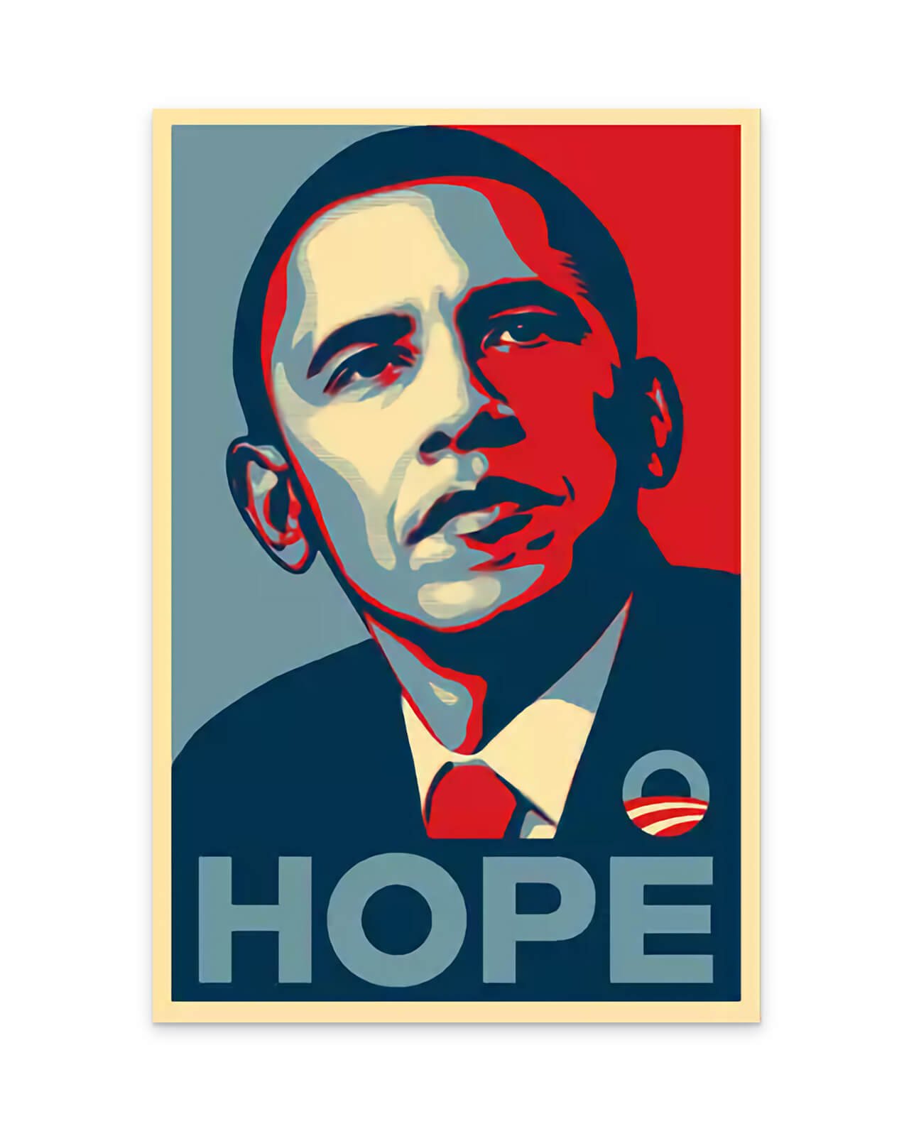
The word "Hope" on the poster conveys a strong emotional message, while the image of Barack Obama and the white, red, and blue color scheme only present a rational fact: that you are looking at the face of the US presidential candidate.
Text design is a significant aspect of graphic design that requires in-depth study of its compositional principles and rules. We will examine them separately in the typography course.
Graphic images
In a graphic composition, texts actively interact with graphic images. Images can come in various forms such as glyphs, emojis, illustrations, or photos.
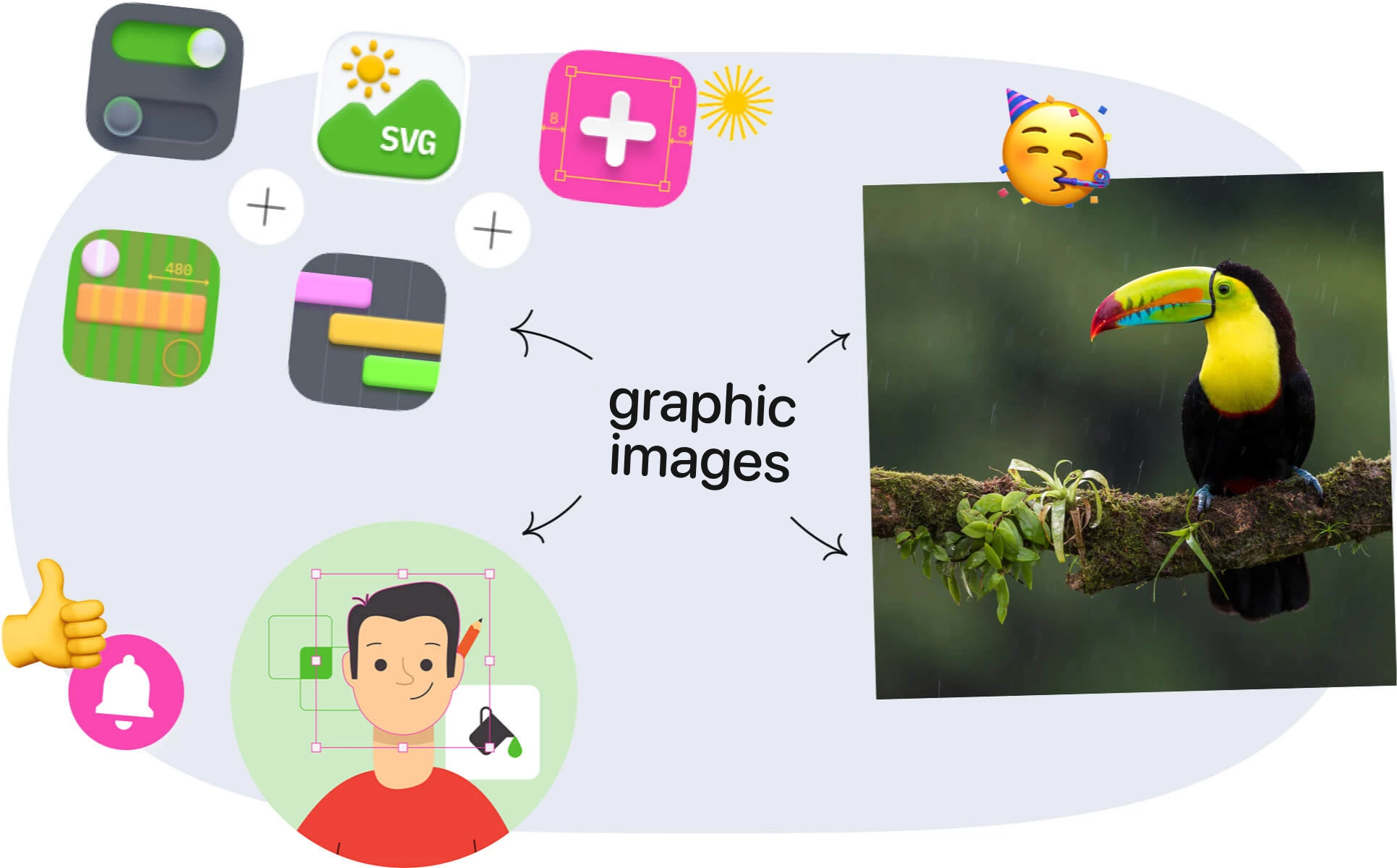
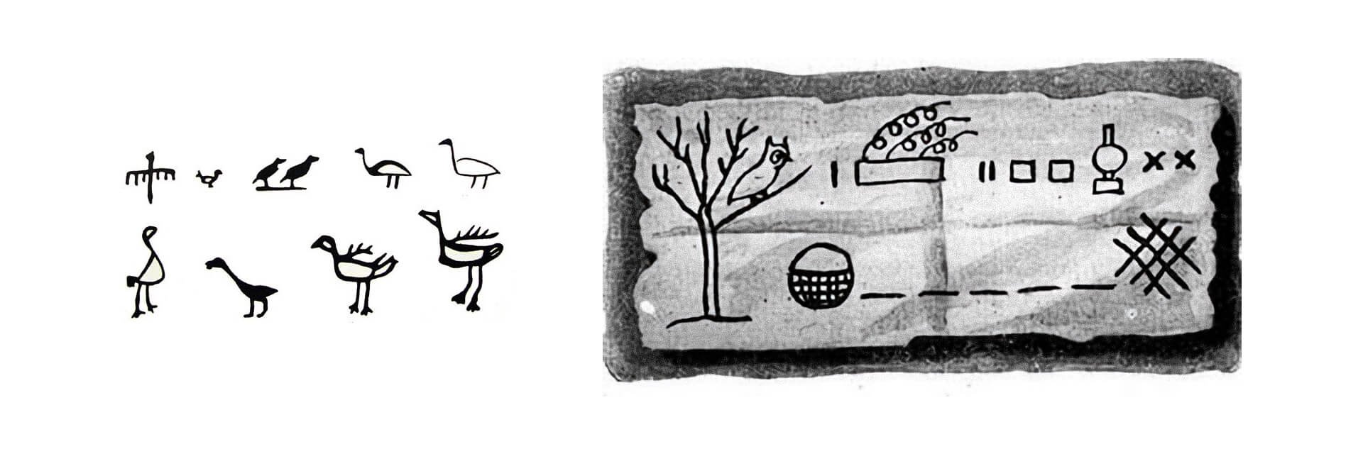
Just like texts, images can convey individual concepts and stories. In fact, the language of graphic images dates back much earlier than phonetic writing, which is commonly used today to write texts.
Before the alphabet was invented, people used so-called pictographic writing (which we will delve into in more detail in the lecture on the history of writing). In this writing, an image of a bird symbolizes a bird, a sun represents a sun, a tree represents a tree, and a river represents a river.
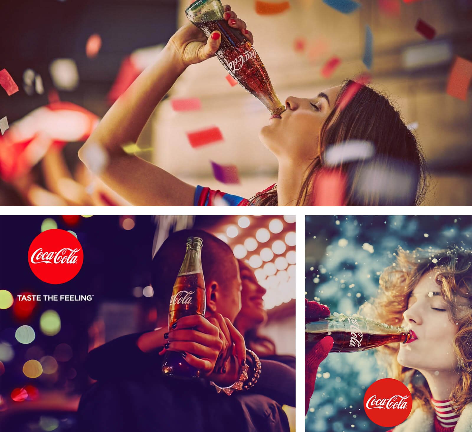
In graphic design, images are often used in a simple and direct way. For example, when Coca-Cola wants to encourage young people to drink its beverage, it shows young people drinking Coke.
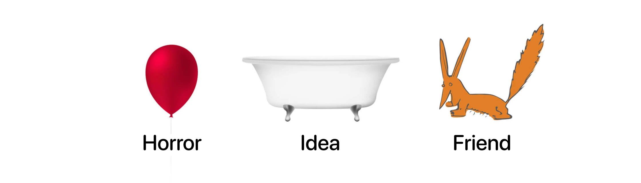
However, the straightforwardness of pictographic writing and images doesn't always work. If it were the case, guessing words like “eternity” or “uncertainty” in charades would be much less entertaining.
Moreover, graphic images don’t always convey meaning in a literal sense. For instance, an image of a glowing light bulb represents an “idea” rather than a “glowing light bulb.” Similarly, an image of a heart symbolizes love, a shield denotes protection, and a gear implies setting. Such interpretation of images is known as graphic metaphor.

By utilizing graphic metaphors and associations, you can add a new layer of perception to your designs. The effectiveness of your use of such tools will depend on your visual vocabulary, which is developed through your cultural awareness. Exposure to various forms of visual art, popular culture, films, and literature can enhance the creativity and originality of your metaphors.
In a way, we can compare the interaction between images and text in graphic design to that of melody and lyrics in a song.
Together, they form the narrative of the composition.
Art and decorative elements
In addition to graphic images and texts, graphic design often incorporates purely decorative elements.
Unlike graphic images, decorative elements are primarily used for aesthetic reasons and usually do not convey any emotional or rational information.
They can take the form of a pattern, a frame, an ornament, or an abstract shape, among others.
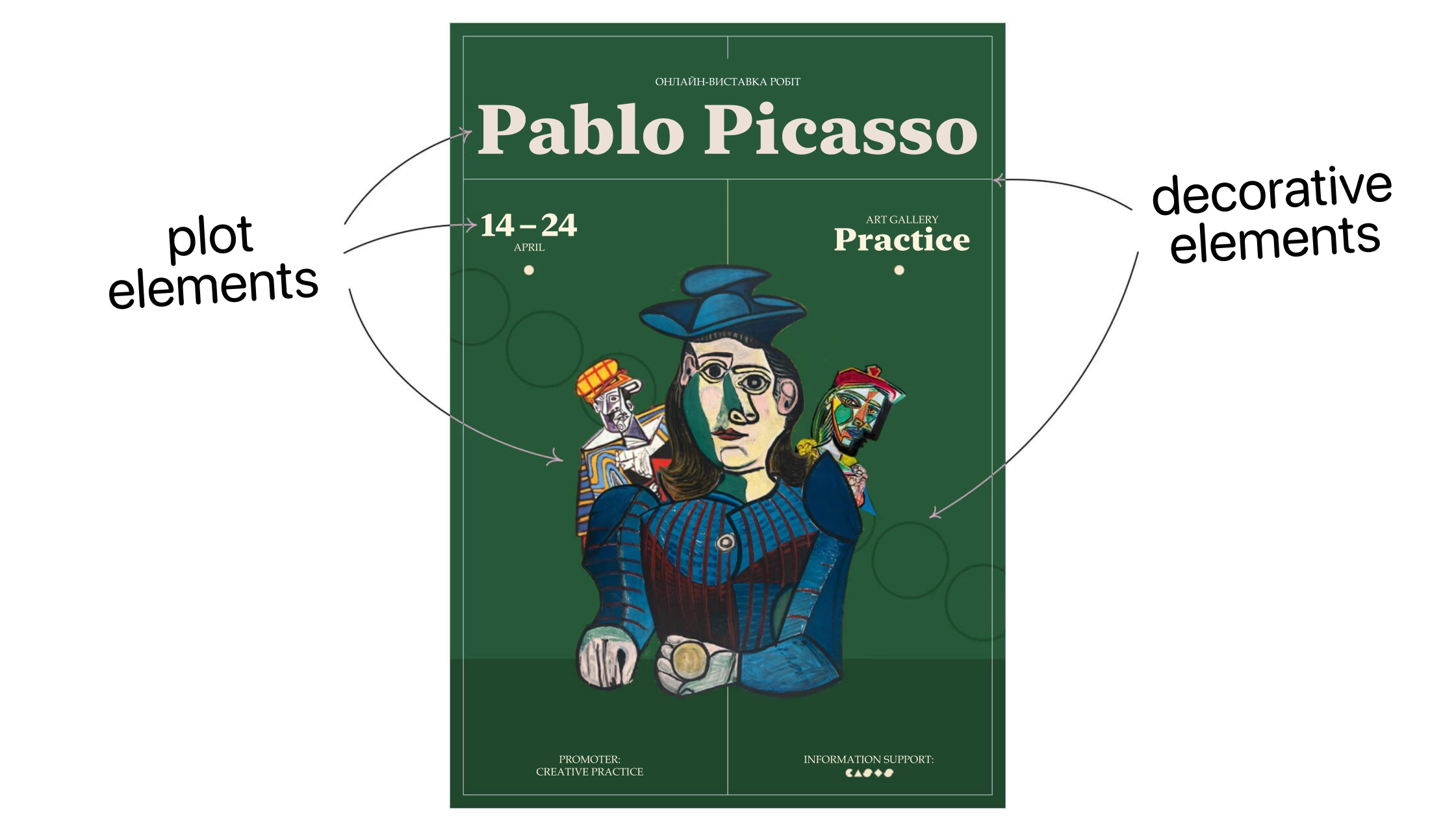
When used judiciously and thoughtfully, decorative elements can add interest and uniqueness to a composition. However, excessive use of such elements (a common mistake made by novice designers) can detract from the overall impression of the composition.
Color palette
Finally, the last component of the composition is colors.
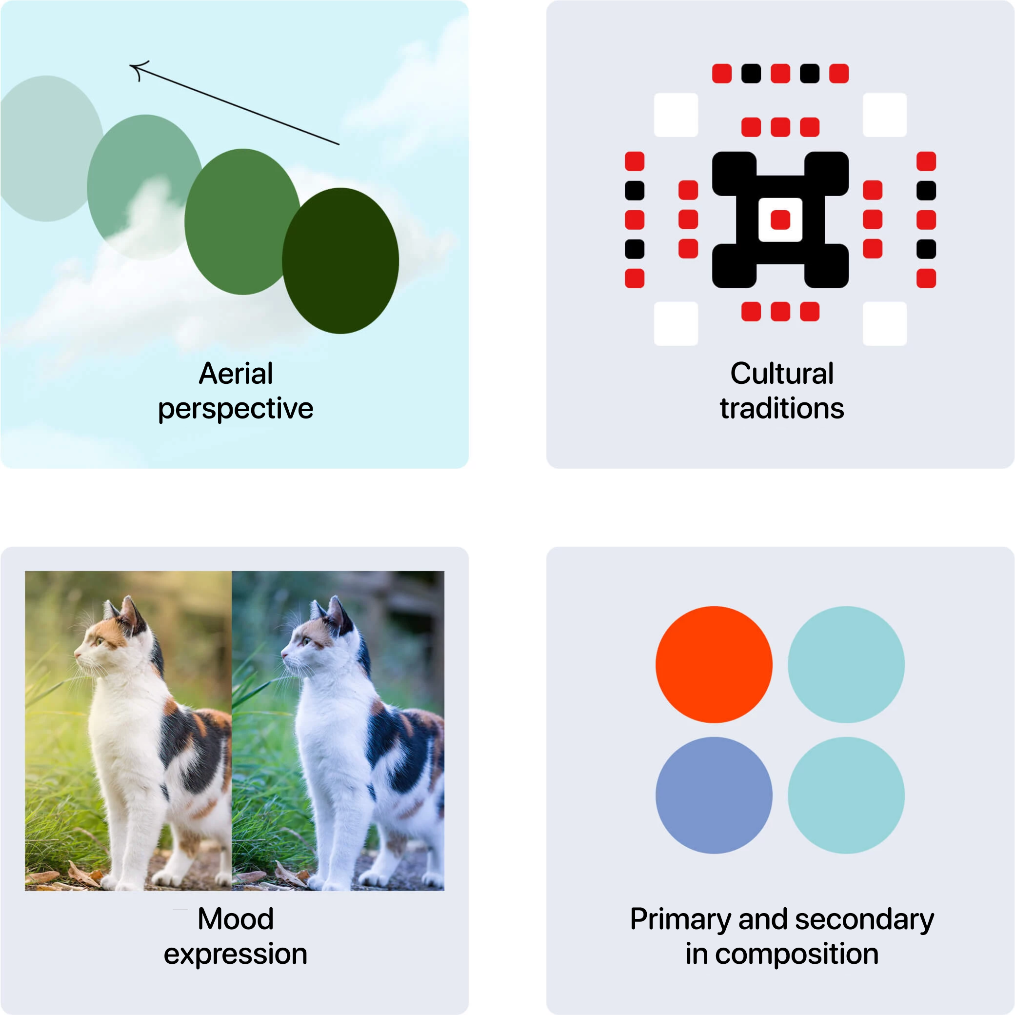
Colors add a whole new dimension to the perception of the composition! Colors can communicate an element’s position in space (this effect is known as “aerial perspective”), evoke cultural traditions, create a certain mood, and emphasize the primary and secondary elements in the composition.
Dealing with colors requires in-depth study, which is why we will cover it extensively in a separate course later on. For now, we’ll focus on some fundamental concepts of color theory.
How the composition components interact
So, when creating a composition, you utilize texts, graphic images, decorative elements, and colors to express particular ideas and emotions.
However, how can you ensure that the audience comprehends and senses the composition’s plot? How can you emphasize one plot element over another? How can you convey motion in a static image?
To achieve these goals, designers employ specific compositional principles and techniques. Compositional principles pertain to the composition's type and approach to construction, while techniques are known as expressive means of composition.
We'll delve into how they operate soon!