

In visual composition, designers express a unified concept on a two-dimensional plane using distinct graphic elements such as text, images, decorative elements, and color palettes. However, these elements represent only the visible aspect of a composition, readily noticeable and understandable to viewers.
Furthermore, a deeper level of composition exists, one that is less apparent but equally significant — the interplay between these elements and their impact on the viewer’s perception.
Let’s examine two graphic compositions featuring identical arrangements of black elements on a white background: a line, a circle, and four squares.
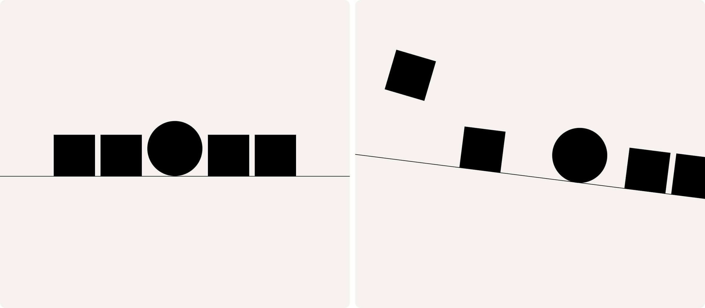
Although the structural elements of the compositions are identical, we perceive these two images in distinctly different ways. The left one appears static, stable, and harmonious, while the right one conveys a sense of movement of the elements.
In other words, placing elements within a composition is crucial in shaping our perception of it. Conversely, the way we perceive a composition is influenced by the placement of its elements within the composition space.
By strategically arranging elements at specific angles and distances from one another, you can dramatically alter the viewer’s perception of the composition.
At the same time, shaping the perception of a composition can be likened to the art of cooking. Just as a recipe for meat stew requires careful consideration of not only the ingredients but also the order and method of adding them, the success of a composition hinges on the approach taken in working with its elements. Just as undercooking the potatoes or over-salting can ruin a stew, mishandling a composition’s elements can harm its overall quality.

To prevent such issues, it is crucial to understand from the outset the desired qualities your future work should possess. By discerning your composition’s impact on the viewer, you can select appropriate techniques and design solutions more effectively.
A good starting point is determining the type of graphic composition that aligns with your idea.
Types of graphic composition
In reality, it would be more accurate to refer to the types of graphic composition as the structural types of visual composition. They establish the fundamental constructive principle of the composition and simultaneously impact its perception.
Altogether, there are three pairs of composition types:
- Closed and Open composition
- Symmetrical and Asymmetrical composition
- Static composition and Dynamic composition
To gain a deeper understanding of how these pairs function and how to use them in graphic design, let’s examine each of them individually. We will begin with open and closed compositions.
Open and closed compositions
Open and closed compositions vary based on the inclusion or exclusion of elements that define the boundaries of the composition.
Open composition
An open composition lacks boundaries or frames. This allows to convey a sense of spaciousness, freedom, and scale. In fine art, open compositions are commonly found in landscapes, where the main focus is on depicting the space itself.
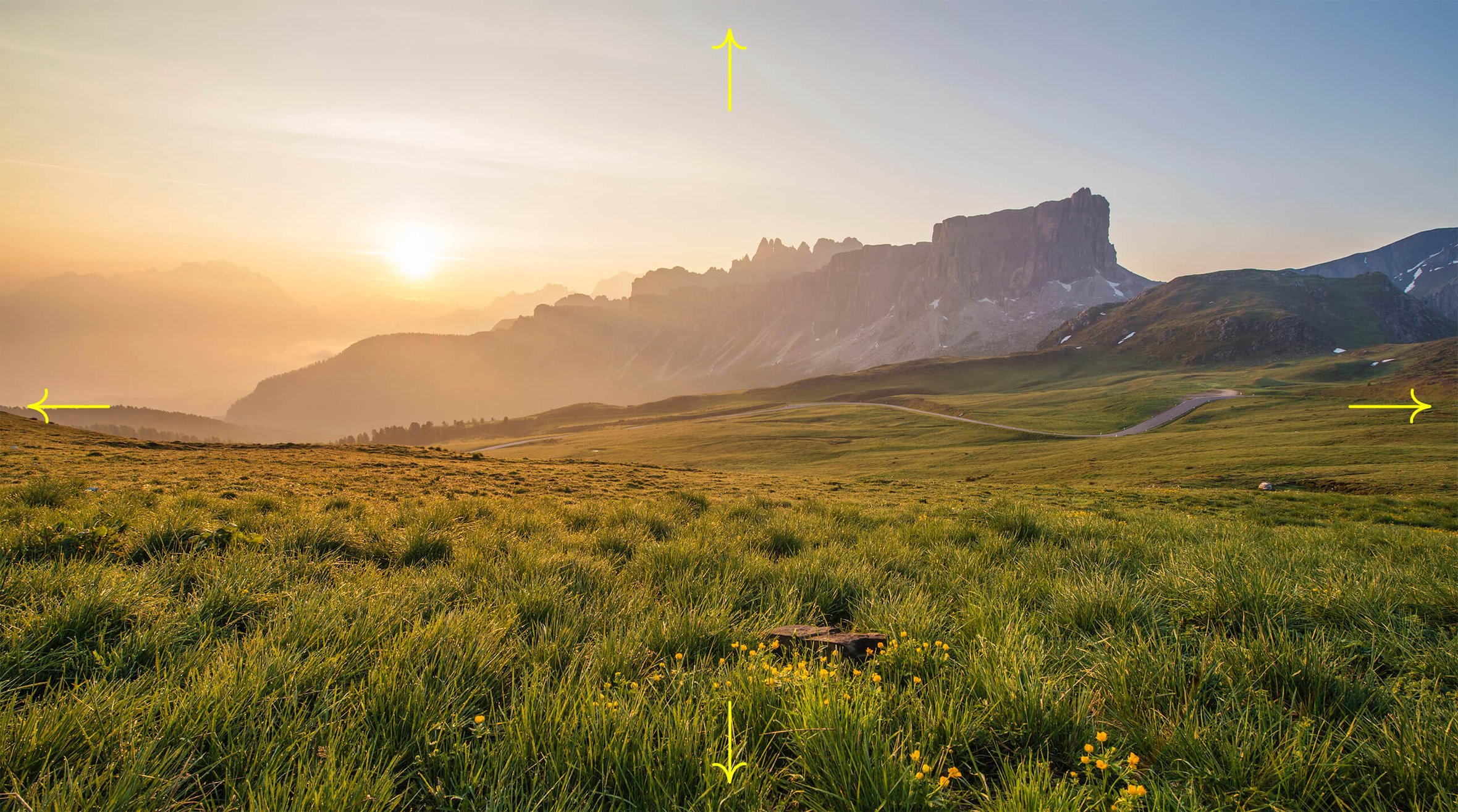
In graphic design, an open composition refers to a layout that doesn’t include any restrictive elements or frames.
Such compositions are often perceived as more expansive and unconstrained.
Closed composition
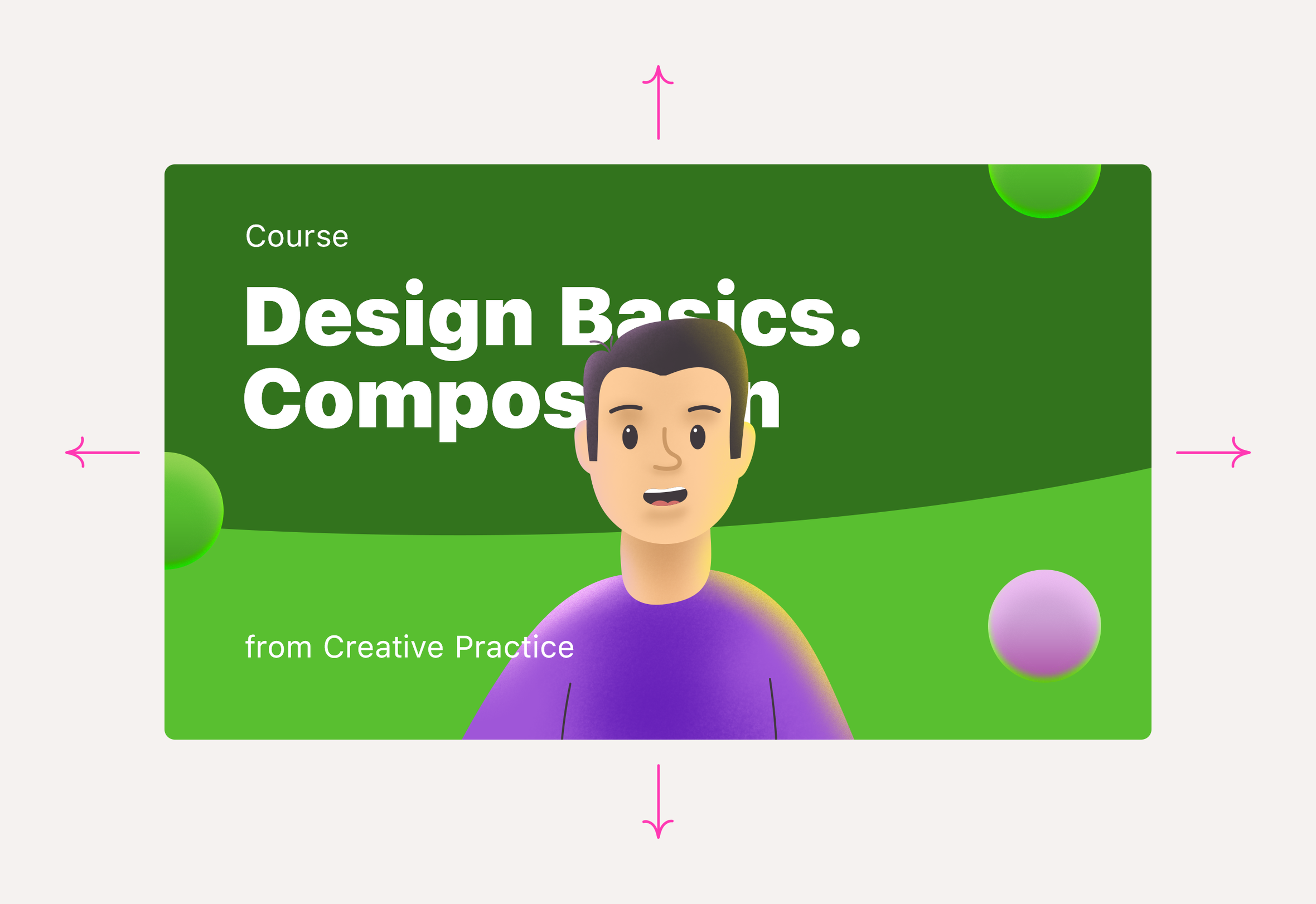
In a closed composition, the main elements are typically enclosed or surrounded by limiting elements.
In fine art, this could be represented by mountains, trees, or the outline of a window:
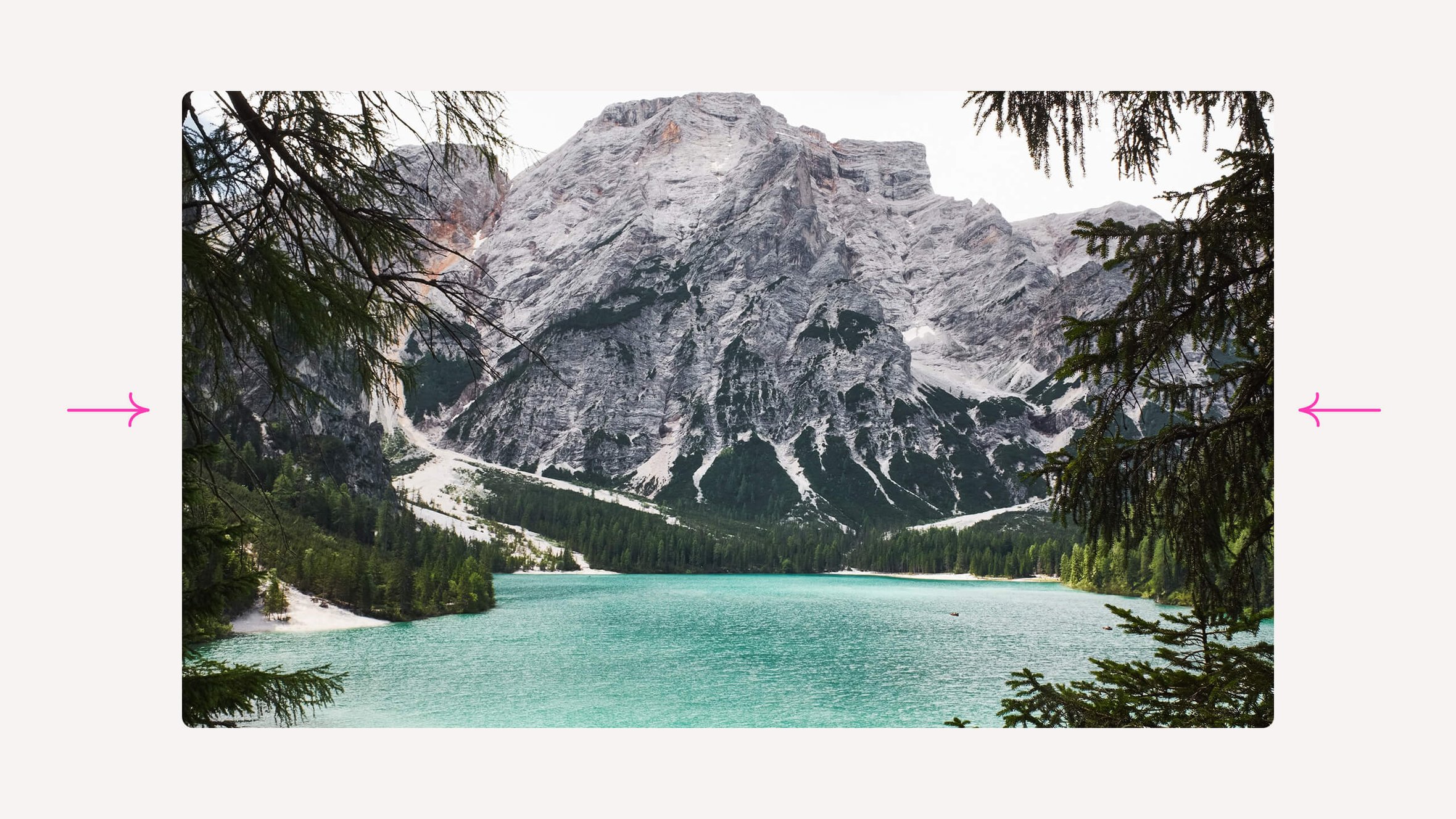
In graphic design, the closedness of a composition is often achieved by incorporating contour frames or abstract bounding shapes.

A closed composition may feel less spacious, but it allows you to direct your eye more effectively. In visual arts, a closed composition can help emphasize the main character or draw attention to a key element in the narrative.
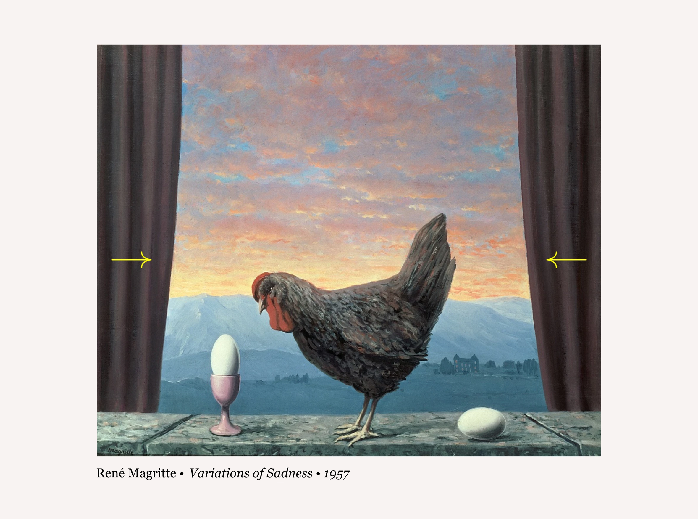
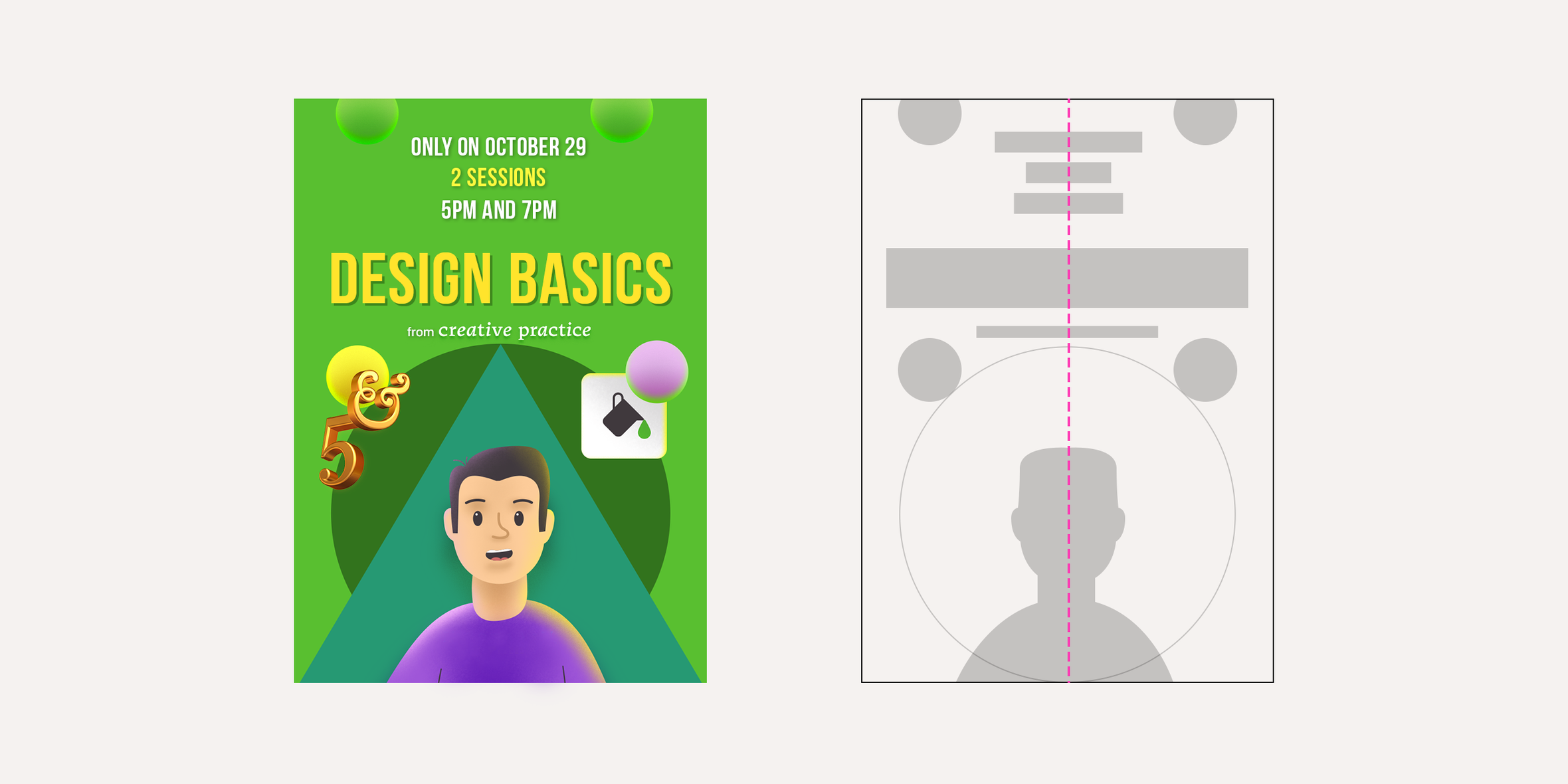
Composition frames create a sense of coherence and unity among diverse elements. You can close a composition not only with a frame; a simple rectangular shape placed in the background can achieve the same effect. Placing text within a separate container makes it easily distinguishable from the rest of the information. This technique is commonly employed in graphical interfaces, book covers, and advertising design.

Symmetrical and asymmetrical compositions
There is a prevailing misconception regarding symmetrical and asymmetrical compositions. Some experts mistakenly believe that symmetrical compositions are solely comprised of two identical halves mirrored to each other, as seen in playing cards, for instance.
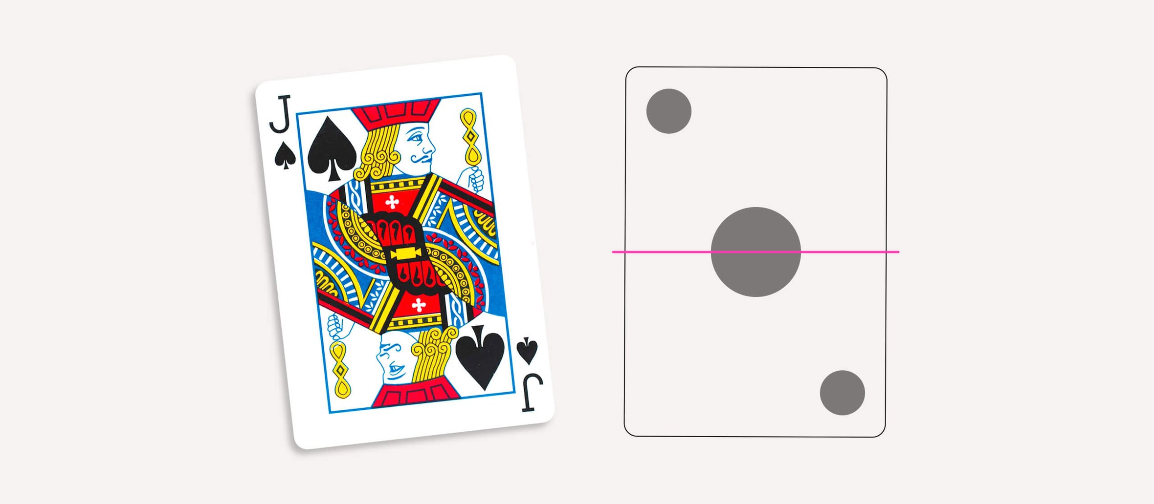
However, this understanding is incorrect. The symmetry or asymmetry of a composition is determined not by the mirrored identity of its halves but rather by the presence or absence of a structural component known as the axis of symmetry.
Symmetrical composition
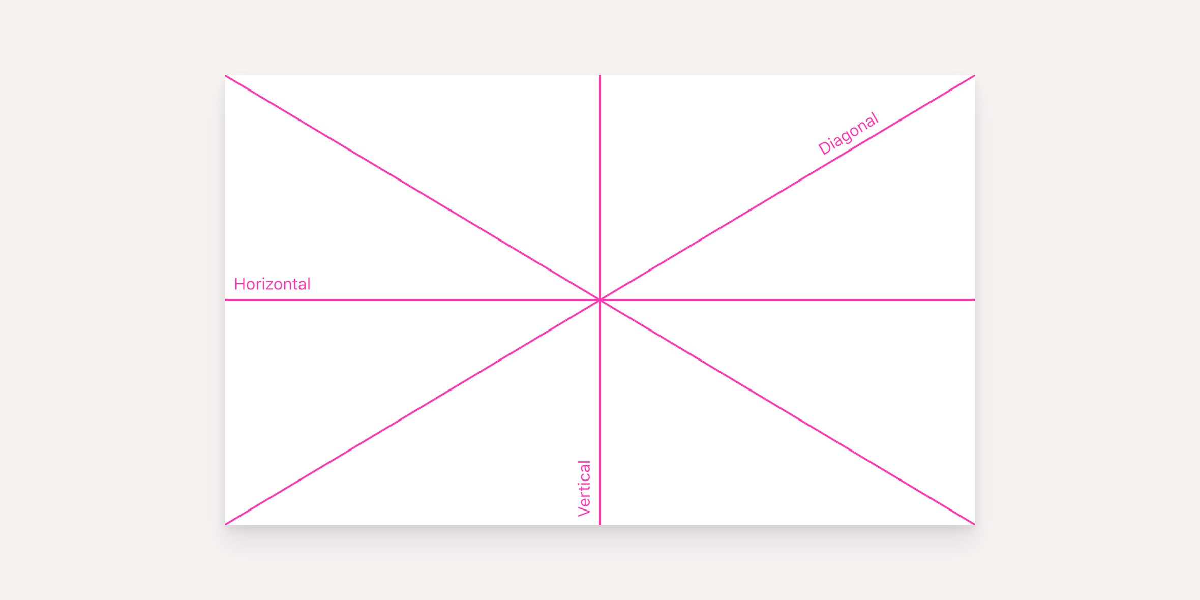
A symmetrical composition is structured around an axis of symmetry, typically an imaginary line that divides a plane into two equal and mirrored halves.
In visual compositions, axes of symmetry can be horizontal, vertical, or diagonal.
In certain cases, the format itself prompts interaction with the axis of symmetry. For instance, in a magazine or book spread, it serves as a purely technical component.
The term “symmetry” originates from ancient Greek and directly translates to “proportionality.” Symmetry, by its inherent nature, represents balance, and thus the line of symmetry serves as a constructive reference point for perceiving the composition’s balance or imbalance. This is one of the reasons why numerous ancient architectural structures prominently feature well-defined lines of symmetry.
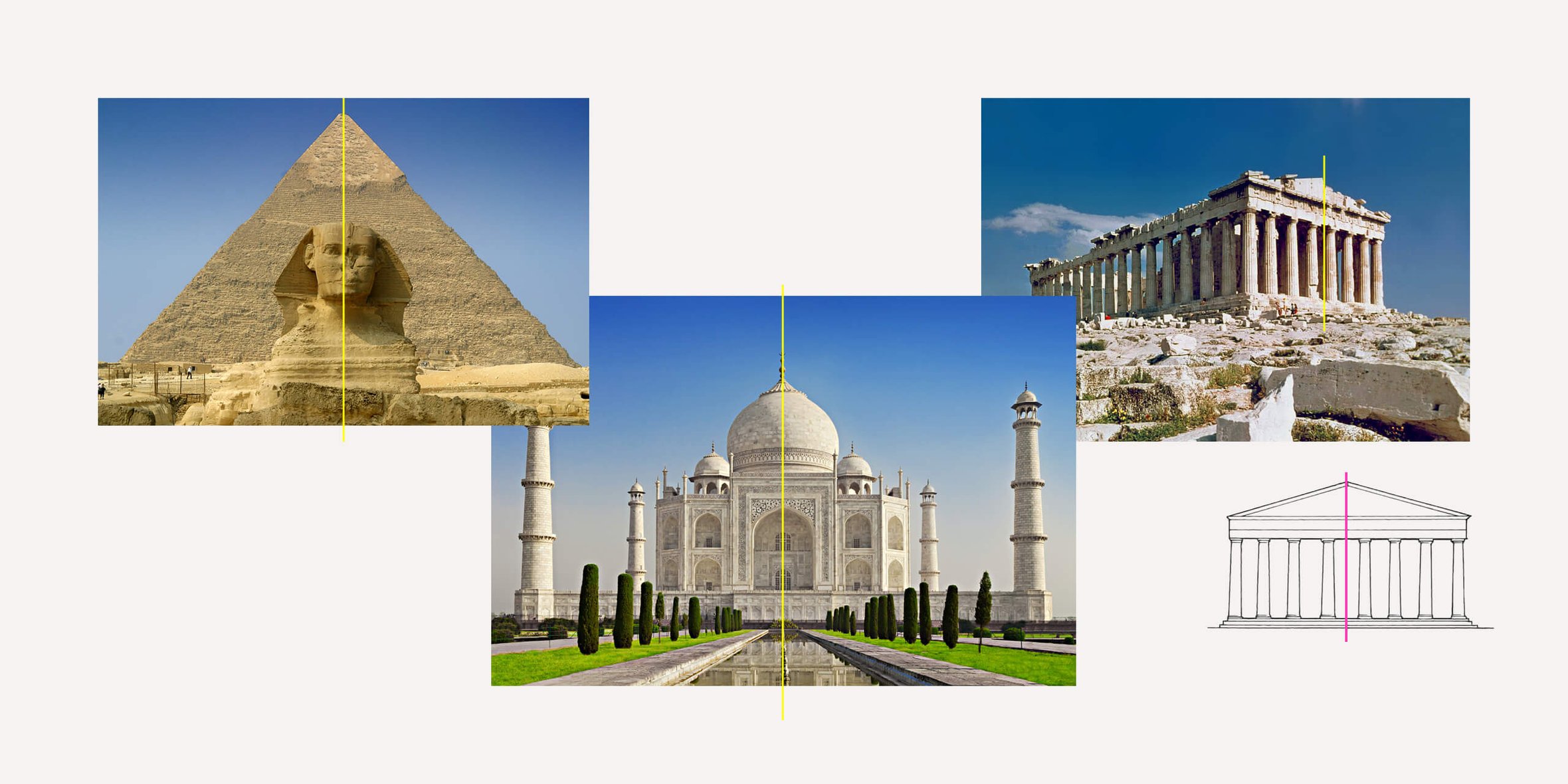
In graphic design and fine art, a symmetrical composition may not always stand out at first glance. However, adding dotted lines makes the significance of the symmetry axis within the composition’s structure readily apparent.
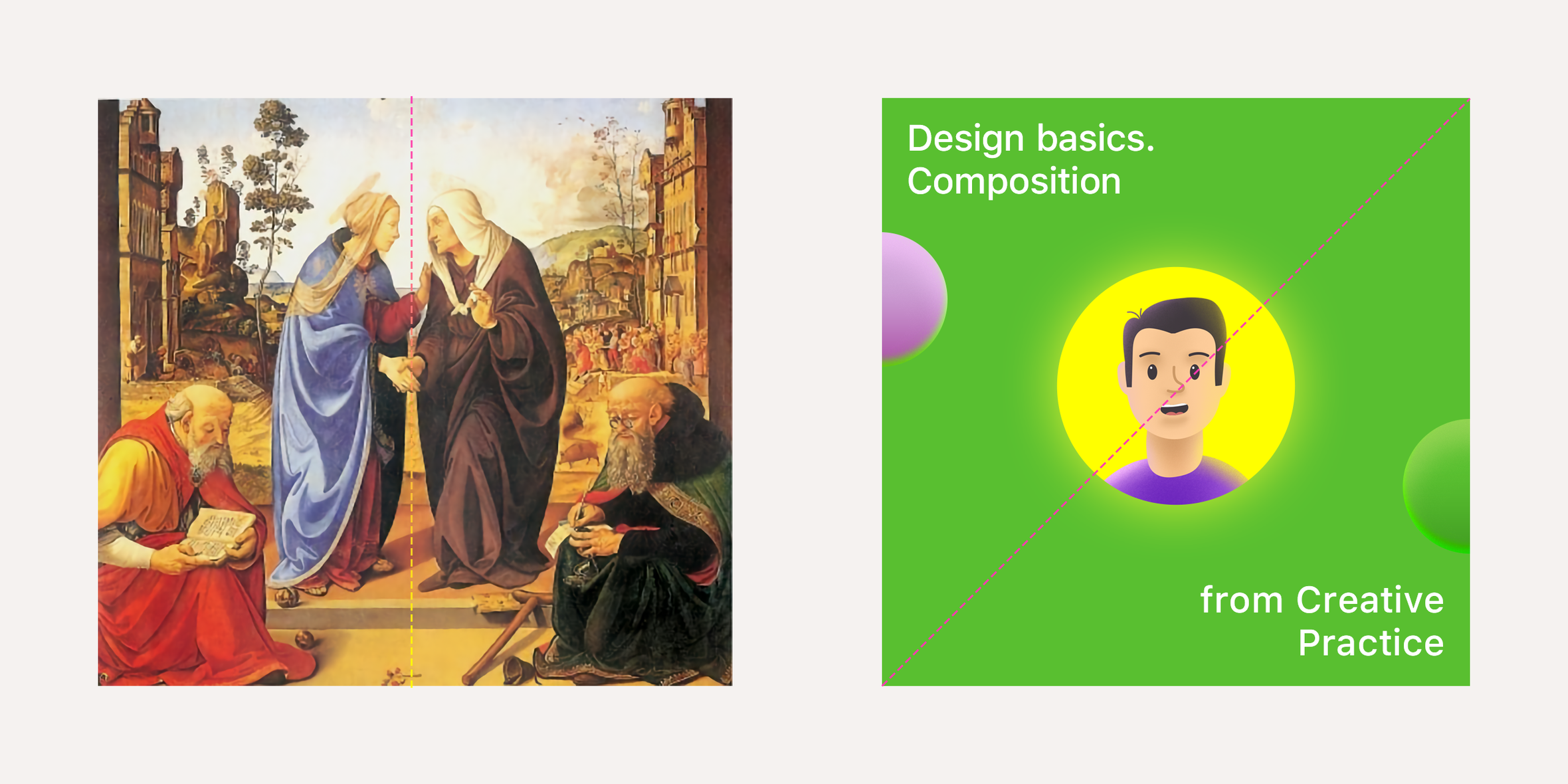
Compositions employing symmetry axes are generally perceived as organized, harmonious, and balanced.
Asymmetrical composition
An asymmetrical composition is devoid of symmetry lines, making it more challenging to achieve visual balance.
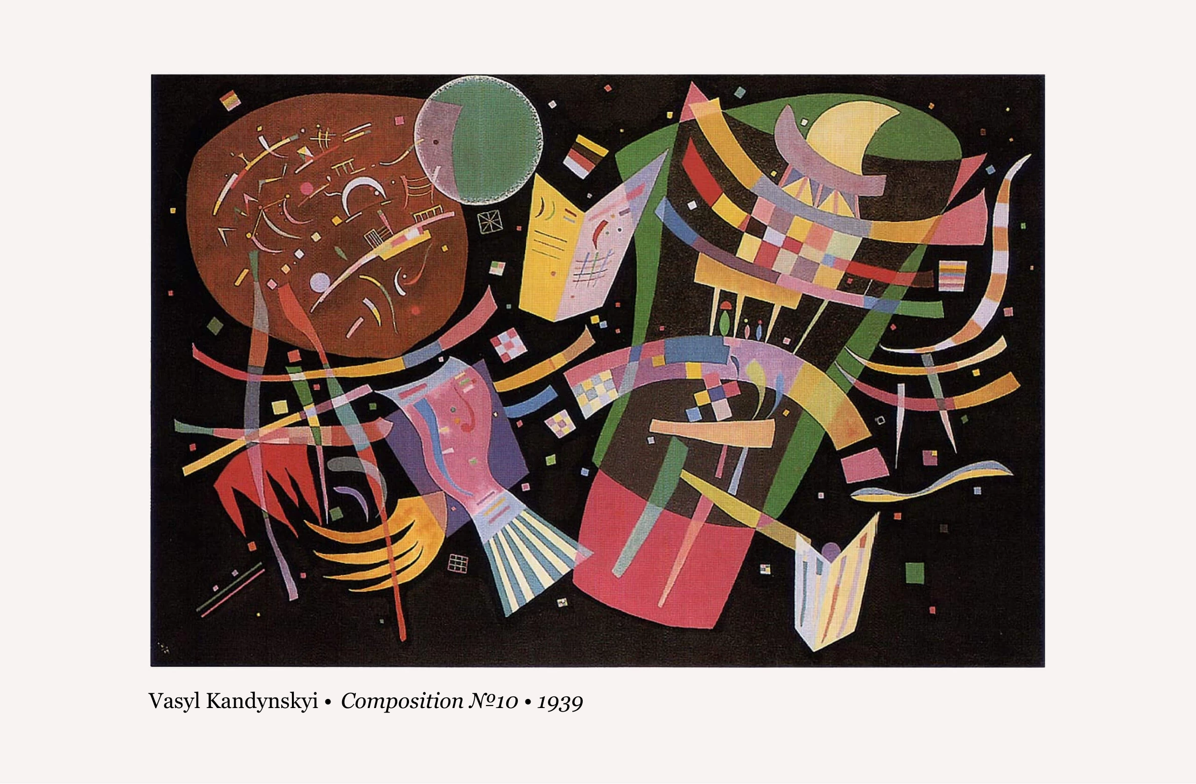
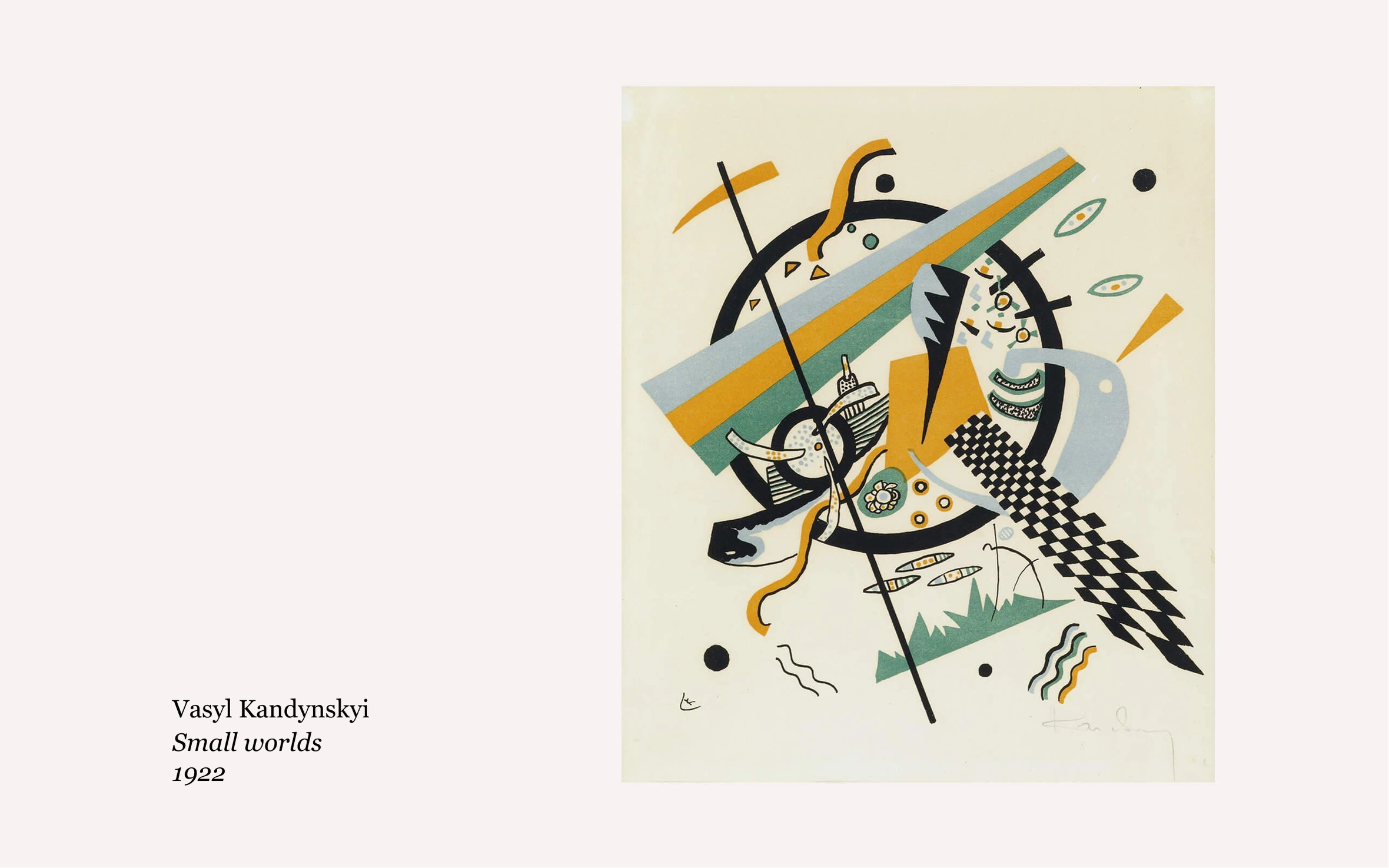
However, this absence of symmetry gives the work a unique sense of dynamism and individuality. Take, for instance, the whimsical and captivating asymmetry found in the works of Wassily Kandinsky.
Asymmetry also characterizes the art of Jackson Pollock, who created his paintings through splashes of paint.
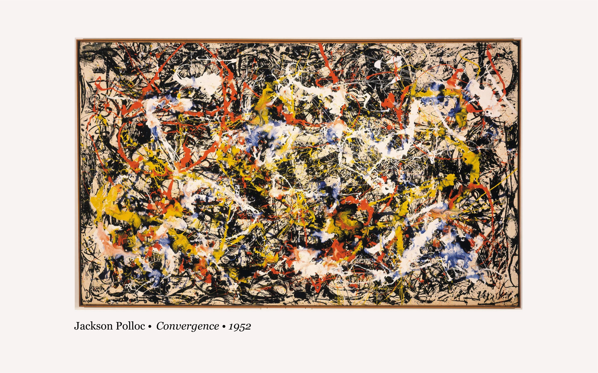
The asymmetrical composition is a vibrant embodiment of creative freedom, so graphic designers often employ it for posters promoting art exhibitions or theater premieres.
Static and dynamic compositions
A static composition evokes feelings of stability, stillness, and equilibrium, while a dynamic composition captures a sense of motion.

In the left photo and the one on the right, the individuals are not actually in motion. However, when asked to describe what is occurring in each image, we naturally say, “The person on the left is standing, and the person on the right is running.”
In reality, both images are static, and specific compositional techniques influence our perception of movement or stillness. Let’s explore these techniques in more detail.
Static composition
In photography or fine art, we interpret the depiction of a motionless object or a person standing still as static.
In graphic design, we frequently work with abstract forms such as geometric shapes, typography, patterns, and so on. However, our perception enables us to perceive them as relatively static. Put simply, the more the elements in your composition convey a sense of stillness, the more static it appears.
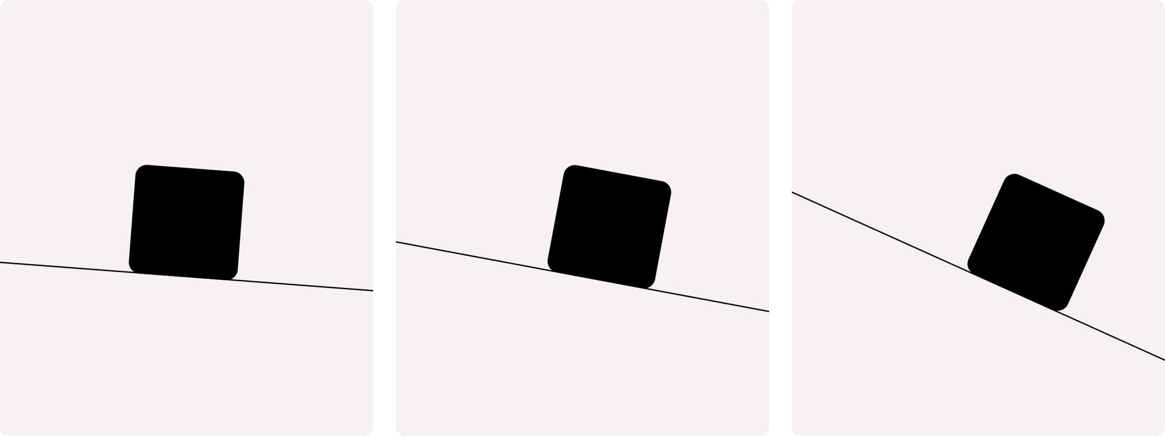
A straightforward example illustrating the static nature of an abstract shape is the image of a black square positioned on a horizontal line.

It appears motionless because there are no indications of movement, similar to a black cube resting on a flat surface. That’s why compositions relying on horizontal guidelines are typically perceived as more static overall.
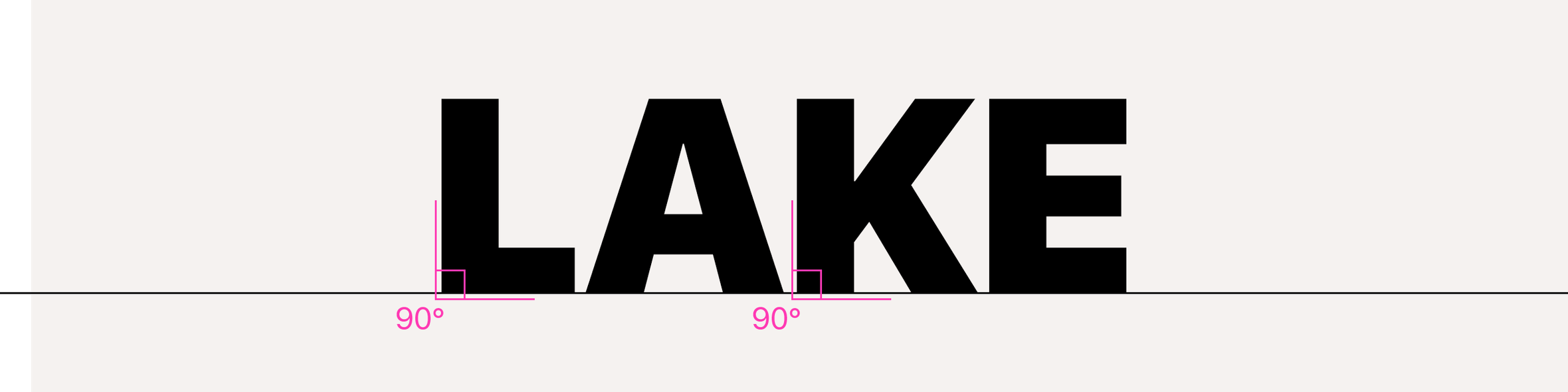
This stroke aligns with the baseline in a dominant vertical stroke font, forming a 90° angle.
The more rectangular a graphic composition is, the more it tends to be perceived as static.
Dynamic composition
A dynamic composition evokes a feeling of movement. Simply alluding to the image of movement is often sufficient to make the viewer feel the dynamics.
In the case of abstract shapes, such as the black square example, the impression of movement is often achieved by positioning the shape on an inclined diagonal rather than a static horizontal line. The greater the inclination angle, the more pronounced the sense of movement becomes, prompting our consciousness to sense the potential for motion.
Diagonal lines are frequently utilized in compositions to evoke a sense of dynamism. They don’t necessarily need to be overtly pronounced; these diagonals can manifest as guiding lines.

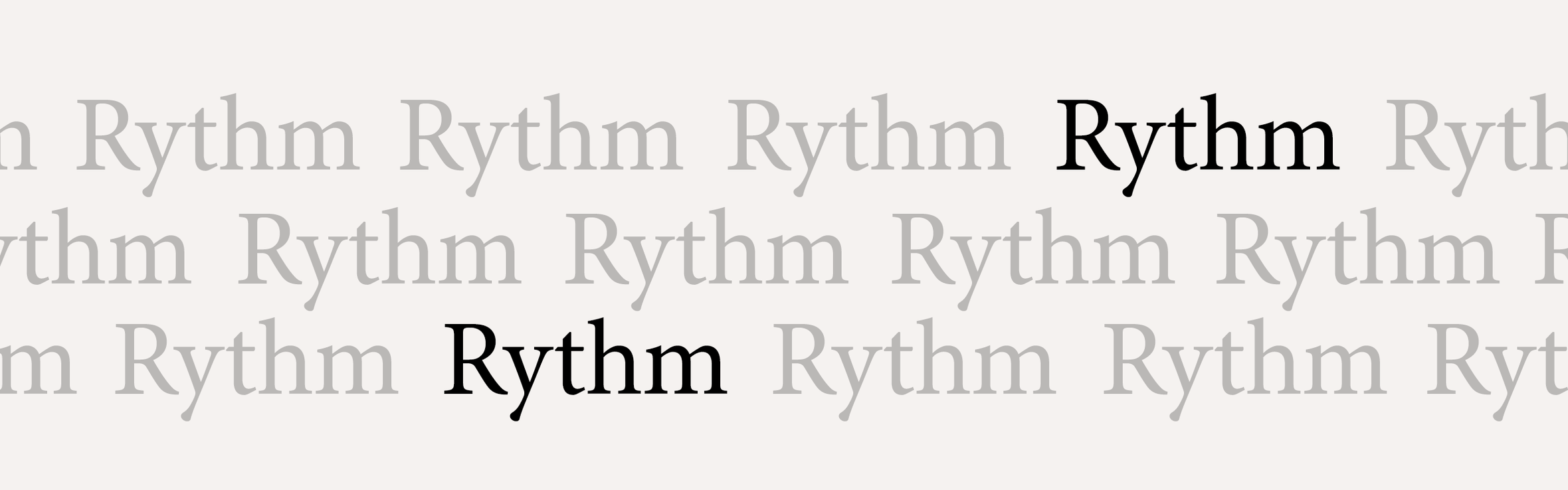
Another effective method for conveying dynamics is through visual series, where you repeat a particular element multiple times with slight variations in spacing. This can take the form of circles, as seen in the iconic title sequence of a James Bond movie, squares, or even repeated inscriptions.
Interaction of composition types
Each graphic composition can be categorized according to these types. But it will belong to only one type within a pair.
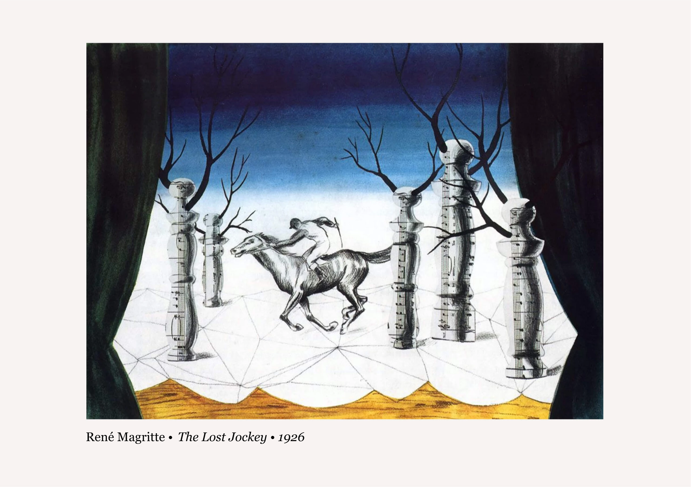
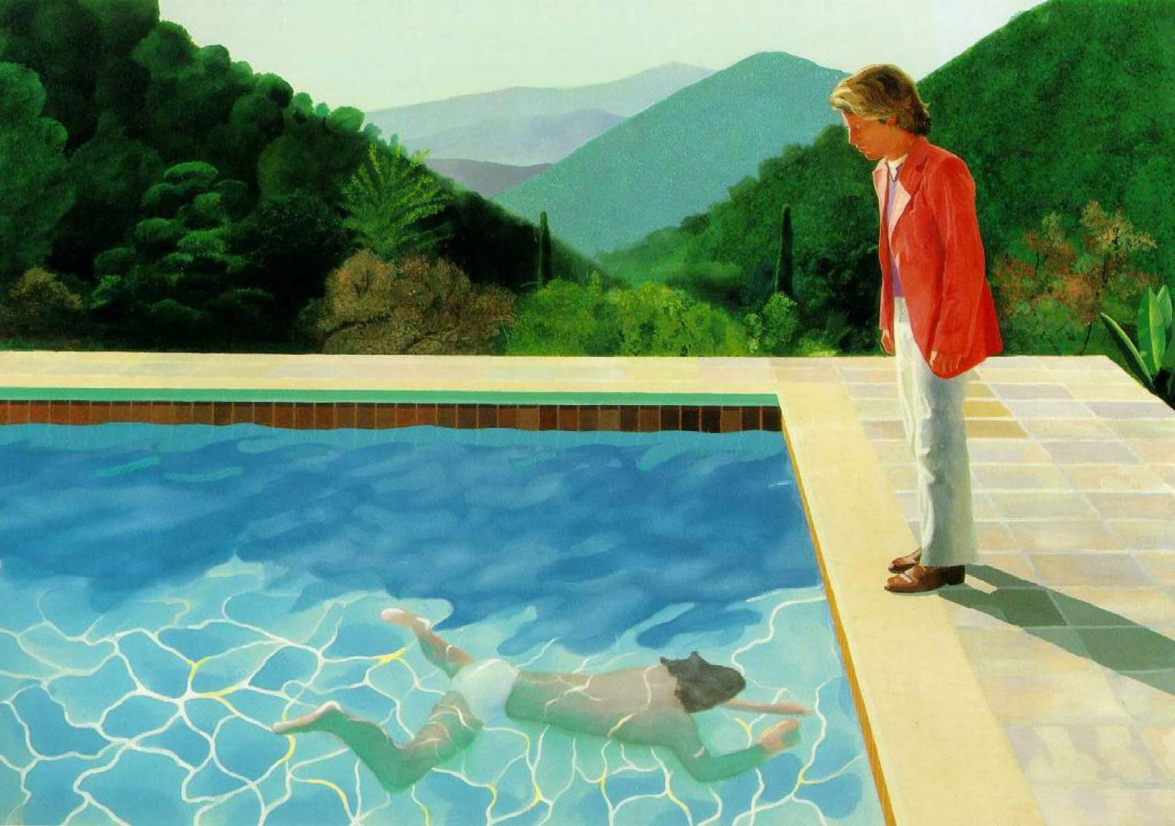
Take, for instance, David Hockney’s painting “Portrait of an Artist,” which exhibits an open, symmetrical, and dynamic composition simultaneously.
However, a composition cannot simultaneously belong to two types within the same pair. In other words, a composition cannot be both closed and open or static and dynamic.
In graphic design, it is common to have multiple compositions coexisting within the same plane simultaneously.
For instance, take Hockney’s painting we mentioned earlier, which serves as a standalone graphic composition. It can also be utilized as a background image, while on top of it, there could be a user account login window. In this case, the composition of the background image would be open and dynamic, creating a sense of space and movement. Meanwhile, the composition of the login window would be closed and static, helping to direct the user’s focus to the desired position.
How to define and select composition types
When determining the type of an existing composition, a simple way to approach it is by considering how it evokes certain feelings within you.
Sense of space, freedom, and lack of restrictions → an open composition.
Sense concentration and focus due to limitations → a closed composition.
Sense of order and balance → symmetrical composition.
Sense of disorder and creativity → asymmetrical composition.
Sense of calm and stability → static composition.
Sense of movement and energy → dynamic composition.
These composition types hold significant expressive power on their own, but they are just a part of the broader range of expressive tools.
In the following article, we will delve into other expressive tools and demonstrate how they can be employed to convey even more ideas and images.


