This one was personal from the start.
The client came with a dream — a marketing agency that actually enjoys what it does. No corporate stiffness, no performance of seriousness. Just good work, done with energy. My job was to make sure that feeling didn't get lost somewhere between the brief and the final file.
The real question behind the brief
Before I opened a single design tool, I spent time with the question that matters most: what does "fun" look like when it still has to earn a client's trust? Because that's the real challenge — playful is easy, playful-and-credible is design.

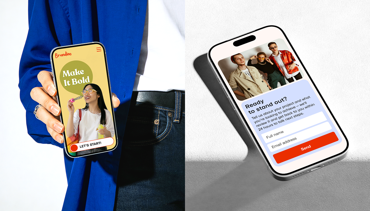
Building an identity with a backbone
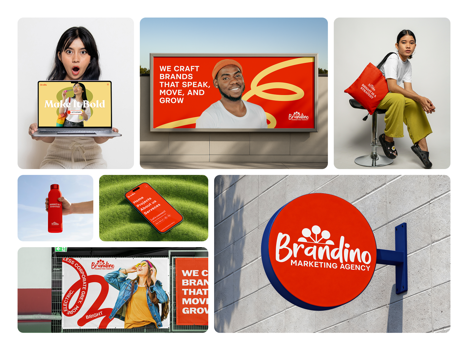
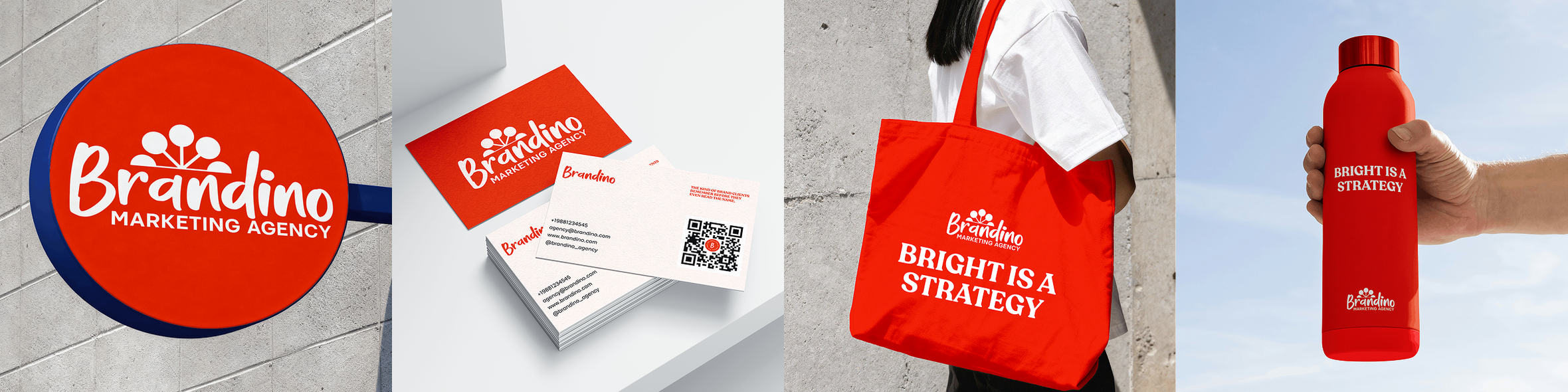
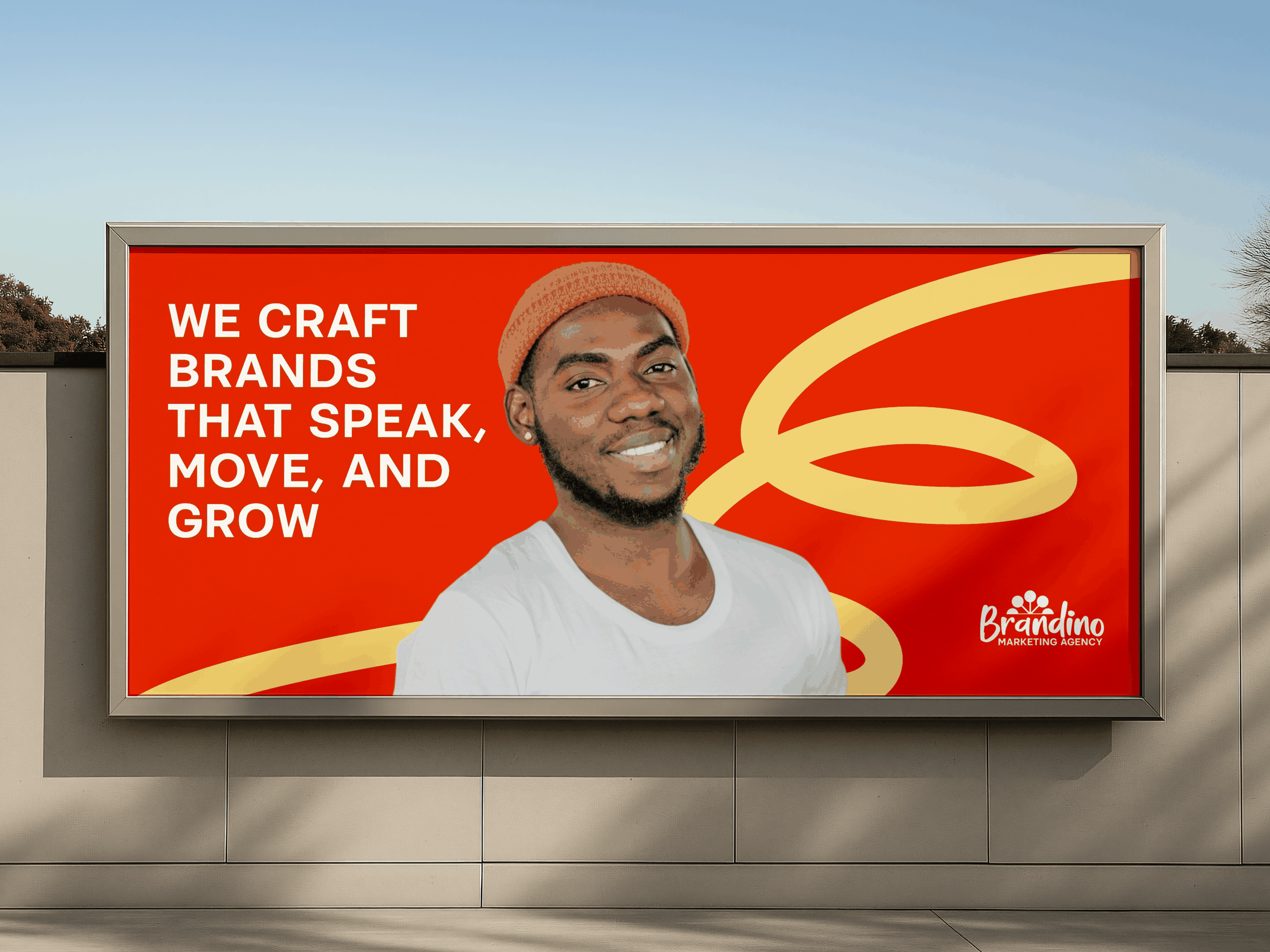
I built the identity around confidence. Bold shapes, a colour palette that doesn't apologise for itself, typography with a voice. The logo is simple enough to live anywhere, strong enough to own a room. The brand guidelines gave the team something they could actually use — not a rulebook, but a language.
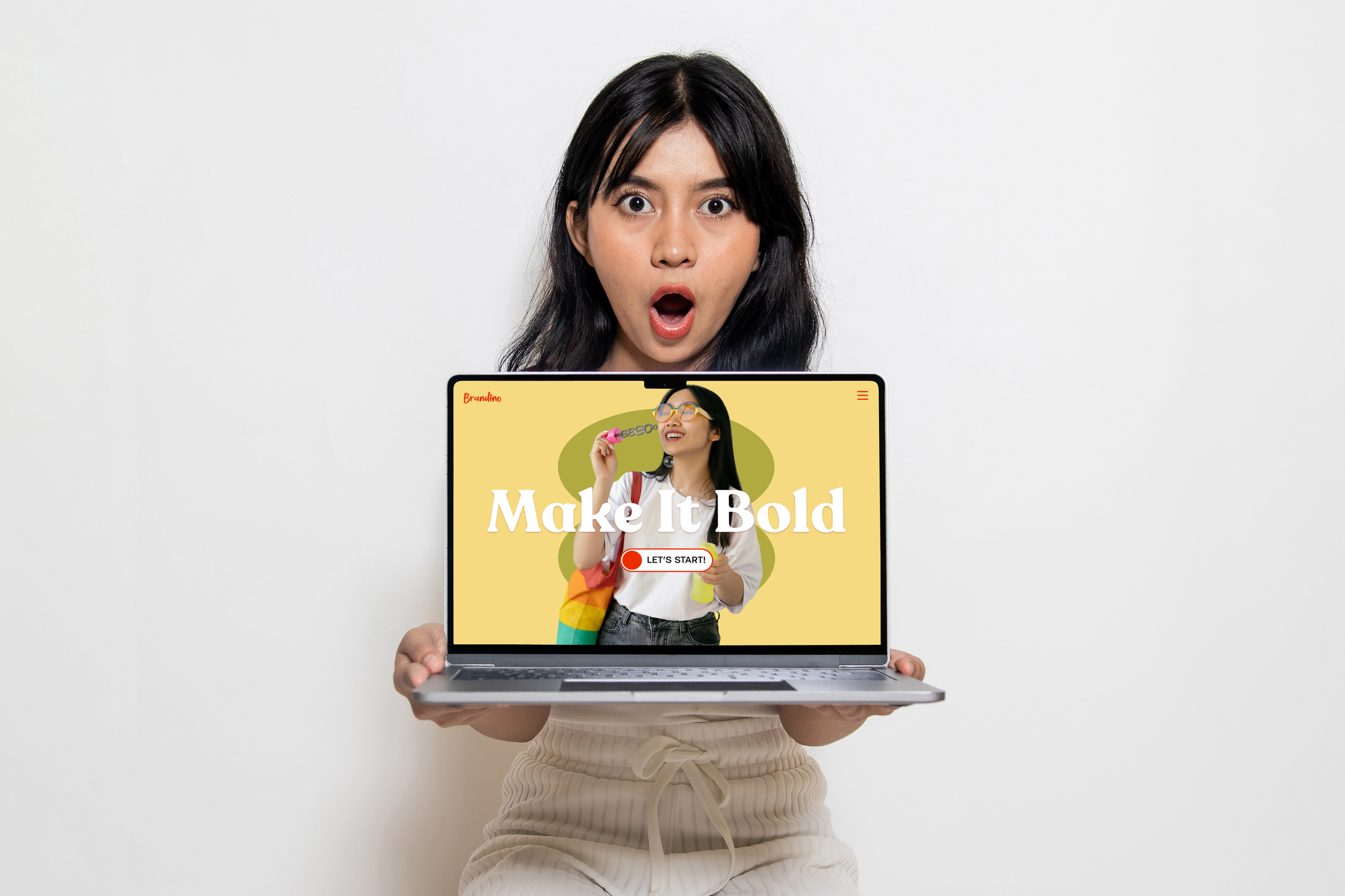
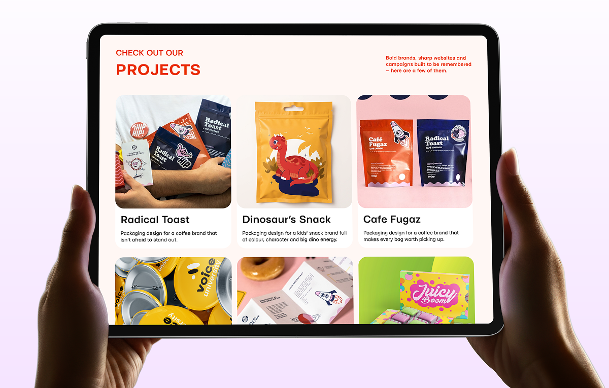
A website that actually sounds like the brand
The website was the last piece, and in some ways the most important. It had to feel like the brand talking, not a template wearing the brand's colours. Every section was written and designed together, so the tone and the visuals say the same thing.
The result
Brandino looks like a studio that knows exactly who it is. That kind of clarity doesn't happen by accident.