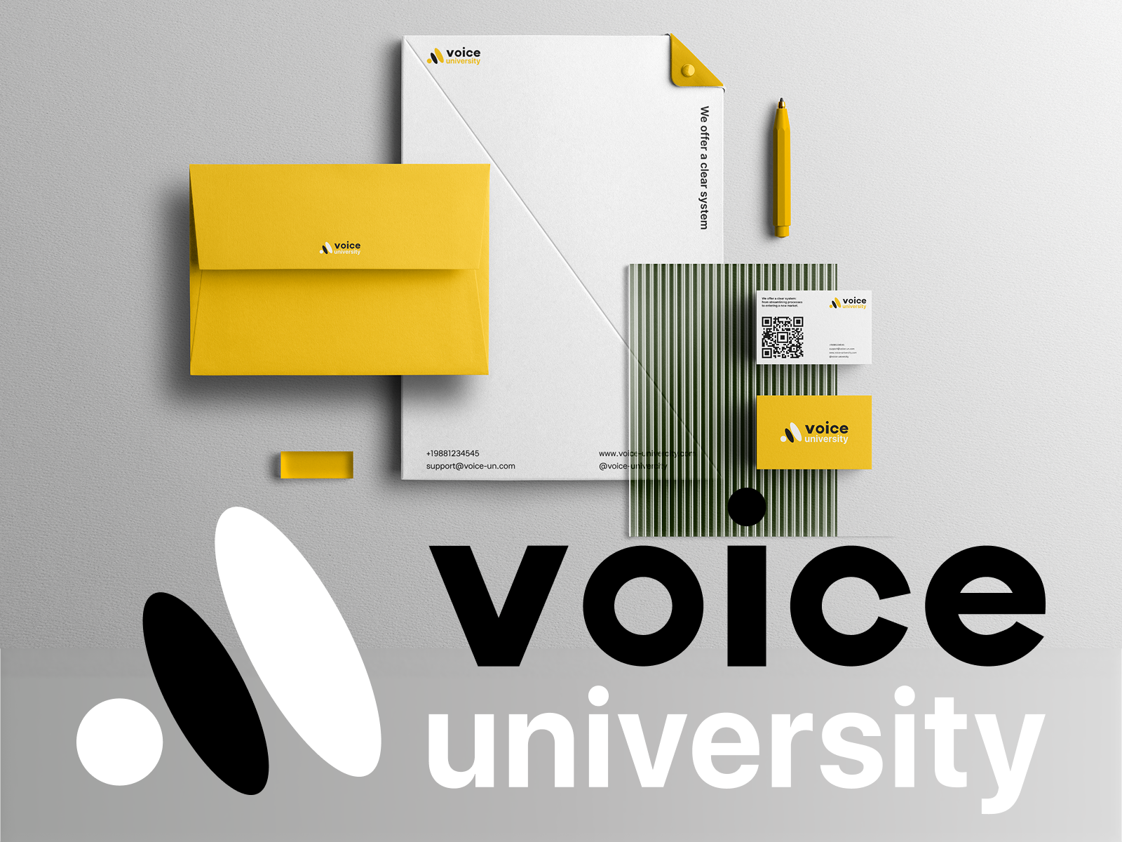
Voice University: Building a Bold Visual Identity for a New Generation of Entrepreneurs

Concept project, created for portfolio purposes.

The Brief
Voice University is an educational platform for entrepreneurs aged 25–30 who already run a business but are ready to move from chaotic survival mode into systematic, sustainable growth. As a personal concept project, I imagined the brand's positioning as a space designed for people who think like founders — fast-moving, hands-on, and allergic to unnecessary formality. The imagined 4-month program would walk participants through a clear system, from building solid business processes to scaling into new markets.
The Challenge
I set out to design a logo for this concept, and as I developed the brand's positioning and audience, it became clear that a single logo wouldn't be enough to carry everything this brand needed to communicate. The target audience — young, ambitious founders — needed a brand that felt modern, energetic, and authentic, not stiff or overly polished. At the same time, the identity had to carry enough weight and credibility to represent a serious educational product with real business value.
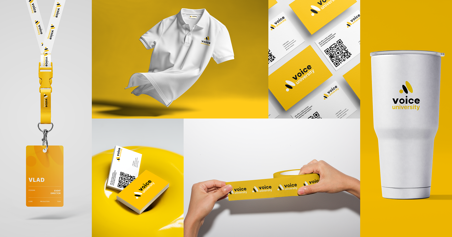
What started as a logo exercise grew into a full visual identity concept — I ended up designing a workbook cover, branded accessories (pins, stickers), business cards, and merchandise, all built around one consistent visual language.
The Concept
At the core of the identity is a simple but powerful idea: transformation. Every business that goes through Voice University moves along a path — from a small, local venture to a structured, scalable system. I wanted the logo to visually capture that journey rather than just represent the brand name.
The result is a mark built from three dynamic shapes moving through space, as if passing through a "portal" of knowledge. Each shape represents a stage of growth: entering the program, going through transformation, and emerging as a stronger, more structured business. The black and yellow color palette was a deliberate choice — bold enough to feel energetic and contemporary, but disciplined enough to stay credible and professional.
This concept carried through to the workbook cover, designed as a bold, collage-style preview of the Voice University experience. The cover brings together the "Level Up Business" title, the program start date, and a visual snapshot of the branded ecosystem — lanyard, ID badge, pen, notebook, business cards, and QR code — all tied together by the signature yellow and black palette. It sets the tone from the very first page: this is a hands-on, practical program, not just another theory-based course.

The Result
Once the logo concept was finalized, I extended it across every other touchpoint, making sure each piece — from the workbook cover to the smallest pin — felt like part of the same story. The final identity strikes a balance between energy and structure, visually representing exactly what Voice University teaches its students to build in their own businesses.
What began as a single logo idea turned into a complete brand system concept — one that speaks the language of its audience: direct, modern, and unafraid to stand out from conventional "business school" branding.
Voice University exists here as a portfolio concept — but the brand feels less like a course and more like a movement — one built for founders ready to level up.