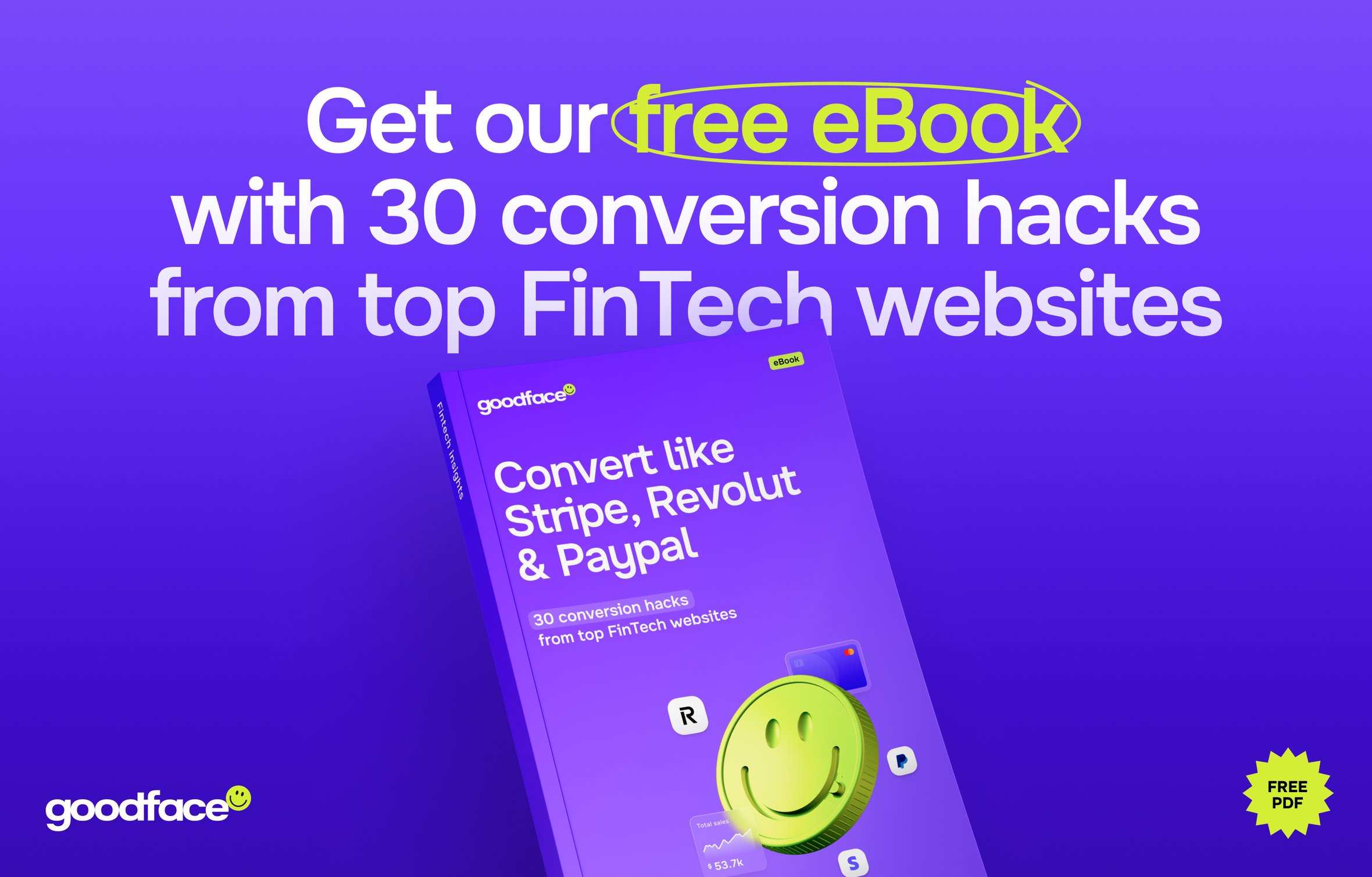
Convert like Stripe, Revolut & Paypal: 30 conversion hacks from top FinTech websites — get free PDF

At Goodface agency, we've spent years working with Fintech companies. It means seeing the backstage and inner workings, communicating with masters of business, and knowing nearly all the ins and outs of the industry.
In partnership with Dmytro Semonov, we've crafted an eBook for FinTech professionals on how to use design and strong copy to convert. We’ve broken down the strategies of industry heavyweights in FinTech to achieve such high conversion rates. Learn their tricks and tactics to make your FinTech stand out.
In this article, we’ll share 6 insights right from the eBook — one from each chapter. Dive in and level up your game.
Chapter №1. Value proposition + heroshot. How to engage your visitors with the first screen
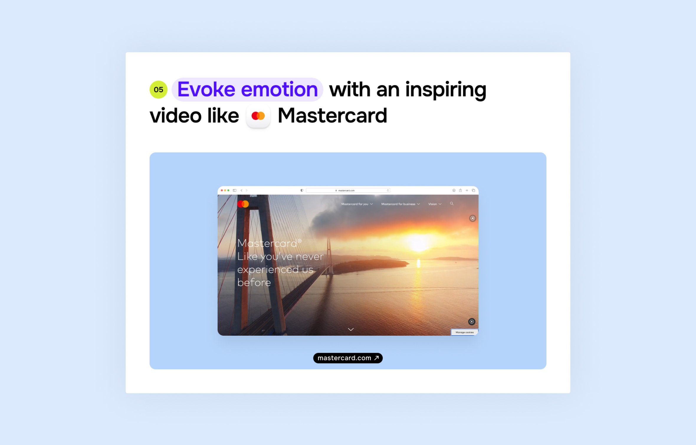
Mastercard is known for its great emotional branding. They don’t need to explain what they do, but they need to attract the audience and win the competition. Emotion is one of the ways to do it and when you visit Mastercard’s website, they stun you with breathtaking videos of bridges, waves, and people. The trick is quite banal, but still works. If your brand is quite known, you can copy it and steal it like an artist.
Chapter №2. Benefits. Let’s show your value to potential customers
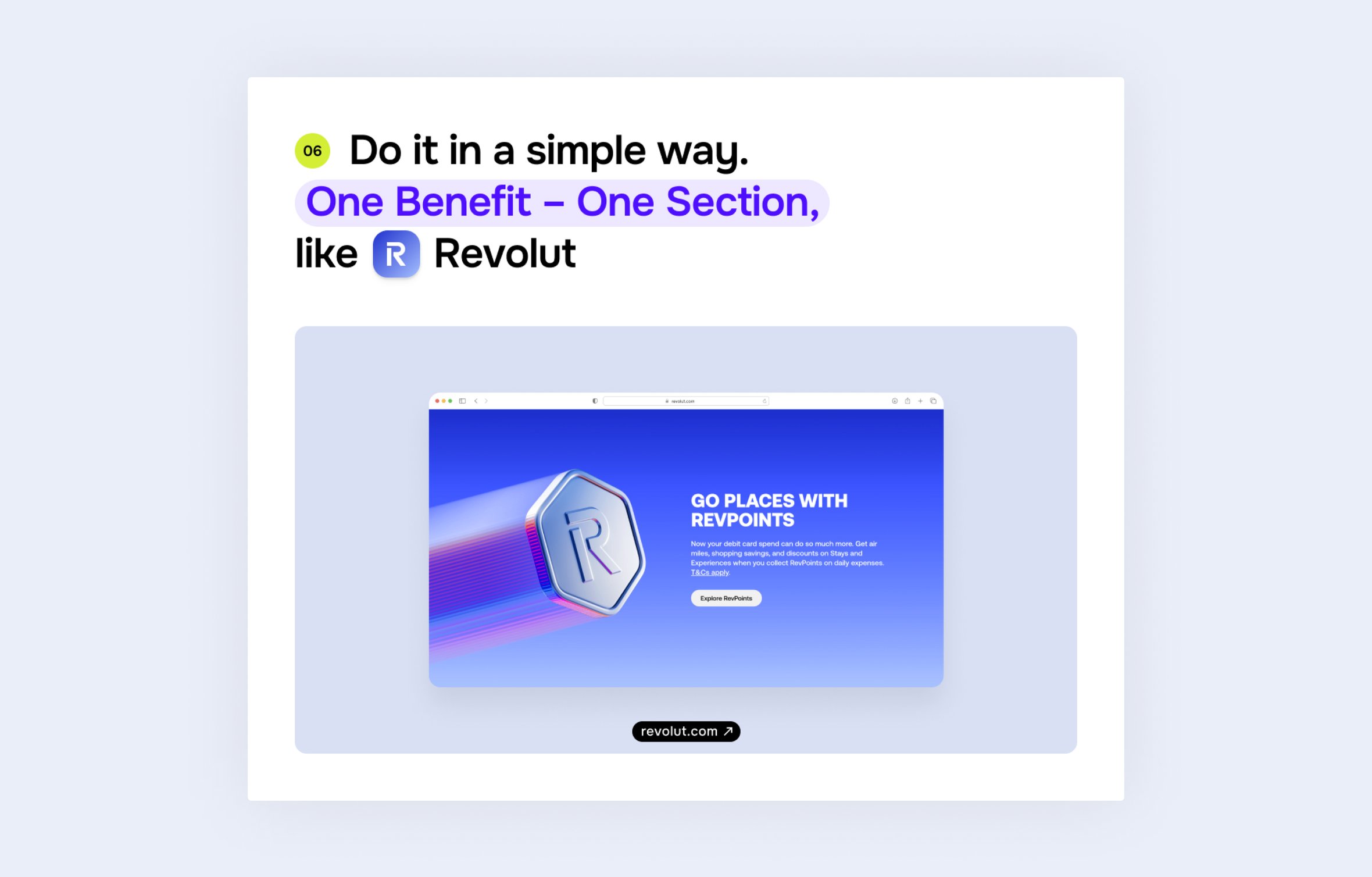
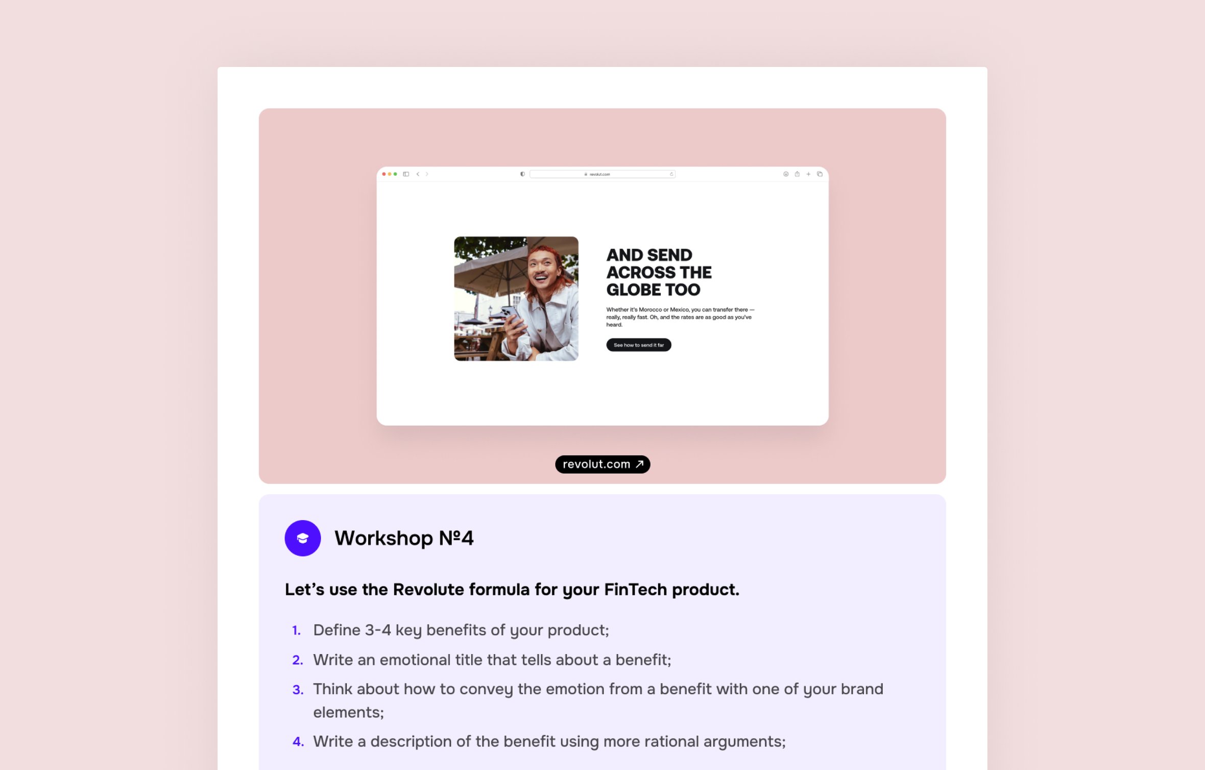
Revolut has outstanding marketing and recognizable visual style, so we can learn a thing or two from it. To showcase their benefits, they use variations of their logotype that symbolize it. For example, the flying 'R' symbol means that this benefit is about traveling. The title bears an emotional message, while the description explains details more rationally. For each benefit there is a unique call to action – this is great, as it bombards a visitor with messages from different angles.
Chapter №3. Features. Show them what you are made of
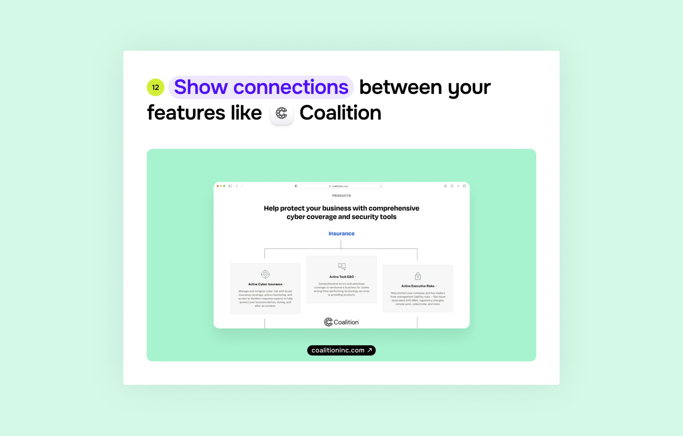
Coalition's website design showcases its cyber security offerings through a concept of the modular, icon-driven feature presentation. This a great approach to communicate a complex, product in a digestible way that shows the interconnection between features. Also, Coalition can swap these boxes around like Lego bricks, keeping things fresh without breaking a sweat.
Chapter №4.Trust Signals: harnessing social proof in fintech design
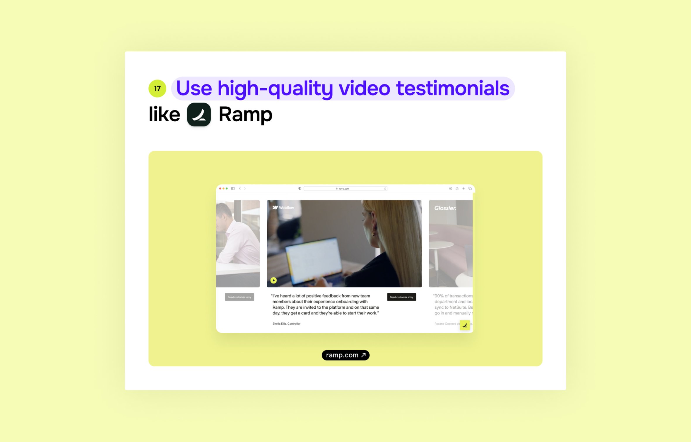
Ramp's use of video testimonials demonstrates a great approach to showcasing social proof. The high-quality imagery and play button invite engagement, while the carousel suggests an abundance of positive feedback. Ramp features recognizable brands and job titles to appeal to a specific audience. Another good element is the CTA, which invites visitors to read the whole customer story.
Chapter №5. Different segments. How to win customers across the board
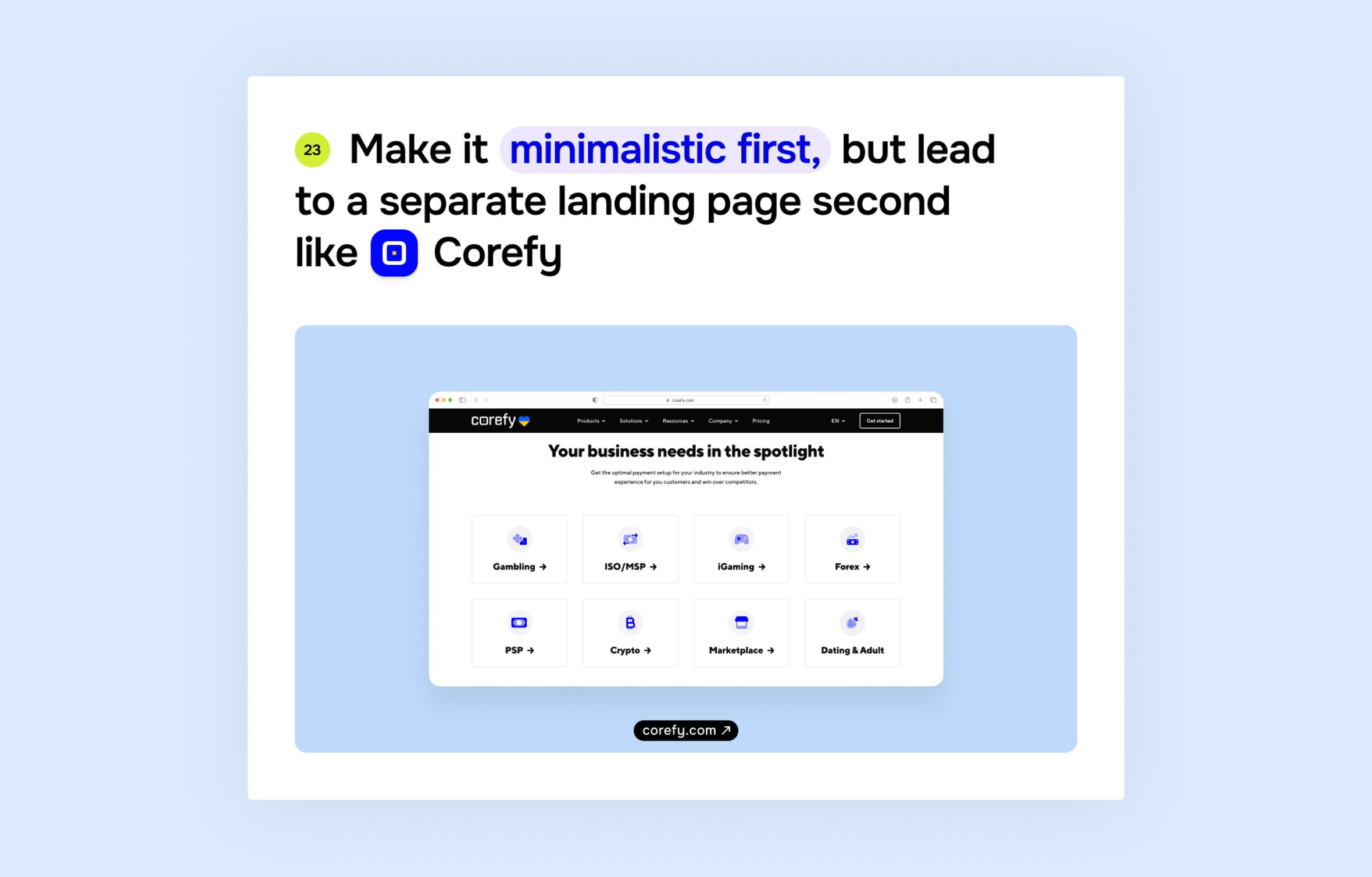
Here is another solution we at Goodface agency implemented for Corefy. It appeals to diverse segments using a grid of industry icons. This modular structure enables easy scanning and selection. It links each icon to a dedicated landing page, catering to specific industry needs while potentially boosting SEO. The clean, icon-based design keeps the main page uncluttered while still showcasing breadth. Your FinTech could adopt this approach to efficiently target multiple industries.
Chapter №6. Call to Action for fintech websites. How to invite potential clients with style
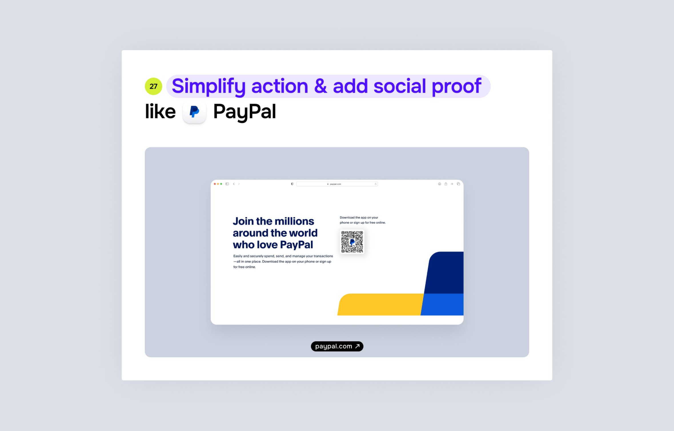
PayPal employs a bold, benefit-driven headline to appeal to potential users. The phrase 'Join the millions around the world who love PayPal' creates a sense of community, trust, and social proof. They follow this with a clear, concise explanation of their core benefits, emphasizing ease of use and security. The QR code provides a quick path to download the PayPal app, which seems to be the main goal for the company. This approach works well for established brands that look to expand their user base by highlighting their global reach and user satisfaction.
Curious about what’s in the full version?
You can download it for free on the Goodface website. Don't miss out!