UX/UI design for a global FinTech payment platform built for scale — Payop
Challenge
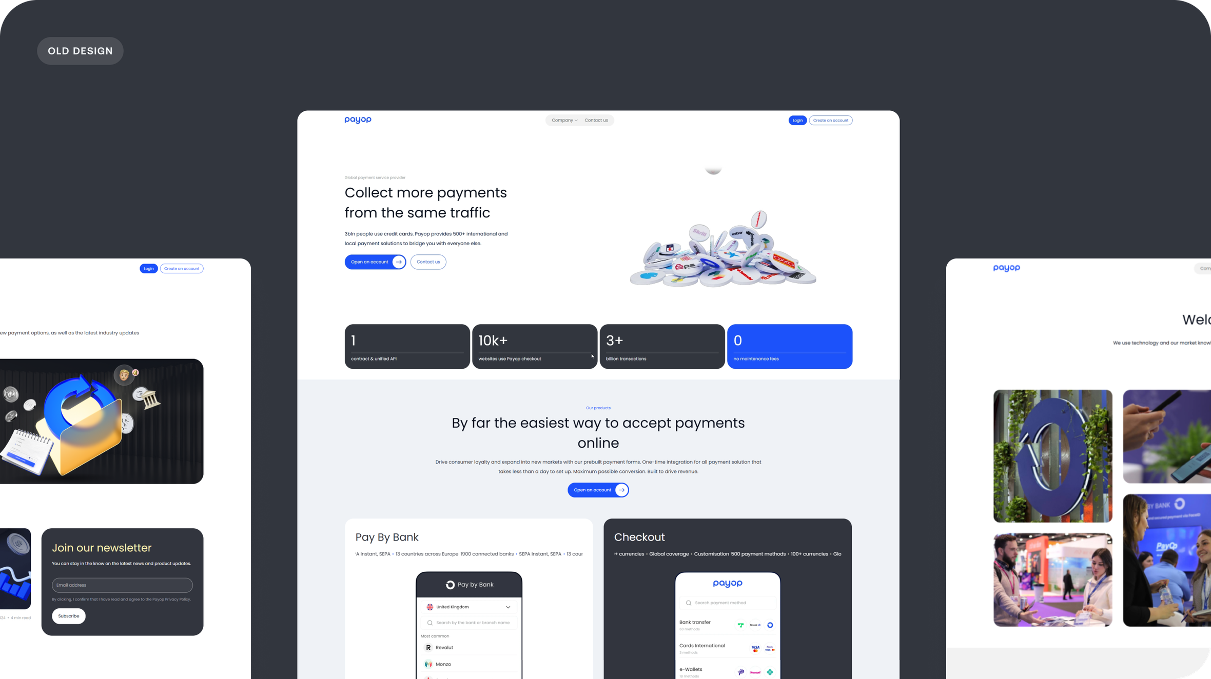
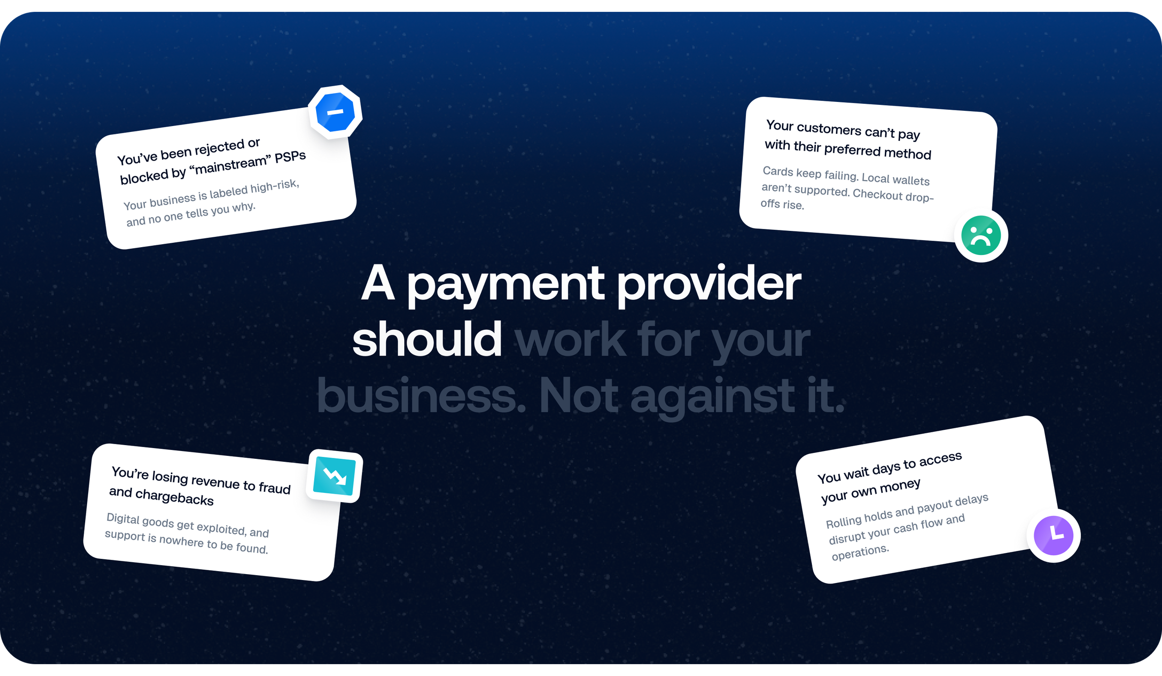
The product was already there. The technology worked. The scale was real. But the website didn’t reflect any of it. It felt smaller than the business had become. Visually cautious. Temporally behind.
As Payop expanded, its digital presence stayed still. The task was clear: reimagine the website so it could finally carry the weight of the platform — its ambition, velocity, and global scope.
Solution
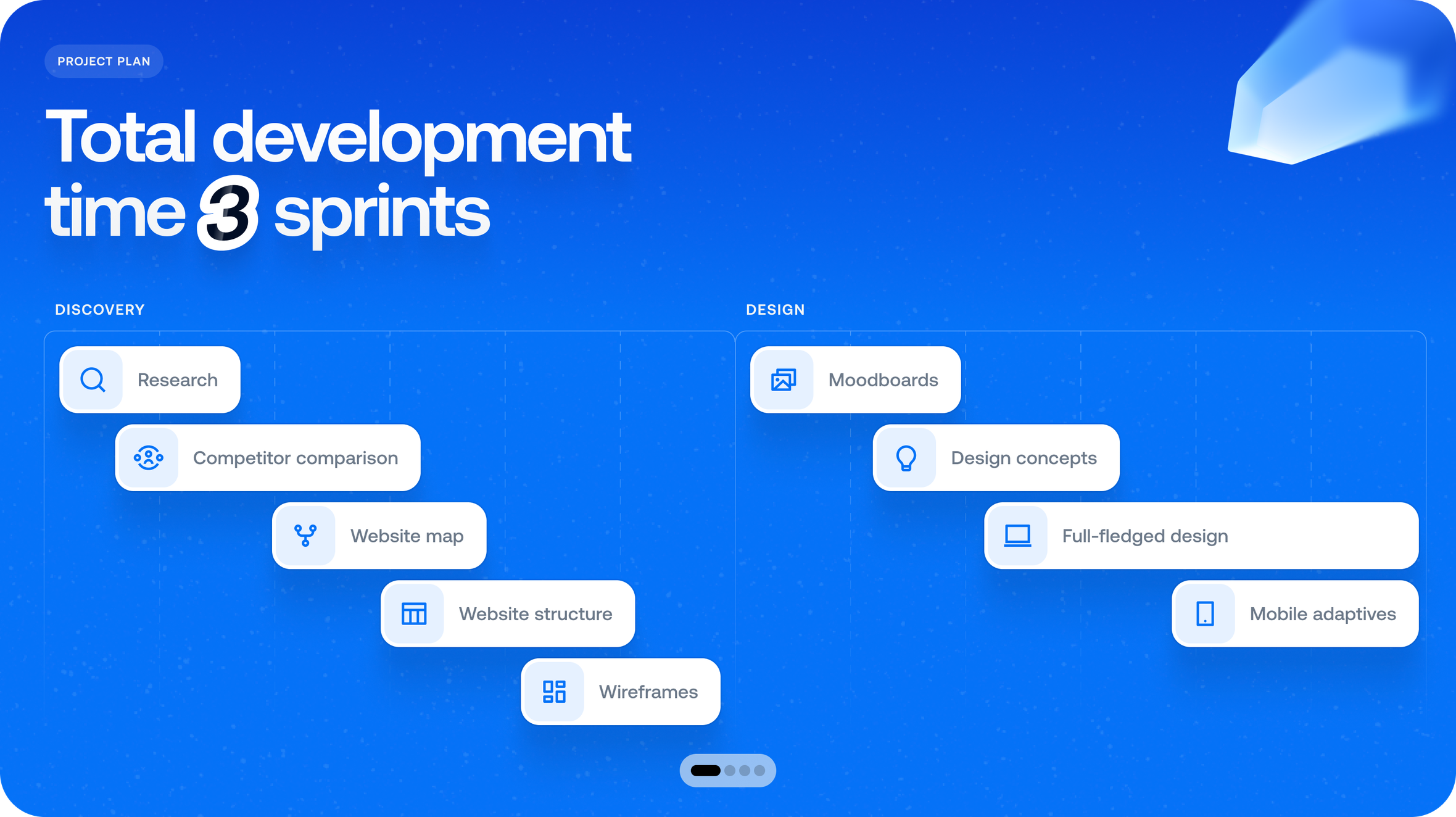
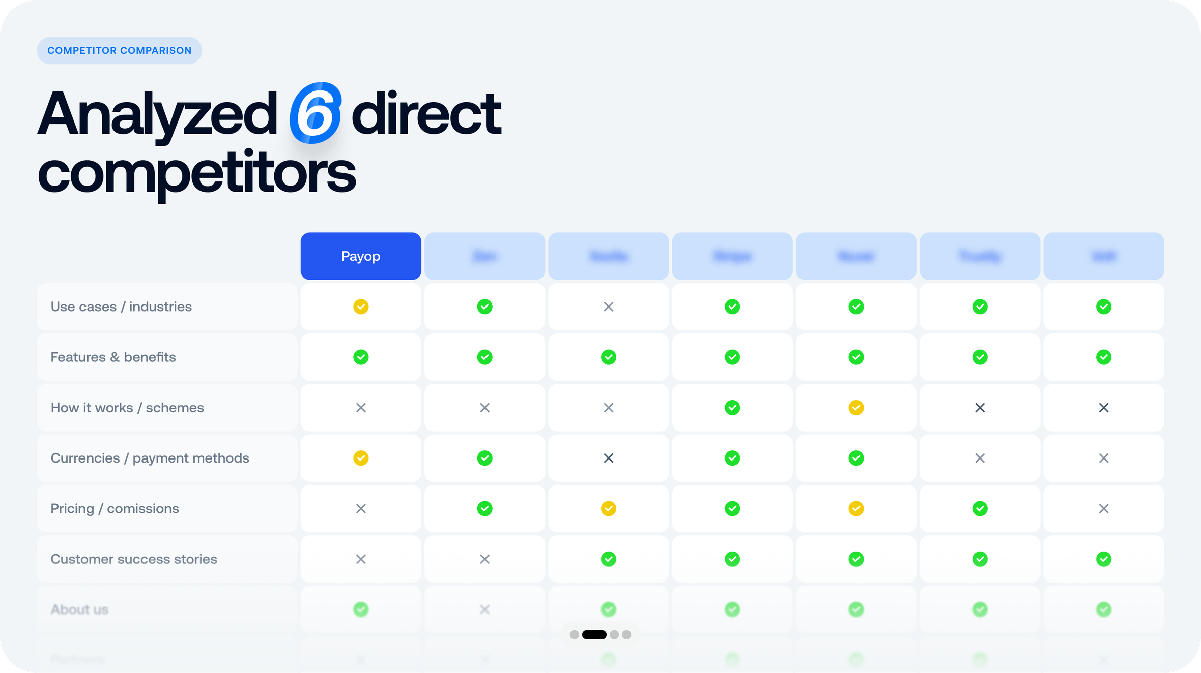
We began with clarity. A full discovery cycle, market analysis, competitor breakdowns, and behavioral research — not to label users, but to understand the pressure and pace of their environment.
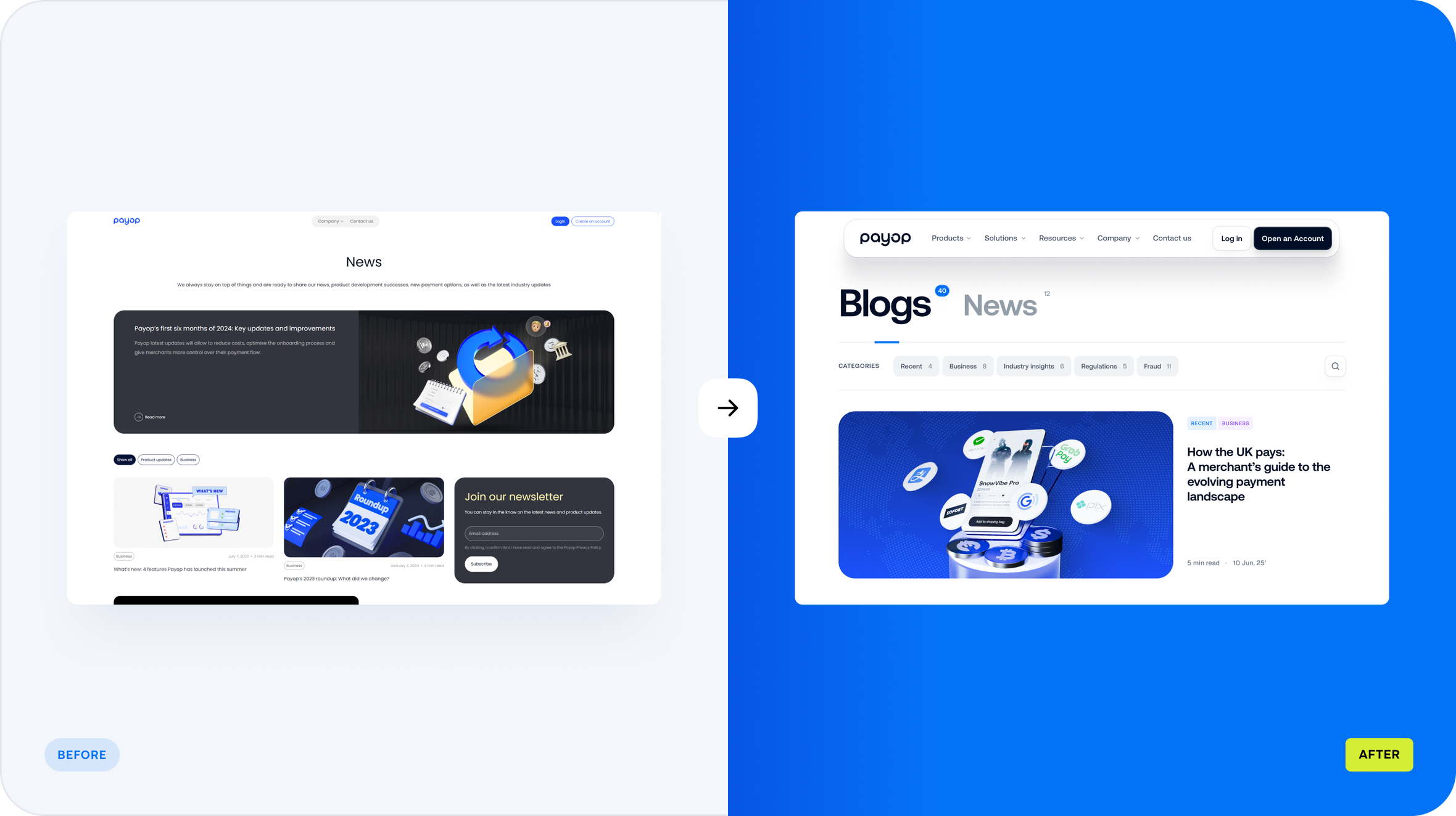
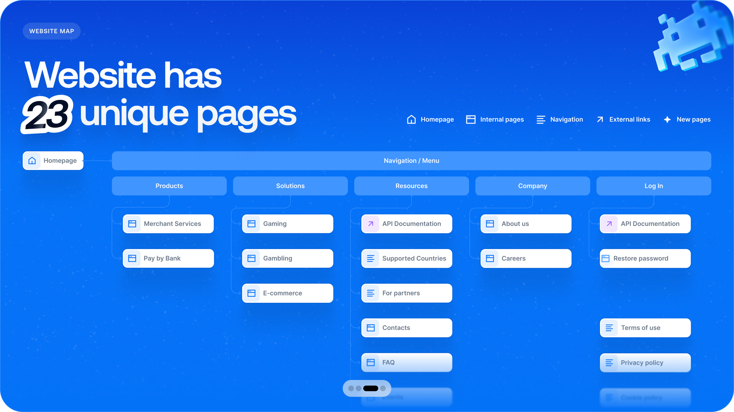
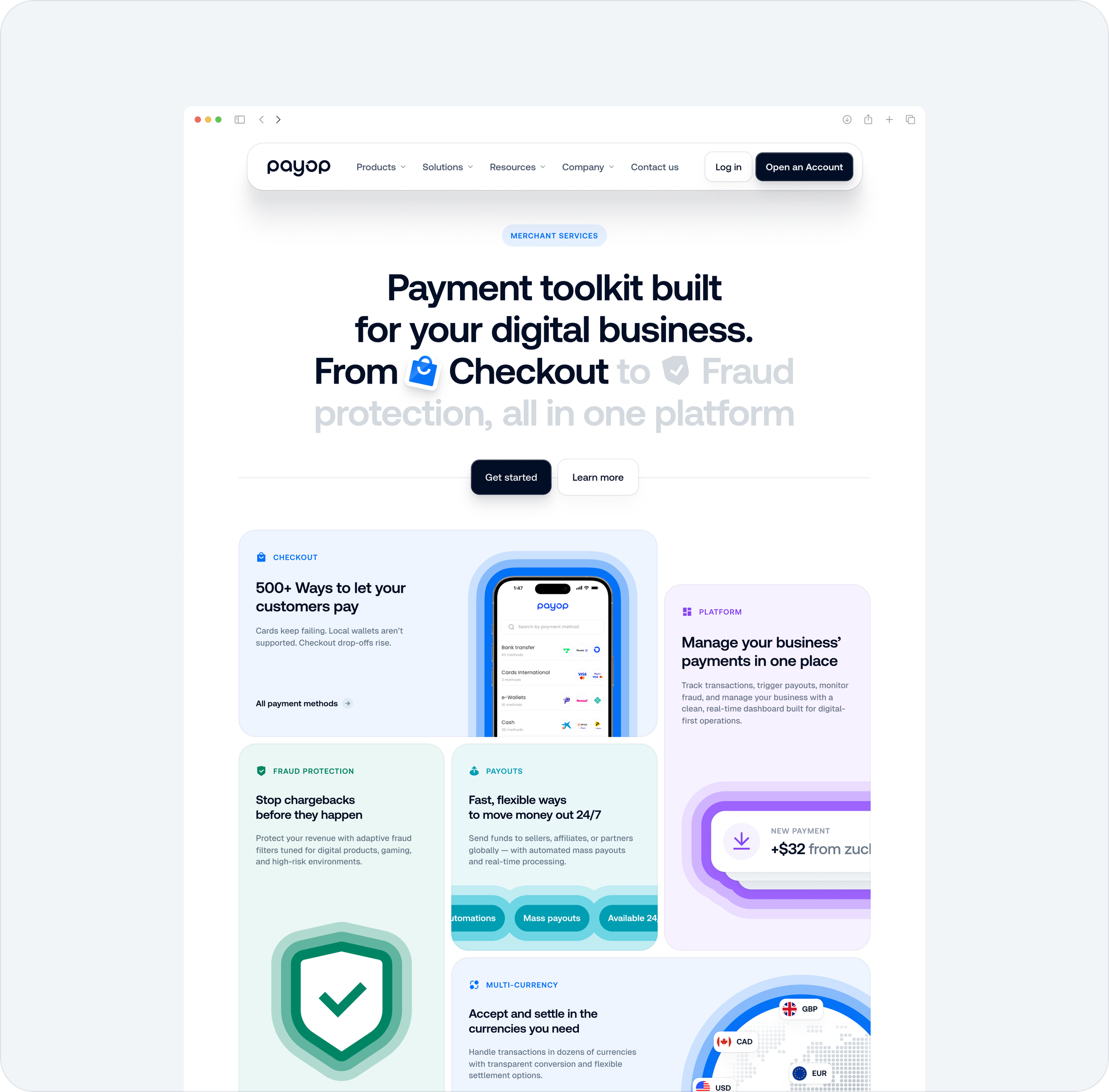
Those insights shaped the structure first: user flows, sitemap, and the logic behind how Payop explains itself. Wireframes followed. Clean. Dense with meaning. Transparent by design. A navigational system that makes complexity feel manageable.
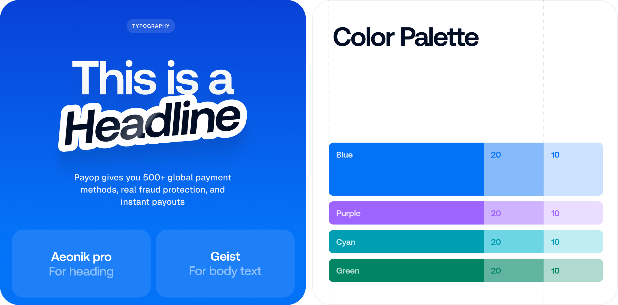
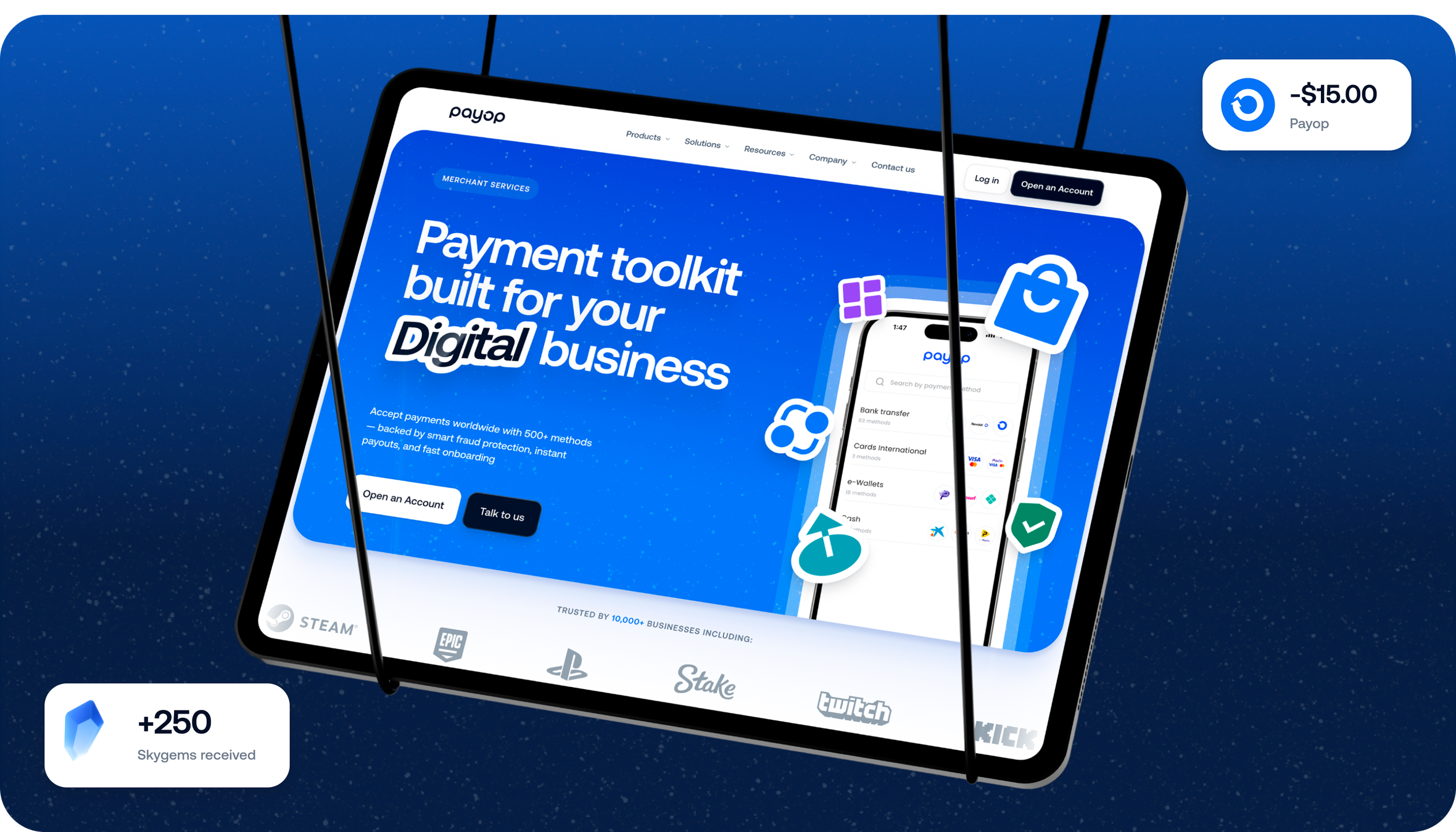
UX/UI design
Visual style
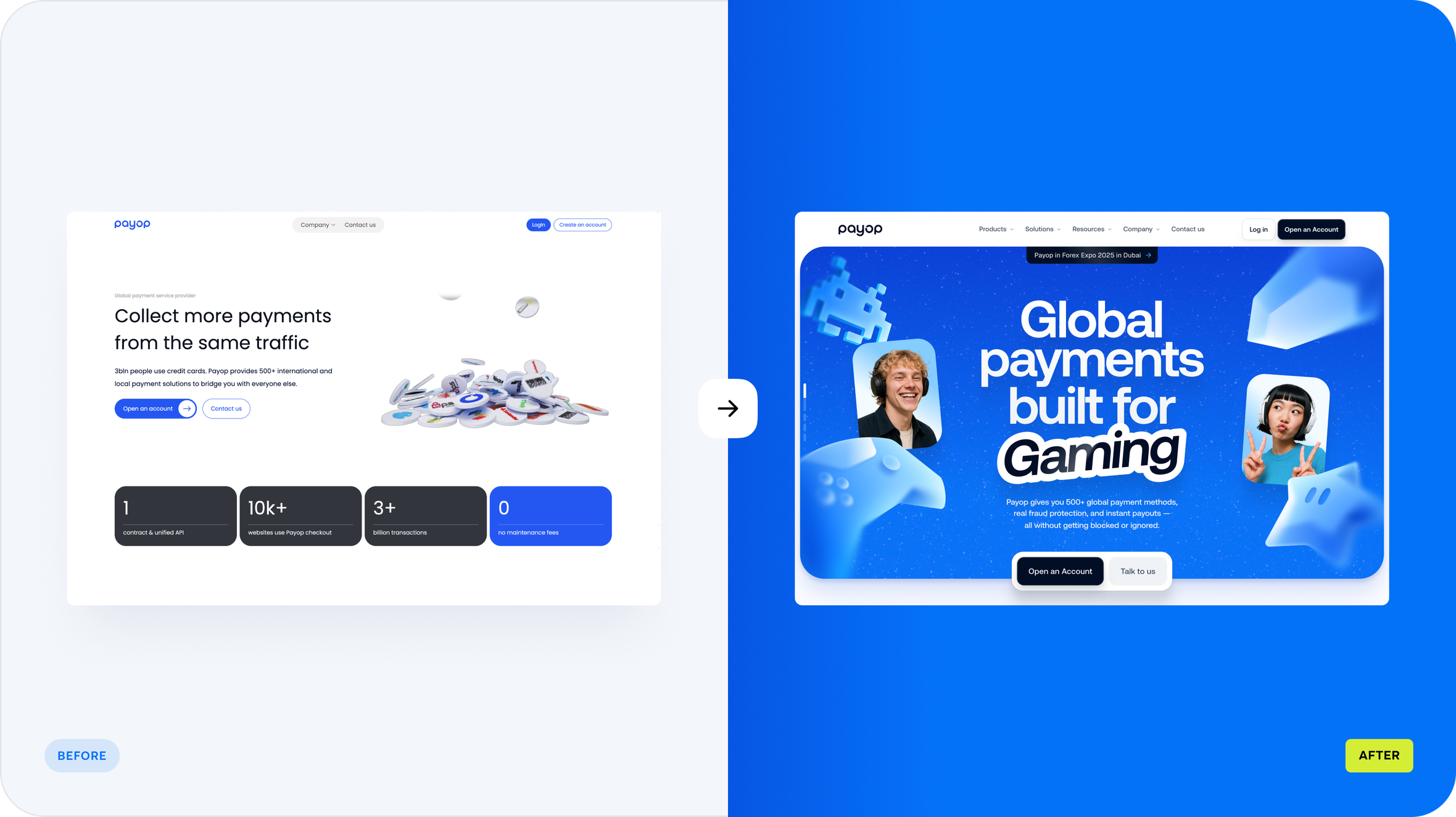
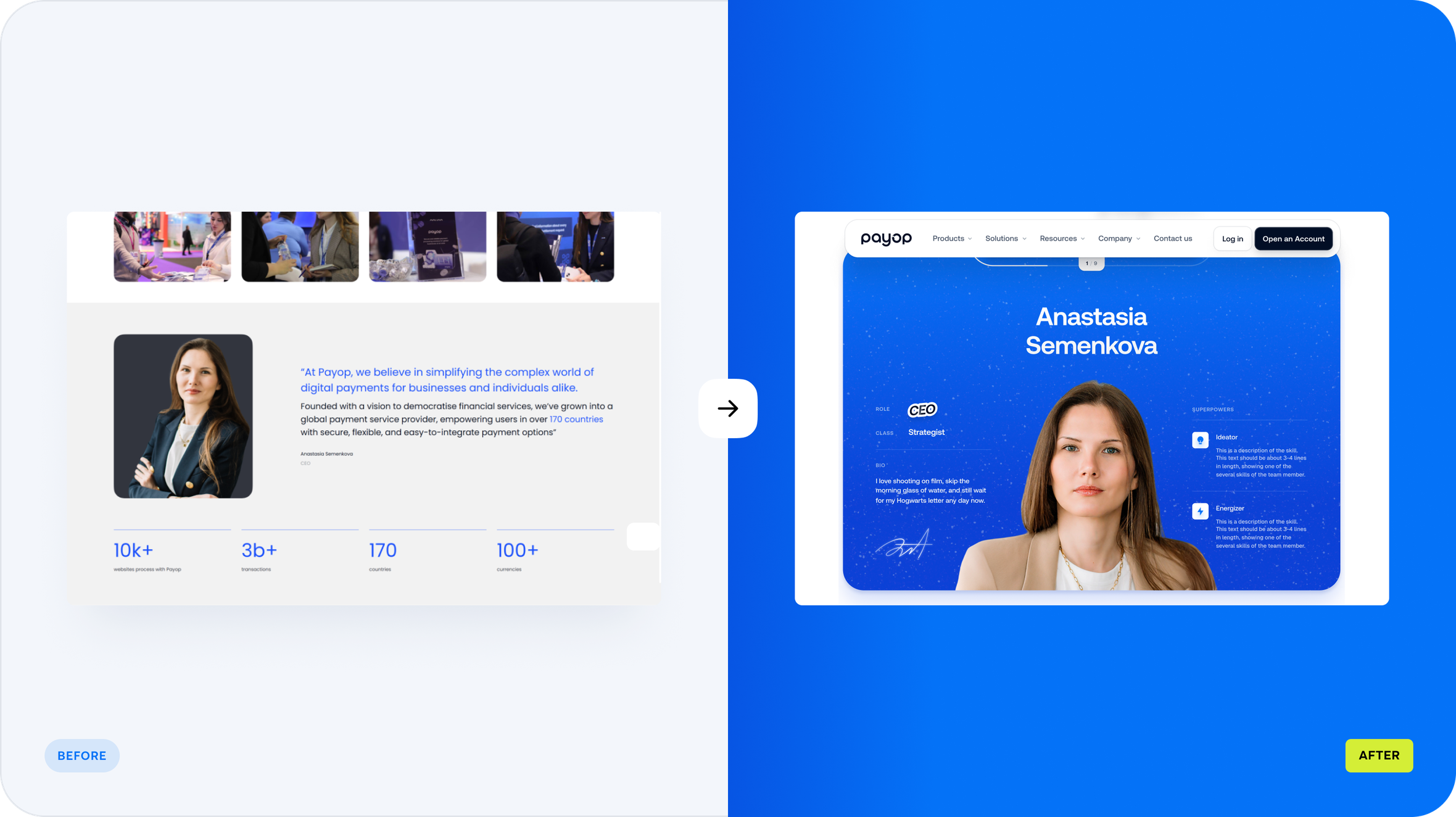
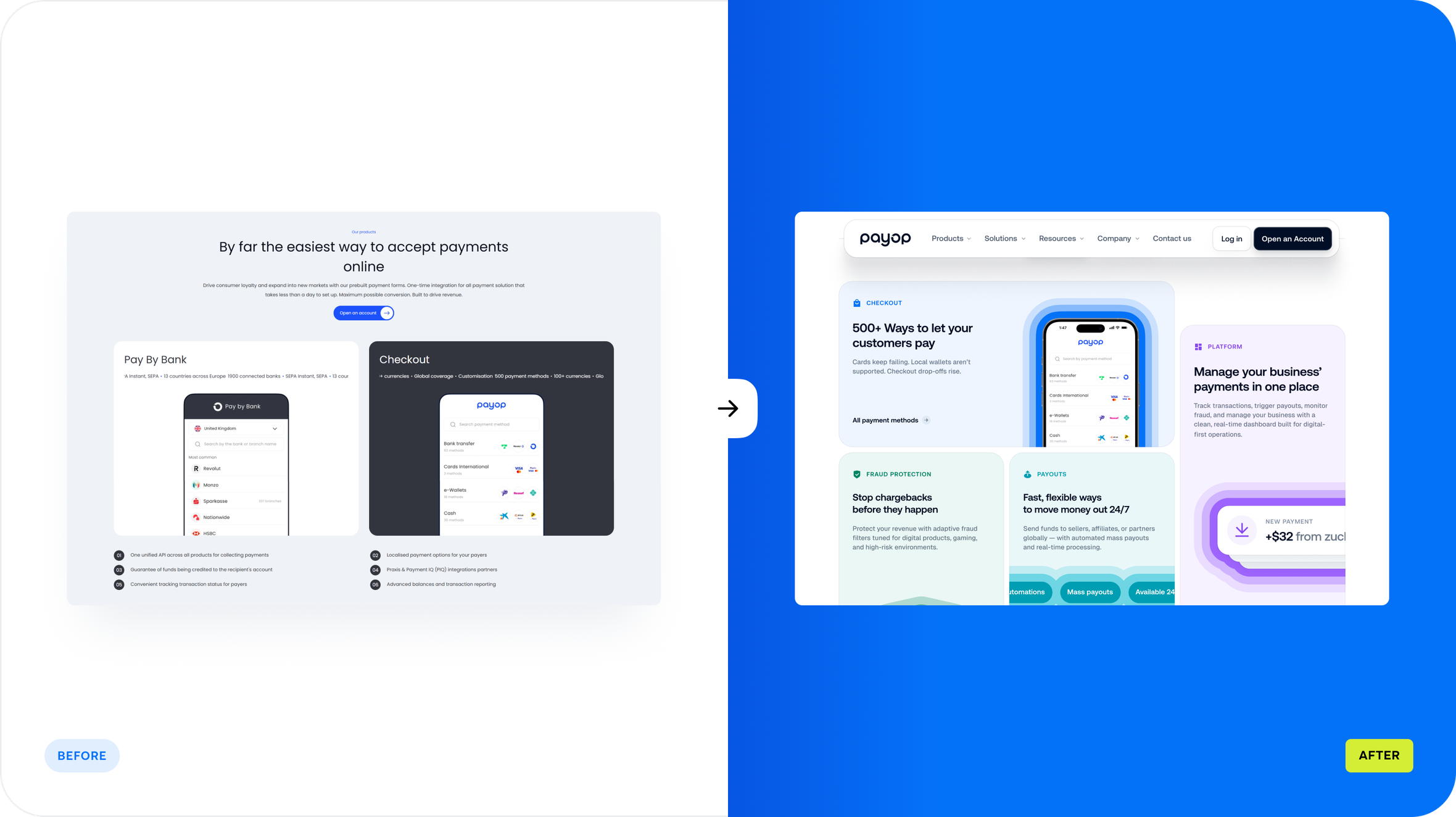
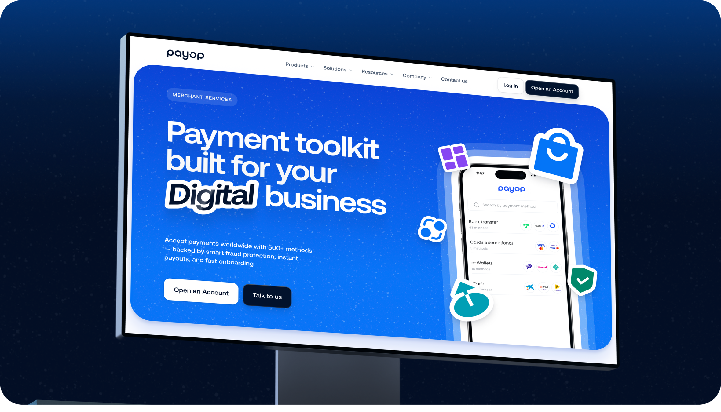
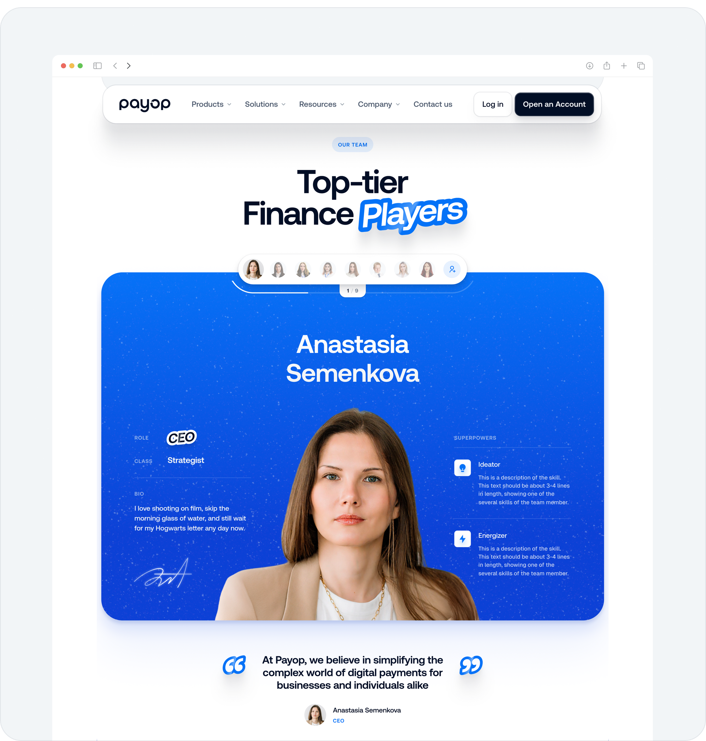
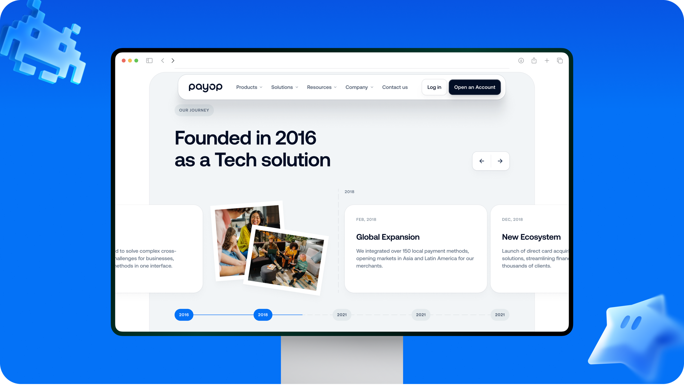
FinTech often plays it safe. We didn’t. The visual language leans bold — energetic without being chaotic. Rich colors. Soft pseudo-3D forms. Custom illustrations made specifically for this product and this market.
The intention was simple: finance doesn’t have to feel slow, rigid, or intimidating. Payop speaks to an audience shaped by gaming and fast systems.
Iconography & 3D elements
To add depth, we expanded the color palette beyond blue and introduced rounded 3D forms — expressive, but restrained.
Icons remain flat and precise. Sharp geometry. Clean strokes. Minimal footprint.
They strike a balance by being soft where emotions are important and clear when judgments are made.
So the interface borrows from game UI logic — intuitive, responsive, and visually light. Engaging without distraction. Structured without stiffness. Everything connects through a consistent UI kit.
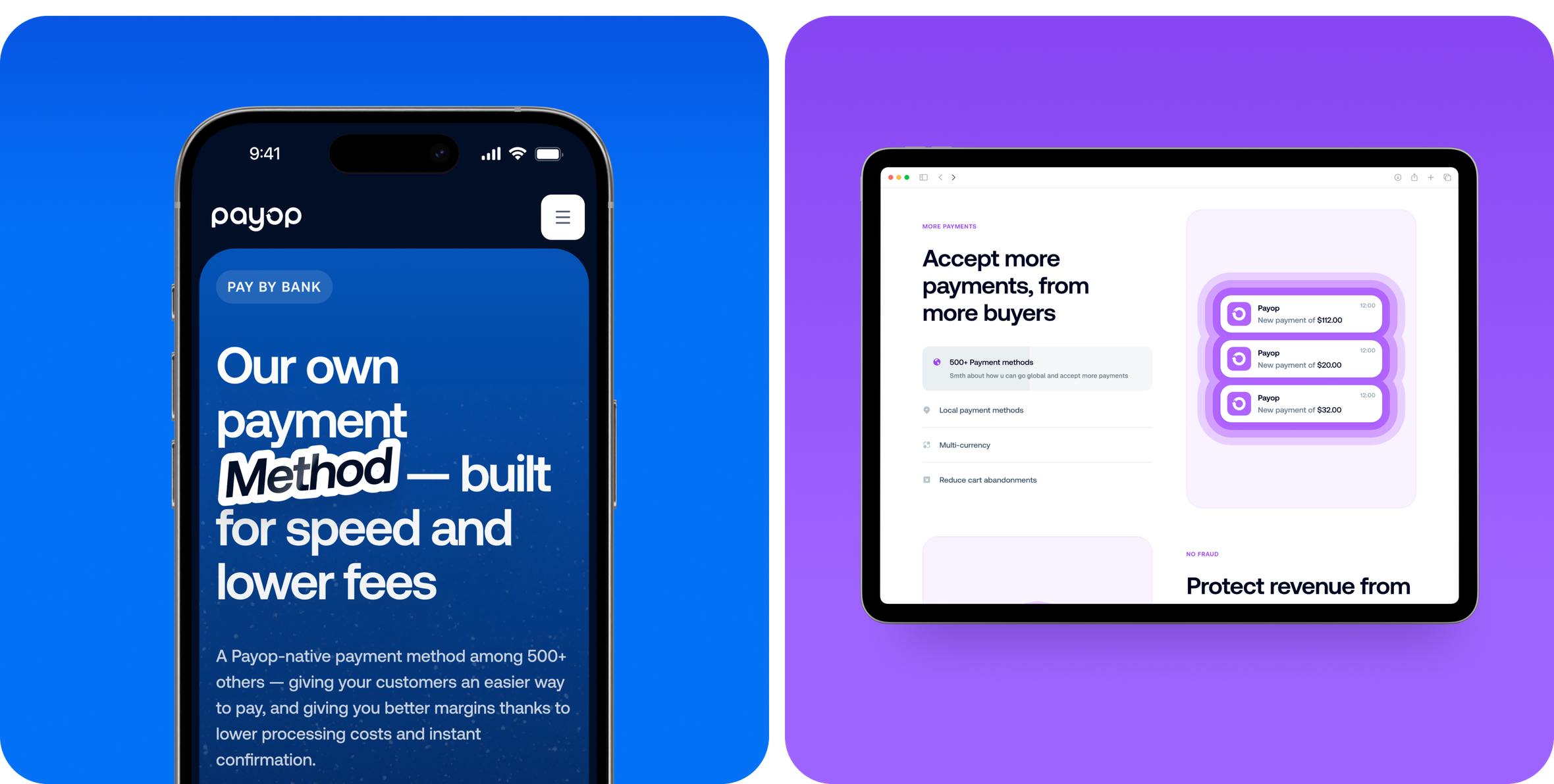

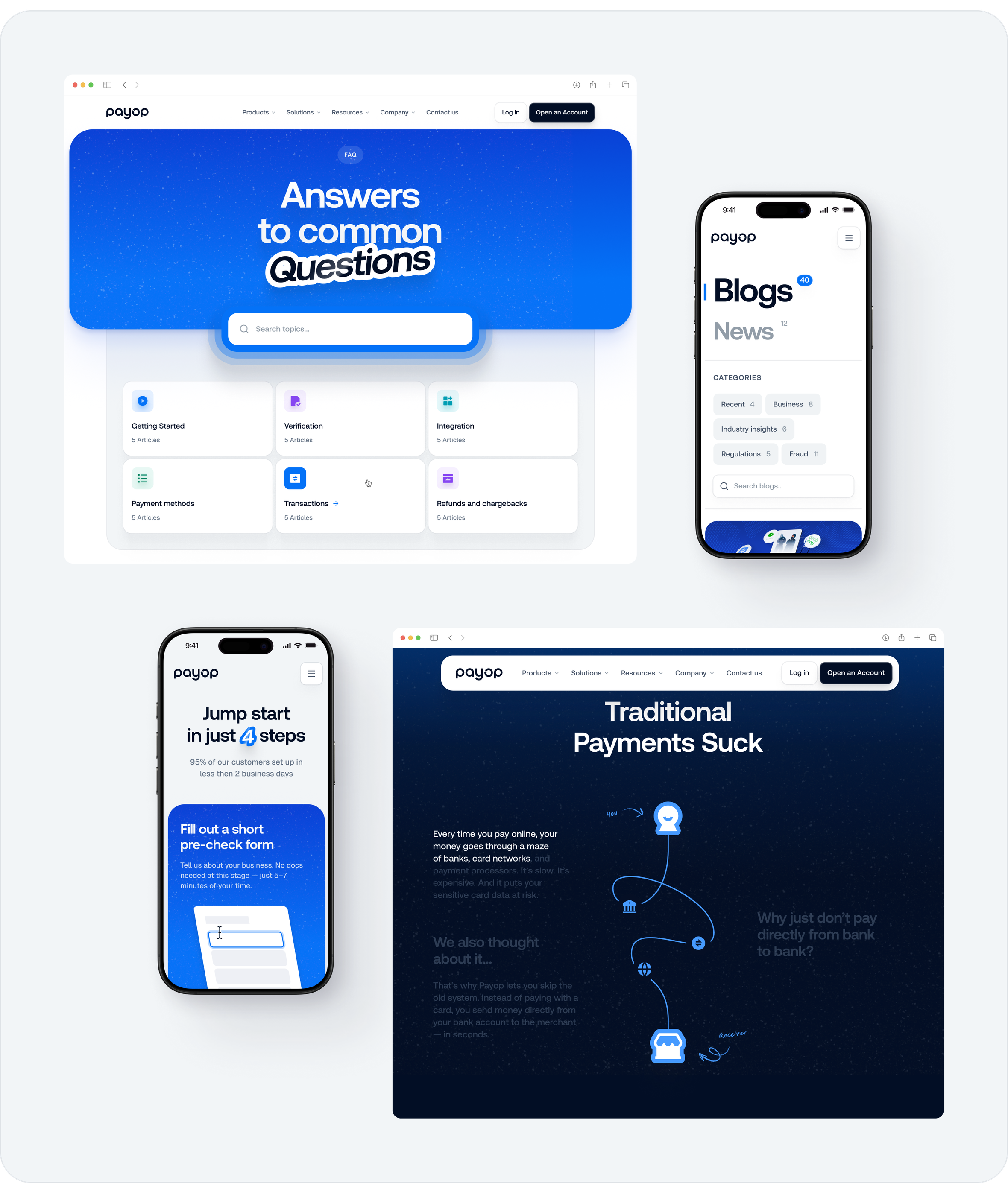
Mobile experience
On mobile, the system adapts quietly. Content reorganizes itself without losing intent. Interactions sit naturally under the thumb. CTAs remain visible. Spacing breathes.
Nothing extra. Just speed, clarity, and flow.
Result
The end result is a vibrant, modern website with a clear visual style and sharp, targeted messaging.
It conveys Payop's scale without yelling. The website feels familiar to gamers and e-sports fans.
Playful, but grounded. Expressive, but in control. A digital presence that is consistent with Payop's current identity while also being prepared for what comes next.