

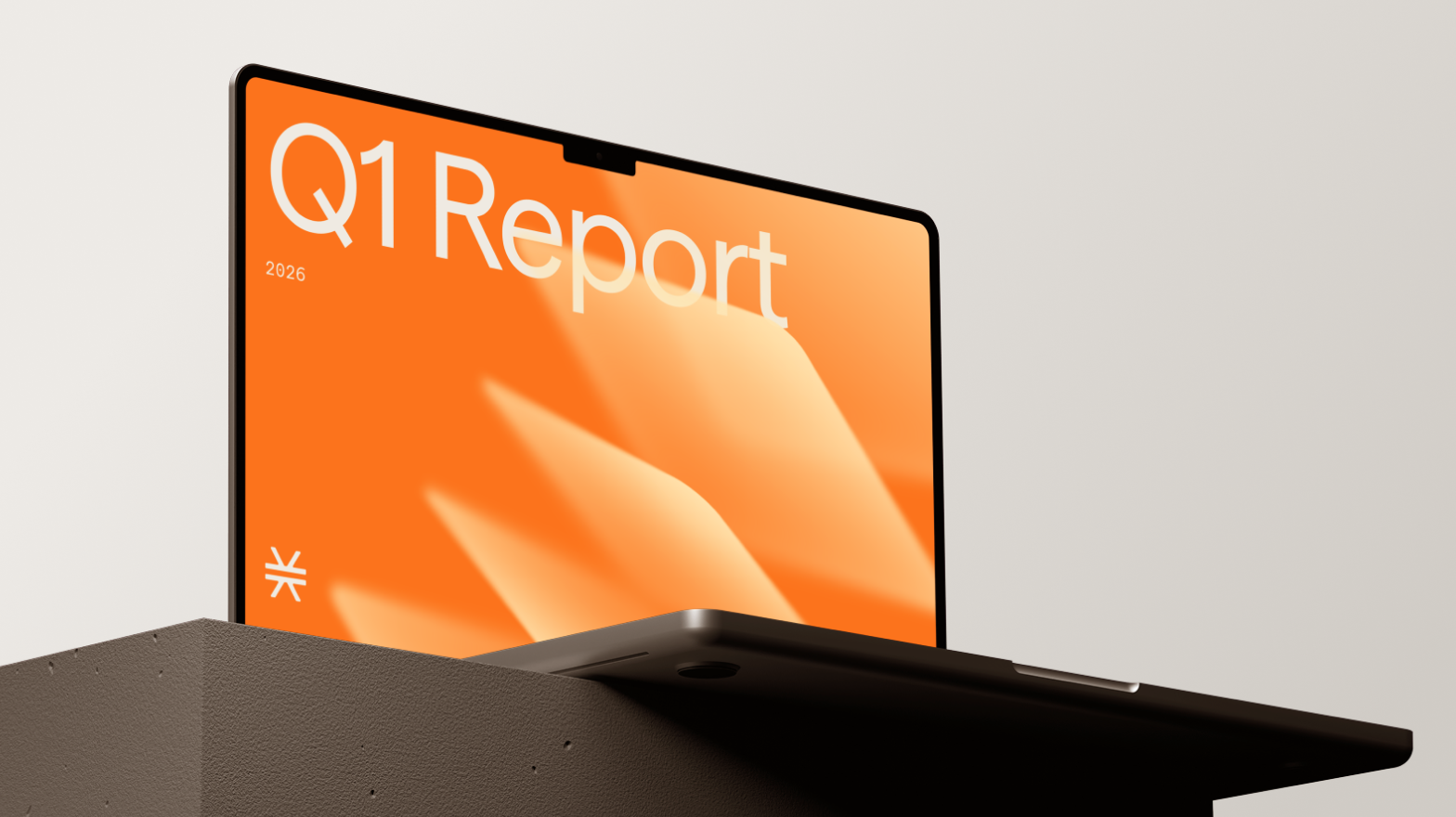
Brand identity redesign for Web3 crypto ecosystem — Stacks Co
About Stacks Co and the Hiro Web3 ecosystem
Stacks Co operates within Stacks, one of the most established and rapidly growing Web3 ecosystems built on Bitcoin.
The broader ecosystem is powered by Hiro, a developer tools company building blockchain infrastructure for Bitcoin. Hiro’s tools enable Stacks, a Bitcoin L2 network that allows devs to build smart contracts, decentralized apps, and digital assets directly on Bitcoin.
Exploring the brand identity direction
At the early stage, the Goodface team explored multiple visual concepts to strengthen the brand foundation and essence.
Some directions were inspired by Asian nature and tree symbolism — using metaphors of growth, interconnected systems, and asset scale. These ideas helped to apply the underlying identity logic, even though they didn’t become the final visual outcome.
Instead of introducing a new mark, the decision was to retain the original Stacks logo. This saved continuity, preserved brand recognition, and built consistency across the parent Stacks ecosystem.
Refreshing the visual system
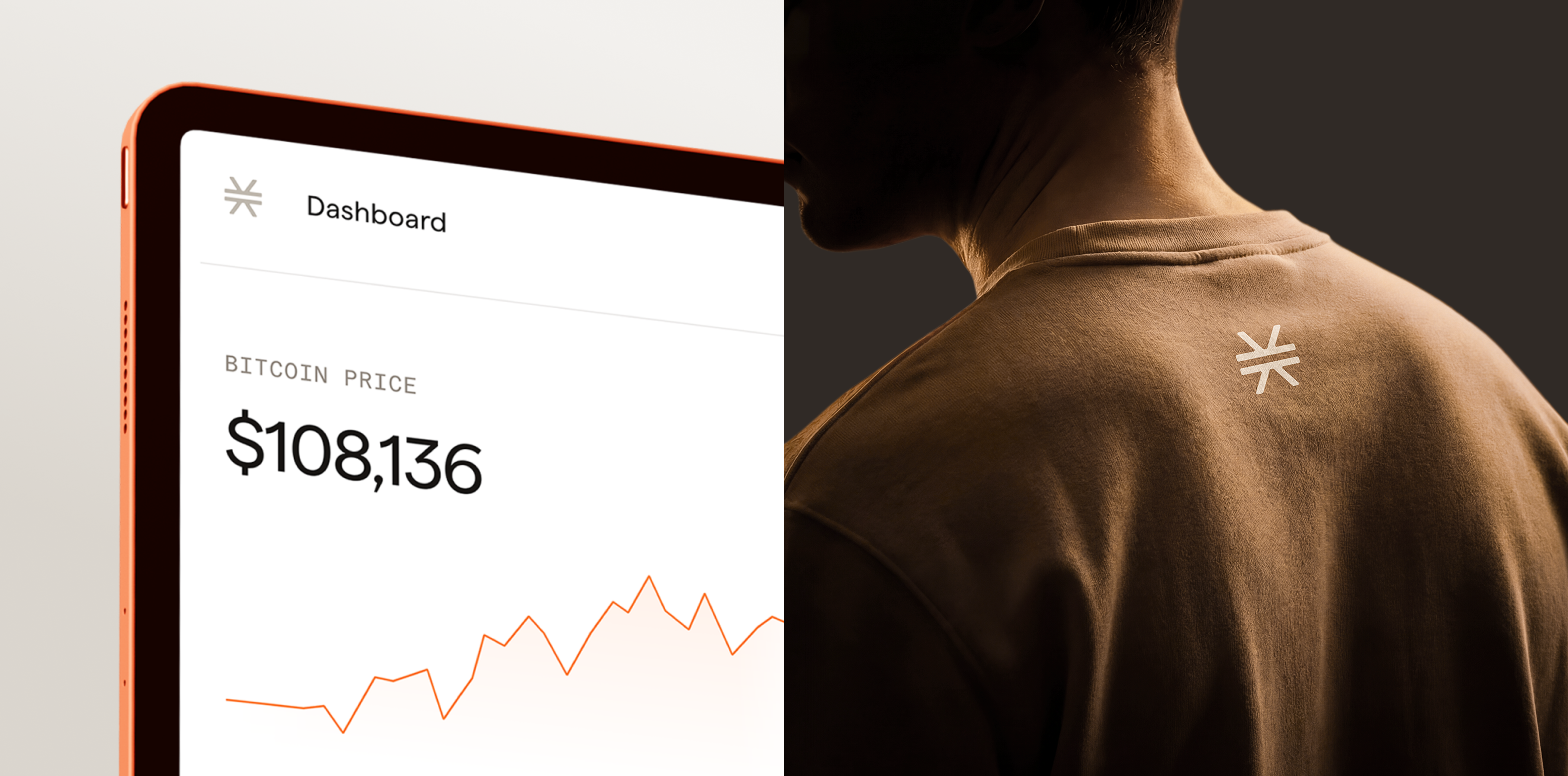
With the logo unchanged, our focus shifted to reworking the design system as a whole.
Each element was reconsidered as part of a cohesive and flexible structure:
- Visual patterns were redesigned to introduce rhythm and adaptability across different formats
- Typography was refined for improved clarity and better scalability in digital environments
- Illustrations and iconography were reimagined to reflect the dynamic and evolving nature of the Web3 industry
Rather than isolated updates, these changes formed a unified visual language that can scale with the product.
Our approach to the Stacks Co brand redesign
We can confidently say that the project was a visual evolution of the existing brand identity, rather than a complete overhaul.
Through collaborative sessions with the Stacks Co team, the initial direction shifted to align how the emerging sub-brand should communicate key qualities — growth, flexibility, and tech maturity — while staying connected to the core Stacks identity.
An important part of the work was creating a comprehensive brand guideline, including typography, color, patterns, illustrations, and components. This gave the team a practical toolset to produce consistent communications and scale design across media channels without fragmentation.
Project outcomes and deliverables
The result is a more expressive and structured visual system that strengthens Stacks Co’s role within the ecosystem:
- Brand recognition is preserved
- The visual language feels more mature and consistent
- Design assets are flexible enough to support both product and marketing needs
Instead of a surface-level redesign, the project gets a new design system that enables long-term growth.
About Goodface
Goodface is a digital design & development agency working with fintech, crypto, and Web3 products.
We focus on building clear, scalable interfaces, design systems, and brand assets that help complex tech remain usable, understandable, and coherent as it grows.


