
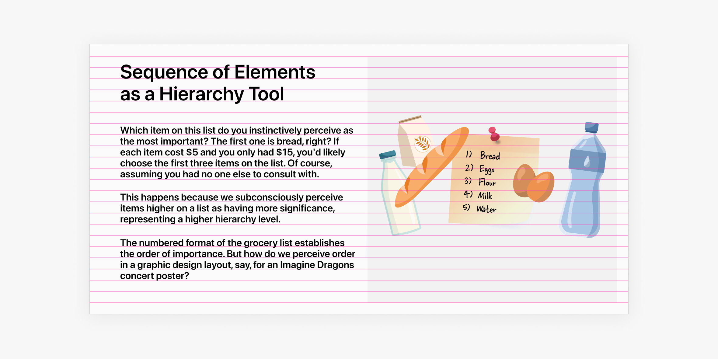
Grids in Websites
In previous articles of the "Website Anatomy" series, we discussed the elements that can be placed within a webpage. In the final article of this series, we'll explore another component of website anatomy that determines how these elements are arranged on a site: grids.
What are grids and what are they for?
The primary function of grids is to ensure that the layout is neat, the elements are proportional, and the information is presented in a rhythmic manner. While the concept of grids might seem unfamiliar, they are foundational to design principles.
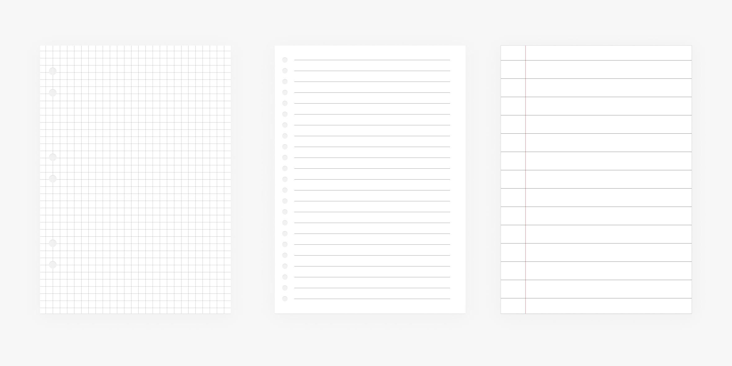
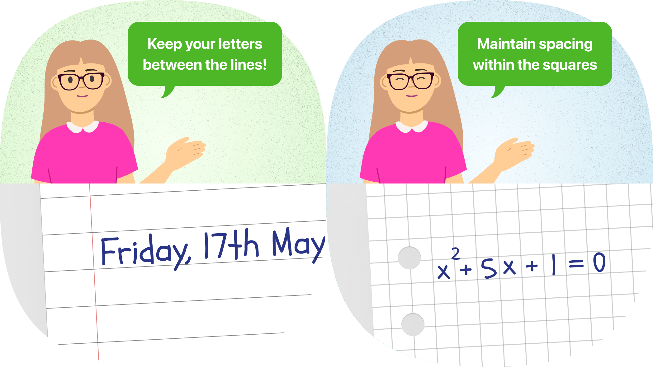
Think about the structure of a notebook: the lines that guide your writing form a basic grid system. These lines help you maintain consistent letter size, align words, and preserve line spacing.
Think about the structure of a notebook: the lines that guide your writing form a basic grid system. These lines help you maintain consistent letter size, align words, and preserve line spacing.
Virtually all professional graphic designers incorporate grids into their work, from newspapers and magazines to posters and brochures. The purpose remains consistent: to create visually appealing layouts with balanced elements and a clear flow of information.
Of course, grids for magazine layouts are often more complex than those used in notebooks. And there are many different types of grids and ways to organize them.
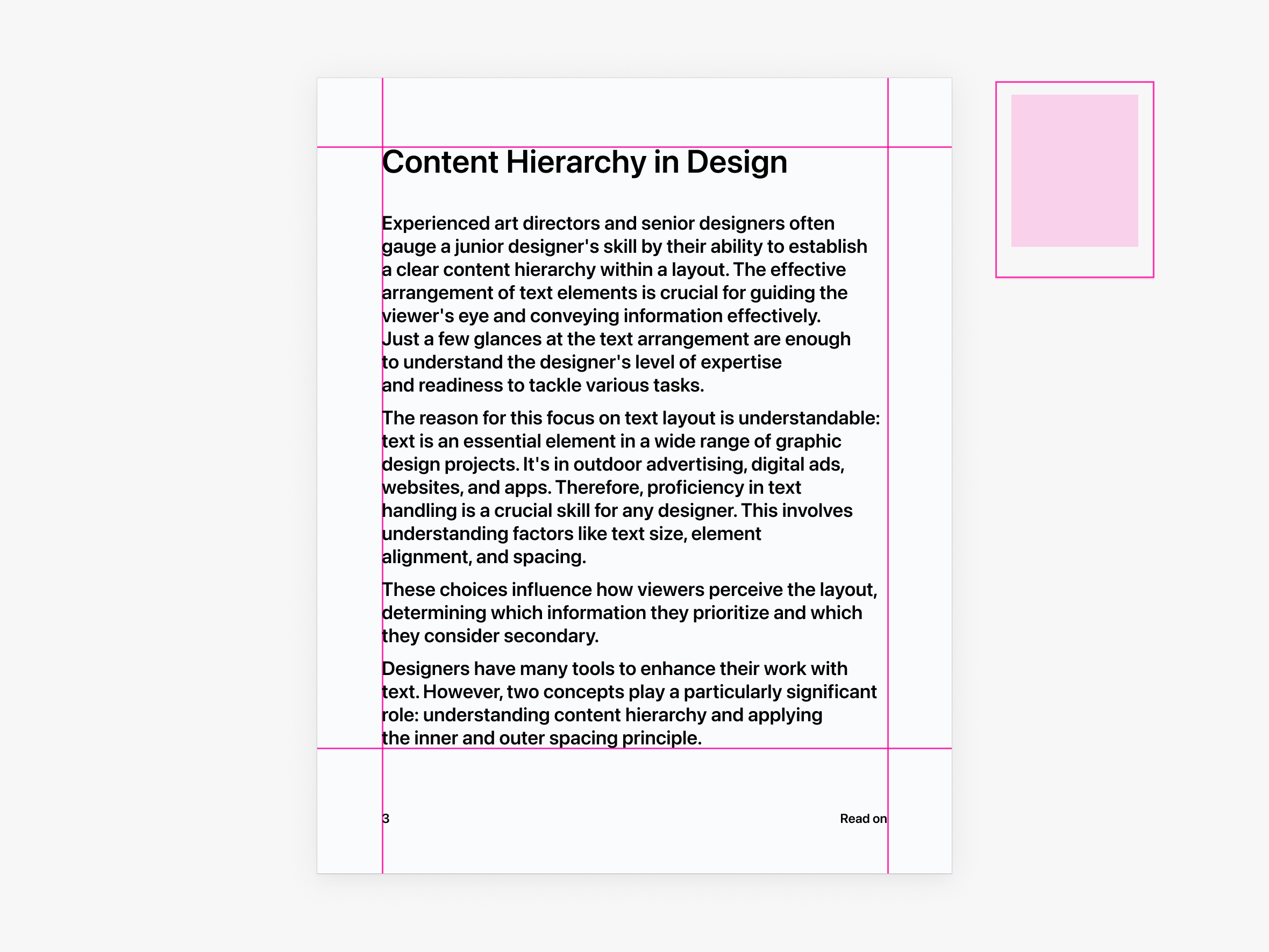
However, for websites and graphic design, rectangular linear grids are typically used. This is because it's easier to create proportions within a grid that match the format you're working with. And in graphic design and websites, you're usually dealing with rectangular formats - A4, A3, B5, 16:9.
So, we'll focus on linear rectangular grids in this article.
Grid Structure
Grids are composed of several fundamental elements:
- Margins
- Columns
- Gaps between columns and rows (also called gutters)
- Rows
- Flowlines
- Modules
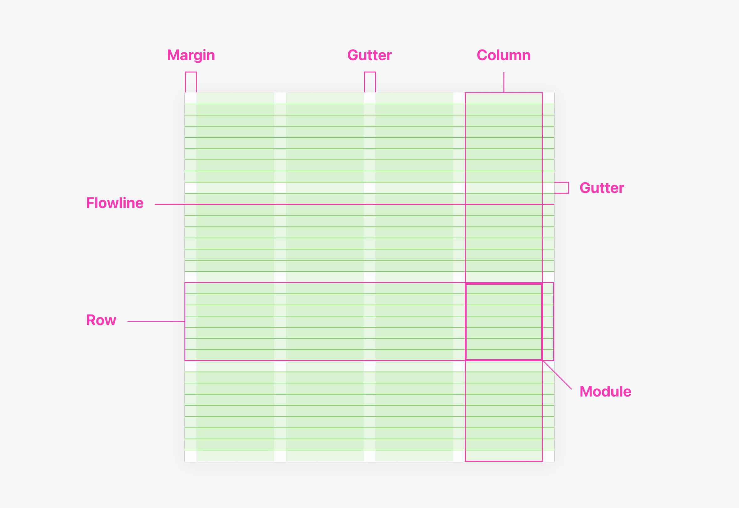
Margins are the spaces between the edge of the design and the content. Margins serve both a practical purpose (e.g., preventing content from being too close to the binding in a book) and an aesthetic one, improving readability and guiding the eye.
Columns divide the design into vertical sections, establishing a horizontal rhythm and proportion.
Gutters are the spaces between columns and rows that help to separate elements and contribute to the overall visual rhythm. Typically, these spaces are narrower than the columns and rows themselves.
Flowlines are horizontal lines that divide the grid into parallel bands, aiding in visual hierarchy and providing a framework for aligning elements.
Rows divide the design into horizontal sections.
Modules are the basic units of a modular grid, formed by the intersection of rows and columns.
By combining these elements, various types of grids can be created. However, five types are commonly discussed. We'll delve deeper into these in the next section.
Common Types of Grids
Manuscript Grid
A manuscript grid is a simple, single-column grid. It gets its name from the fact that similar grids were used in ancient manuscripts. In this type of grid, all content is placed within a large rectangular area, with margins on all sides.
Manuscript grids are often used in books and some magazines. In web design, they are frequently used for longreads and mobile layouts.
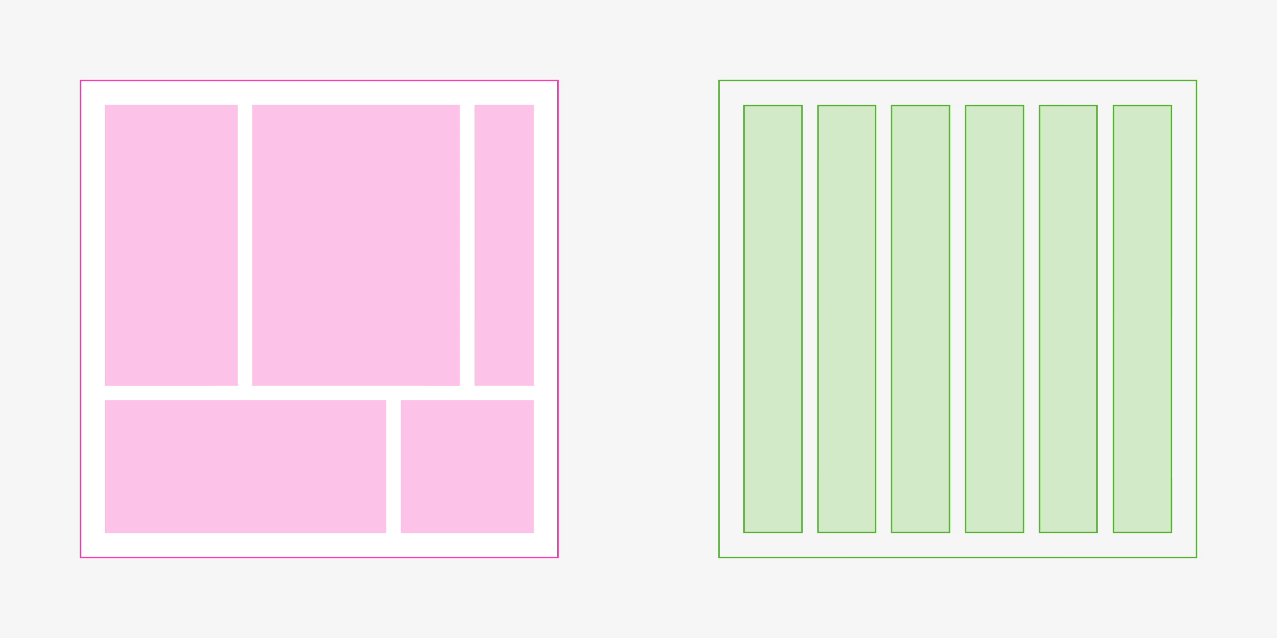
Column Grid
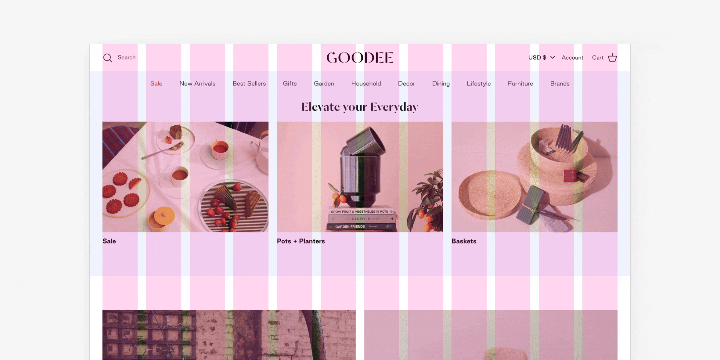
Column grids, also known as multi-column grids, divide the design area into multiple columns. You see them every time you hold a newspaper. The large blocks of text are divided into separate columns, achieving proportionality when dealing with a large amount of content in a wide format. Columns allow for easy division of space into thematic zones (hence the terms "sports column," "analysis column," etc.).
Since websites often deal with heterogeneous information, most websites are built on column grids. One of the most popular column grids is the 12-column grid. Within the same proportions, it allows for creating various compositions on a website.
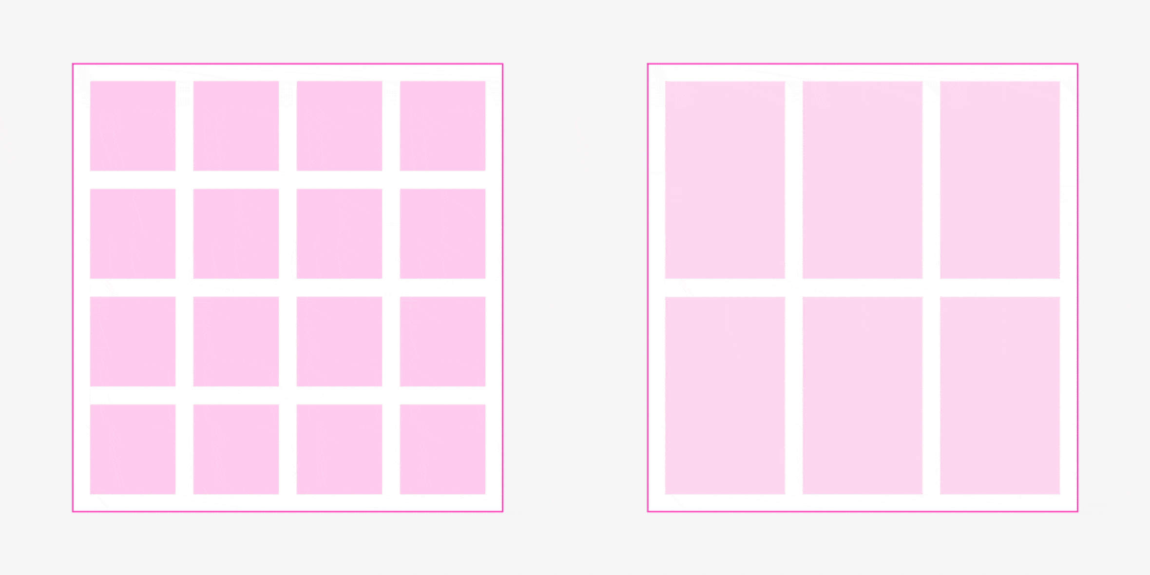
Modular Grid
Modular grids are similar to column grids but also include rows. You see this every time you hold a smartphone, as the icons on its home screen are organized within a modular grid.

The idea of a modular grid is that the size of the rows and modules is strictly defined, and therefore, the layout is tied to it. In other words, you need modular grids when creating a layout where both horizontal and vertical rhythm are important. In magazines, this is useful for catalogs. In websites, it's useful for online stores and photo galleries.
Baseline Grid
Baseline grids are those in which all text is aligned to a baseline. This means all headings, subheadings, body text, and quotes are aligned to these baselines.
The simplest example of a baseline grid is a lined notebook!

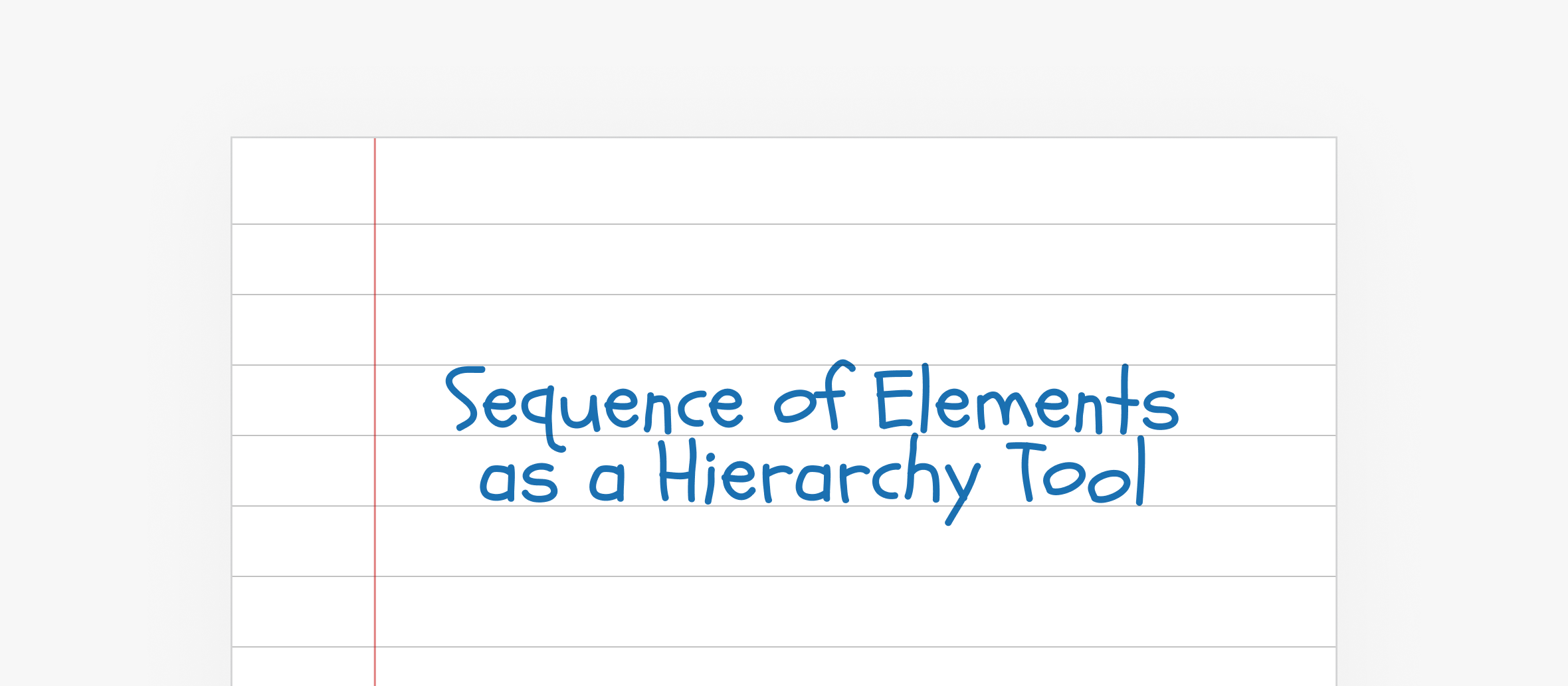
Hierarchical Grid
Hierarchical grids often have a more arbitrary structure than the ones mentioned above. The column widths, heights, and gutters can vary. They are called hierarchical because the importance of a module is determined by its position and size. Hierarchical grids are commonly used on news portals.
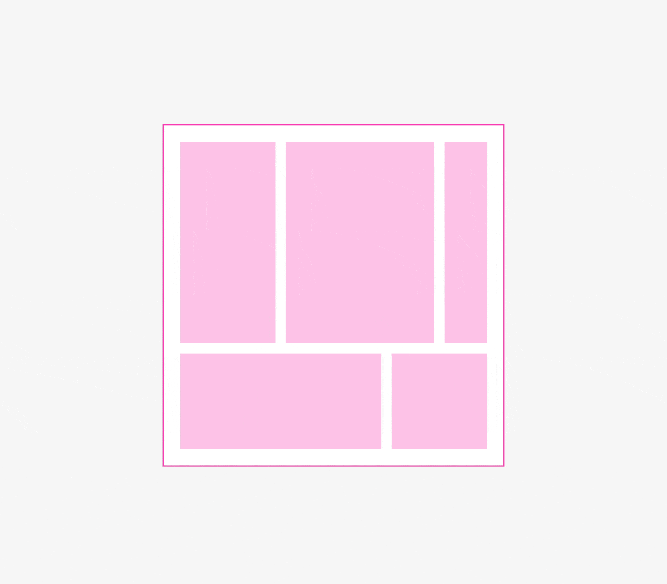
To ensure proportionality in a hierarchical grid, it can be built on the basis of a column grid.
Grids in Websites: Unique Characteristics
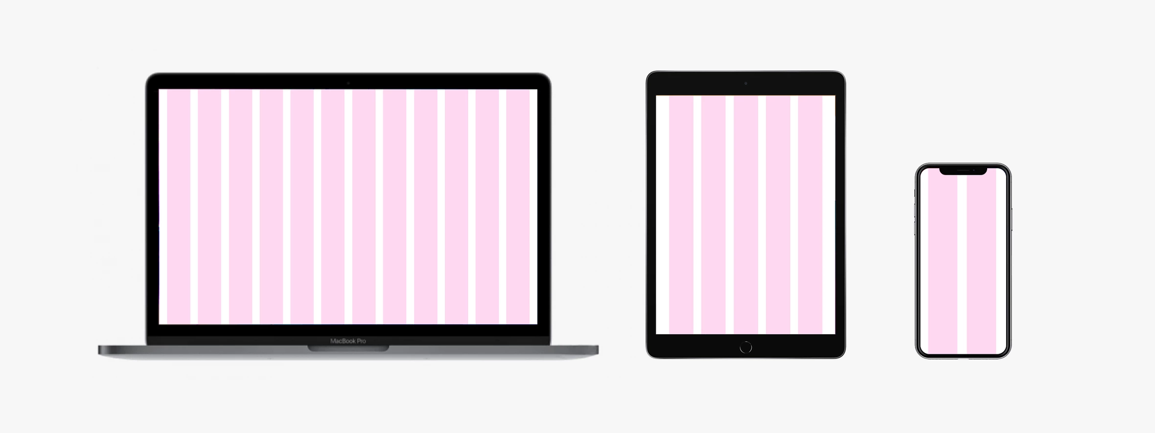
A significant difference between websites and print products is that while magazines and newspapers have a fixed format, websites do not. The same website can be viewed on a smartphone, tablet, or computer.
How can a single grid ensure comfortable viewing on such different devices? The answer is, it can't. A grid that looks good on a 1280x720 monitor won't look organic on a smartphone.
Therefore, a special type of grid is used on websites: a responsive (or flexible) grid. Typically, it is based on a column grid, and the number of columns varies depending on the resolution of the screen on which you are viewing the website.
In the next series of articles, we will explore the topic of website adaptability in more detail.
