The Inner and Outer Spacing Principle
In our previous article, we discussed the hierarchy of content in design. We talked about how to set the size and position of elements in a layout to ensure that the content hierarchy is read correctly.
We also noted that within the format, elements are grouped and interact with each other due to their specific location and design. One of the important tools that help to regulate this interaction is the so-called "inner and outer spacing principle".
It is to this principle that we dedicate this article.
The Essence of the Principle
The principle is often formulated as follows:
inner ≤ outer
In more detail, the principle can be stated as follows:
The outer space of an element should be equal to or greater than the inner space.
So far, it is probably not very clear. But don't worry, we will fix that now. For that, we will need to figure out what we call an element, what a group is, and accordingly, what is inner and what is outer.
Elements, Groups, "Inner" and "Outer"
In general, the inner and outer spacing principle is a special case of proximity in composition, which we covered in the lecture on Gestalt psychology. According to it, we perceive the relationship of objects to common groups due to the distance between them.
For example, let's take five squares and arrange them in space.

In this arrangement, the elements are perceived as independent and unrelated. After all, they are located far from each other.
Now let's consider another example, with a slightly different organization of elements:

Here we see that the elements have a common axis. But despite this, their perception as a group is still not clear.
Let's consider four more cases of the elements approaching each other.

In the given example, we gradually reduced the distance between the squares. In the first two rows, the elements didn't clearly form a group. But in the third and fourth rows, it became obvious.
Why did this happen? At what moment do individual elements form a common group?
To understand this, we need to add an additional parameter to our element - the outer space.
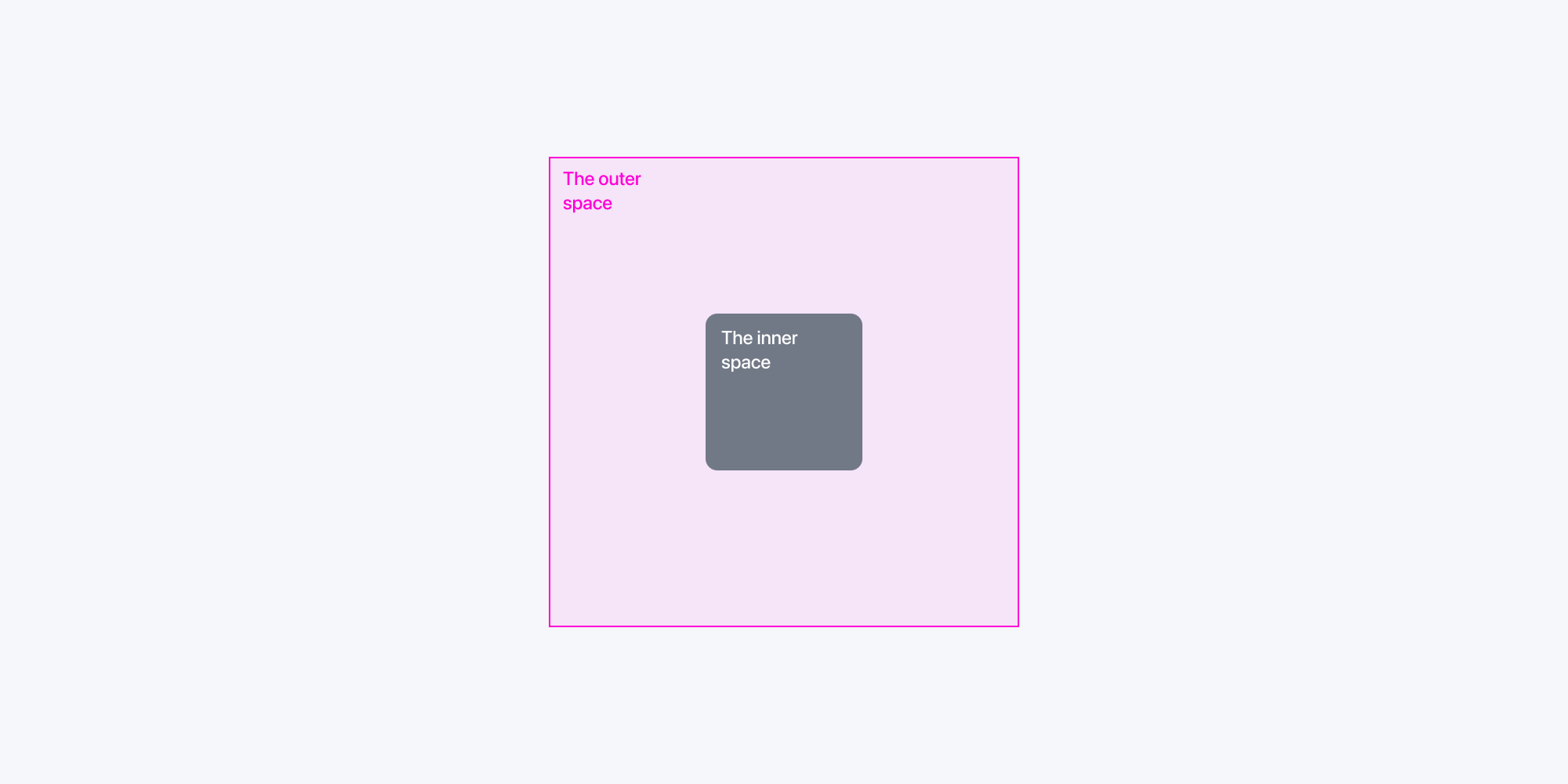
This outer space is what is called "outer". Accordingly, the width and height form the inner space of the element—the "inner".
That is, the principle "inner ≤ outer" defines the following principle: an element is independent if there are no other elements in its outer space. In this case, the size of the outer space should be equal to or greater than the size of the inner space. If another element appears within this space, a group is formed.
Now let's visualize this by looking at an illustration with four rows of elements. We'll explicitly show the outer spaces, making the effect clearer.
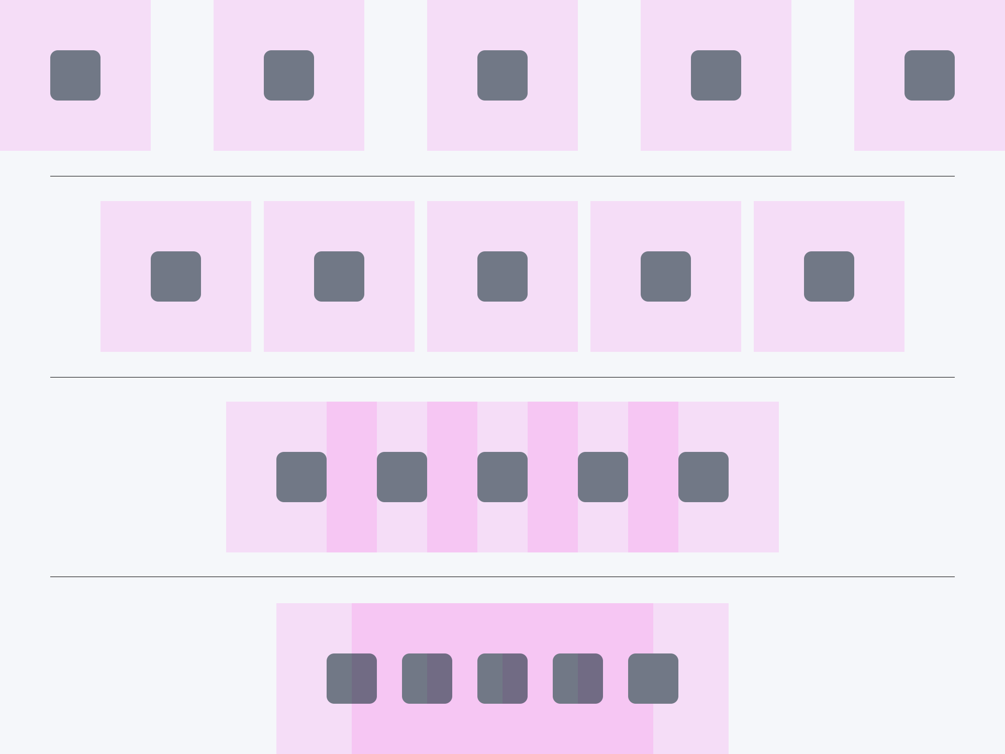
So, we perceive elements as groups when the distances between elements are equal to or less than the size of these elements.
Moreover, each group has its own space. Two groups interact with each other similarly. The closer the groups, the stronger their perceived connection.
This principle is quite important in text layout. Let's look at how it works using a few examples!
Putting the Principle into Practice
One key area where the inner and outer spacing principle shines is in text layout. Here, individual letters typically serve as the basic elements, while words form the smallest groups.
For instance, in the phrase "Design Basics," we see two distinct groups at play.
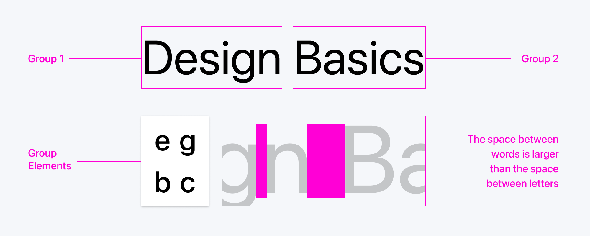
The tight space between individual letters (kerning) connects them as a unit. While the slightly larger gap between words is still relatively small, it's enough to group the two words.
Let's add another line, reading "by Creative Practice," and a third line, "visit creativepractice.com.ua for details."

If we maintain equal spacing between words on each line and between lines, the text feels off. Subconsciously, we perceive each line as a separate group.
Everything within a line becomes the 'inner' space, with the 'outer' space surrounding it. To emphasize this distinction, we increase the vertical space between lines. This space between lines should generally be larger than the space between words within a line.
We adjust this distance using a parameter called leading. Leading is the vertical distance between the baselines of two lines of text. In some computer programs, it is referred to as line height.
Like font size, leading is measured in points, and for comfortable reading, a leading of 1.2 to 1.6 points (or 120-160% of the font size) is generally recommended.
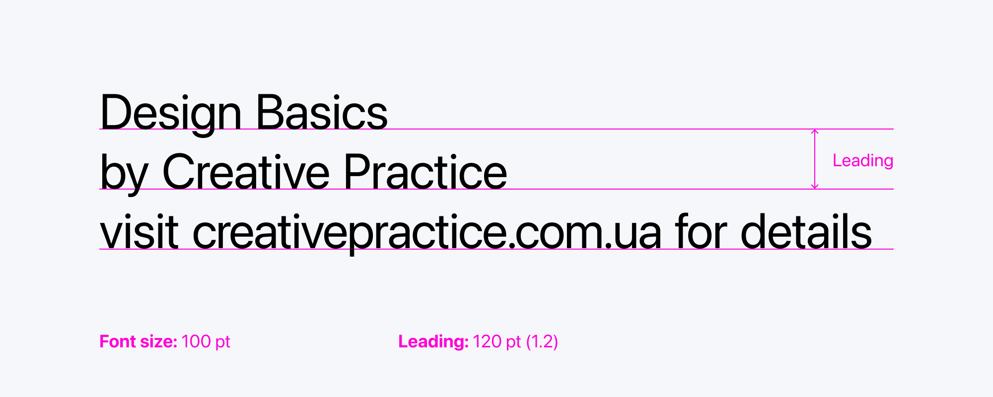
While this is an improvement, we notice an issue: the first two lines form a complete thought, while the third line seems out of place. To correct this, we can visually group the first two lines and differentiate them from the third. Reducing the font size of the third line can also emphasize its lesser importance.
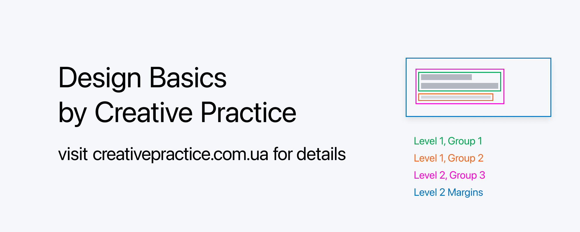
Now, the grouping is more evident.
Similarly, the principle extends to larger bodies of text. For texts with subsections, these subsections form distinct groups that should be visually represented according to the following hierarchy:
Letters → Words → Lines → Paragraphs → Subsections → Sections
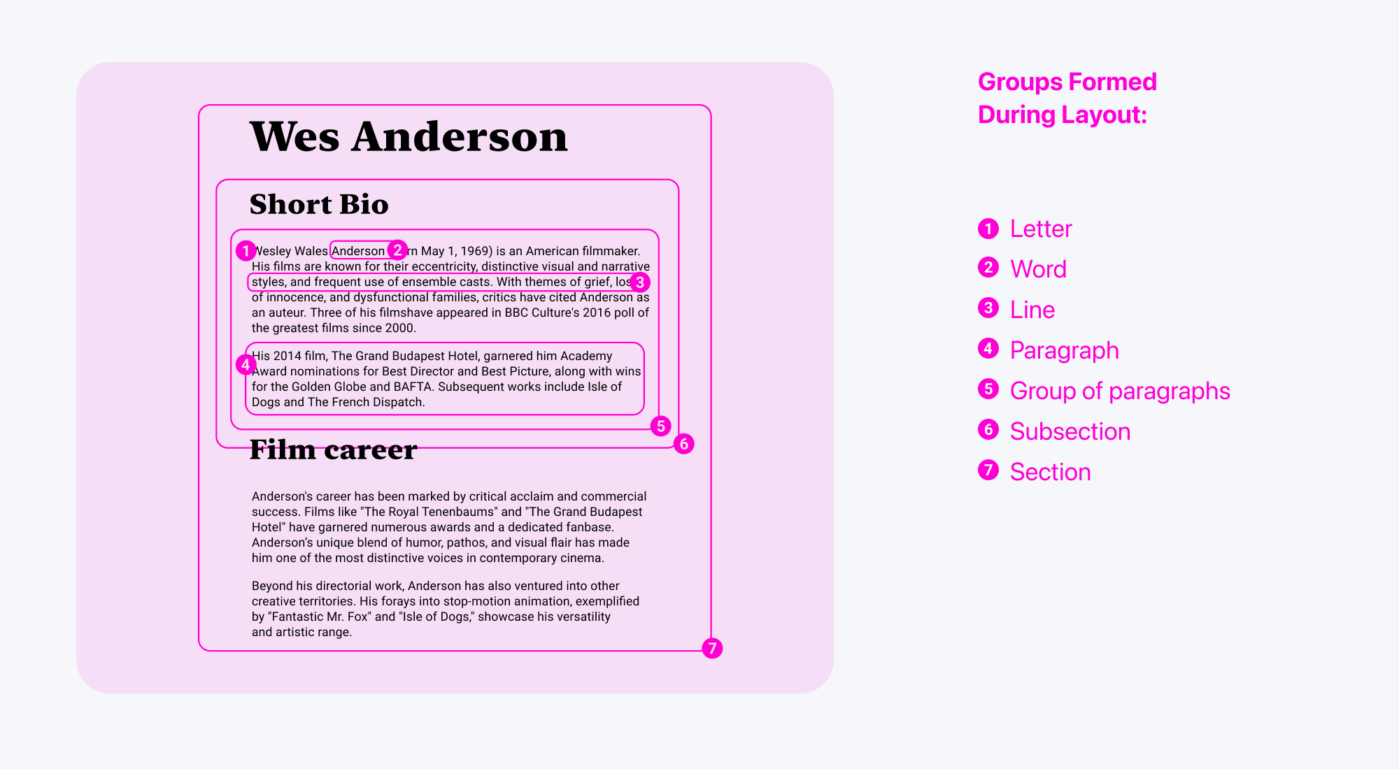
Importantly, this concept isn't just about text; it applies equally to images and other design elements within a layout.
Text doesn't usually exist in a vacuum; it's contained within a specific shape or frame. Designers often overlook how this container influences the internal spacing and relationships between elements. And that's a mistake.
Balancing Internal and External Space in Form Design
The concept of internal and external space extends to any shape or form, whether a poster, a button, or a storefront sign.
When placing content within these forms, it's crucial to adhere to this principle to maintain visual harmony and balance.
Consider the following examples:
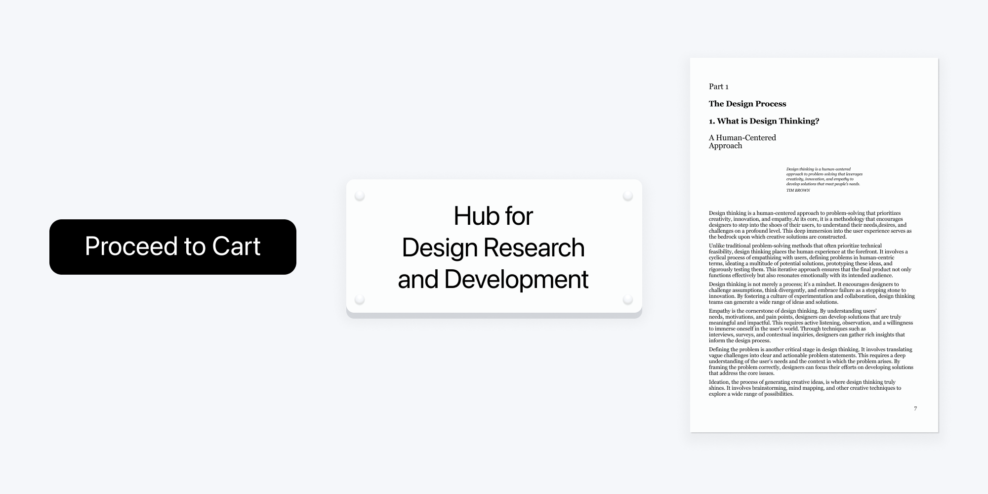
You might notice a subtle sense of incongruity or imbalance. While we may instinctively recognize that something is amiss, pinpointing the exact cause can be challenging.
The culprit often lies in the external margins, the spaces surrounding the content within the form. Let's visualize these external margins:
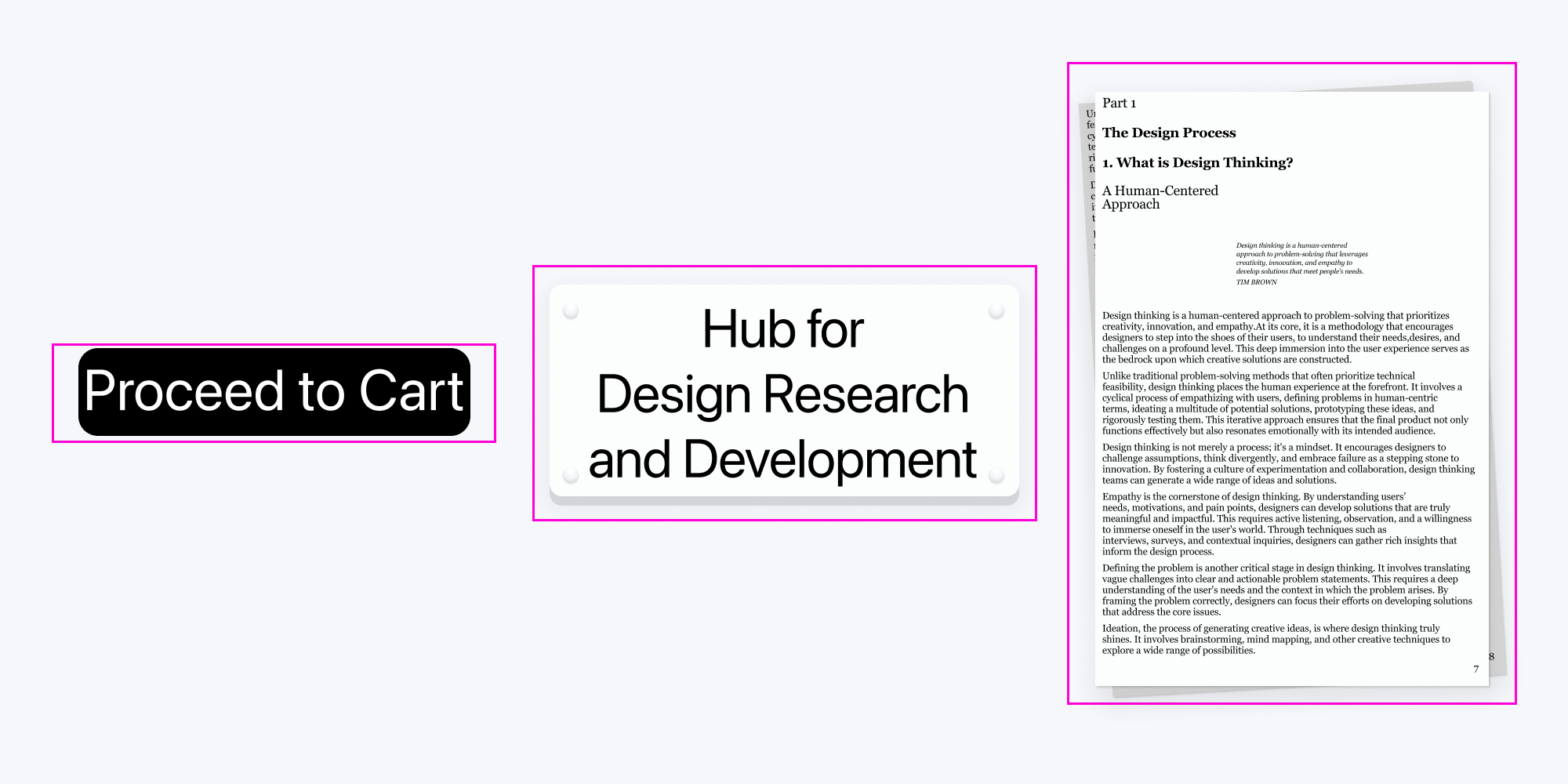
As you can see in the examples, the content's external margins extend beyond the boundaries of the form, creating a sense of visual overflow.
To address this issue, two approaches can be employed: either increase the size of the form itself (if feasible and appropriate) or modify the size of the elements within the form to maintain proportional external margins.
