

Experienced art directors and senior designers often gauge a junior designer's skill by their ability to establish a clear content hierarchy within a layout. The effective arrangement of text elements is crucial for guiding the viewer's eye and conveying information effectively. Just a few glances at the text arrangement are enough to understand the designer's level of expertise and readiness to tackle various tasks.
The reason for this focus on text layout is understandable: text is an essential element in a wide range of graphic design projects. It's in outdoor advertising, digital ads, websites, and apps. Therefore, proficiency in text handling is a crucial skill for any designer. This involves understanding factors like text size, element alignment, and spacing.
These choices influence how viewers perceive the layout, determining which information they prioritize and which they consider secondary.
Designers have many tools and techniques to enhance their work with text. However, two fundamental concepts play a particularly significant role: understanding content hierarchy and applying the Inner and Outer Spacing Principle.
In this article, we'll delve into these concepts and explain how they intertwine. Let's begin with the content hierarchy.
Visual Hierarchy in Composition
We briefly touched upon hierarchy in our "Composition Basics" lecture. This concept is closely tied to visual hierarchy in composition, which dictates that every work should have a clearly defined focal point to which all other elements are subservient. Another way to express this principle is that the content hierarchy within a composition must be easily discernible. Since all design layouts are essentially compositions, they must adhere to this principle.
Before we explore applying hierarchy in design, let's first understand what content hierarchy entails.
The word "hierarchy" originates from the Greek word "Ἱεραρχία," which meant "the rule of a high priest." The term "hierarch" remains associated with the church today, referring to high-ranking clergy like bishops, archbishops, metropolitans, and patriarchs.
However, in modern usage, "hierarchy" often goes beyond the religious context, encompassing any method of structuring and determining the subordination of elements within a system.
In simpler terms, hierarchy defines who reports to whom and how objects are grouped within a given system.
For instance, in the British Army, hierarchy plays a crucial role. It enables rapid decision-making in various situations and establishes the weight of each individual's decision in case of disputes.
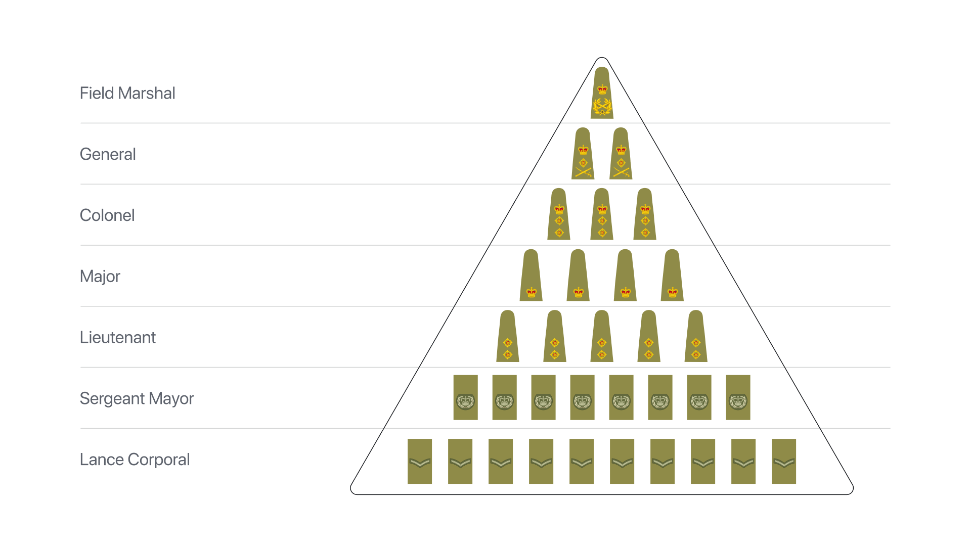
Even for those unfamiliar with military hierarchy, it's clear that a sergeant mayor's decision holds more weight than a lance corporal's. Similarly, a field marshal's order carries more significance than a sergeant mayor's instruction. However, all ranks, from generals and sergeants to privates, are ultimately subordinate to the Secretary of State for Defence. Regardless of personal opinions, orders must be followed. This is the foundation of order within the military.
While military hierarchy is relatively straightforward, how does it translate into design? Unlike in the military, design elements don't issue orders to each other.
…Indeed, they don't, but they do follow a hierarchy. Let's now explore how this works.
The Nested Boxes and Content Hierarchy
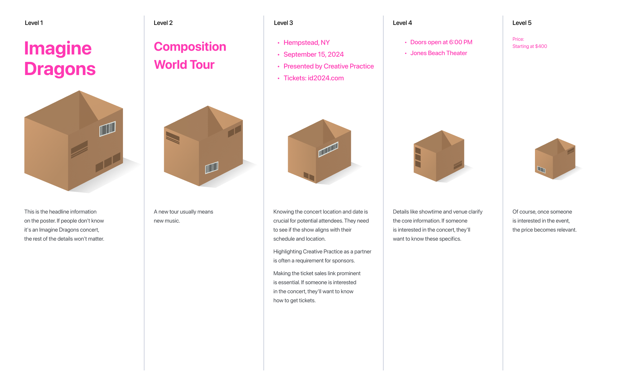
Imagine stacking boxes, one inside the other. The concept is quite simple: one box fits inside another, slightly smaller one. This continues, with each box being smaller than the one before it. Some nesting box sets have five boxes, while others may have fifty or more. These sets serve as an excellent visual representation of hierarchy. A quick look at each box is sufficient to understand its place in the sequence. Mixing them up is impossible, as physically fitting a larger box inside a smaller one is not feasible, making the nesting order evident.

As in nesting boxes, the size of individual elements in design often indicates their level of nesting (or level of hierarchy).
This concept can be easily explained using the example of book layout. At the lowest level of the hierarchy lies the letter. Letters are combined to form words. Words are combined to form sentences. Sentences form paragraphs. And so on.Furthermore, within a chapter, there may be subsections, and within subsections, there may be lower-level subsections. This hierarchical structure is reflected in the visual presentation of the text, with headings of different font sizes indicating various levels of importance.

Furthermore, within a chapter, there may be subsections, and within subsections, there may be lower-level subsections. This hierarchical structure is reflected in the visual presentation of the text, with headings of different font sizes indicating various levels of importance.
Establishing Hierarchy
As we've seen, the size of elements, particularly text, can effectively convey their level of hierarchy and importance. In the previous section, we explored the hierarchical structure of book layout, where the nesting level is typically straightforward. However, designers often encounter situations where information is not inherently organized.
Consider this scenario: you receive a list of details for an Imagine Dragons concert in Hempstead, NY to be displayed on a poster. The information is presented in this format:
Composition World Tour
Imagine Dragons
Hempstead, NY
Jones Beach Theater
September 15, 2024
Doors open at 6:00 PM
Price: Starting at $400
Presented by: Creative Practice
Tickets on sale now at id2024.com (this is a fictional website for demonstration purposes only.)
Currently, this information lacks a clear hierarchical structure. It's simply an unorganized collection of data. In such cases, before designing a layout, designers must first structure the information, establishing clear hierarchy levels. This involves identifying the primary and secondary elements, while acknowledging that some information may hold equal importance at certain levels.
Consider this structured version of the information:
In design, hierarchy is determined by both content and form. It's important to note that size is just one way to visualize hierarchy. Another important tool is the organization of elements within the format.
We'll discuss this in more detail now.
Sequence of Elements as a Hierarchy Tool
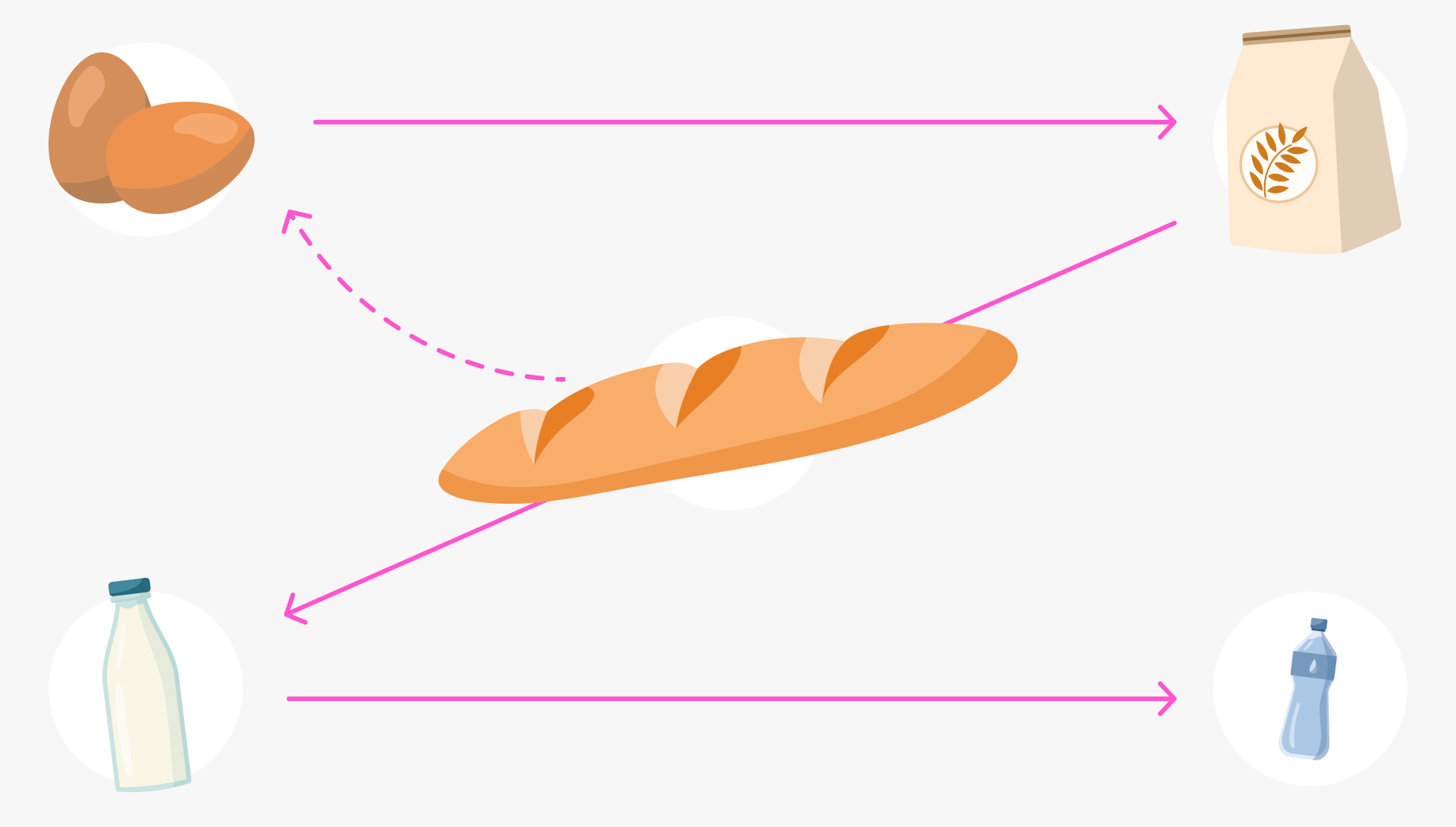
One effective way to emphasize hierarchy in design is through the sequence of elements. Imagine you're heading to the grocery store with a shopping list in mind:
- Bread
- Eggs
- Flour
- Milk
- Water
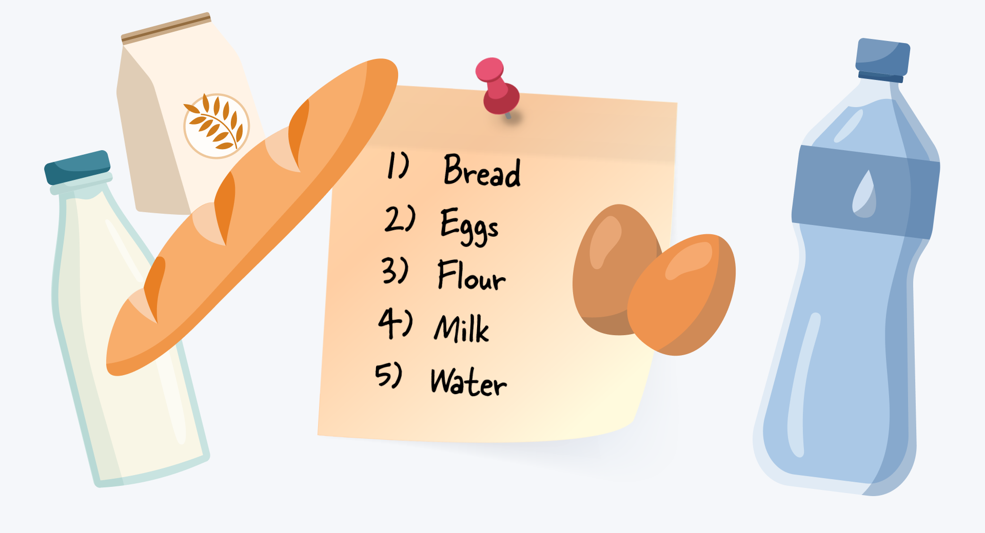
Which item on this list do you instinctively perceive as the most important? The first one is bread, right? If each item cost $5 and you only had $15, you'd likely choose the first three items on the list. Of course, assuming you had no one else to consult with.
This happens because we subconsciously perceive items higher on a list as having more significance, representing a higher hierarchy level.
The numbered format of the grocery list establishes the order of importance. But how do we perceive order in a graphic design layout, say, for an Imagine Dragons concert poster?
In this case, we need to delve into the intricacies of human information perception. A simple "left-to-right" or "top-to-bottom" sequence doesn't always work here.
Consider this image:
Did you notice something interesting? Despite the larger headline, the text in the center of the white space is likely the first thing you see. This is because our eyes are naturally drawn to elements that stand out against a plain background, especially when they hold a central position.
The larger headline, though technically holding a higher hierarchy level, might be perceived as secondary due to the sequence in which you read it.
So, why does this happen?
The central placement of the important text plays a crucial role in attracting attention. This is due to our visual perception, which often directs our focus to specific points within a format. In many compositions, elements closer to the optical center are more likely to capture our notice.
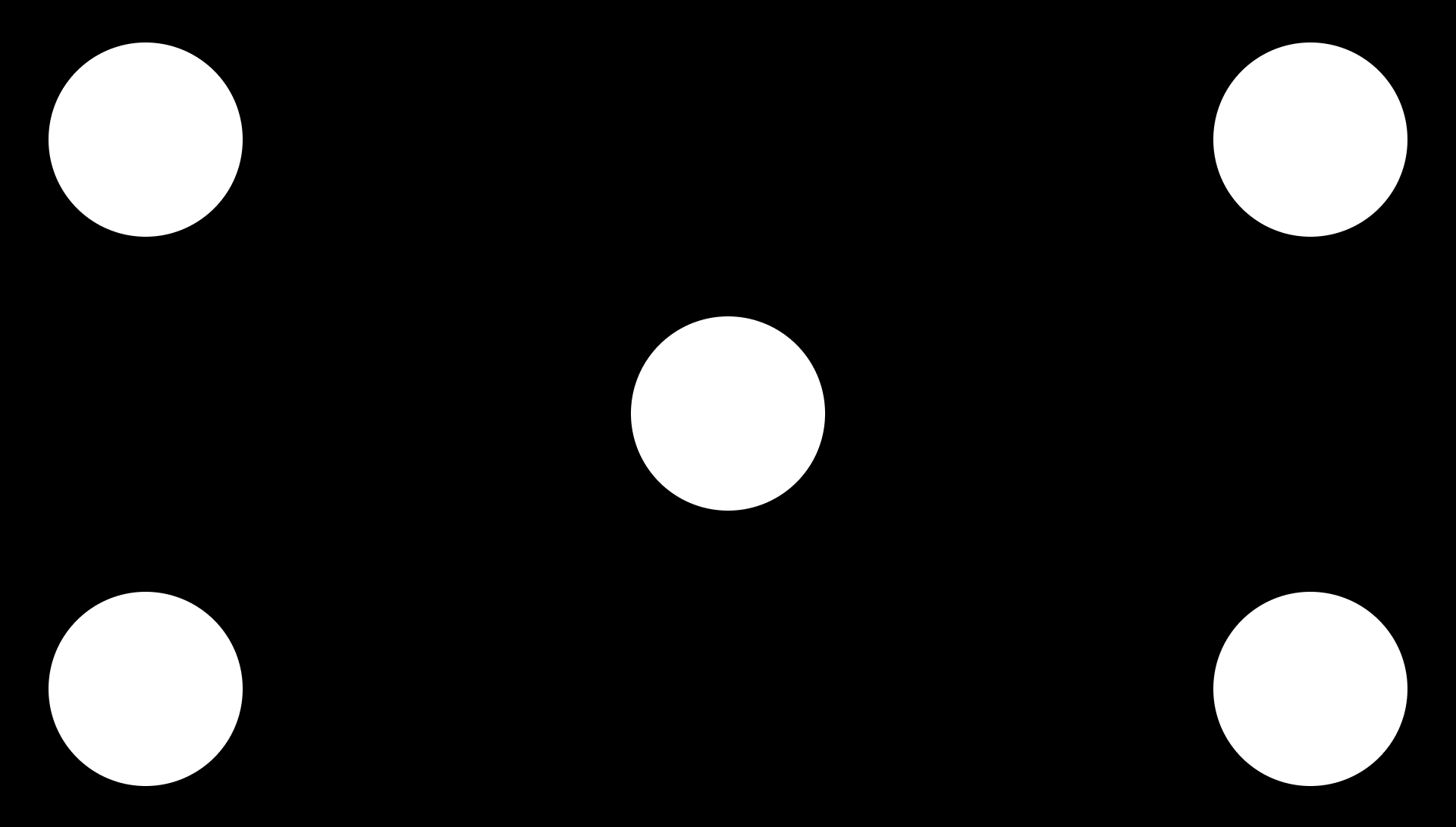
A central element is most likely to grab your attention first. This is followed by the item in the upper left corner, and then the one in the upper right:
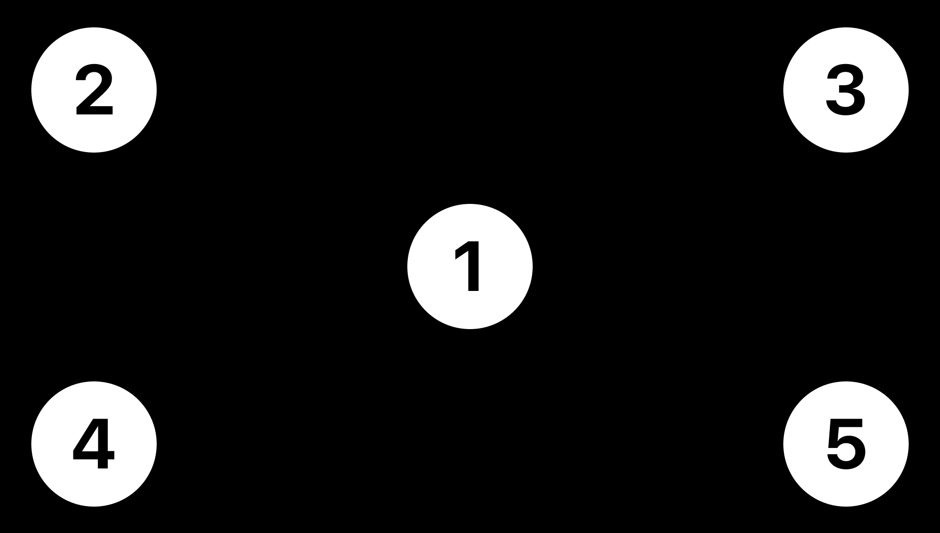
Let's imagine transforming our numbered grocery list into a visual format. We can leverage our understanding of visual perception to guide the viewer's attention:

Our eyes naturally follow a specific path when scanning visual information. This pattern, often known as the Z-shaped pattern, is influenced by various factors, including reading habits.
Drawing upon the principles discussed above and incorporating them with the element sizes from the poster we discussed earlier, we can arrange the content in a way that amplifies the desired effect:

Our example poster features more than five items, Real-world posters might often incorporate even more information. This is where managing content hierarchy becomes even more important.
These relationships are precisely what the Inner and Outer Spacing Principle helps to regulate. We will delve into the specifics of this rule in the next article.


