

Branding for the hospital
Medicine demands exactness.
Brand identity should be held to the same standard.
AKCIOMA’s visual system is designed around order and transparency.
Every element has a function; nothing exists purely for decoration.
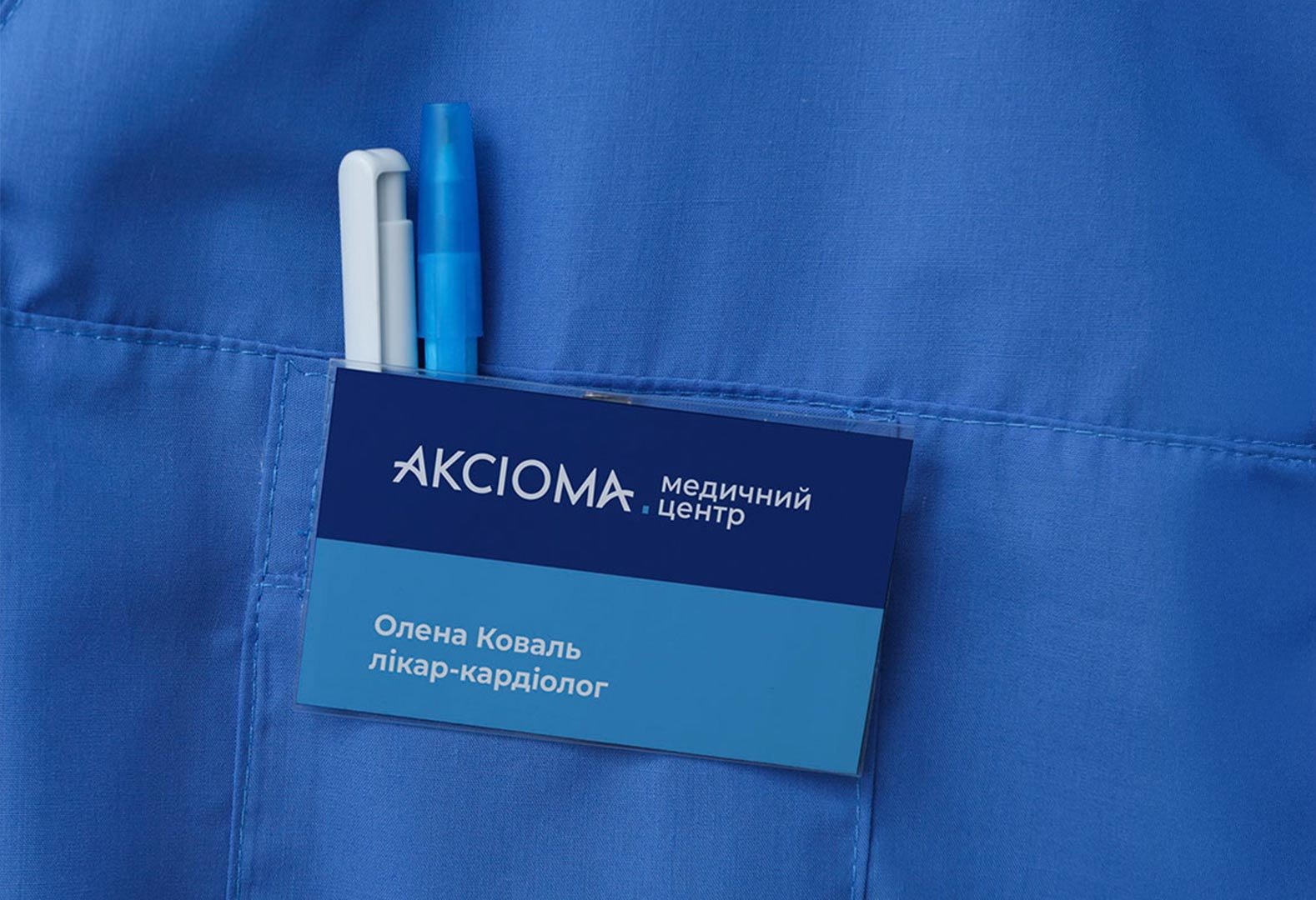
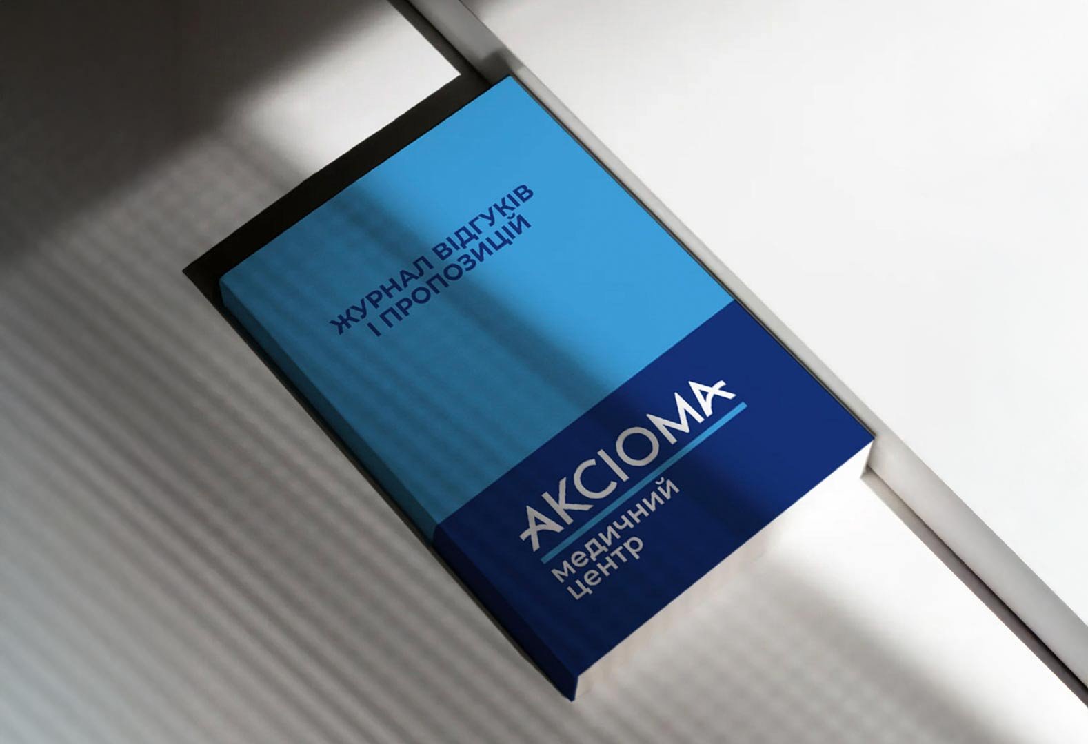
The foundation of the identity is a modular structure of solid color fields —
a visual analogy to clinical logic: clear, methodical, and balanced.
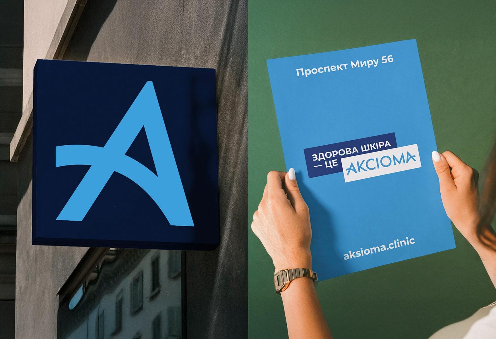
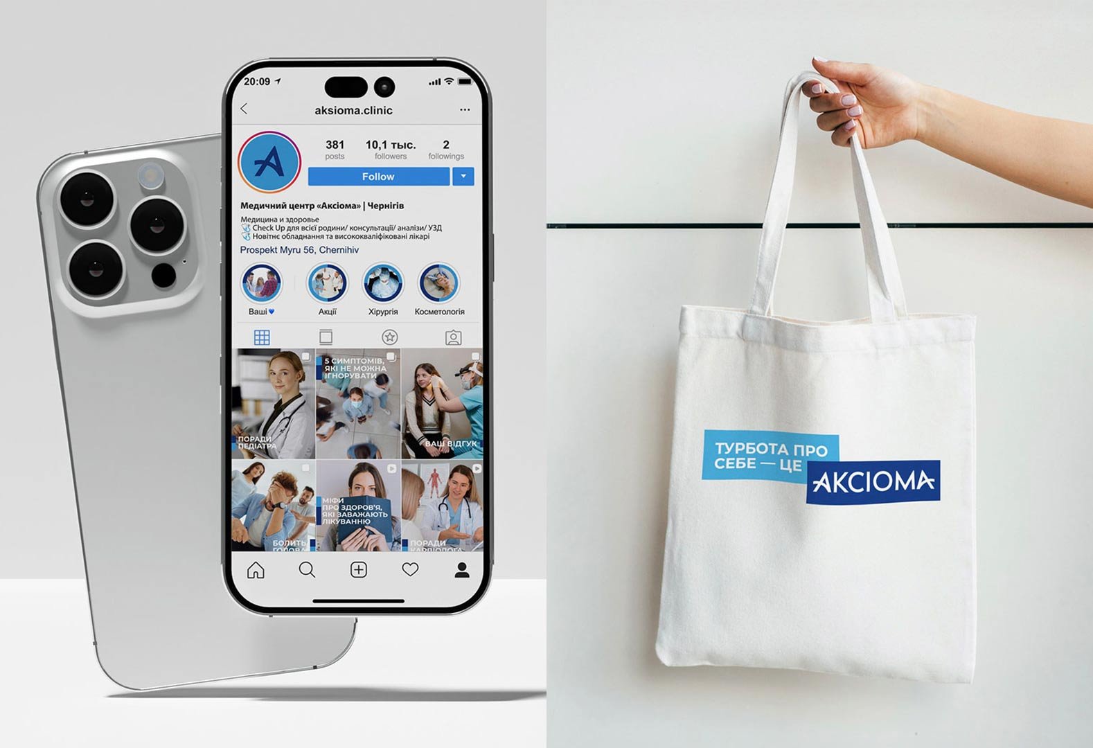
This system is flexible and consistent across all brand environments:
— interior spaces
— printed collateral
— digital interfaces
— medical staff uniforms
— daily-use branded materials
The identity does not draw attention away from medical expertise —
it supports and amplifies it.
AKCIOMA — where clarity is essential, not optional.


Кейси автора Інші кейси автора
Всі кейси автора 


