Landing page for Citroen C4
Design goals
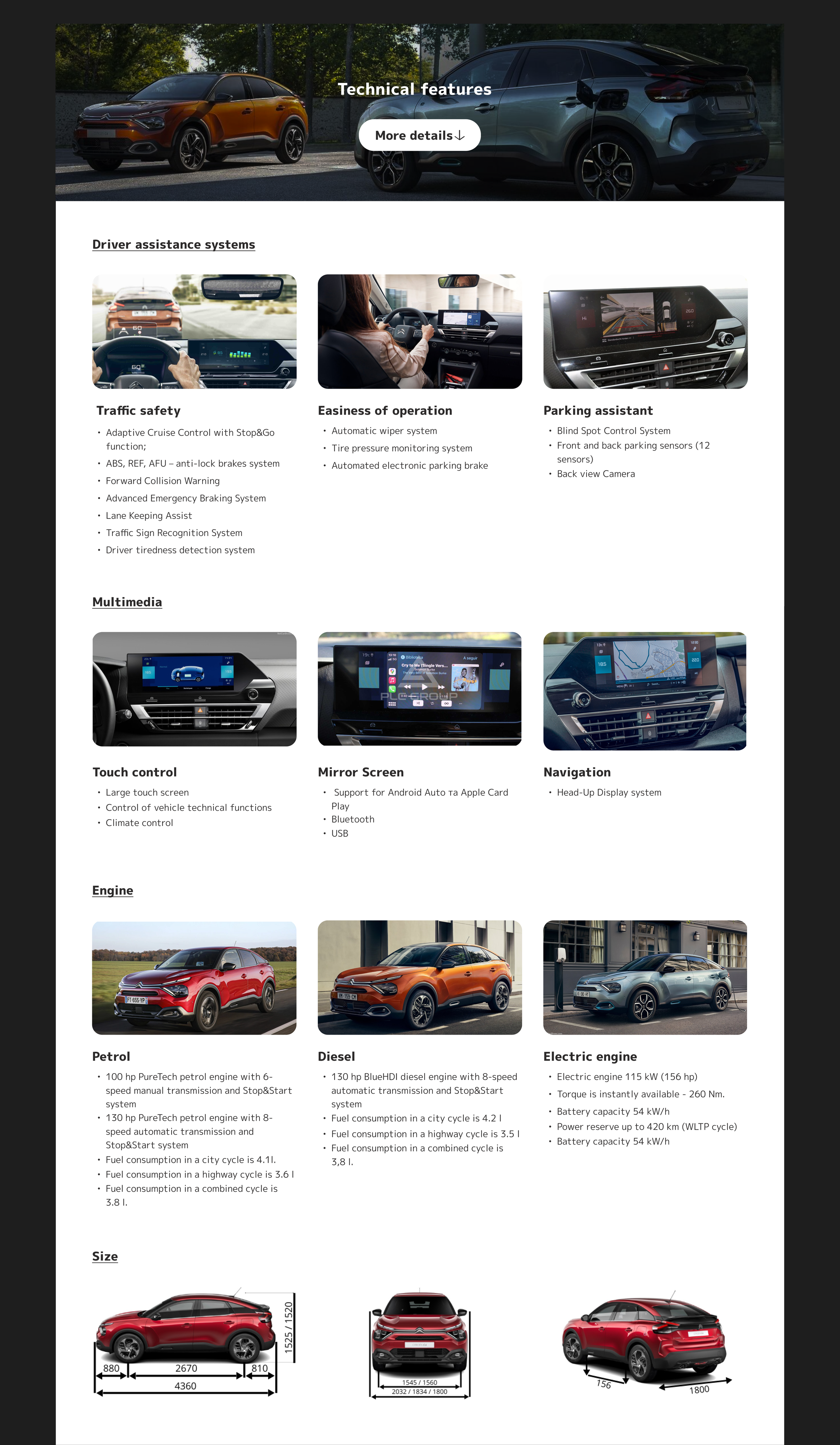
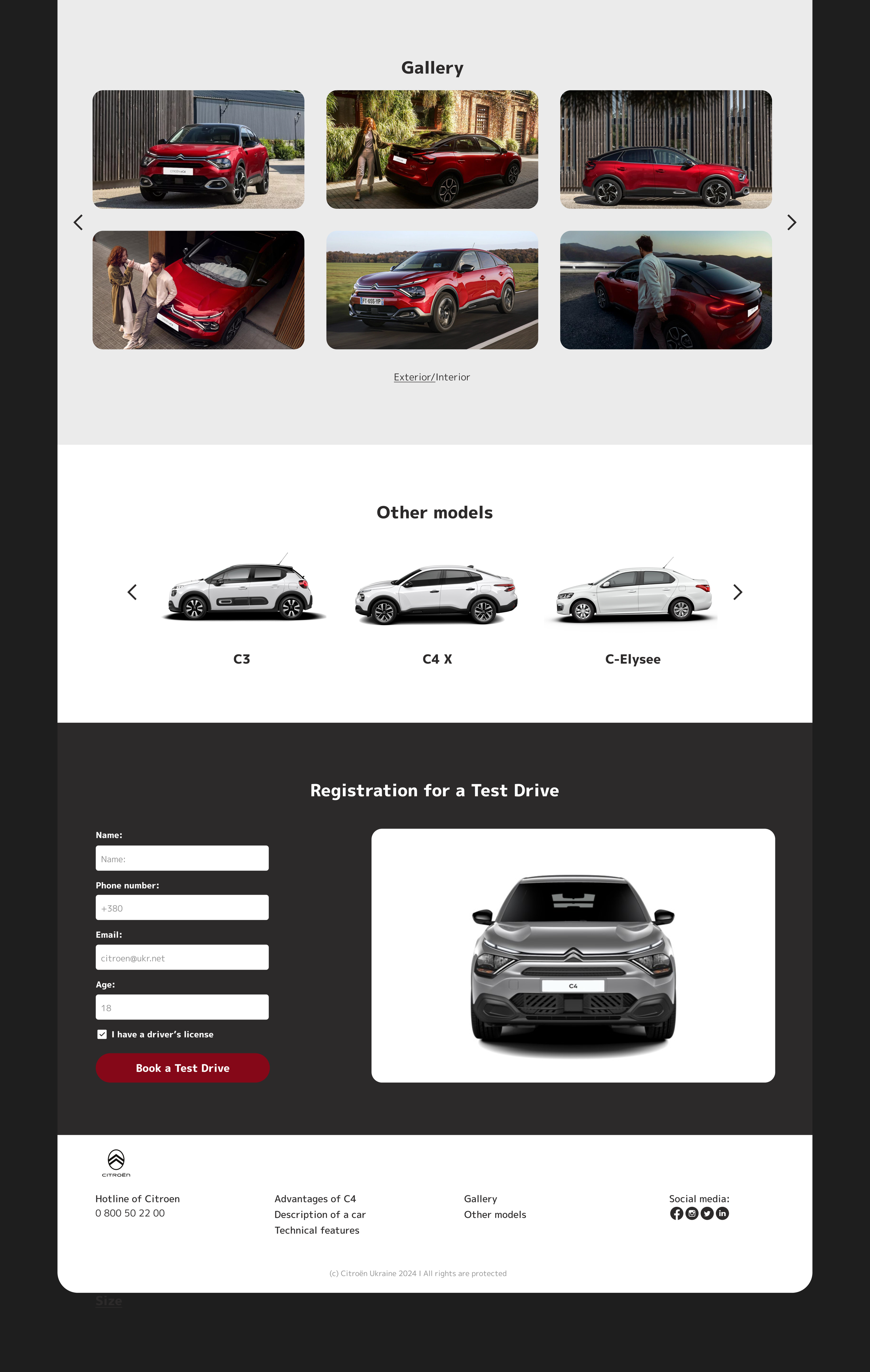
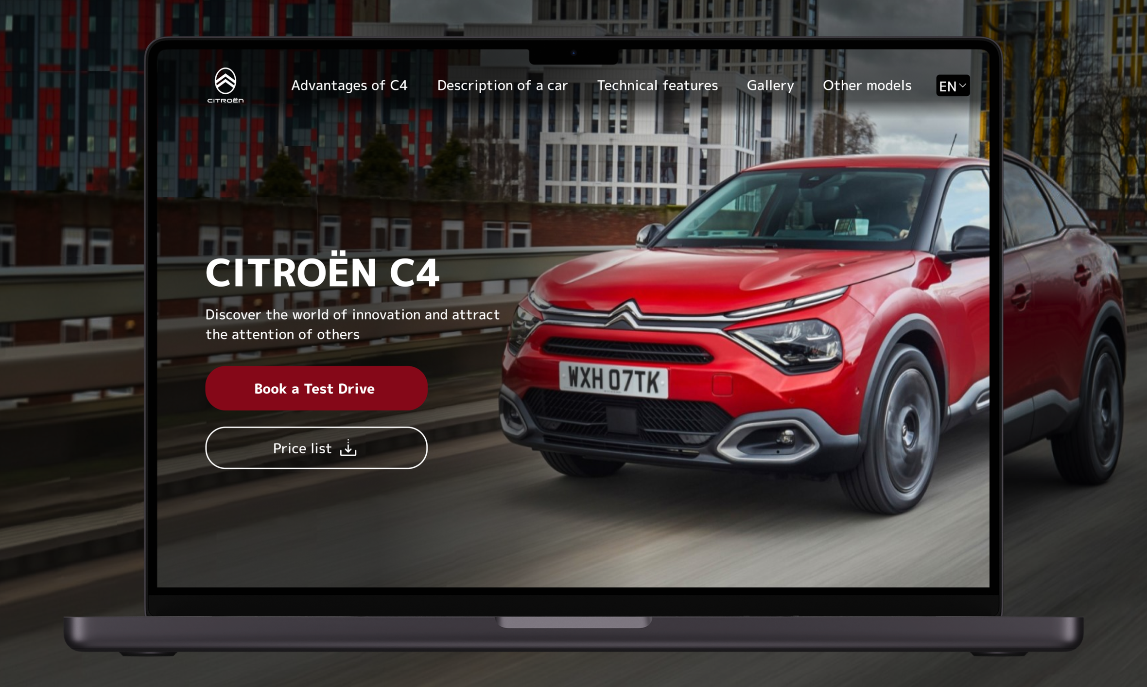
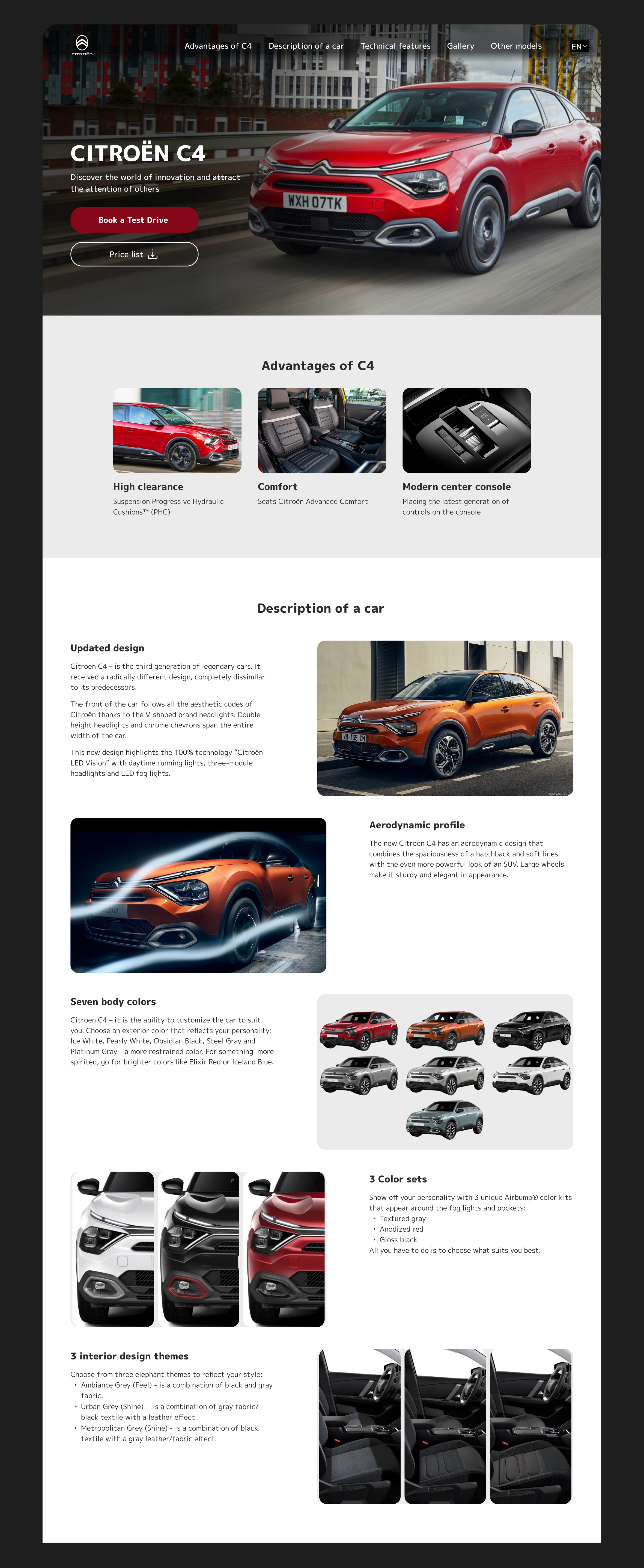
To create a Landing page for Citroen C4 advertising, according to the following requirements: (i) CTA button "Download a catalog" or "Book a test drive" on start screen; (ii) block “Advantages” (why this model is better than others); (iii) block "Description of a car"; (iv) block “Technical features” (to describe the car’s compatibility with portable electronics, driver assistance systems, fuel, etc.), by default, this block is hidden and can be expanded; (v) block “Gallery”; (vi) registration form for a test drive (required data - name, phone number, email, proof of license, age), (vii) the entire line of cars; (viii) footer
Composition
The Landing page is created with a clean and minimalist approach, ensuring that the car takes center stage. The composition follows a structured grid layout, providing a seamless flow of information and visuals. The start screen features a striking image of the Citroën C4 in a bright red color, immediately capturing the user's attention.
Typography
The typography used on the Landing page is Mplus 1p, a modern and clean typeface that ensures readability across all devices. The font choice complements the minimalist design, with clear and legible text that guides the user through the content without distraction.
Colours
The colour palette is simple yet effective: a white-gray background with black text and dark red buttons. This monochromatic scheme enhances readability and keeps the focus on the images and information about Citroën C4. The red color of the buttons and the car itself adds a touch of sophistication and energy, reflecting the car's dynamic and stylish nature.
Buttons
The buttons on the landing page are designed in a dark red color. This color choice not only aligns with the brand's color scheme but also provides a sharp contrast against the white background, making the buttons stand out.