

Logo Collection 2026
Logo Collection 2026: Visual Identity & Brand Systems
About the Project
This case study explores contemporary aesthetics in logo and visual identity design.
The collection showcases a blend of technical precision, bold typographic choices,
and a conceptual approach to brand visual communication.
Key aspects of the work:
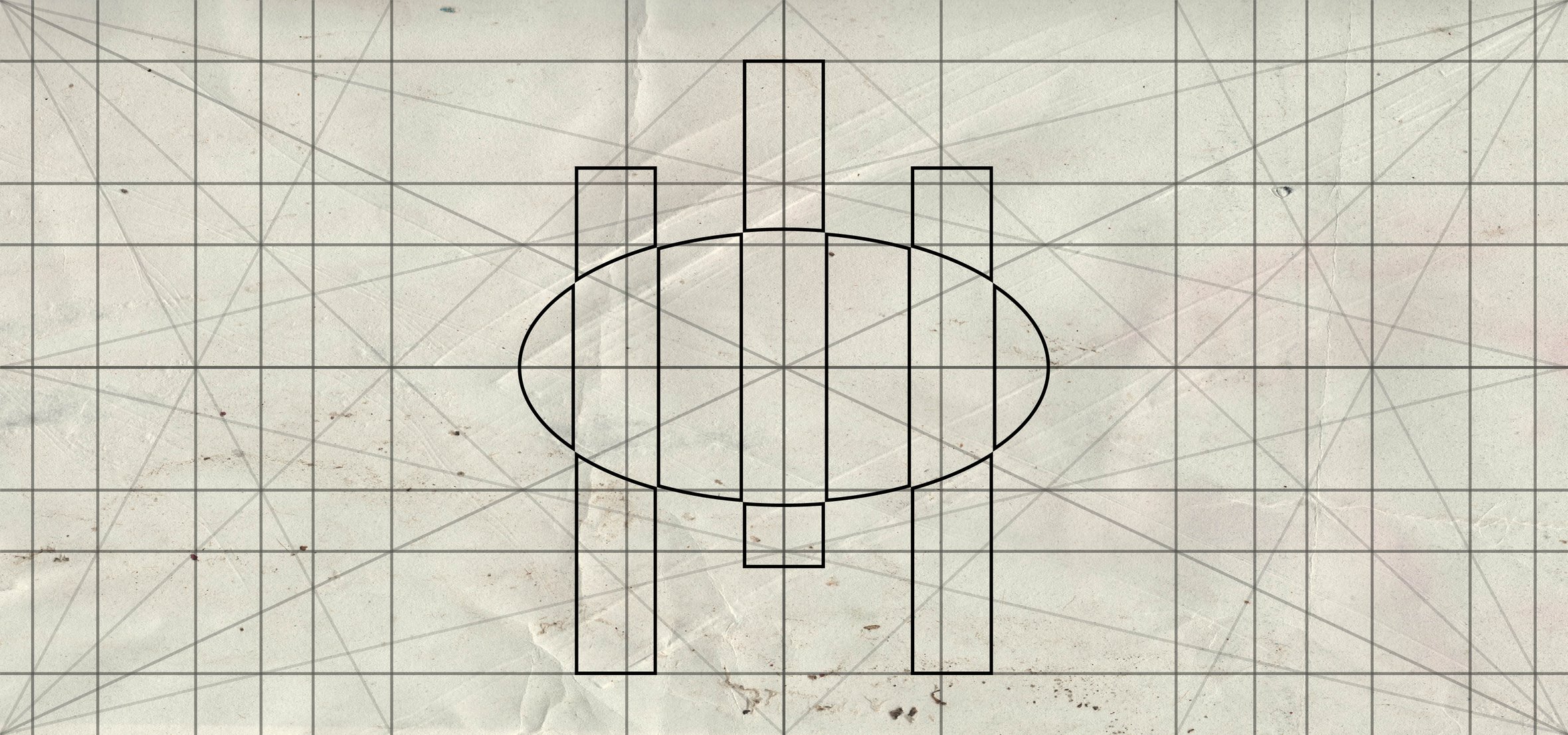
Geometry and logo construction: Each logo begins with a clear modular grid system.
This allows for ideal proportions and scalability, which is critically important for modern digital platforms.
Typography: The project features custom typographic work. The typographic solutions are selected to complement the unique shape of the logos, creating a cohesive and recognizable visual voice.
Color and atmosphere: Each concept has its own unique palette—from futuristic metallic gradients and neon accents to subdued natural tones. This underscores the brand’s
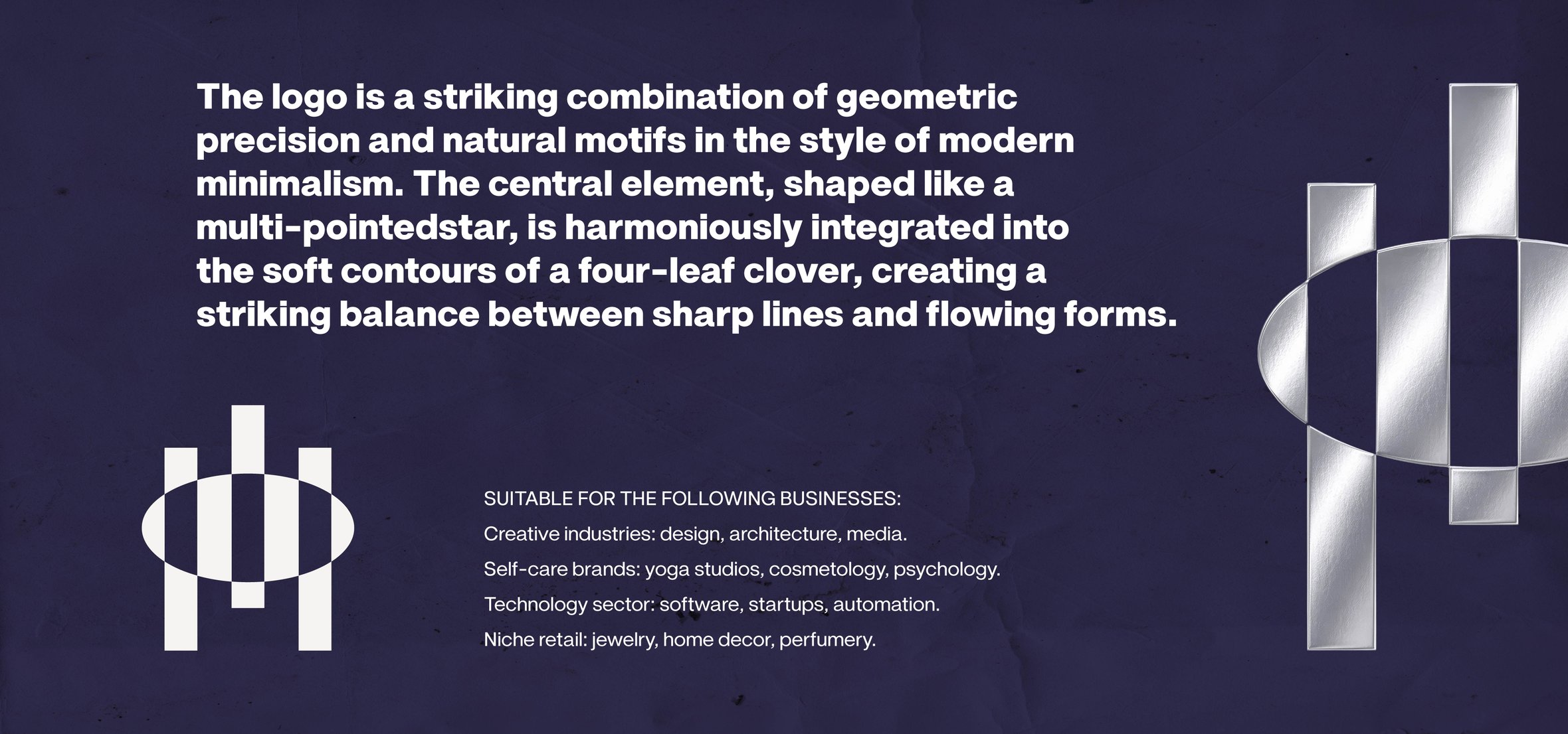
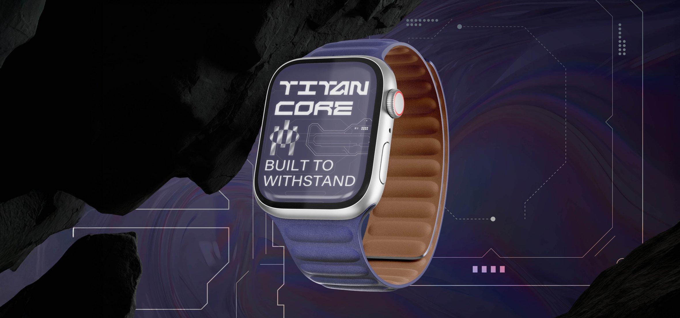
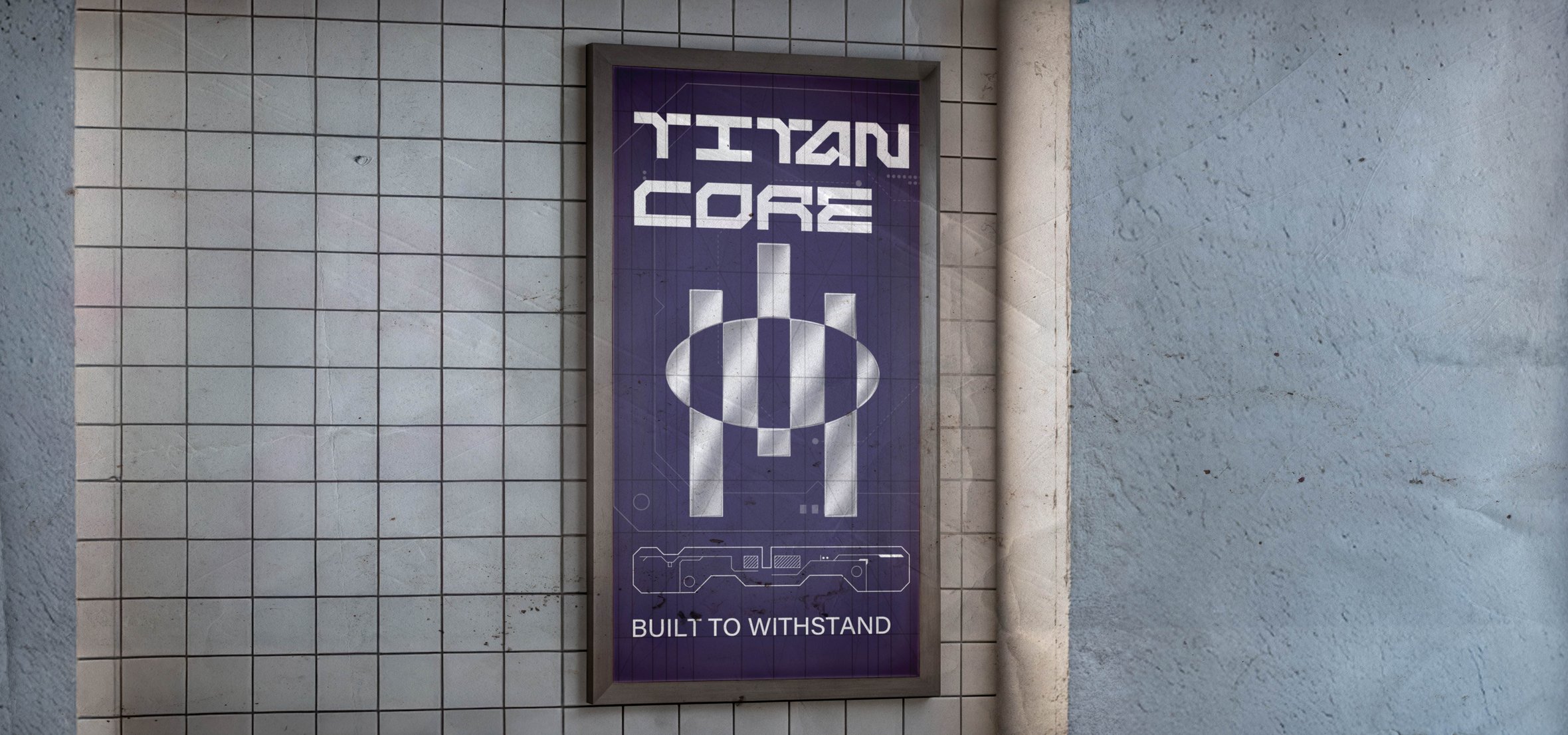
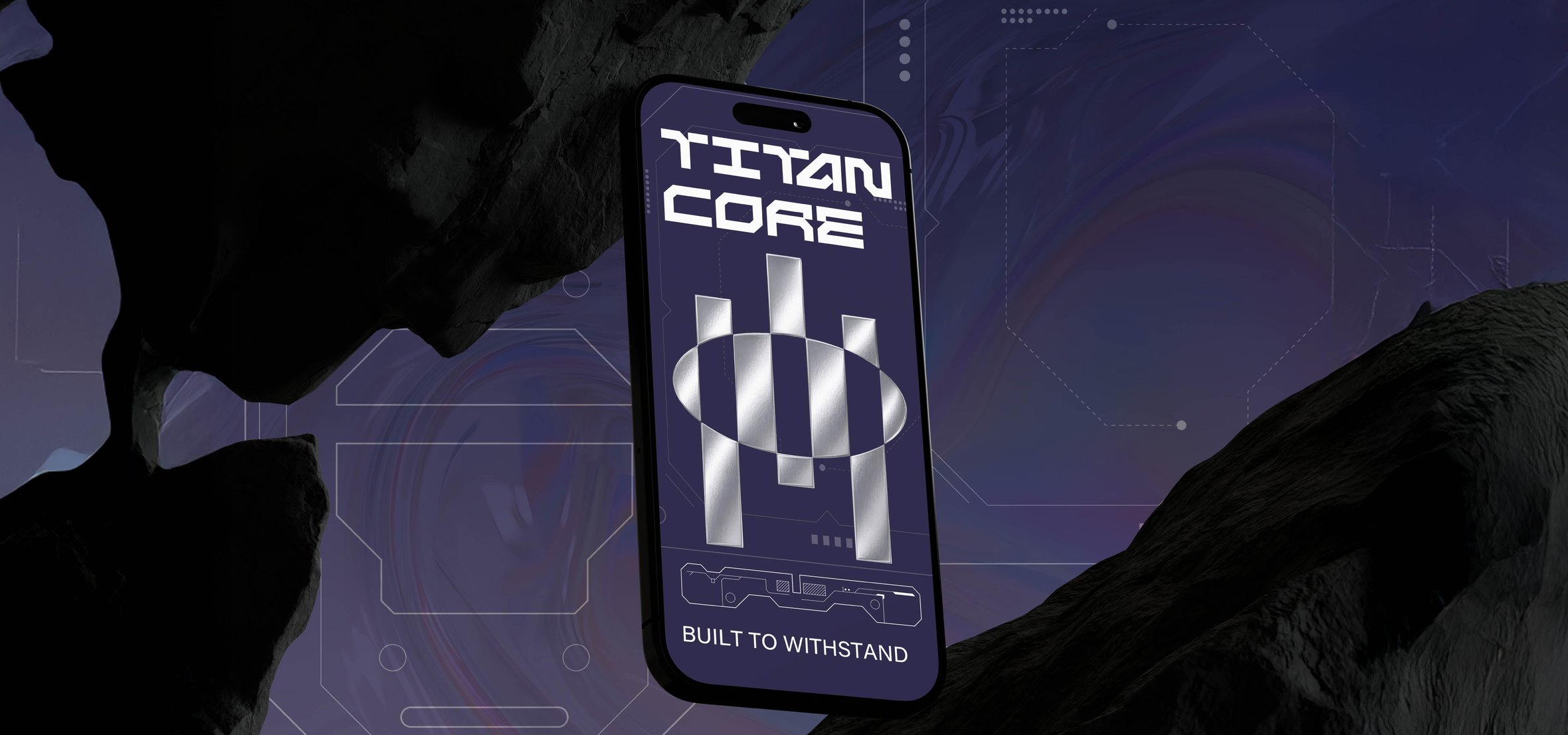
The TITAN CORE case embodies an identity that blends geometry with natural symbolism. The logo combines a star and a clover in a deep blue-violet color palette with chrome accents. The aesthetic of minimalism and “durability” (Built to withstand) positions the brand as a high-tech premium product for the creative and self-care sectors.
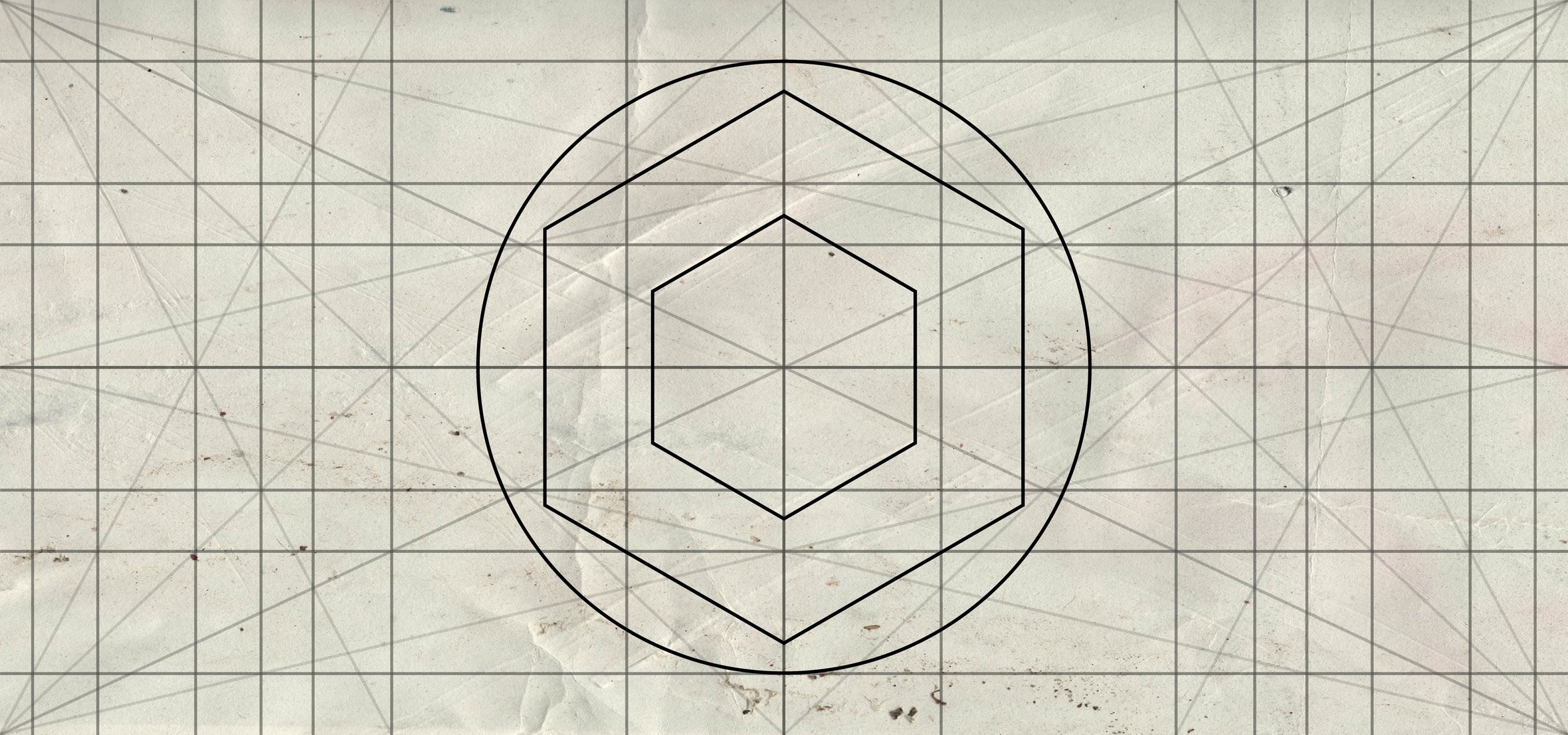
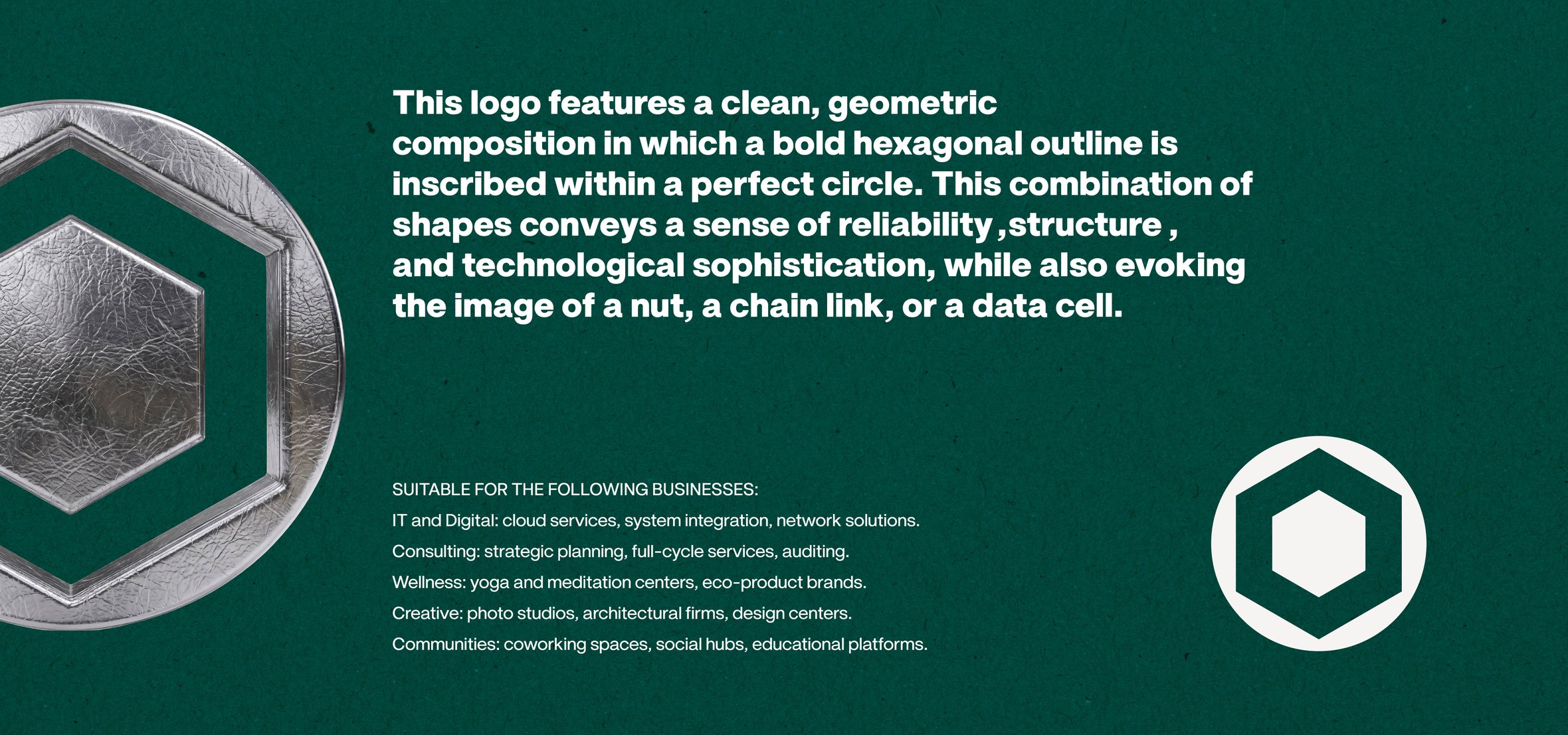
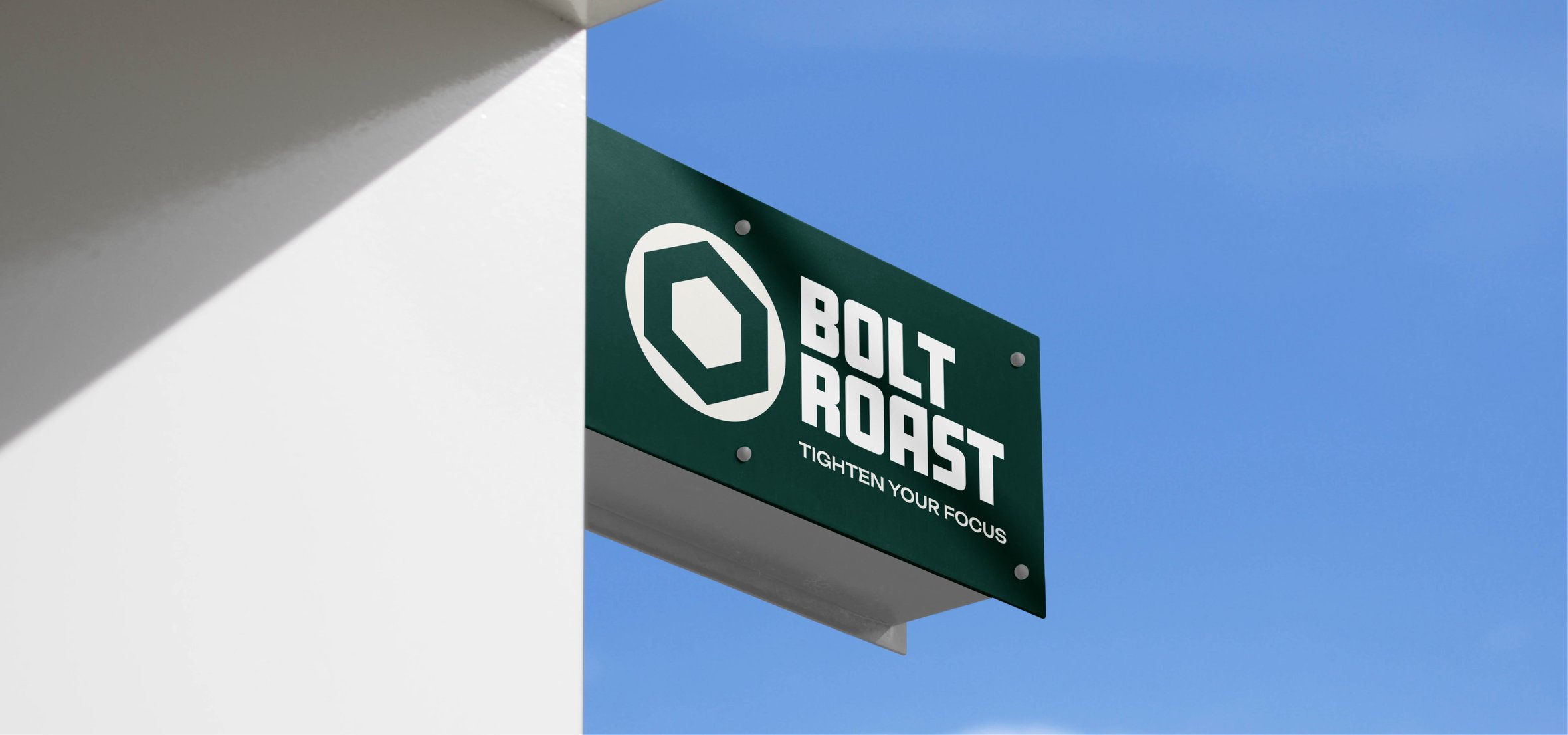
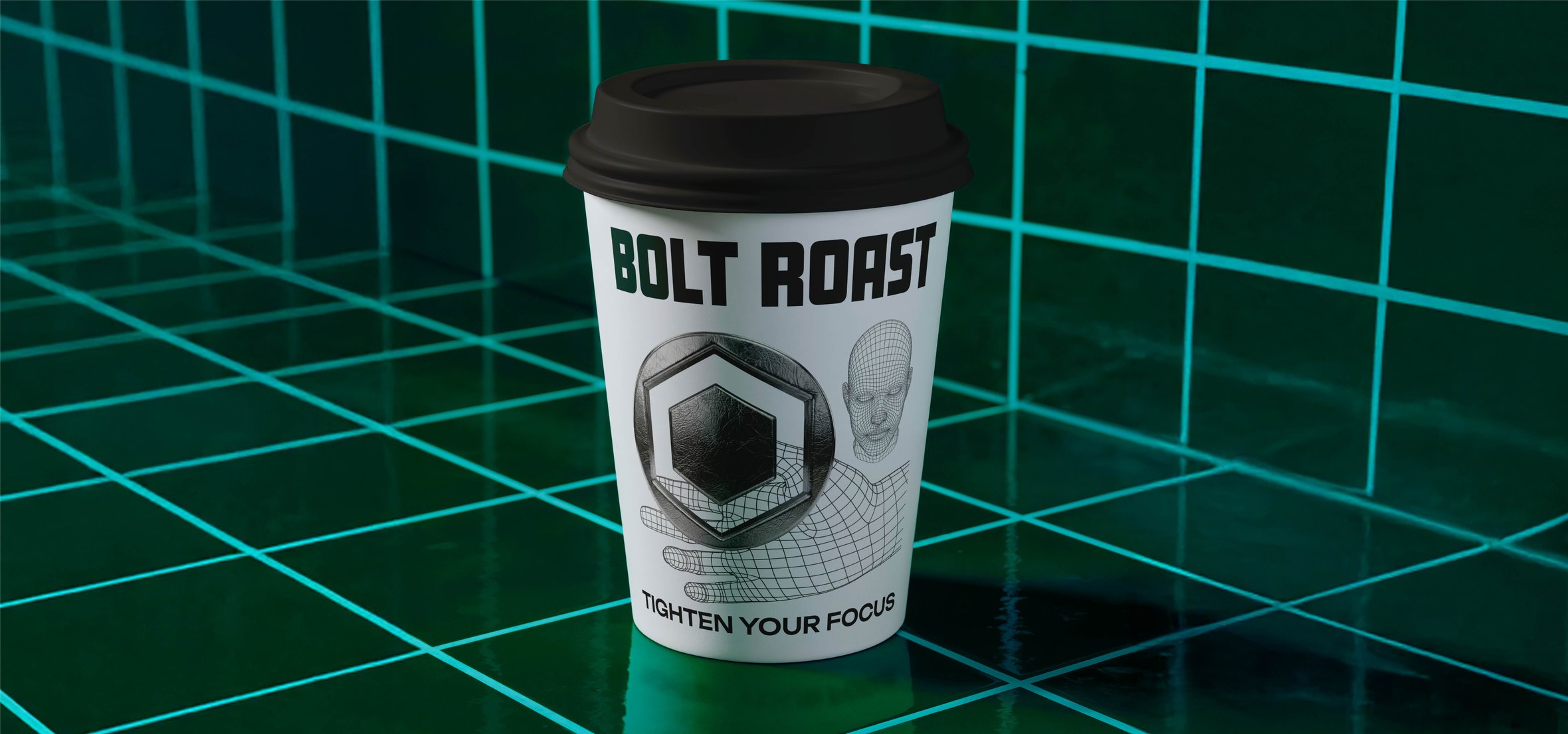
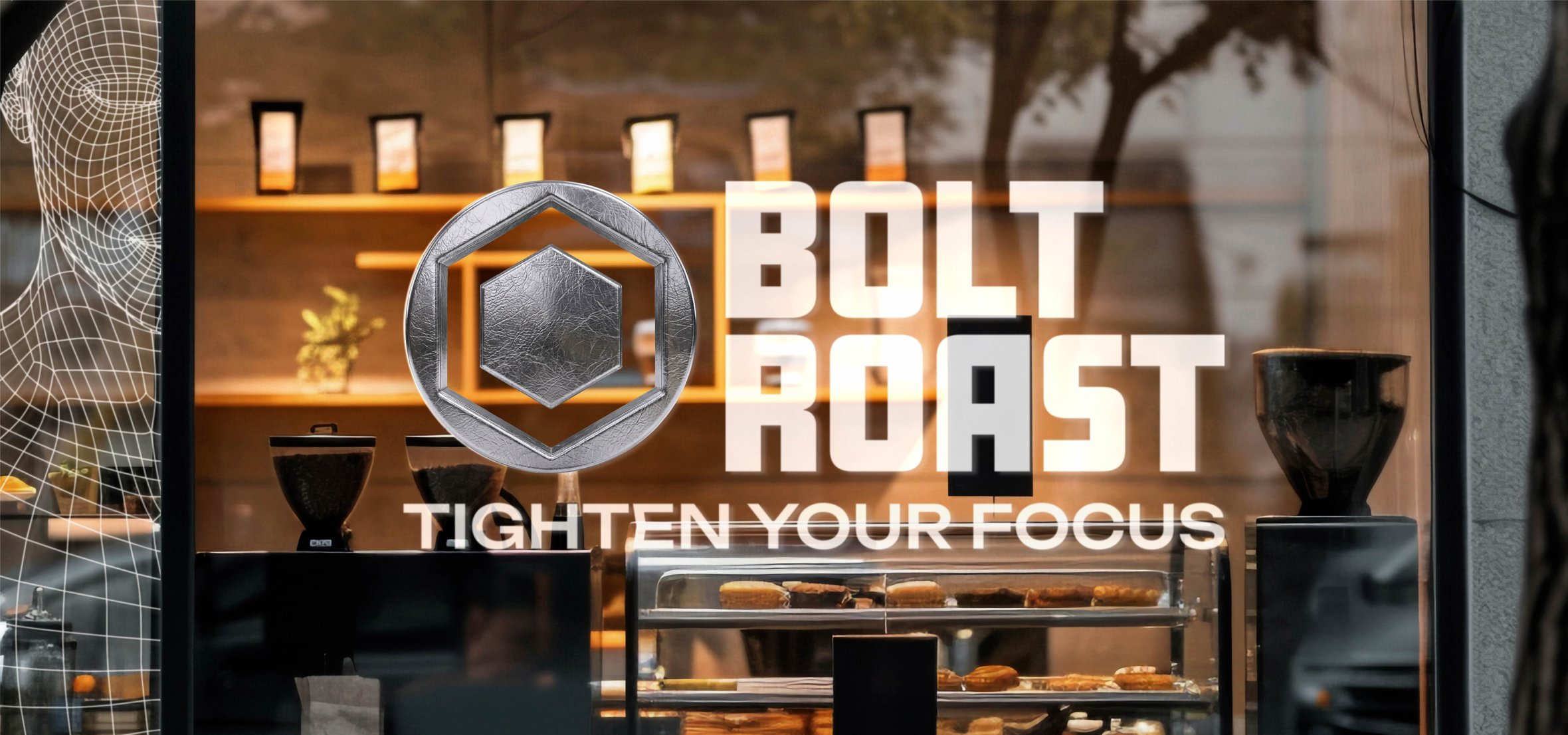
The BOLT ROAST brand identity is an industrial design that blends coffee culture with the aesthetics of technology through hexagonal geometry. The combination of metallic textures, a deep emerald color, and 3D graphics conveys reliability and intense focus, emphasizing the brand’s “Tighten Your Focus” concept..
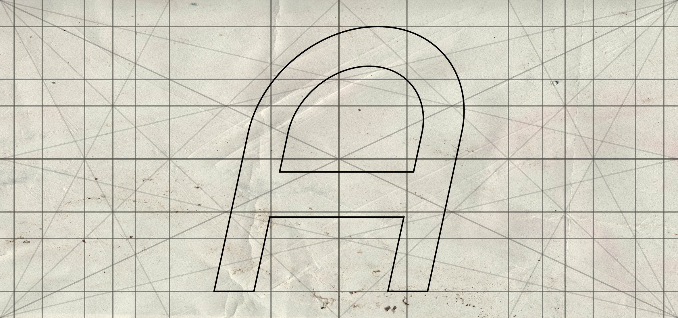
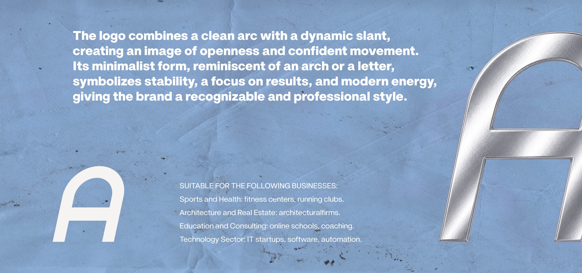
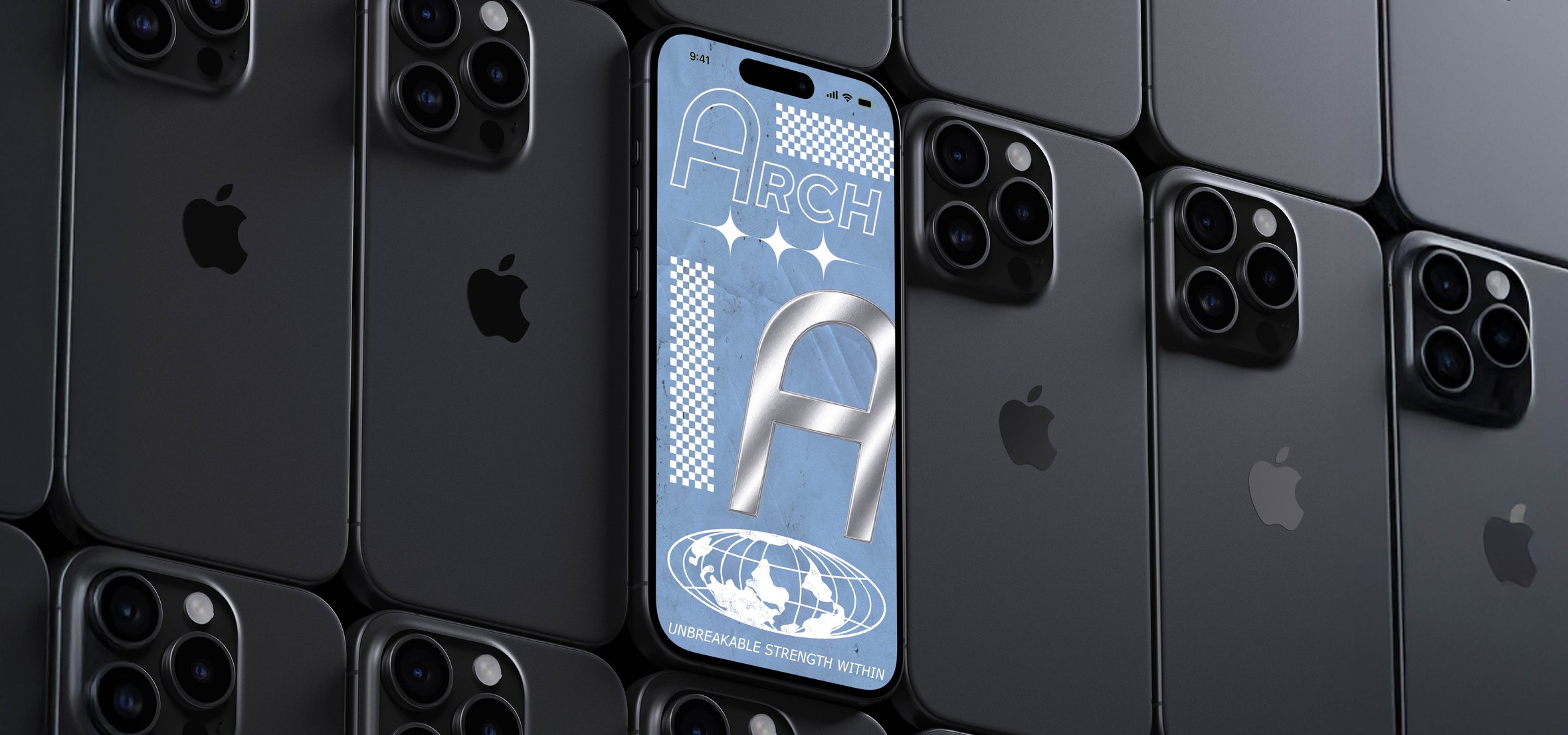
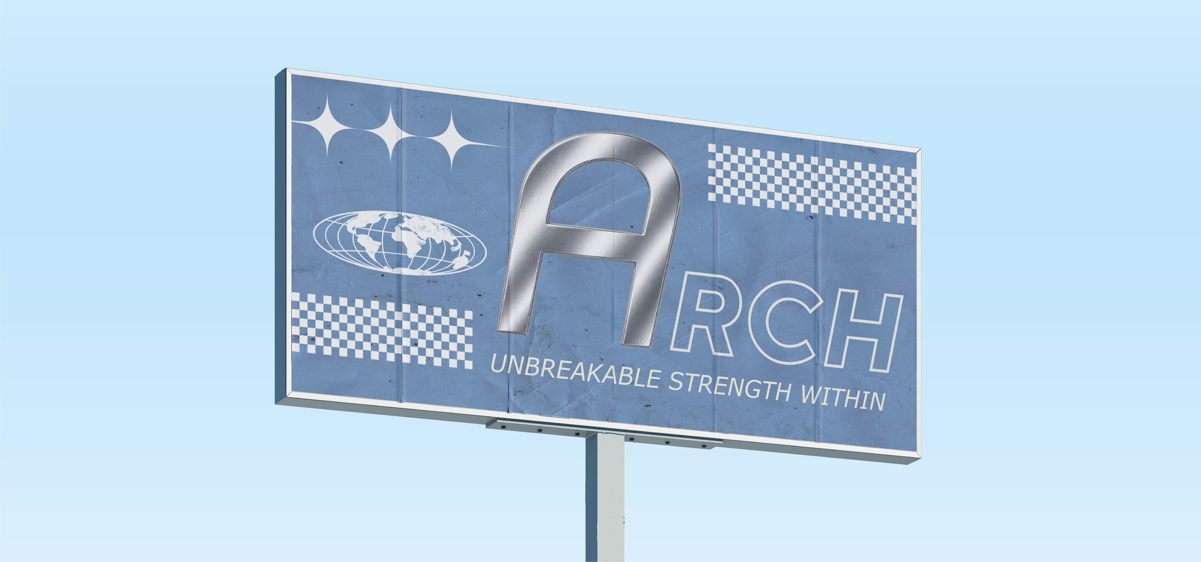
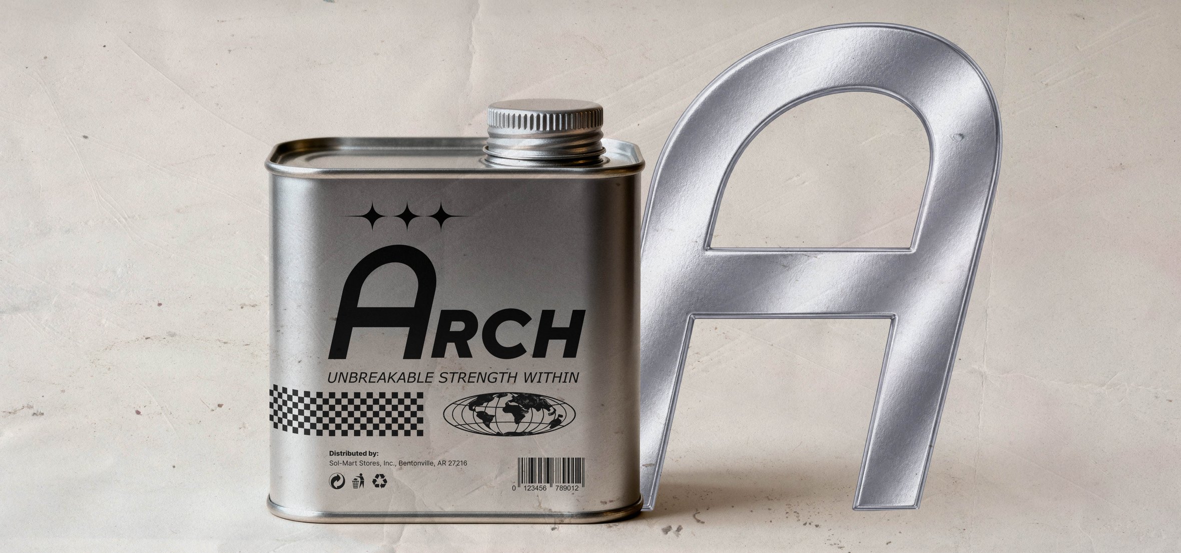
The ARCH brand identity is a minimalist design built on a combination of a clean arch and a dynamic slope, symbolizing stability and movement. The visual style, featuring sky-blue tones with chrome typography and the slogan “Unbreakable Strength Within,” creates a professional and confident image, ideal for architectural firms, sports brands, and IT startups.
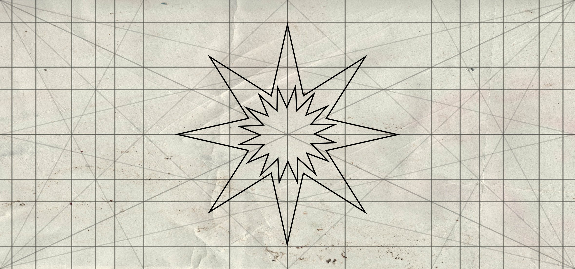
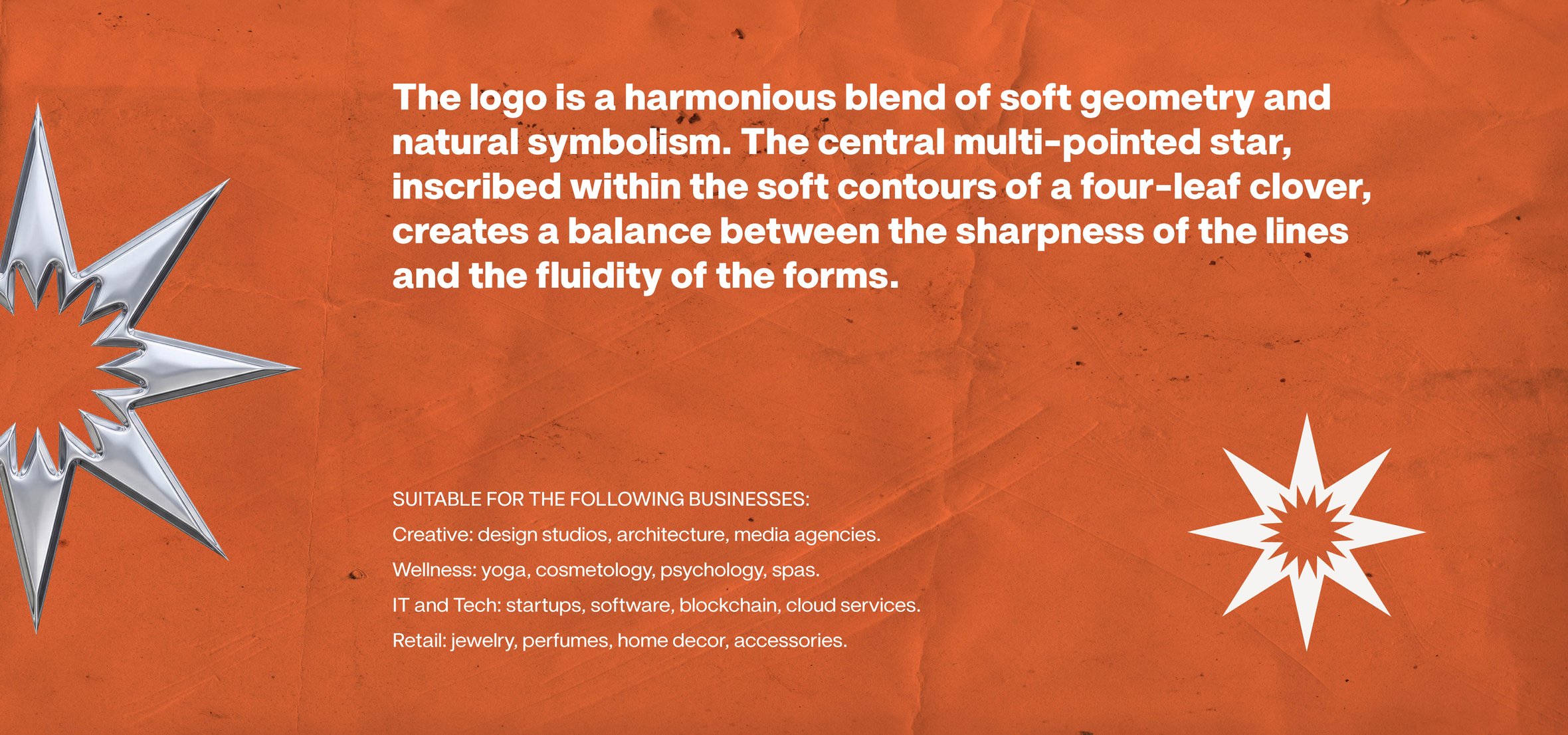
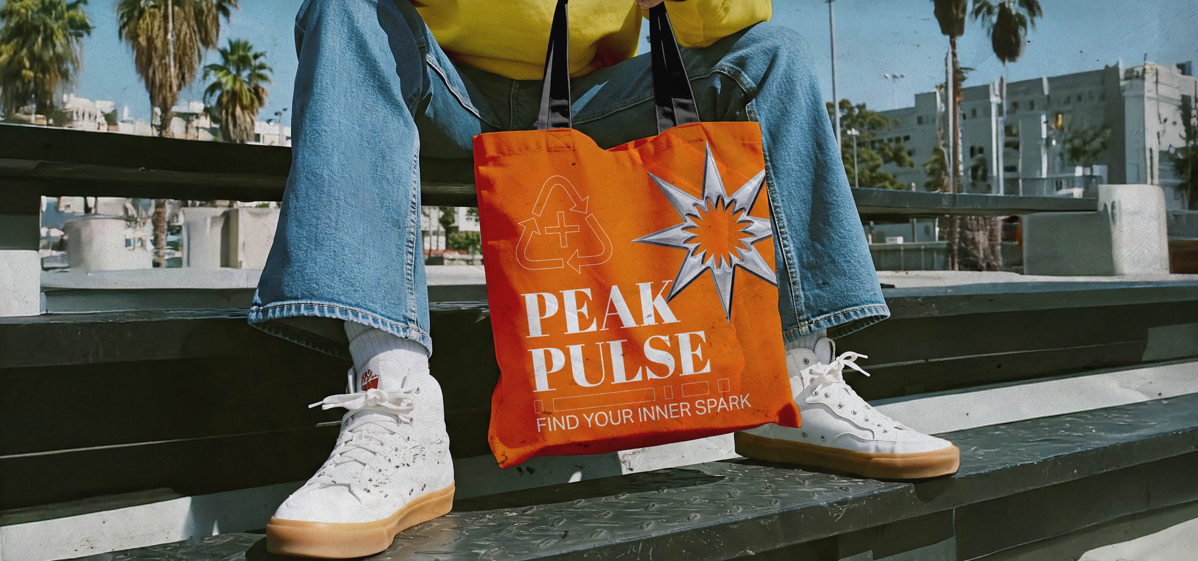
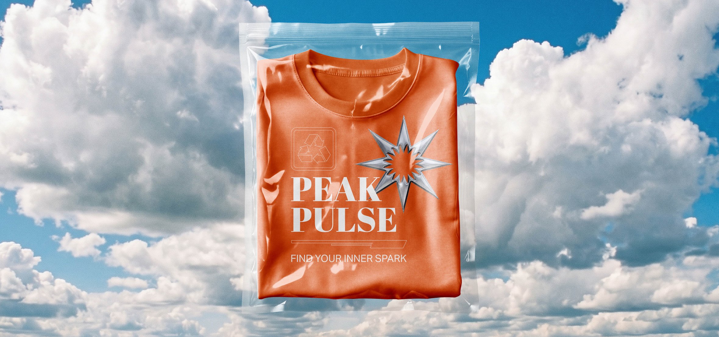
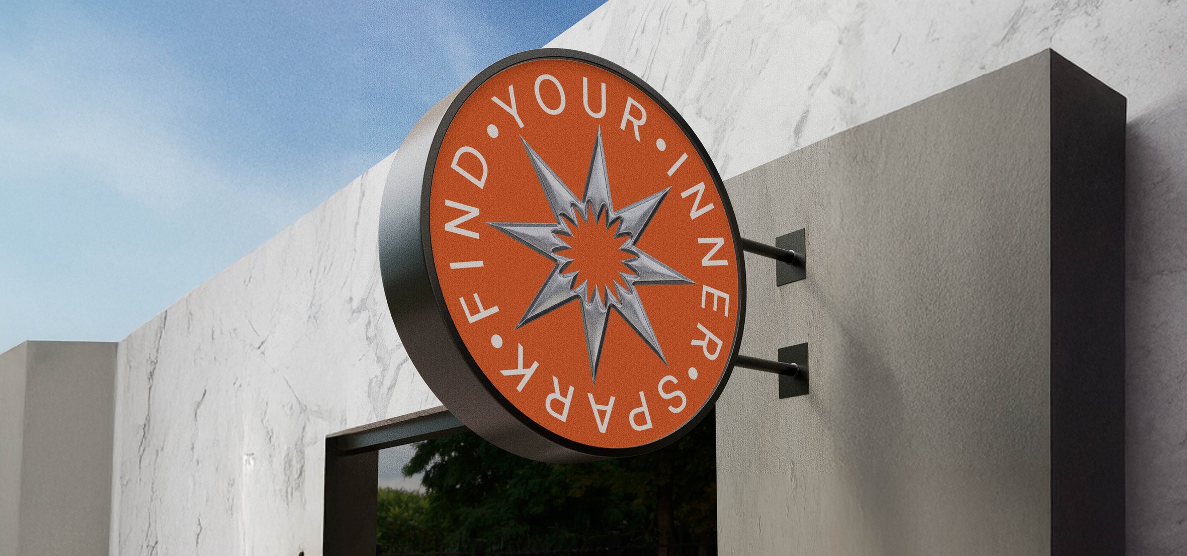
The PEAK PULSE case features a dynamic visual identity built on the balance between the sharp geometry of a multi-pointed star and the soft curves of a four-leaf clover. The bright orange color, combined with metallic silver and the slogan “Find Your Inner Spark,” creates a dynamic look that’s perfect for lifestyle brands, the wellness industry, and creative agencies
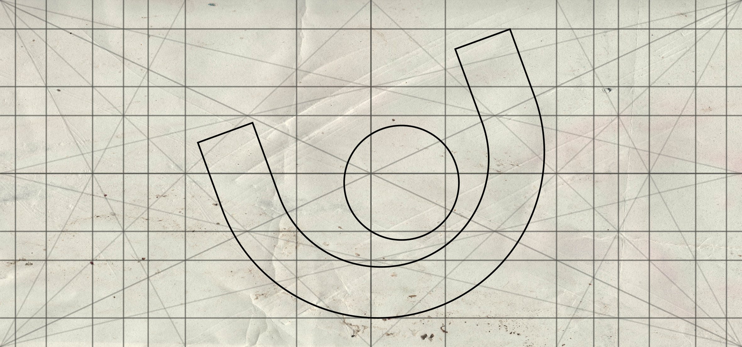
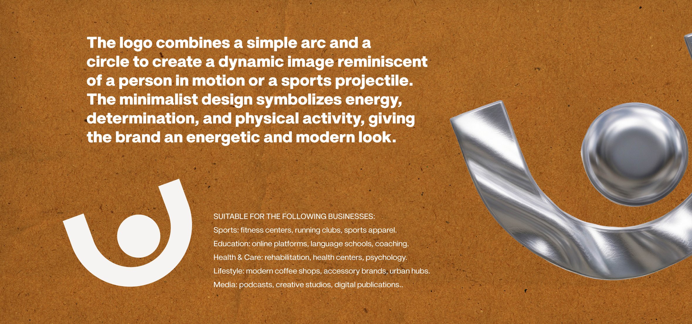
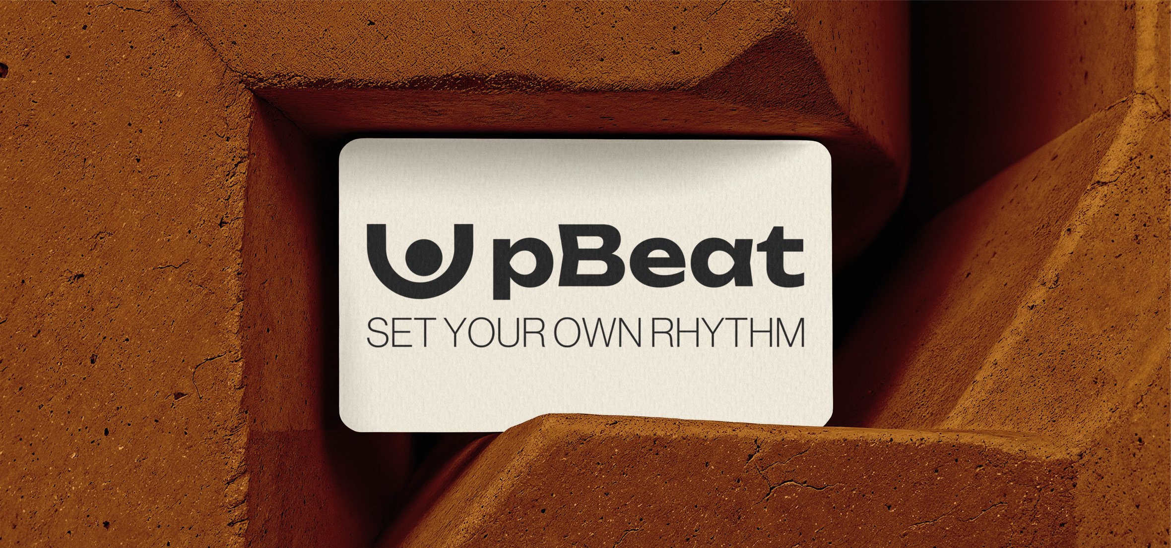
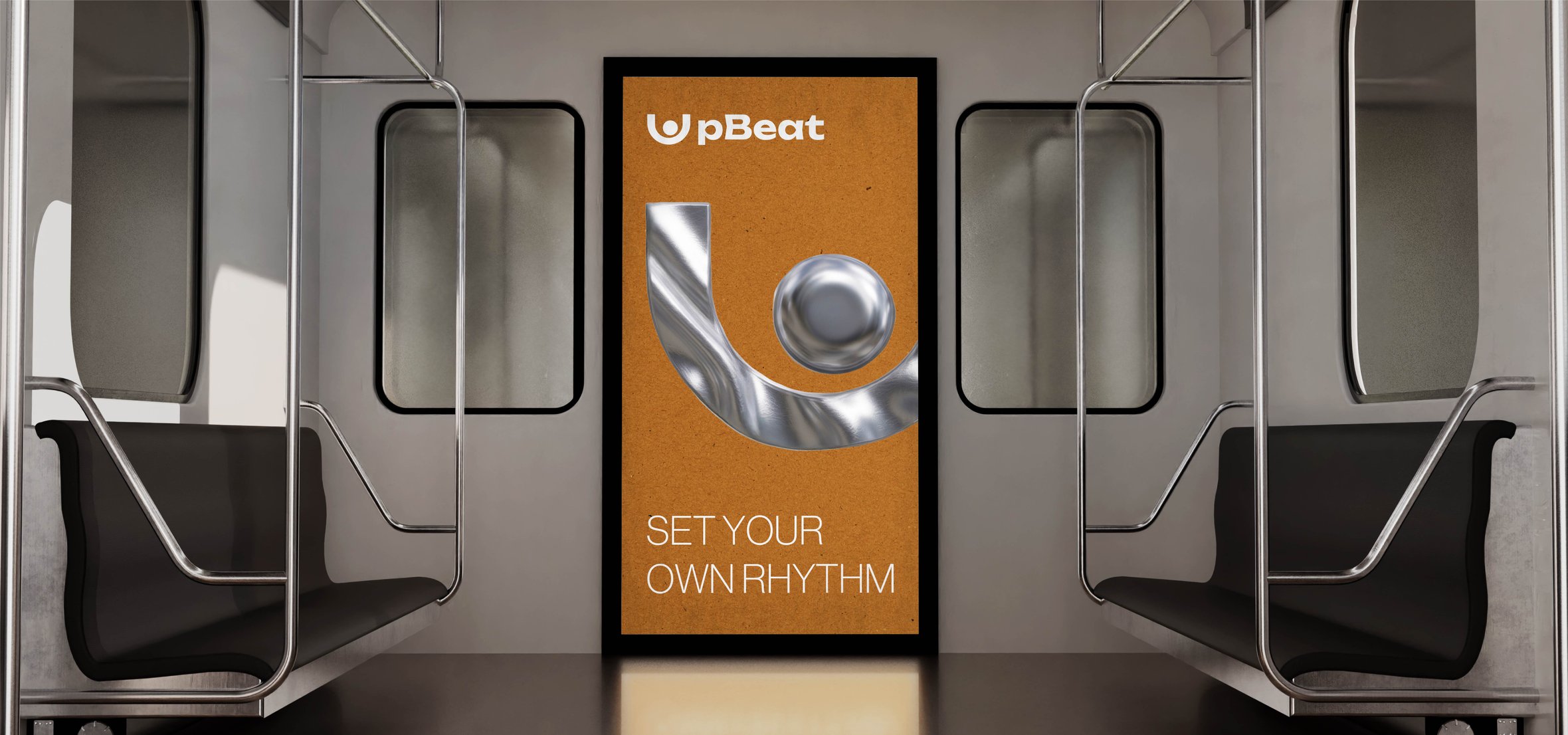
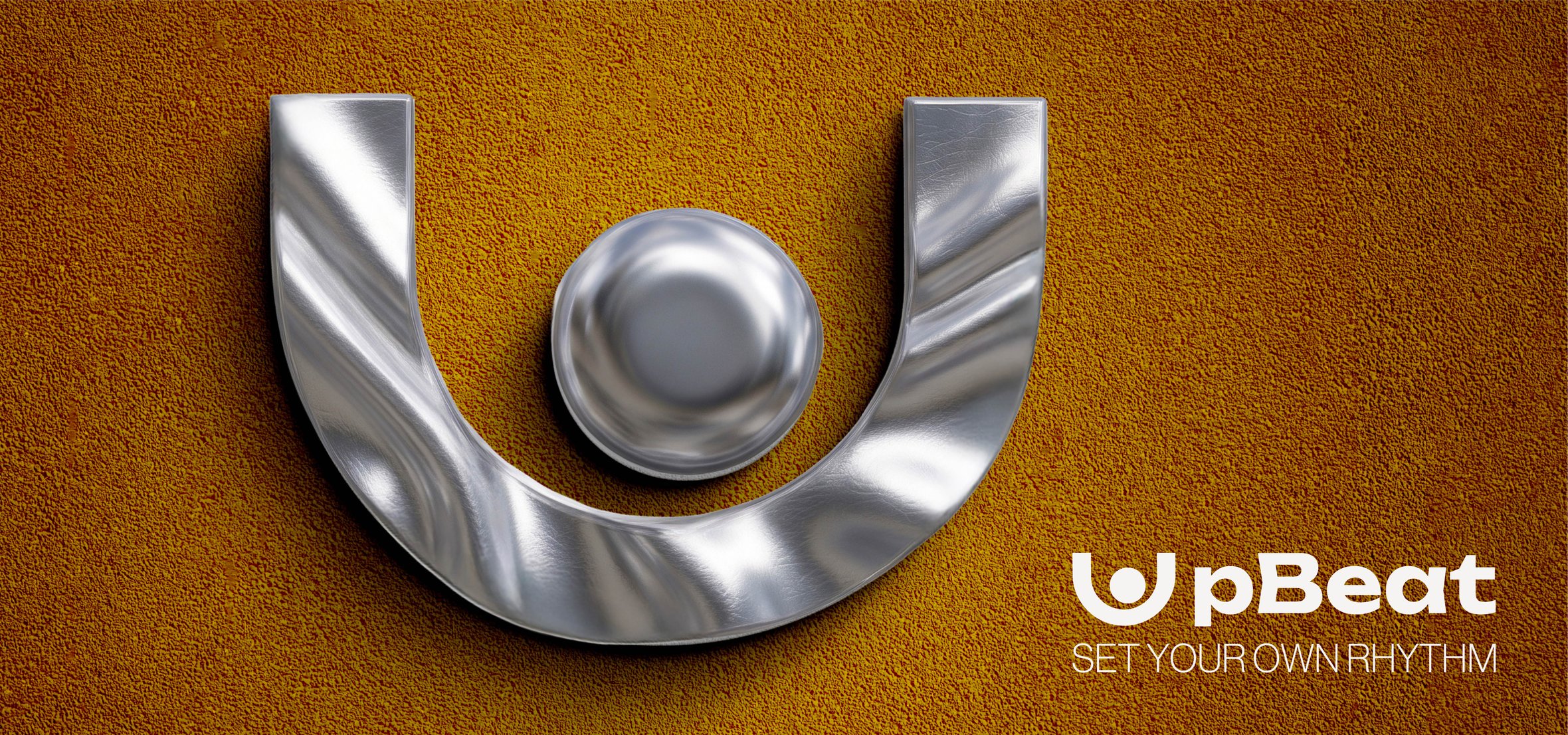
The UPBEAT brand identity is a minimalist design that symbolizes energy and movement through the abstract forms of an arc and a sphere. The combination of warm, earthy textures with flowing “liquid” metal and the slogan “Set Your Own Rhythm” creates a modern, athletic look geared toward the fitness industry, educational platforms, and lifestyle projects.
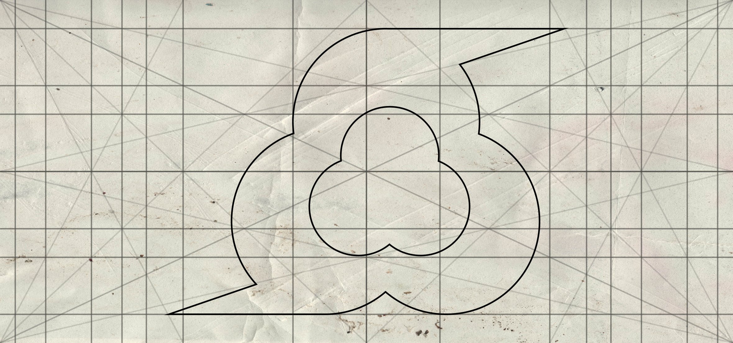
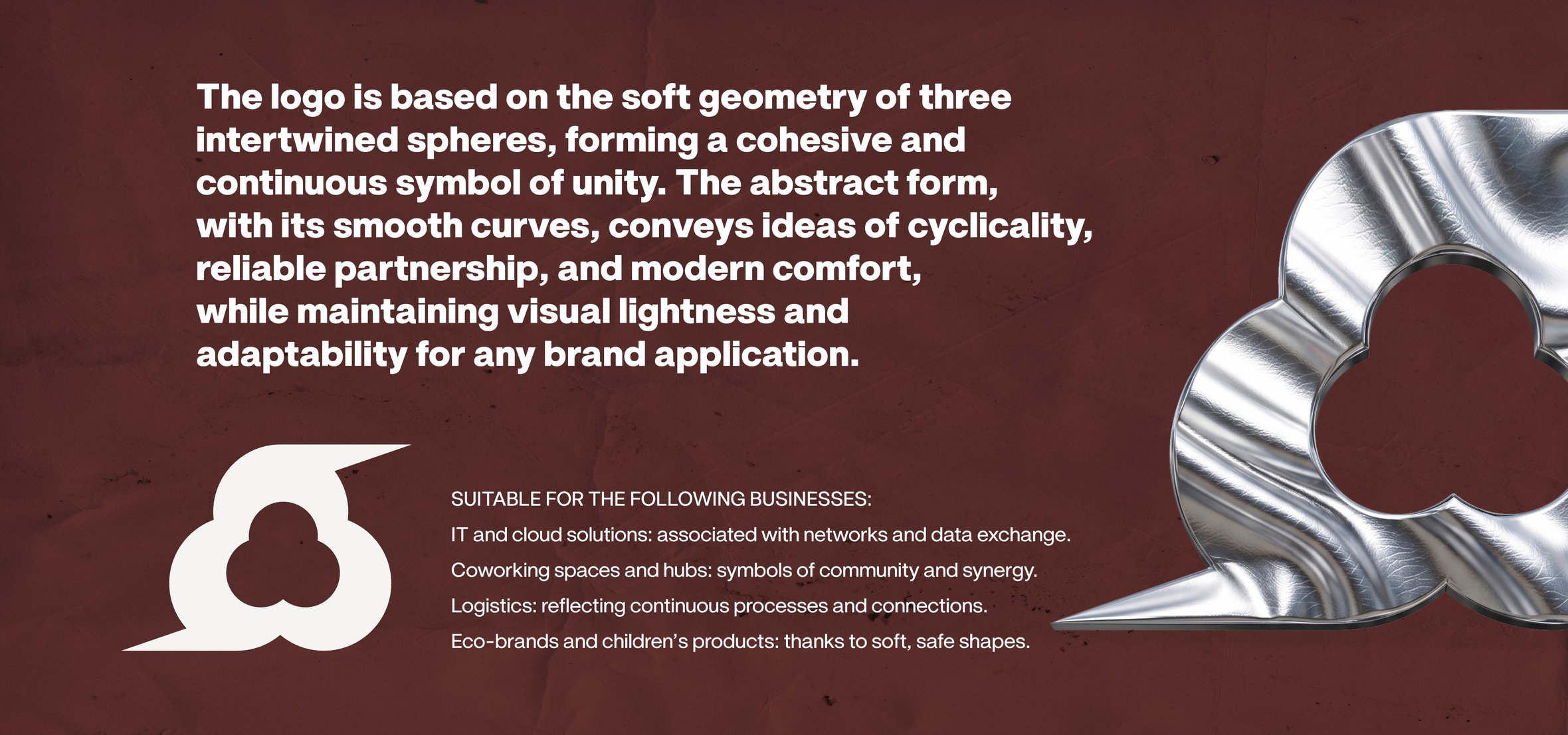
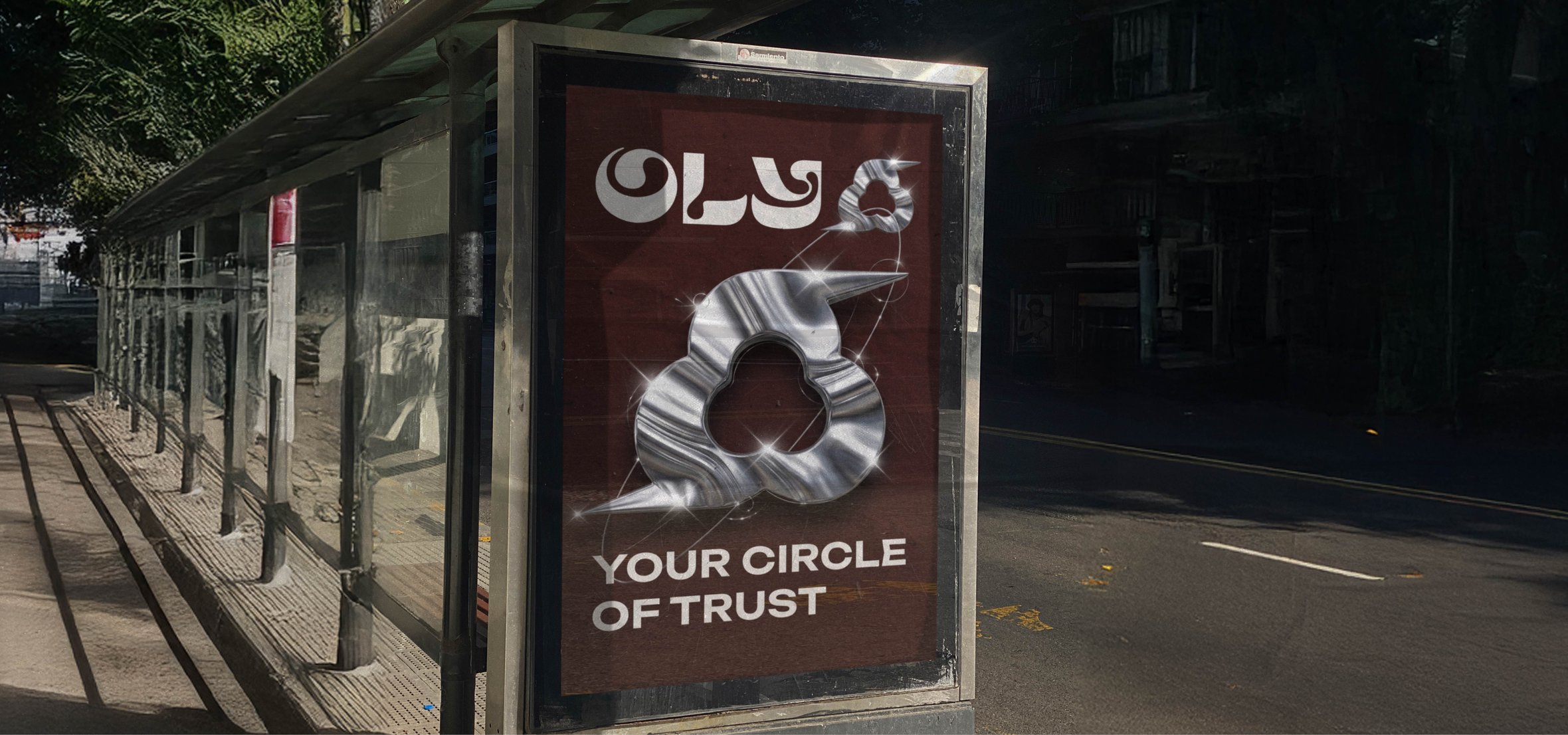
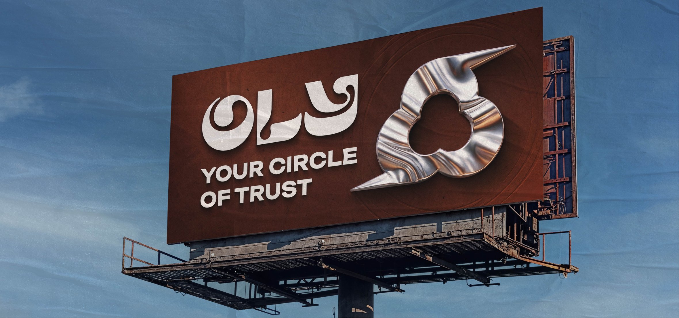
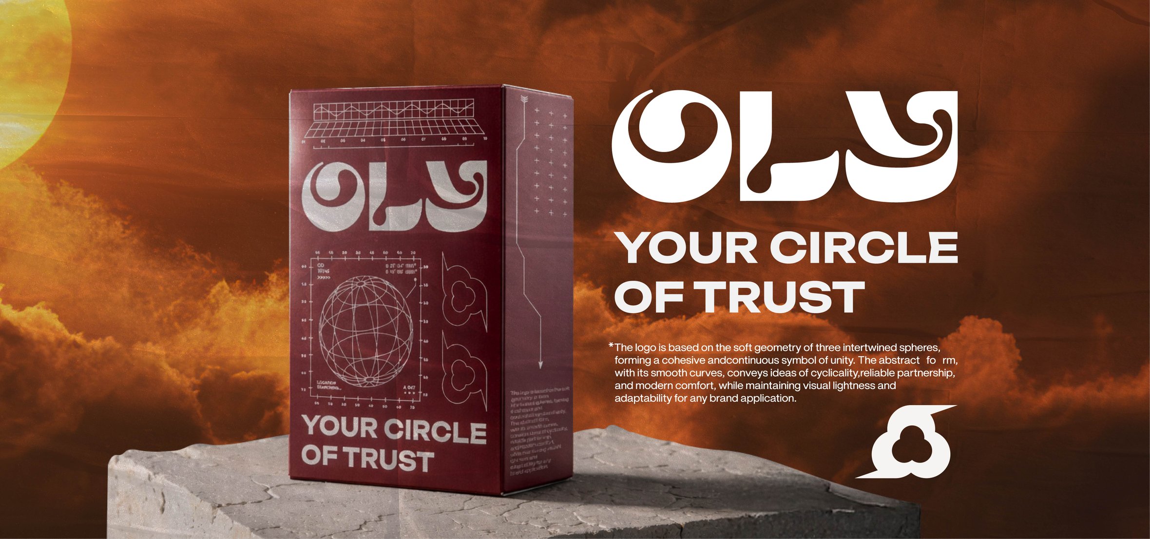
The OLY brand identity is a soft, organic design built on the intertwining of three spheres, symbolizing unity and cyclicality. The use of liquid metal textures against a backdrop of deep terracotta tones, combined with the slogan “Your Circle of Trust,” creates an image of reliable partnership and comfort, suitable for IT solutions, coworking spaces, and eco-brands.
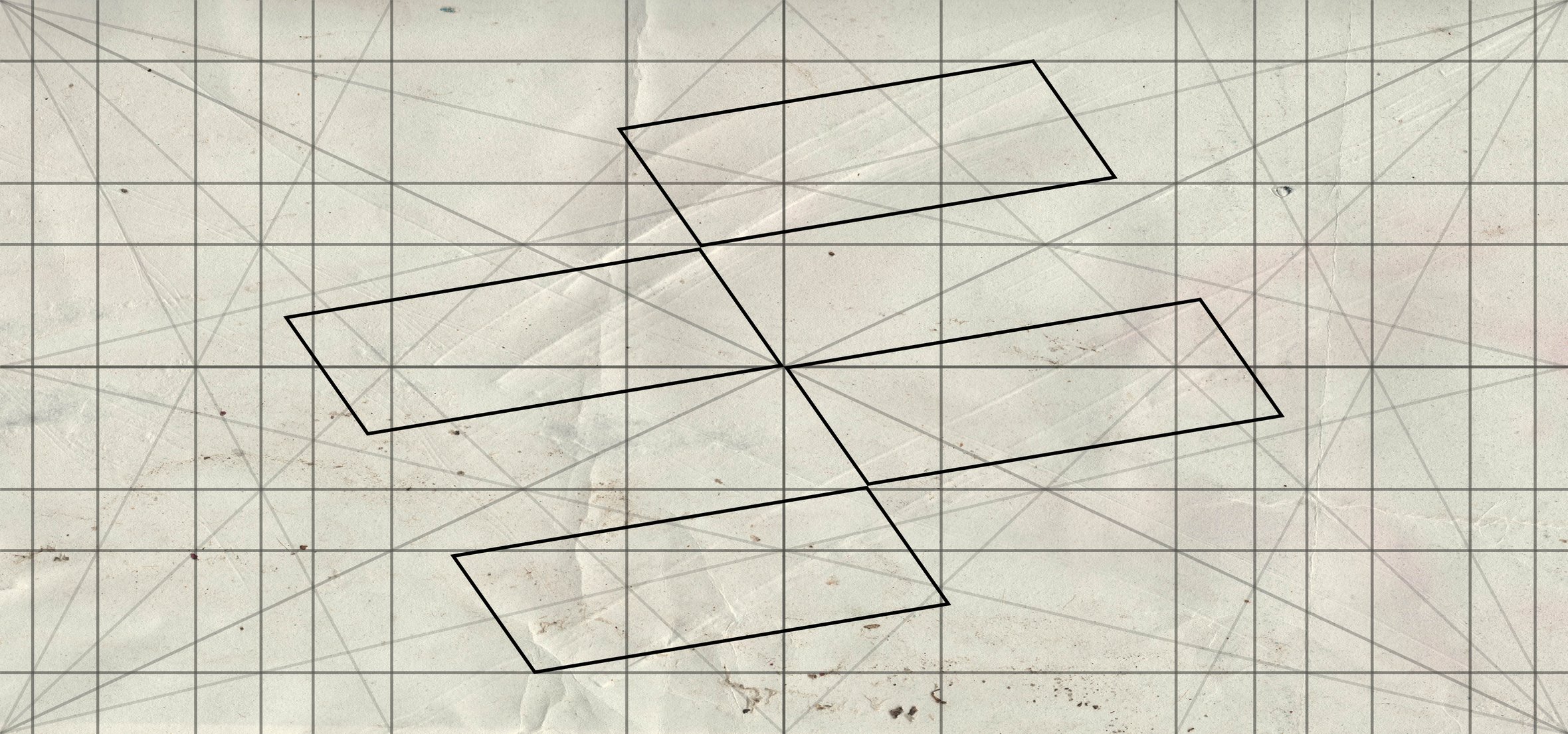
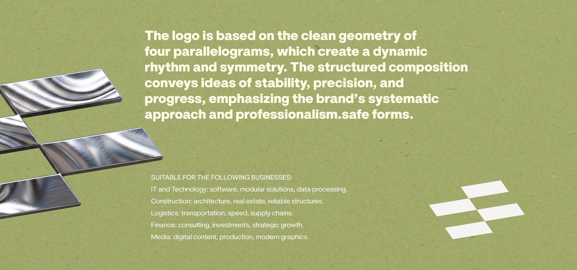
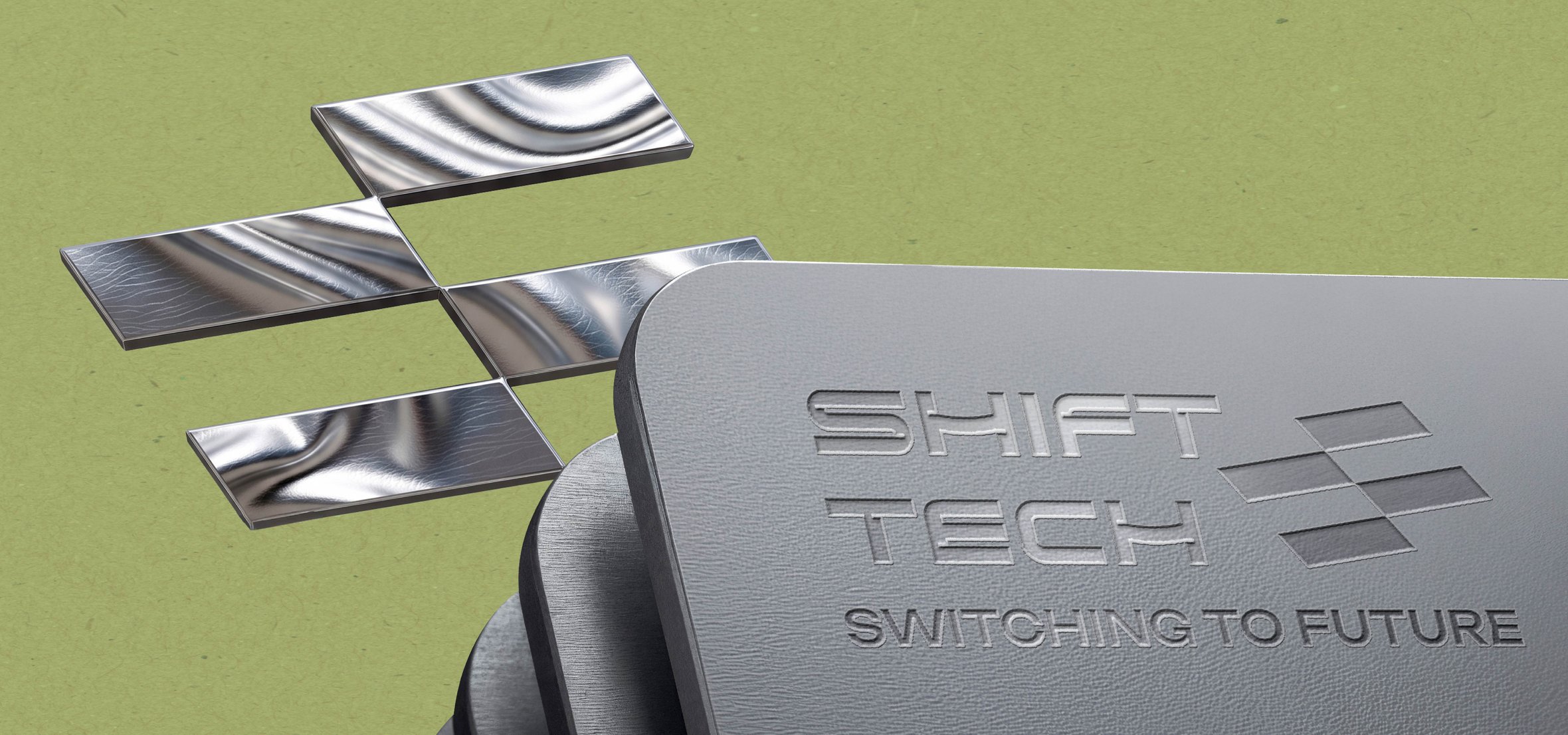
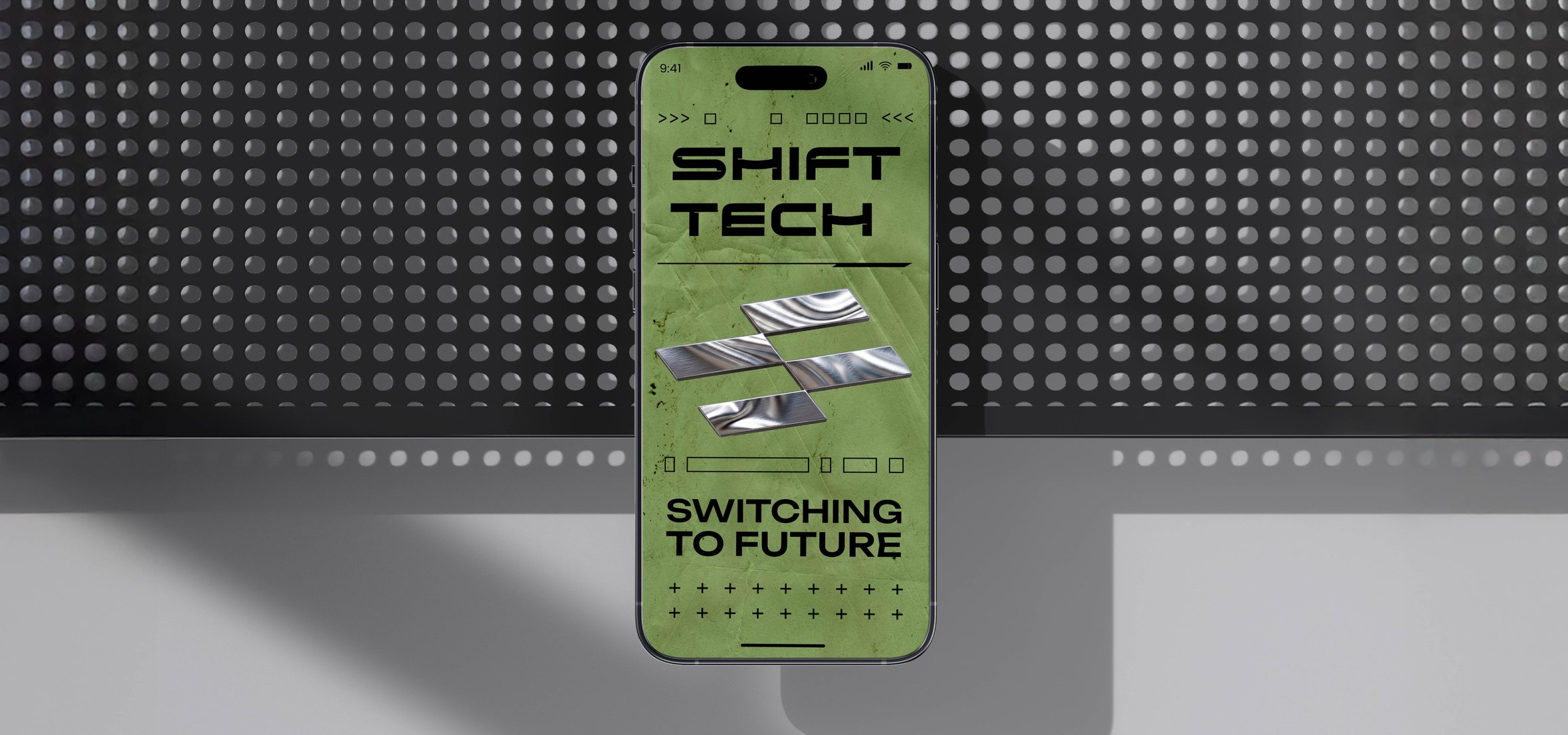
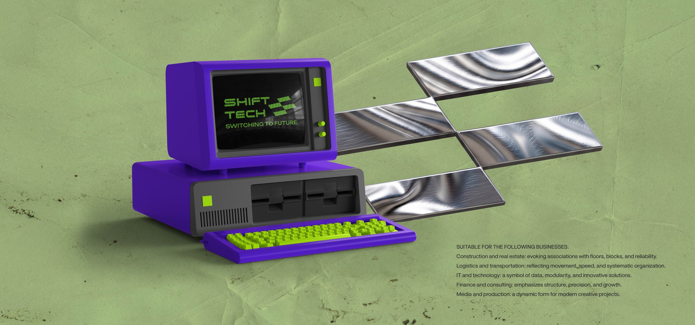
The SHIFT TECH brand identity is a modern design concept based on the clean geometry of parallelograms and the aesthetics of digital retro-futurism. The combination of liquid metal textures, brutalist typography, and a contrasting color palette emphasizes the brand’s dynamism and technological sophistication, showcasing its confident growth in the fields of IT, logistics, and innovative manufacturing.
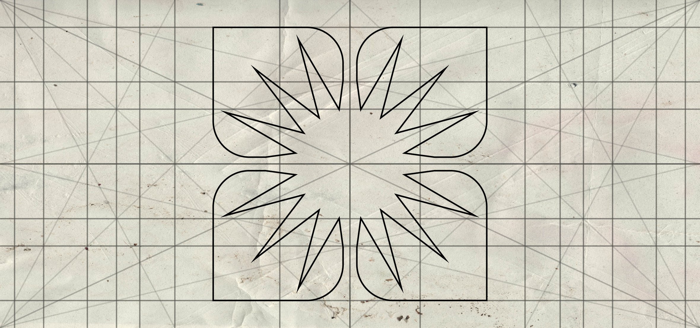
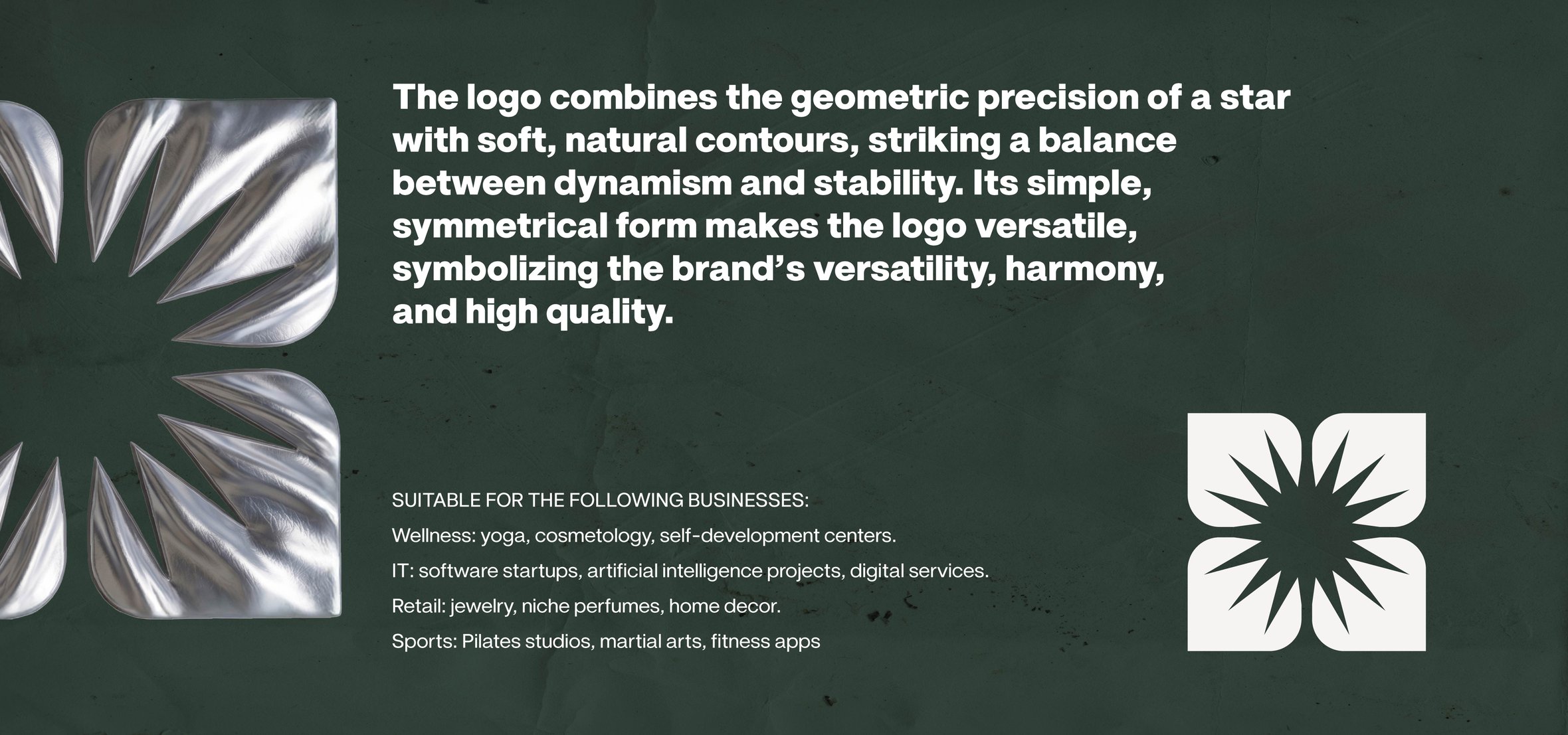
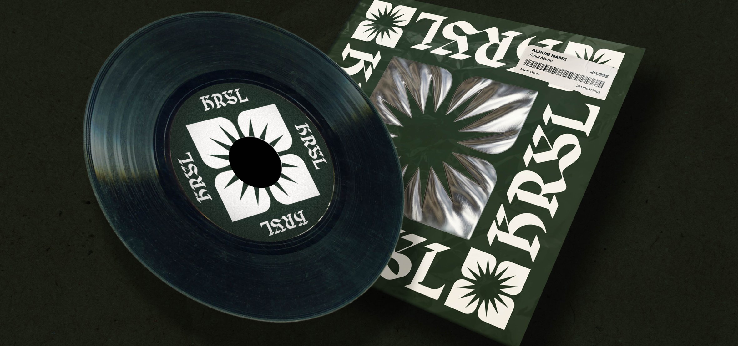
The KRSL case is a versatile visual identity that combines the geometric precision of a star with soft, natural contours. The use of brutalist typography, deep coniferous hues, and “liquid” chrome textures creates the image of an “energy structure.” The concept balances dynamism and stability, meeting the needs of the wellness industry, IT startups, and niche retail.
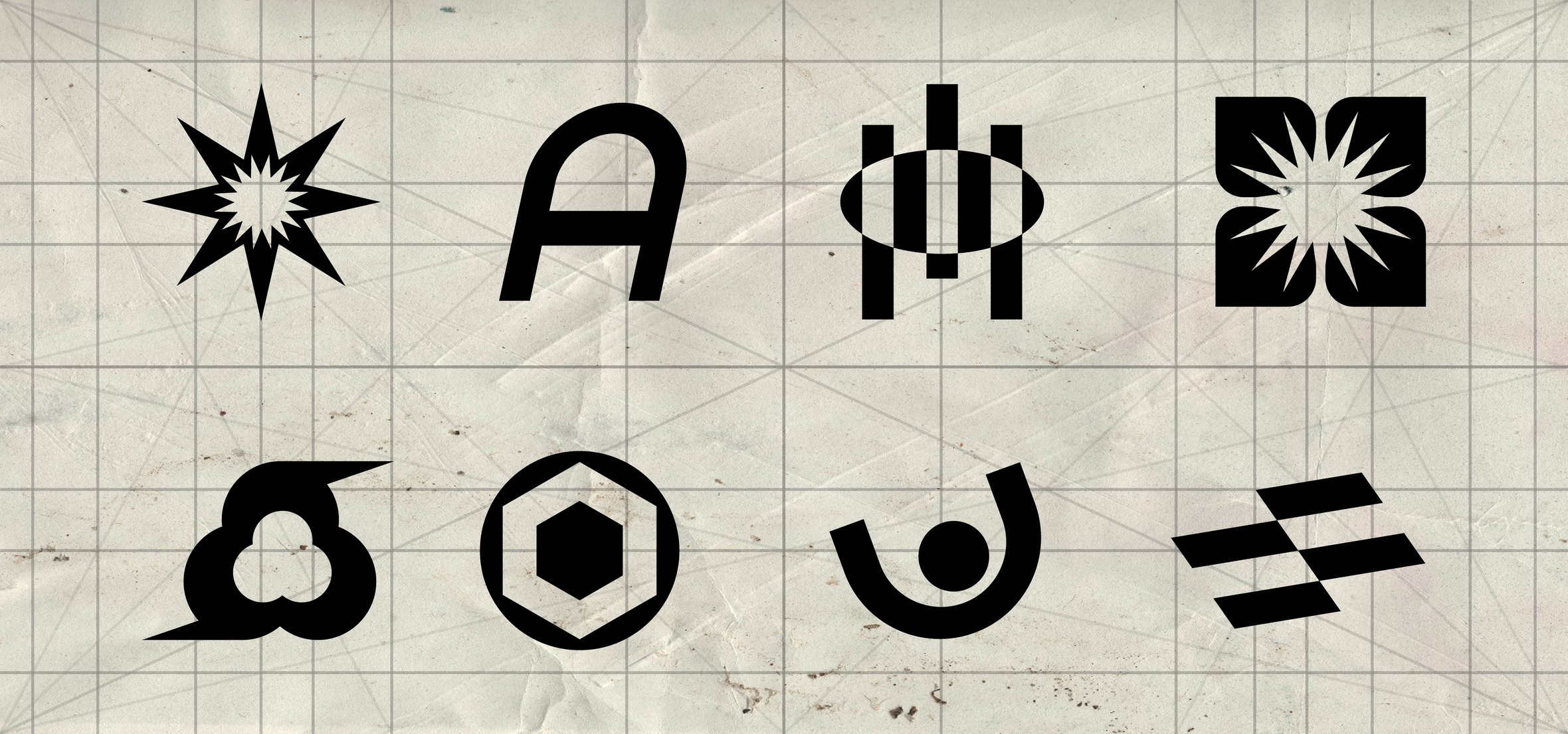
This series of works demonstrates the evolution of the artist’s style, which blends brutalism with digital futurism. All the works are united by a common aesthetic thread: the use of “liquid metal” textures, deep natural tones (pine, terracotta, olive), and austere geometric symbols.
Each project is an exploration of how minimalist formswhether the SHIFT TECH parallelograms, BOLT ROAST hexagons, or KRSL natural motifs—can be transformed into flexible visual systems. The result of the series is a portfolio of versatile solutions for the technology and lifestyle industries, where design functionality is inextricably linked to a vivid, tactile visual presentation.
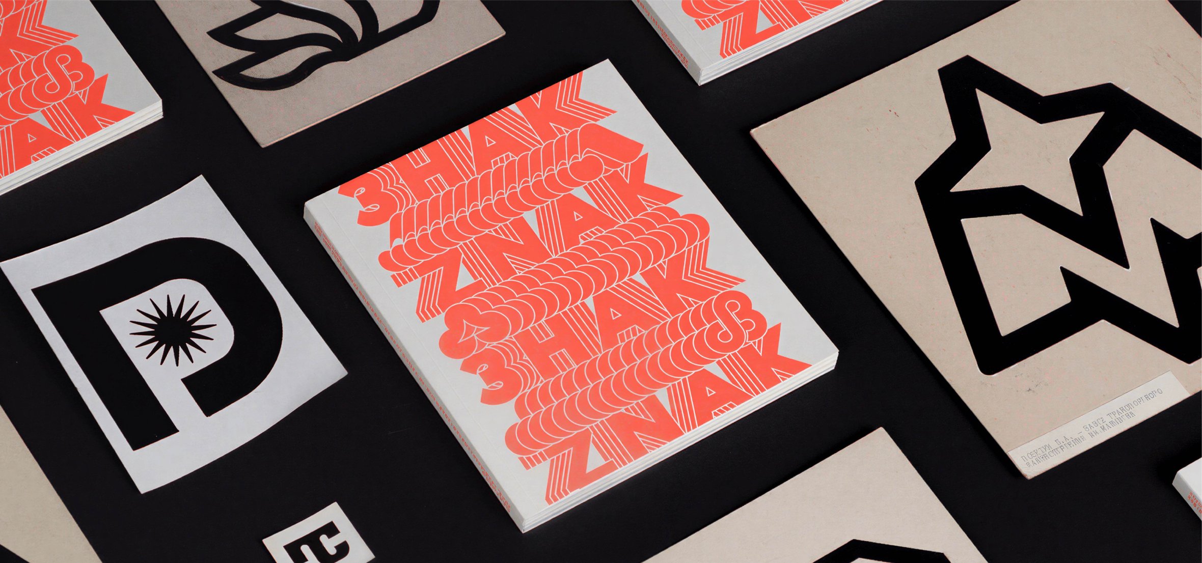
This project is my personal tribute and the result of deep inspiration drawn from the book
"Znak: Ukrainian Trademarks of the 1960s–1980s"
Don't forget to like and comment on this project.
I put a lot of effort and time into it , thank you in advance!
Want to build something similar?