

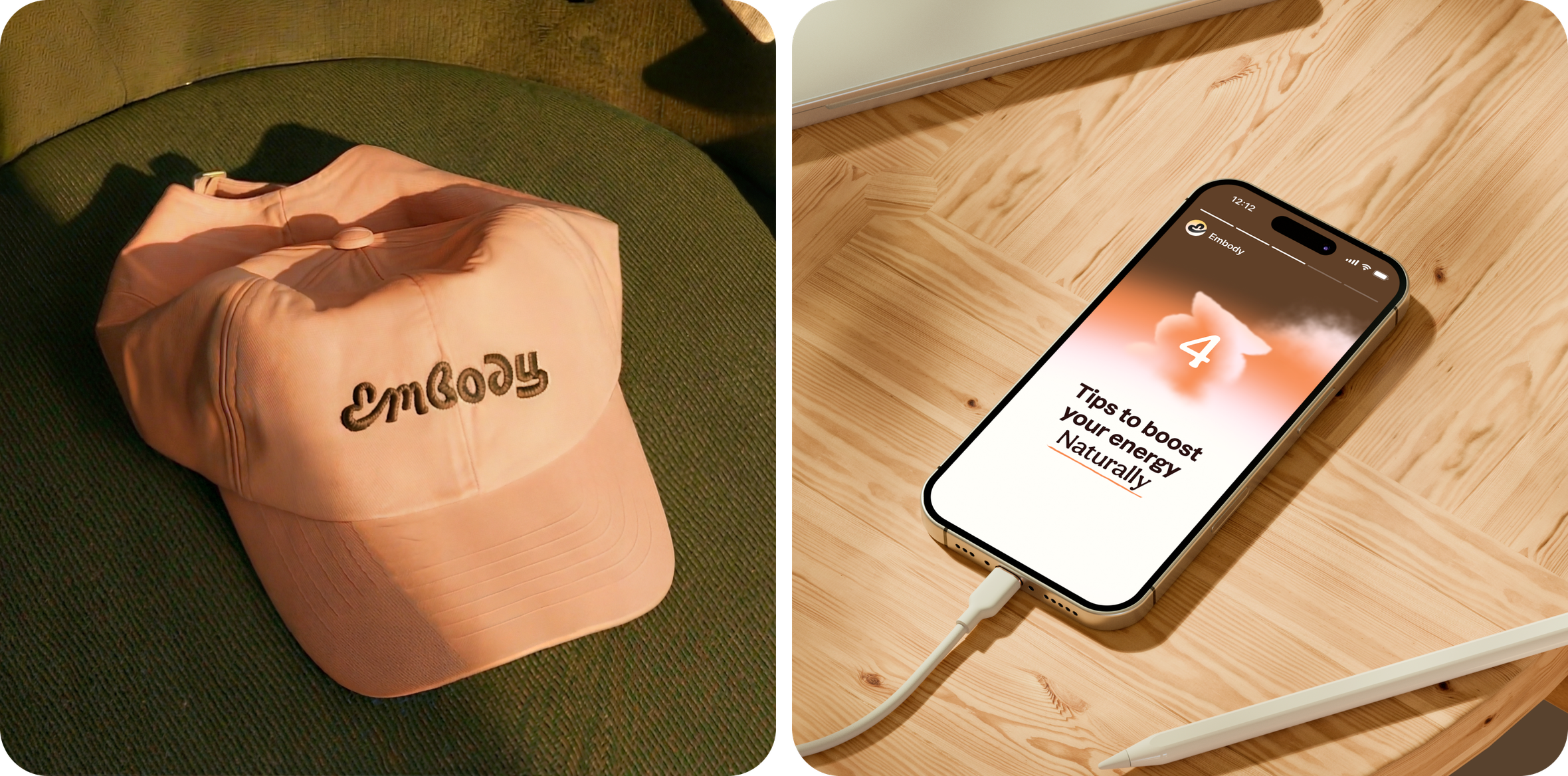
Branding and product design for a health & wellness App — Embody
Challenge
The wellness market loves extremes. Hard discipline, loud promises, “do more, push more, be more.”
Embody chose a different direction — and that was the challenge.
We needed to create a brand experience that doesn’t judge, doesn’t demand, doesn’t overwhelm — but invites. A system that feels like someone taking your hand and saying, “Let’s start gently. You’re safe here.”
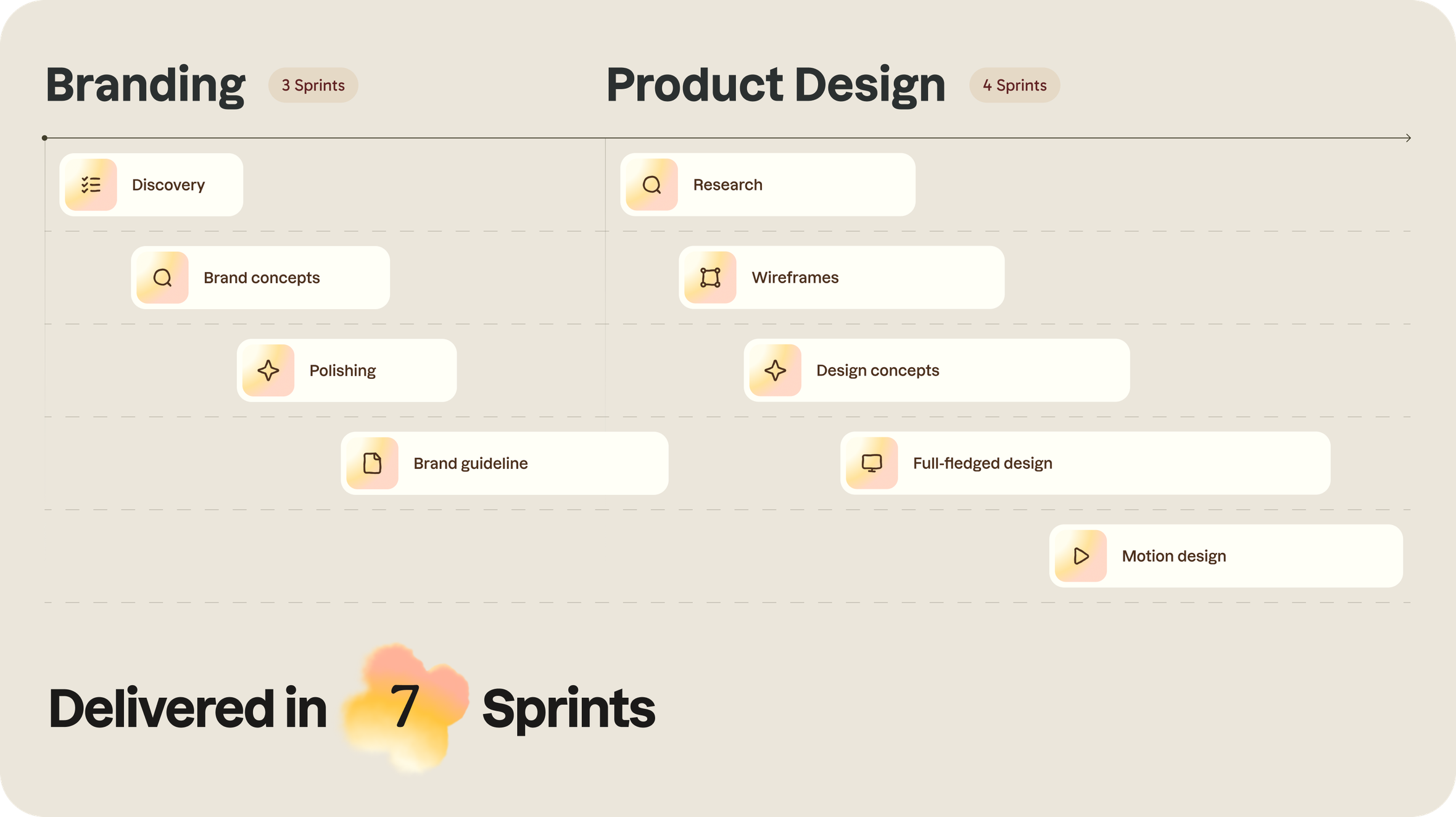
Solution
Beautiful visuals are nice. But clarity, data, and discovery make them meaningful.
We started with a deep dive into the yoga and wellness market — studying behavior patterns, emotional triggers, and why so many people abandon fitness apps before they even begin.

A user journey designed for relief, not pressure
From funnel to fit
Quiz funnels are standard — familiar hooks, strong conversion mechanics. We didn’t reinvent the wheel. We refined it, grounding it in the new emotional architecture of the brand.
Nurturing empathy — the anti-“grind harder” approach
Let’s be honest: “push through the pain” isn’t motivation. It’s pressure.
They didn’t need another coach yelling at them. They needed a product that understands why starting is hard.
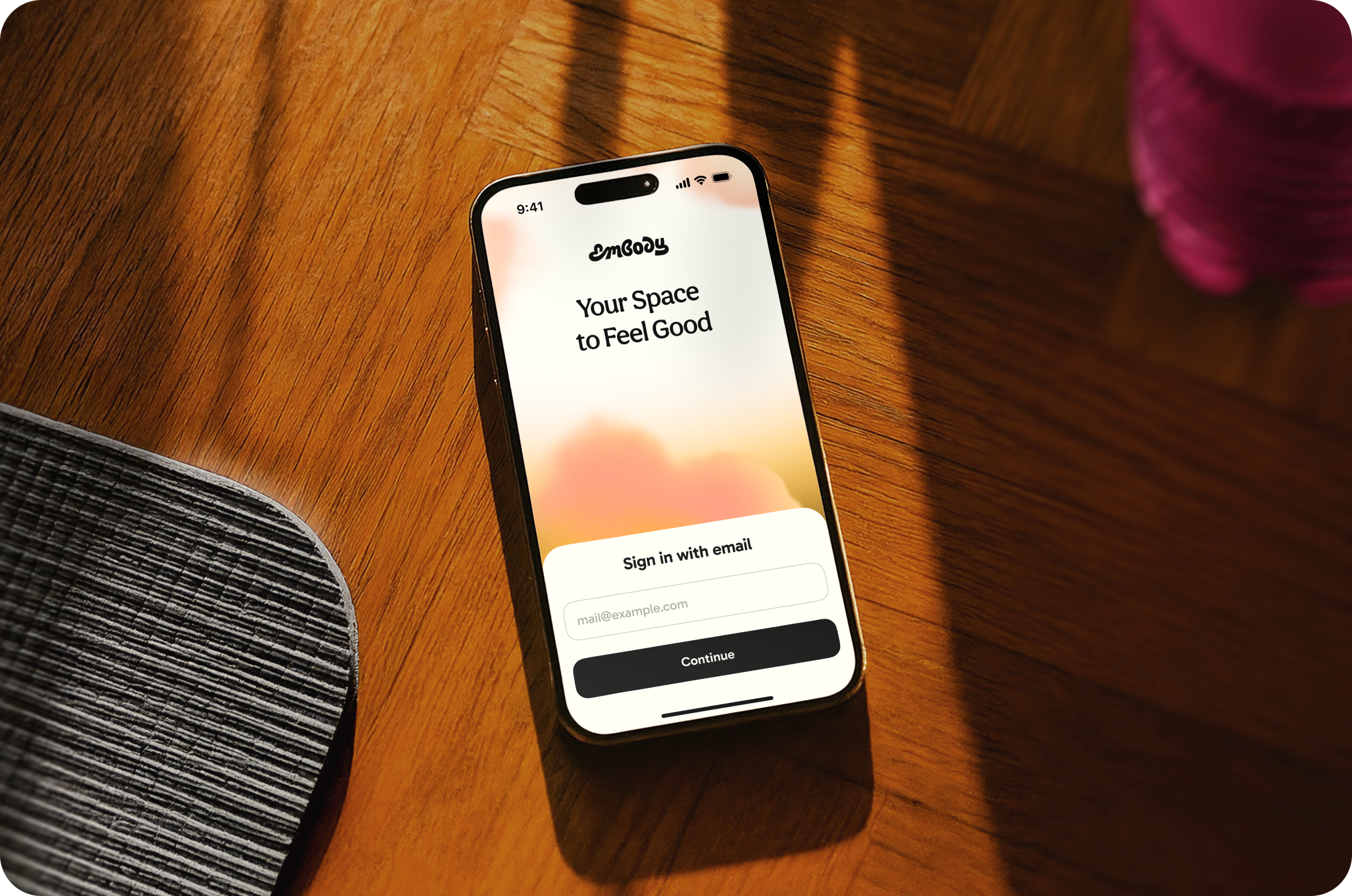
Start gentle
Making authorization invisible
From the web quiz to the app, the transition feels effortless. Deep link. Secure token. Auto-filled login.
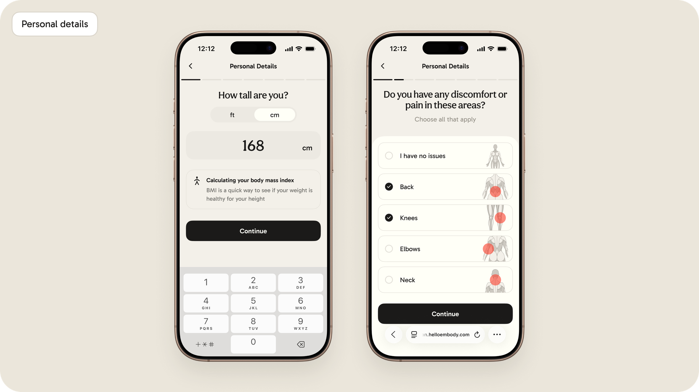
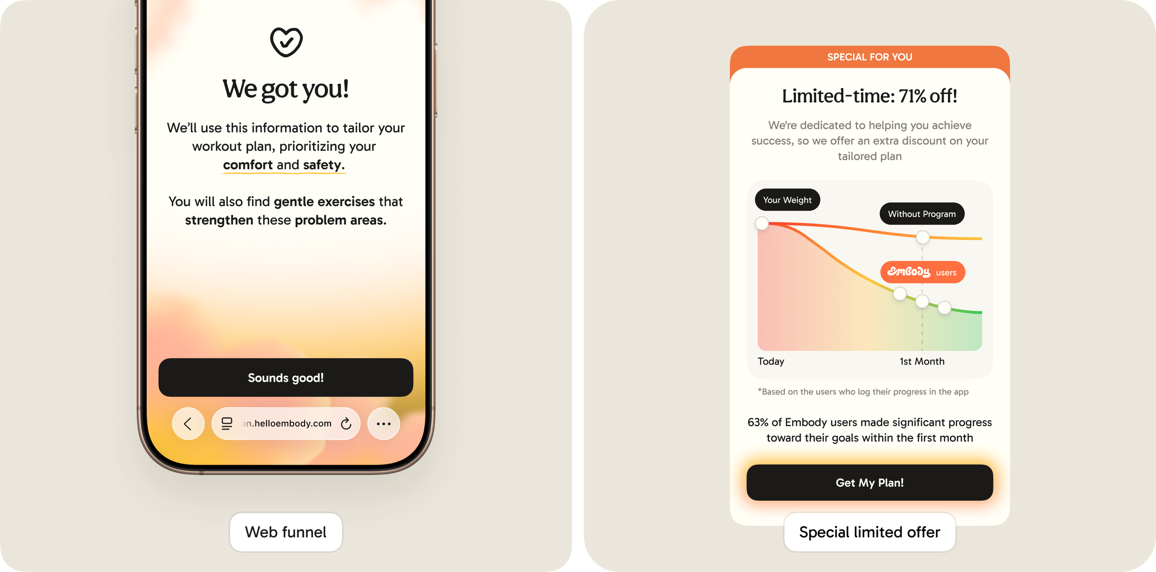
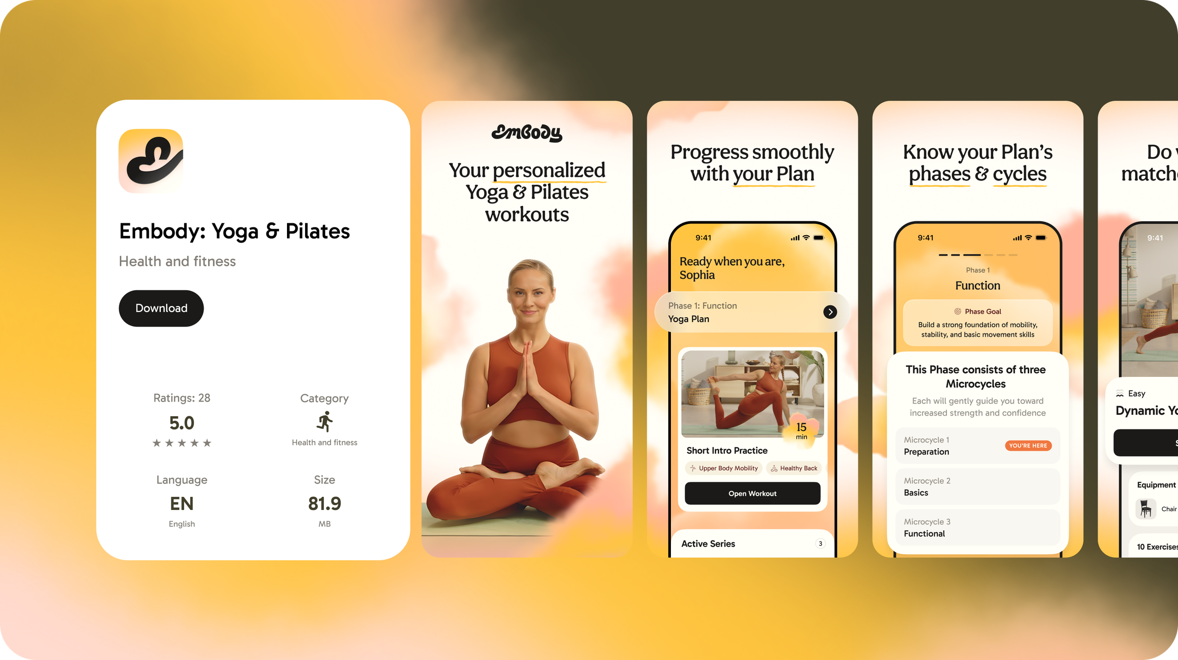
Reducing uncertainty. Showing what comes next
Users see their plan before they commit — and can instantly understand how it reflects their answers.
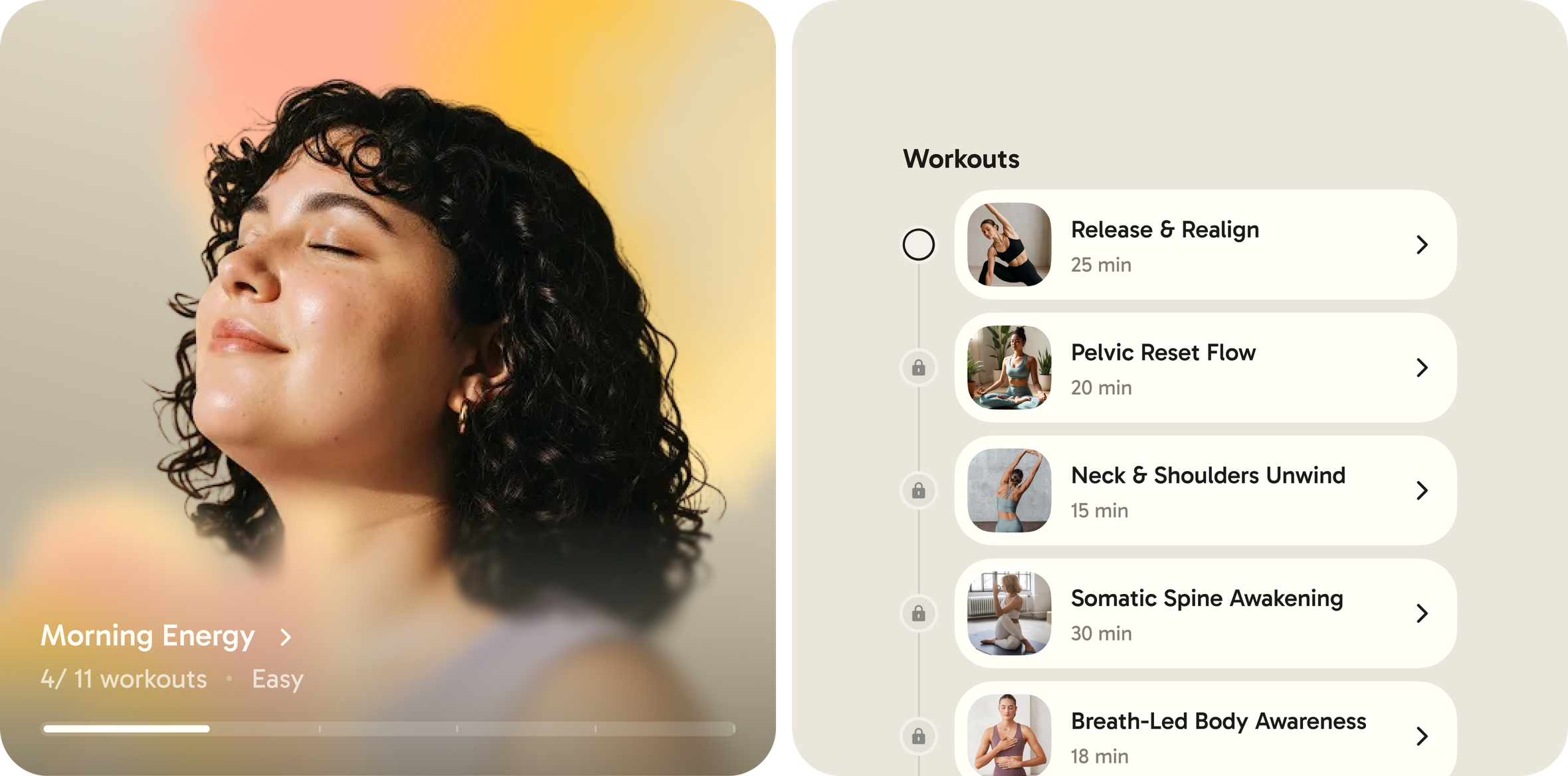
Personalization that feels human, not mechanical
After the plan is built, the product keeps reinforcing emotional continuity:
— being greeted by name
— visuals that reflect their age group
— subtle cues that say “we see you”
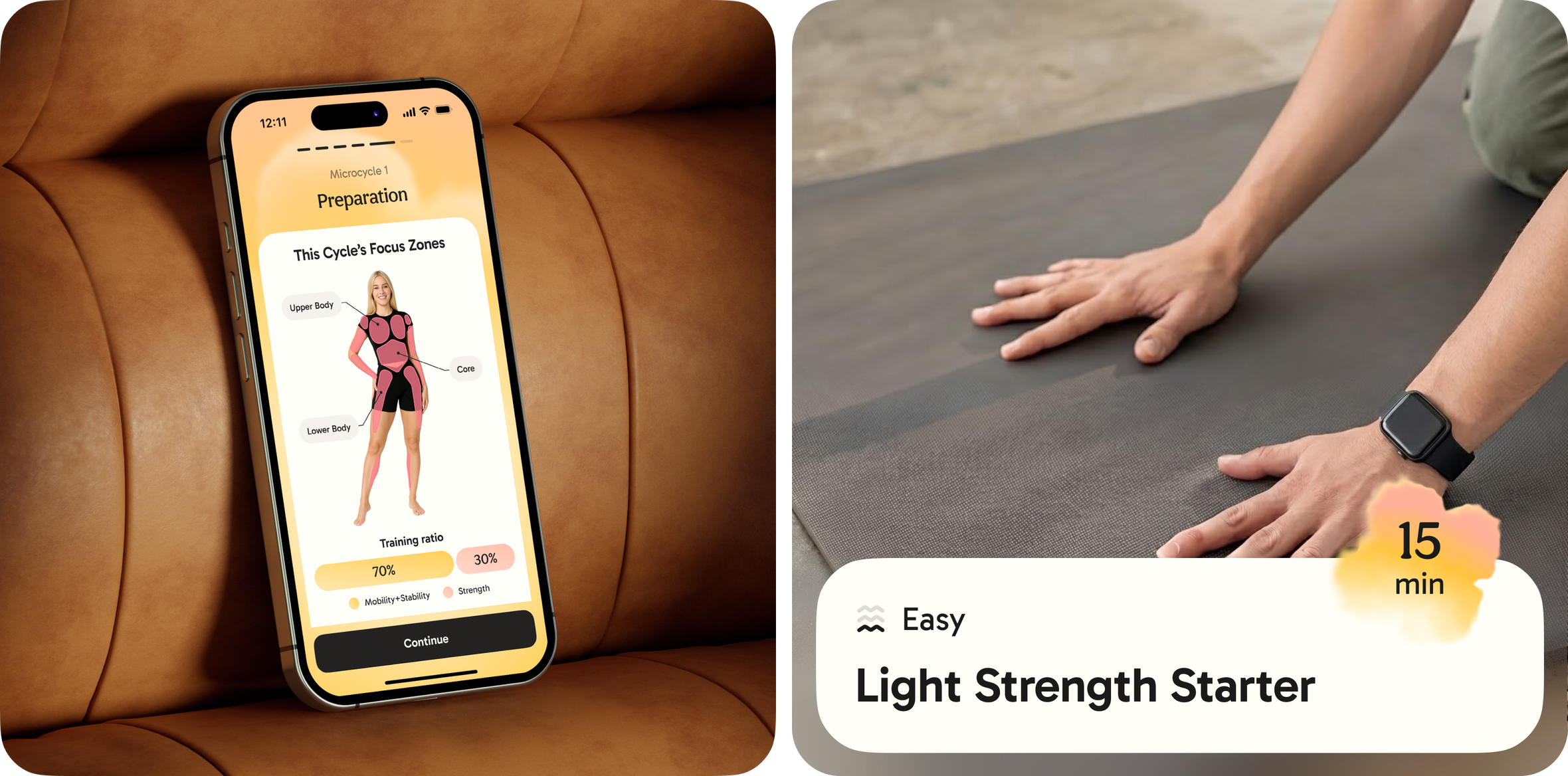
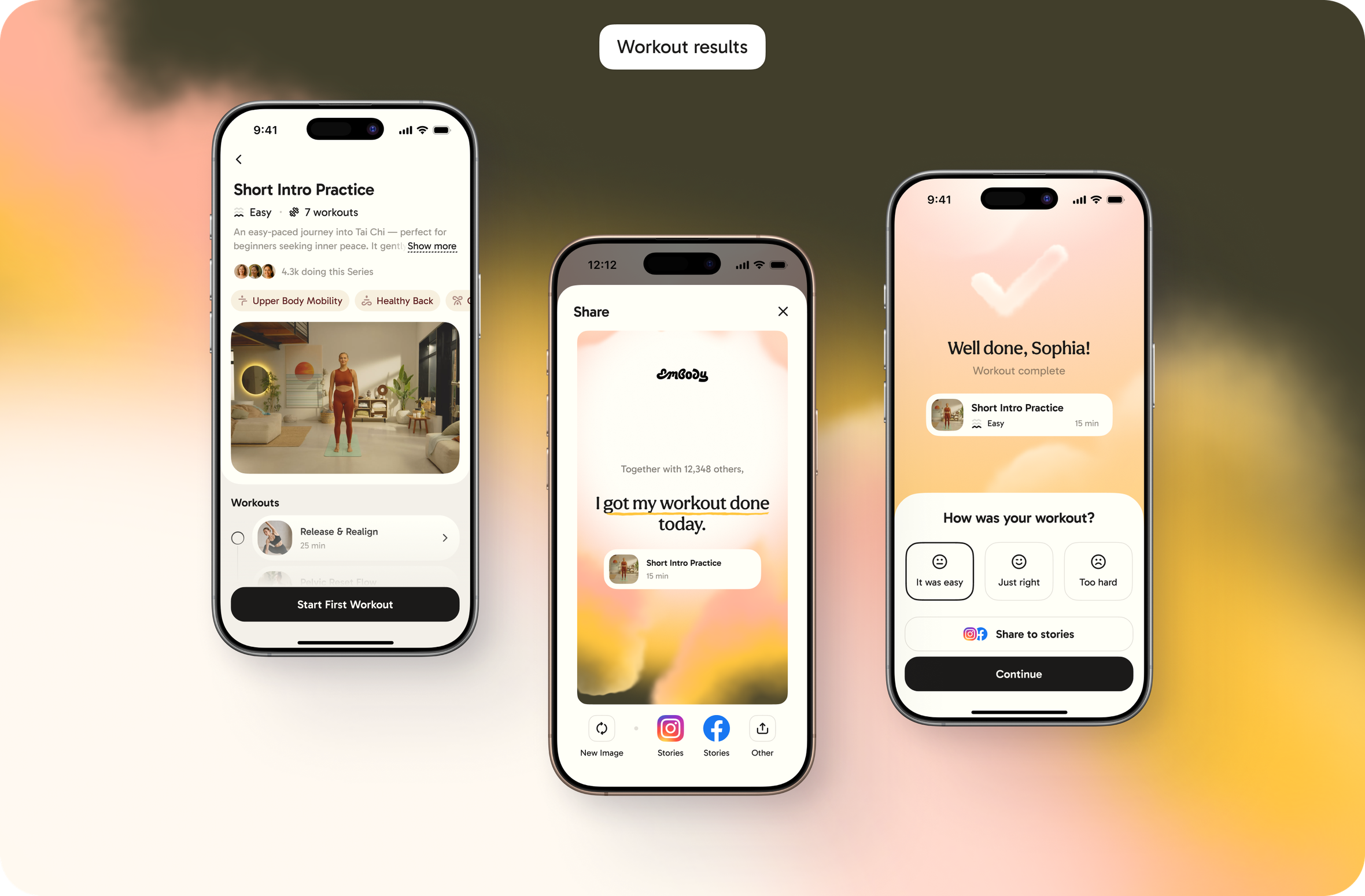
Making the first session doable
Onboarding ends with a short introductory workout. But you can skip it.
The message is simple: pace is personal — and yours matters.
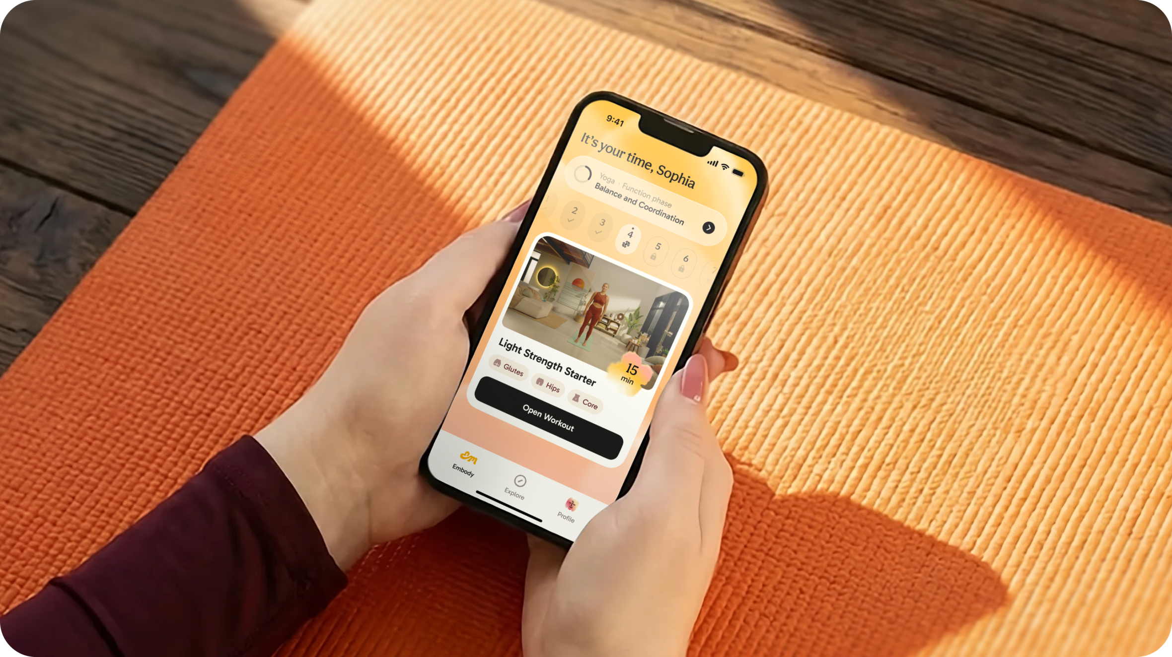
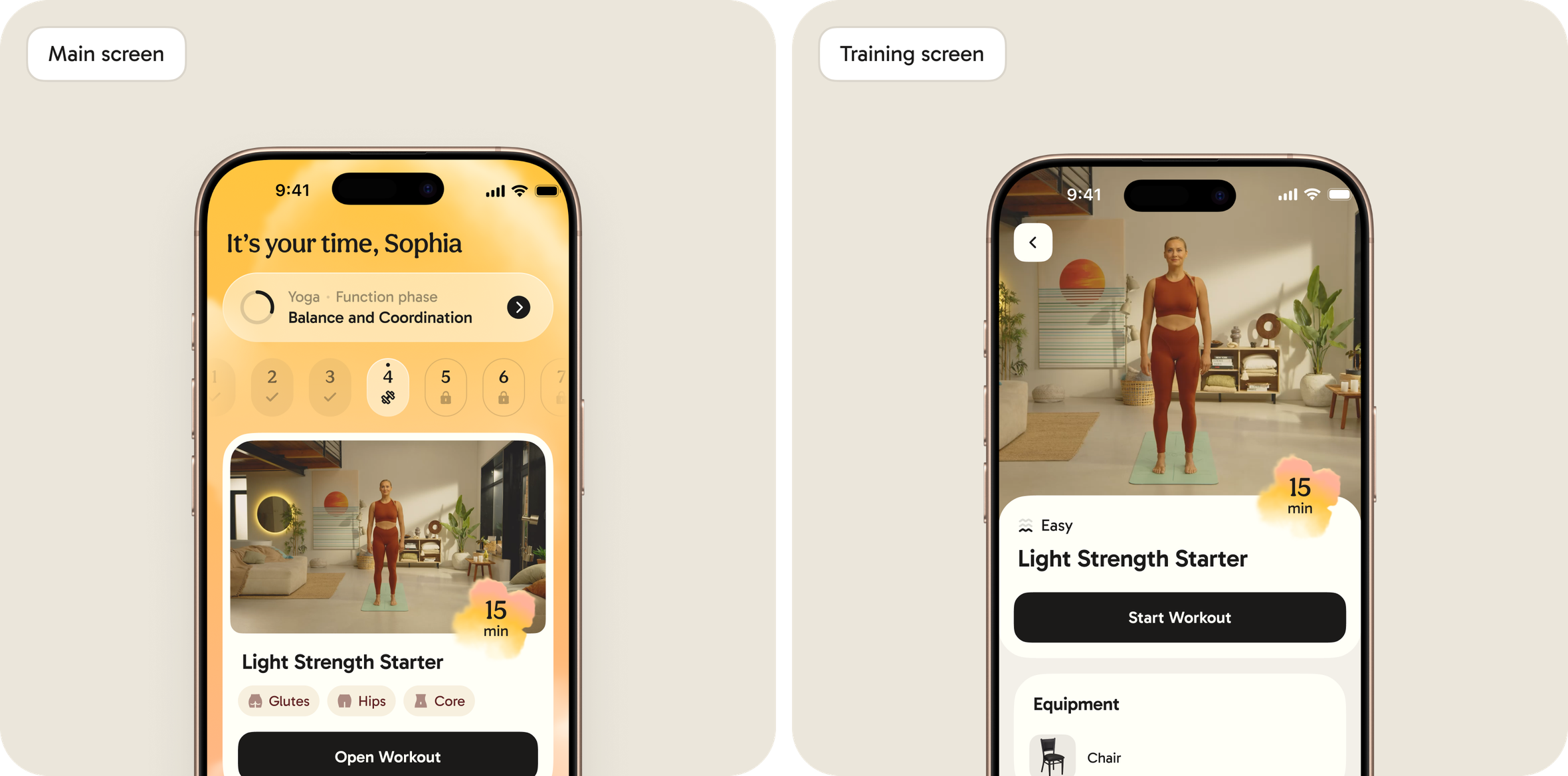
Core experience — a system that moves with you
Inside the workout session
Before a session starts, everything is clear: needed equipment, exercises, how to perform each movement.
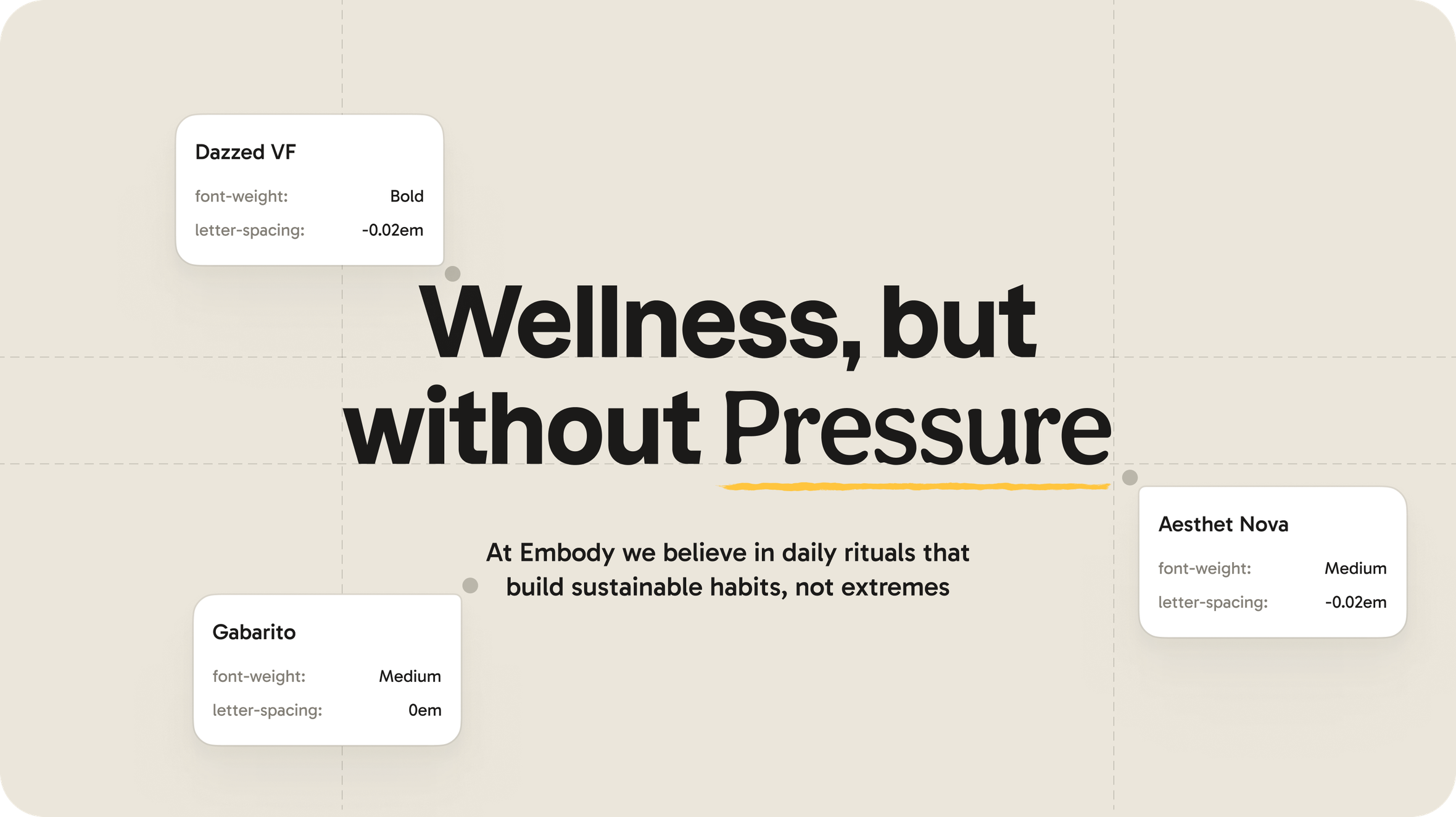
A visual language built for emotional safety
The UI sets the atmosphere. No aggressive contrasts, no “sporty” clichés. Instead — soft, natural tones that feel safe and welcoming.
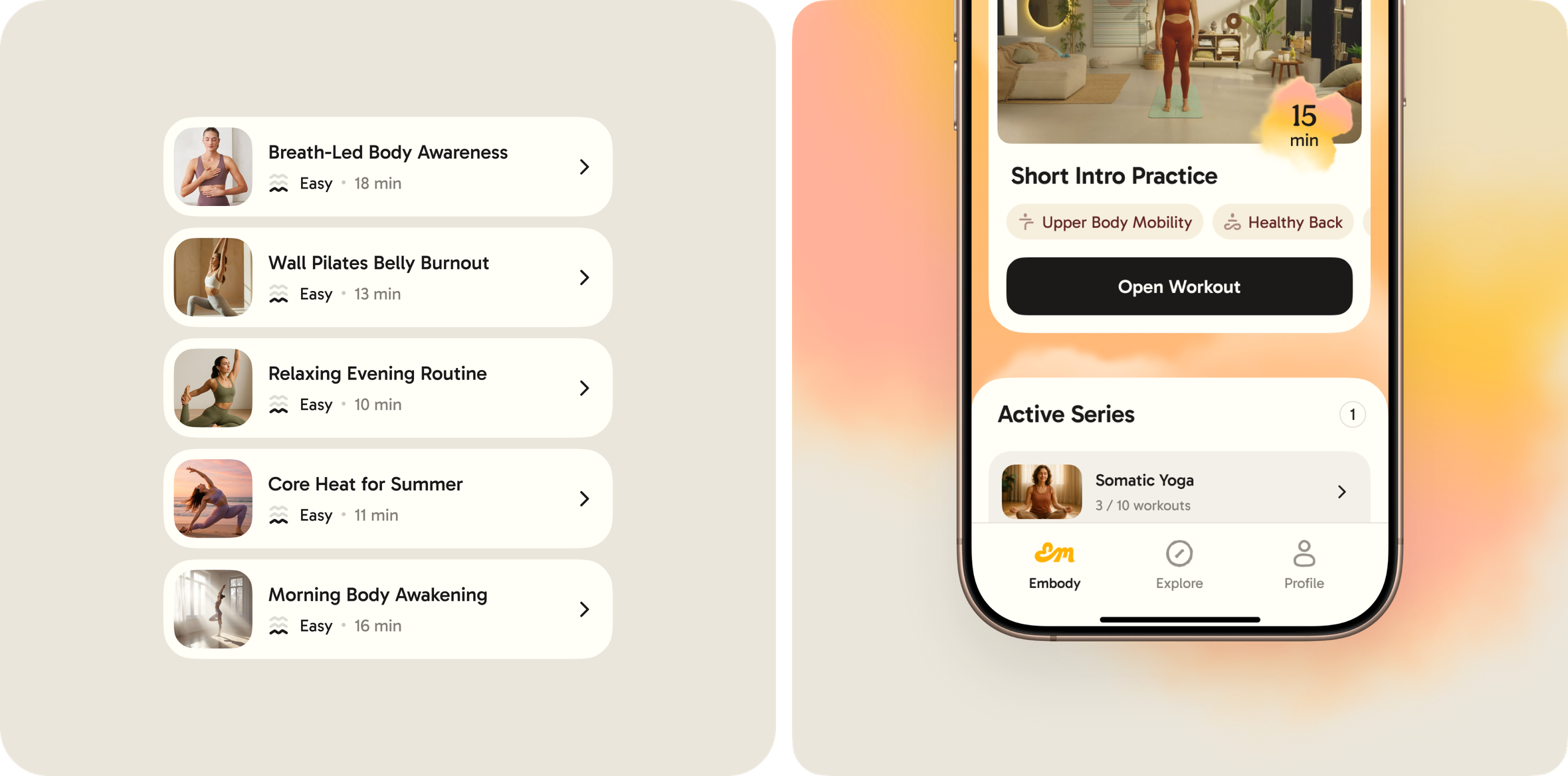
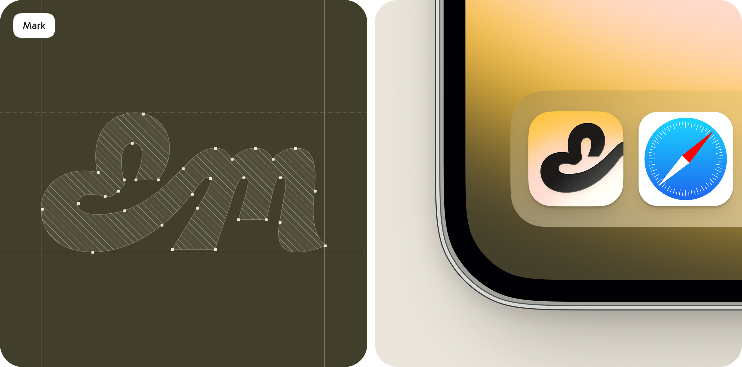
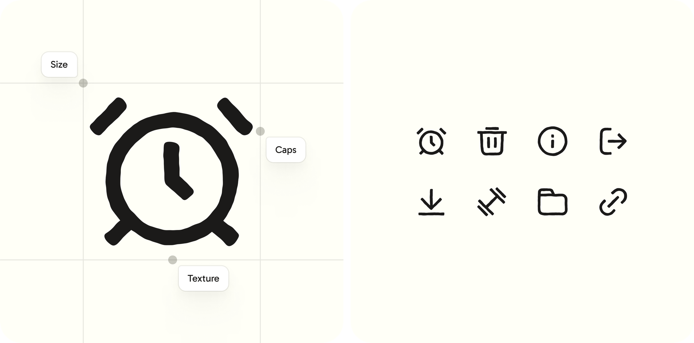
Rethinking body iconography
We needed a respectful, neutral way to show target body areas. The solution: a single gentle silhouette with subtle highlights. Simple. Honest. Unbiased.
Result — a foundation that feels alive
The new visual style became the emotional and strategic backbone of the brand across every touchpoint.
The UX architecture shaped the product’s logic — and now guides new features and future iterations.
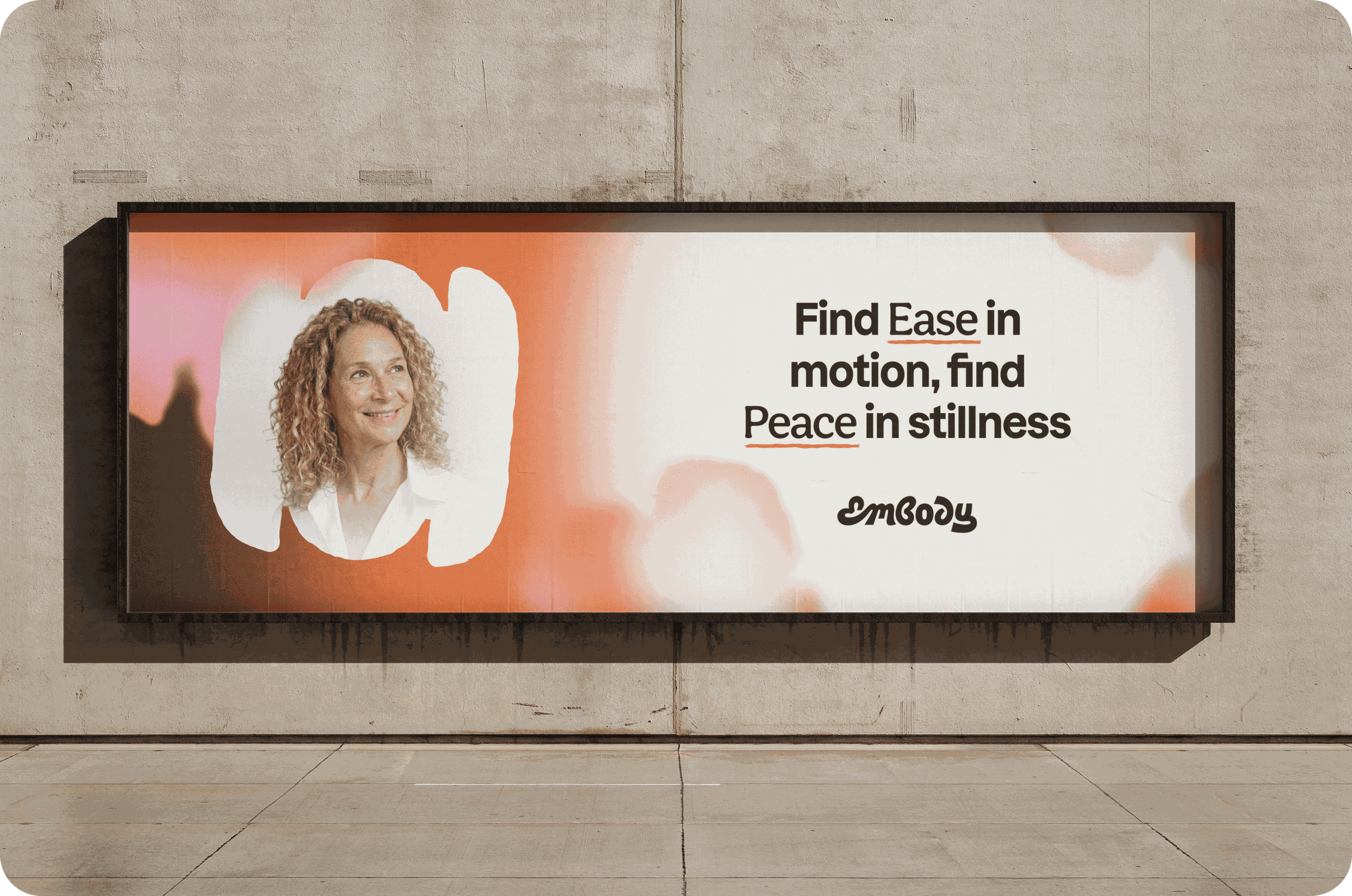
Investors and early users described the design as “calm, pleasant, modern, and deeply aligned with the brand’s purpose.”
Embody now has a flexible, scalable foundation — ready for market tests, product growth, and deeper exploration of wellness journeys.
Client review
Early feedback shows the new style is consistent and intuitive. It now anchors the brand across core touchpoints — mobile app, website, and marketing materials. The UX framework reinforces product logic and guides future development. The team executed the project with clarity and rigor. Our collaboration continues: together with the Goodface, we refine the user experience, test new product hypotheses, and shape the next phase of growth.
🔗 Links
App: Embody | Other works: goodface.agency


