

Naming and visual identity
Develop naming and brand identity for the burger shop.
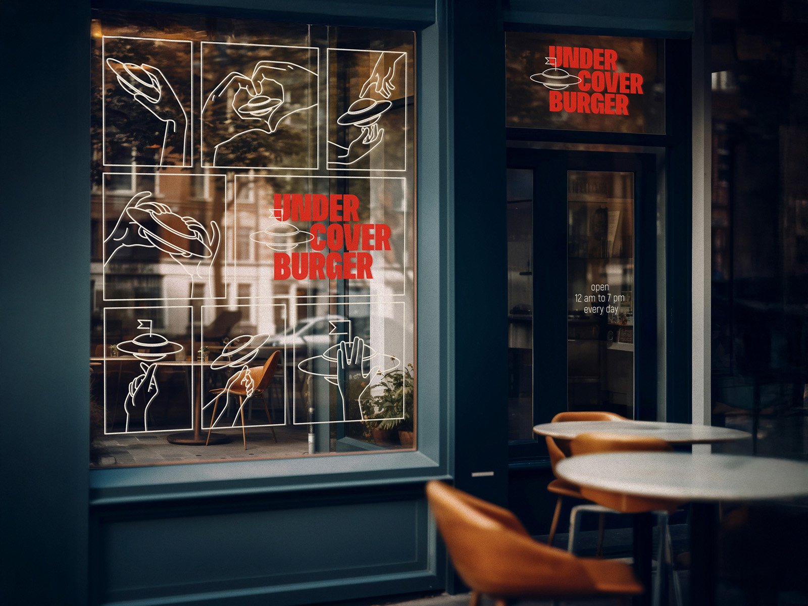
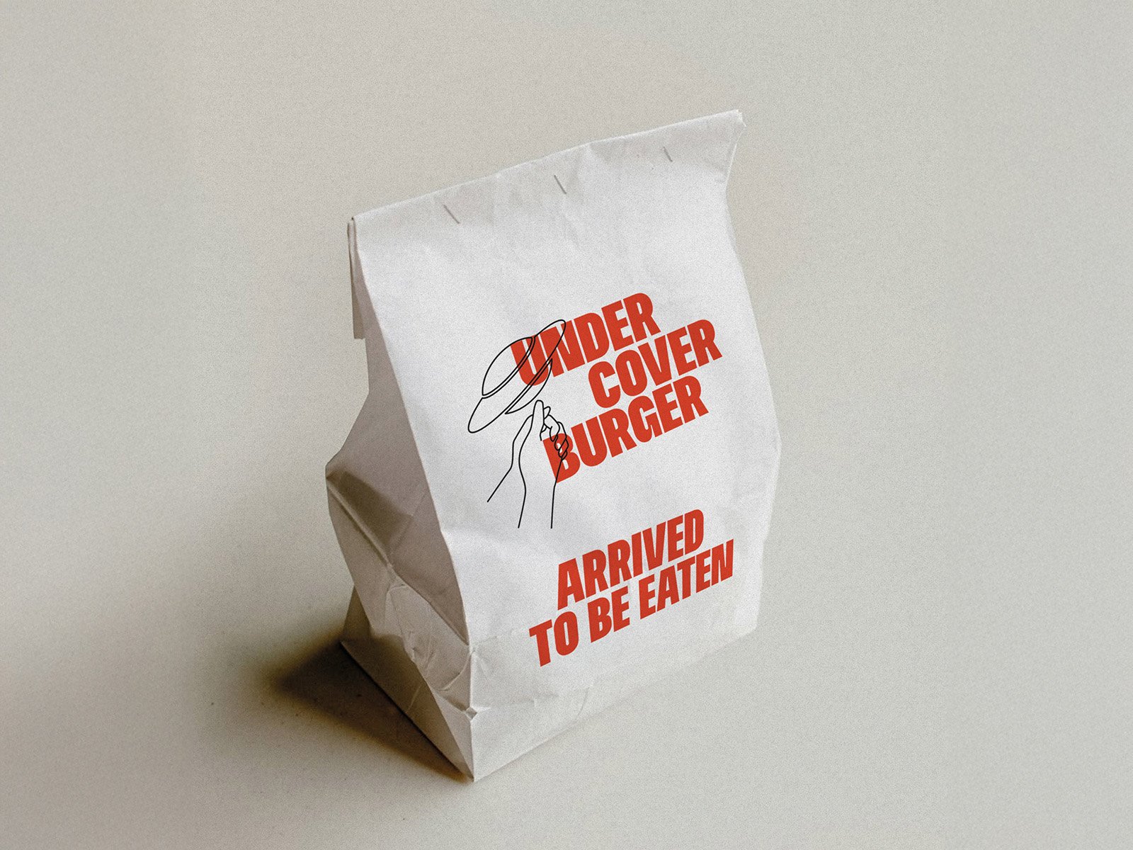
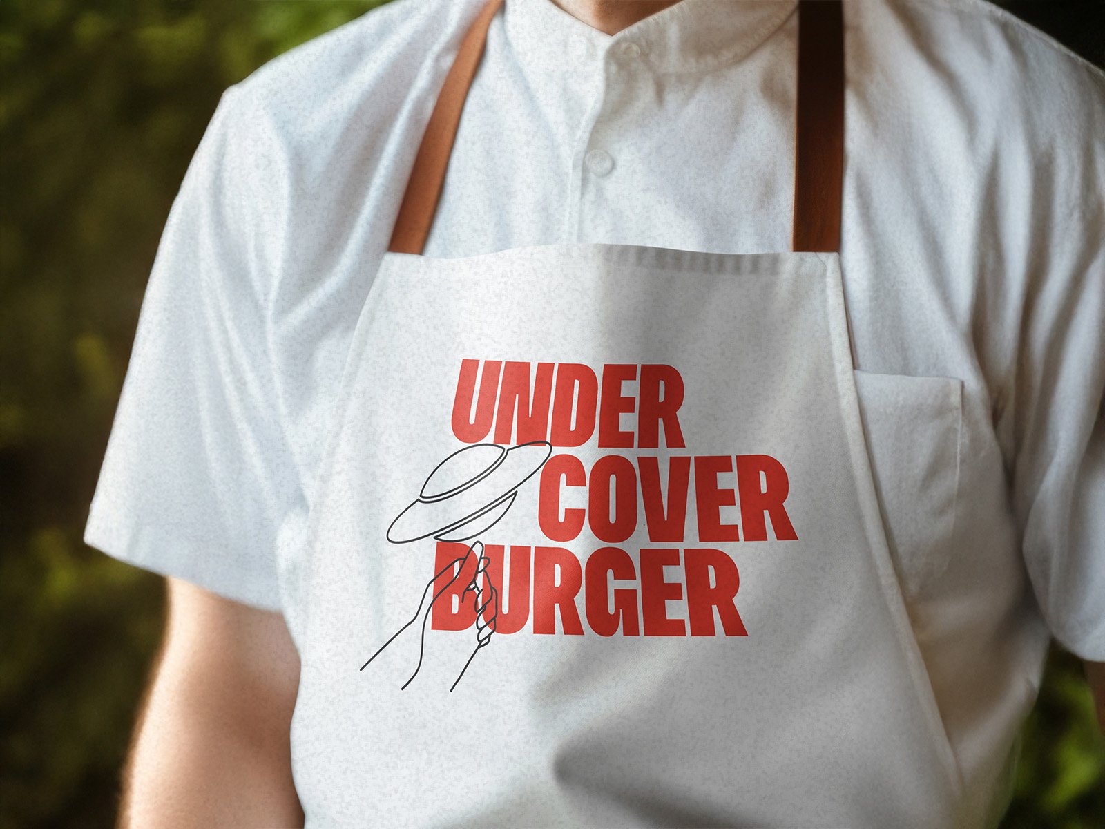
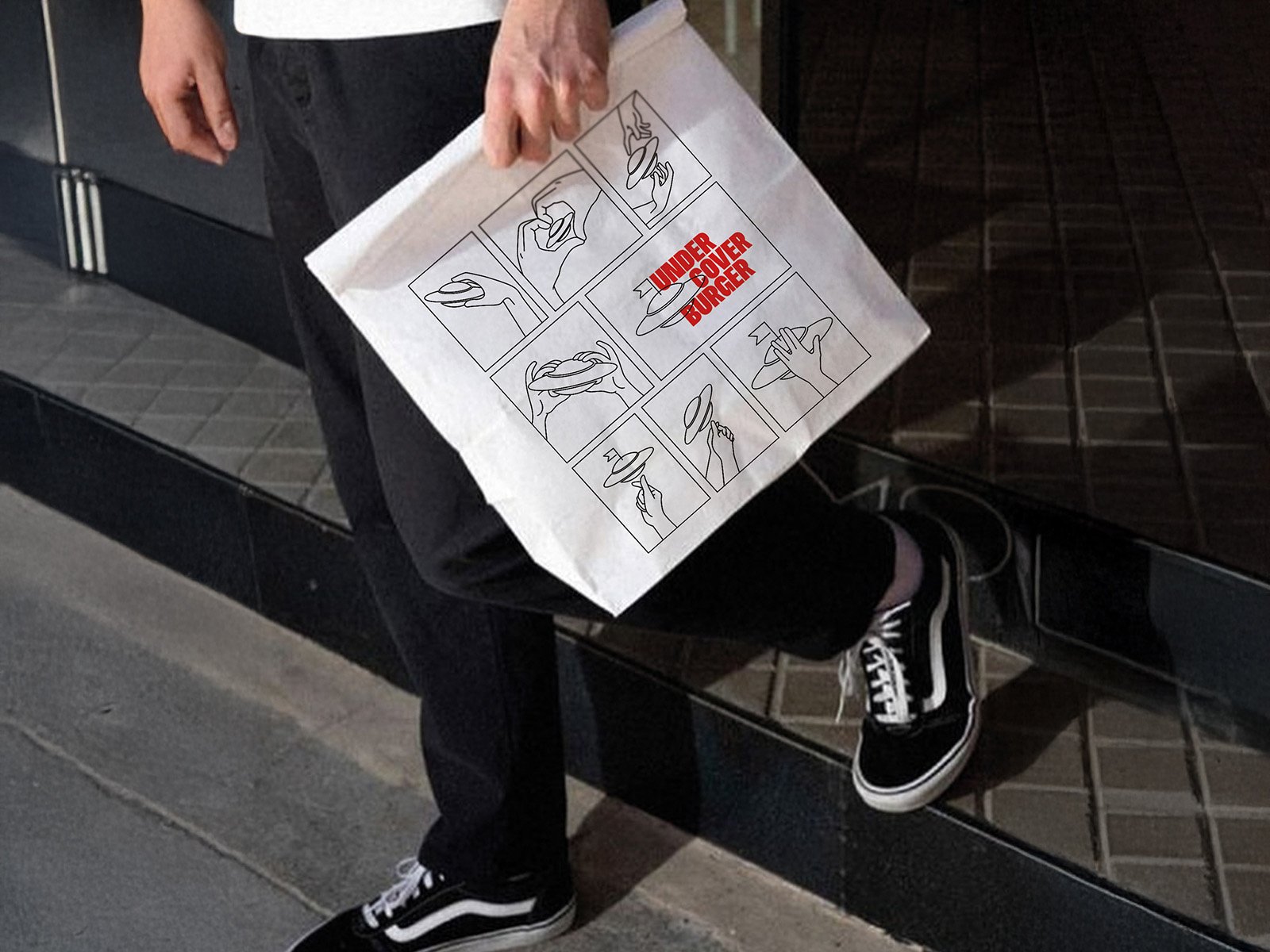
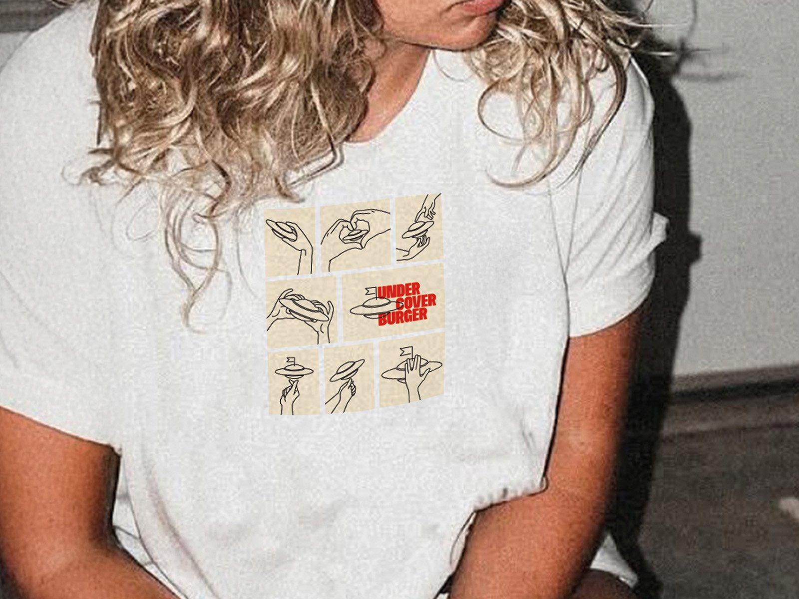
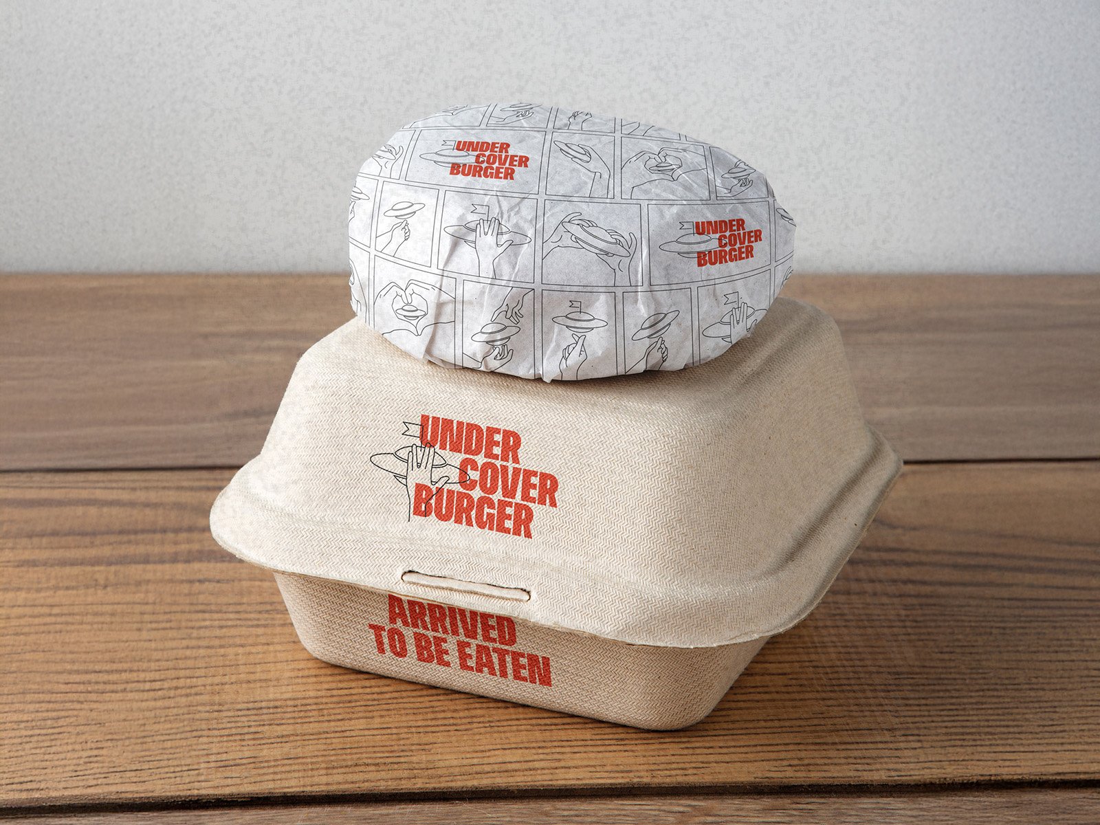
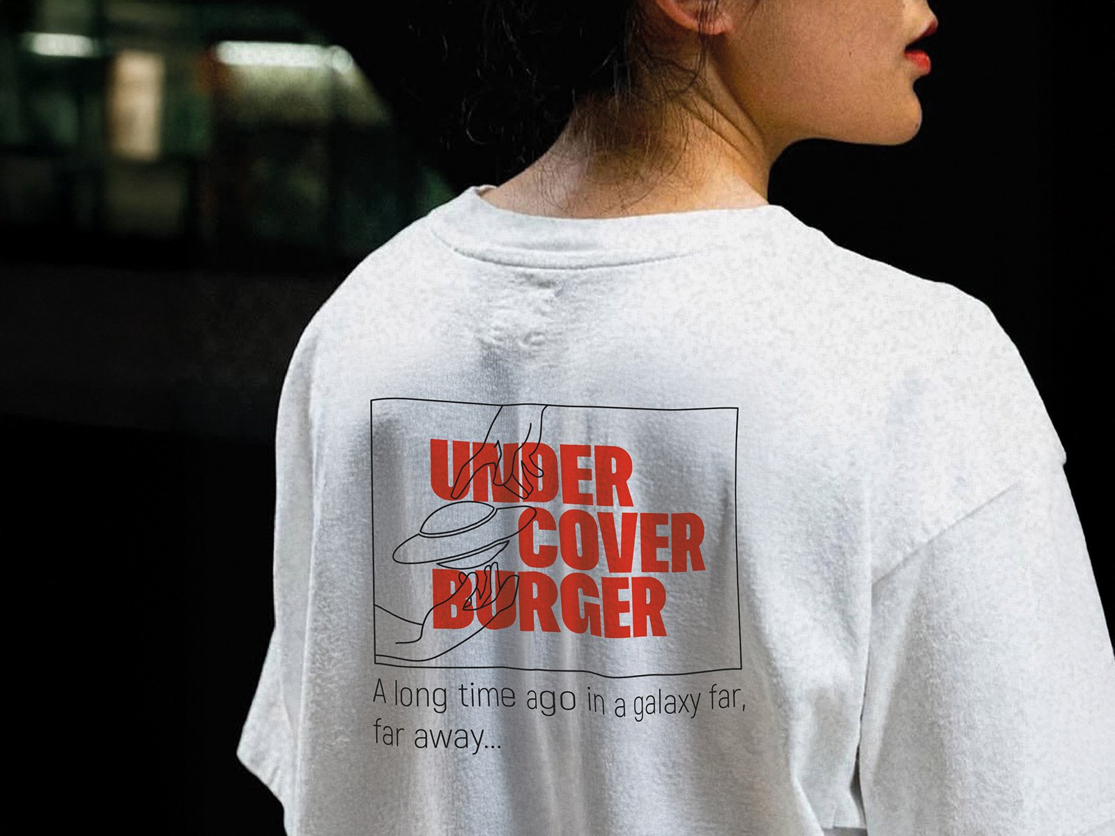
Building a brand that connects directly to the product was the starting point for Undercover burger. The concept grew from the burger itself: a UFO-style form, pressed and sealed along the edges, with the entire filling hidden inside. A true “burger under cover.” This idea shaped both the name and the tagline: Undercover burger — Arrived to be eaten.
The visual identity mirrors the energy and unpredictability of space exploration:
— A stable, bold logotype that anchors the brand
— A flexible visual language, brought to life through evolving cosmic graphics and humorous alien characters
The result is a brand conceived as a living universe, where each burger launch feels like a fresh mission.
More by the author More cases by the author
See all 


