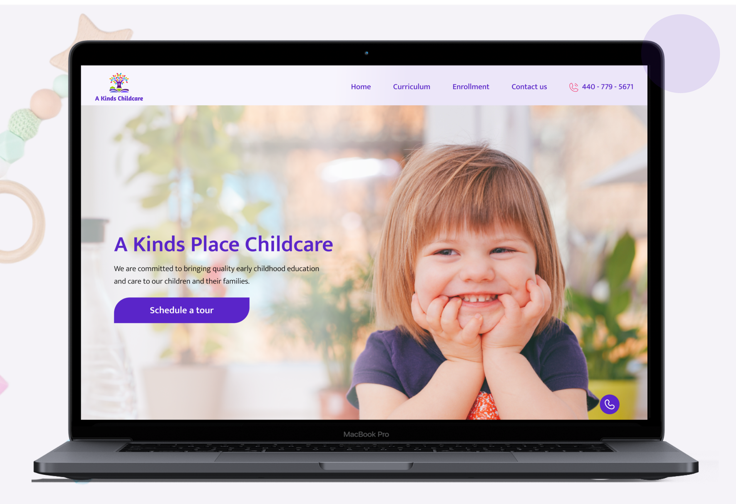
Redesign for A Kids Place Childcare
About
This project is a website redesign for a kid’s place, located in North Olmsted, Ohlo USA.
Problems
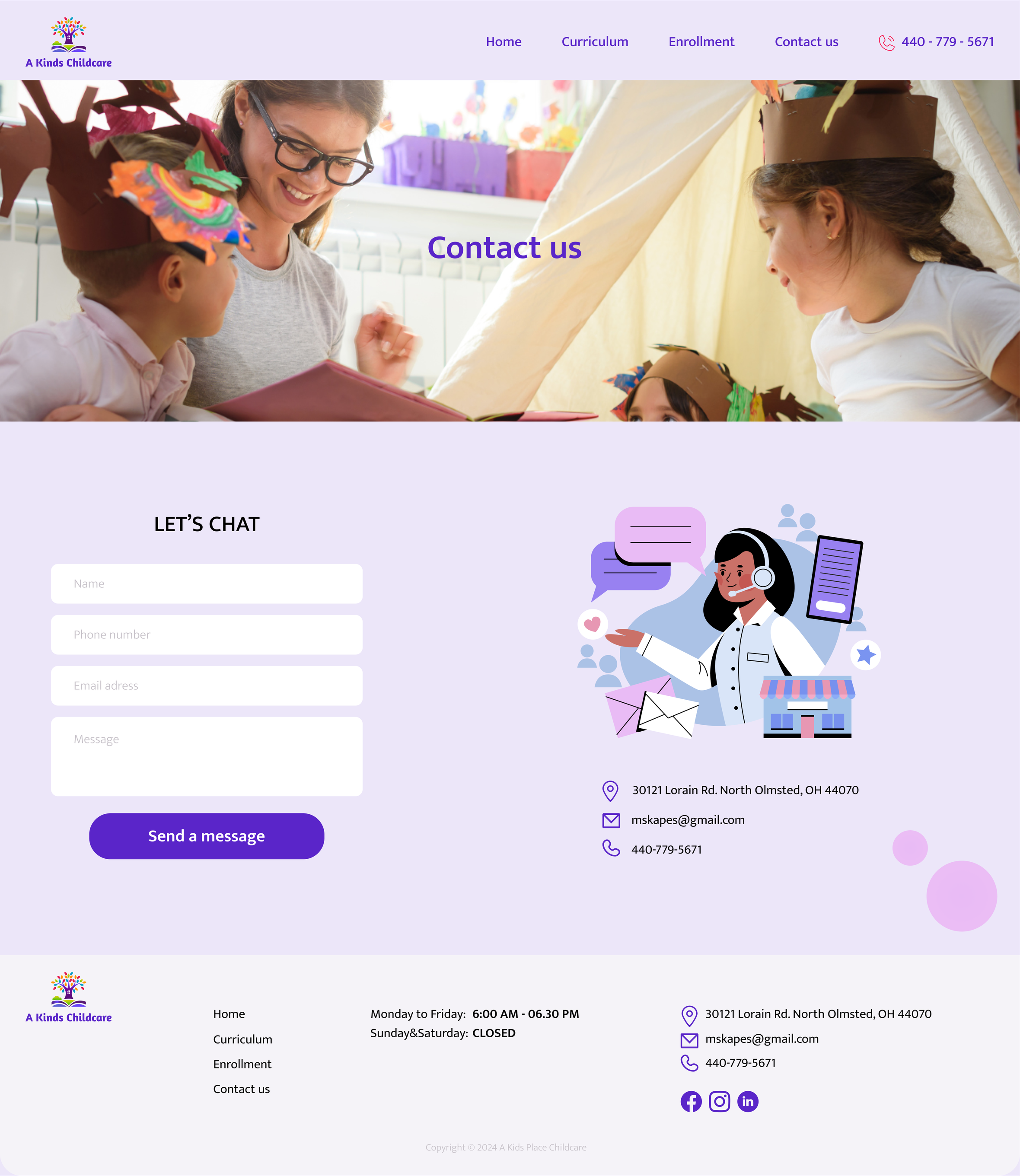
The previous website had an old fashioned design with messy combination of colors and chaotic presentation of information. The website did not have logo and blocks’ headlines. Block “Our teachers” was absent despite of such headline on main page, there was no section “About us”, section with parents testimonials. “Schedule a tour today!” button did not have form for registration, just leads to “Contact us” section.
Solutions
To create a modern, well-structured, user-friendly design, using calm color palette and hierarchy of fonts; to add “About us” block, “Our team” (with information on hiring) and “Testimonials” sections, “Enrollment” block to main page, ‘a quick’ application form for a button “Schedule a tour”; to provide adaptation design for tablets and mobile devices.
Composition
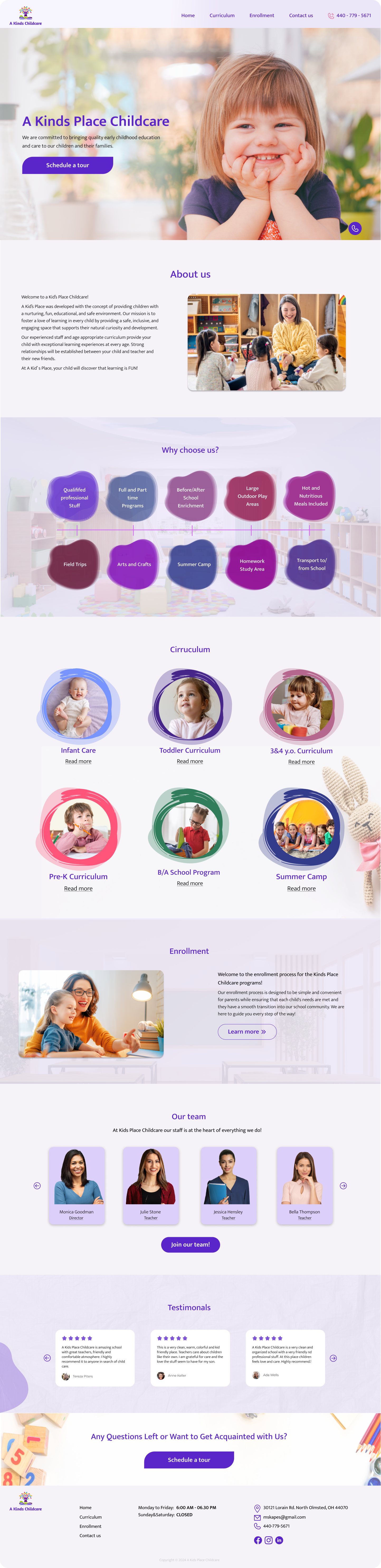
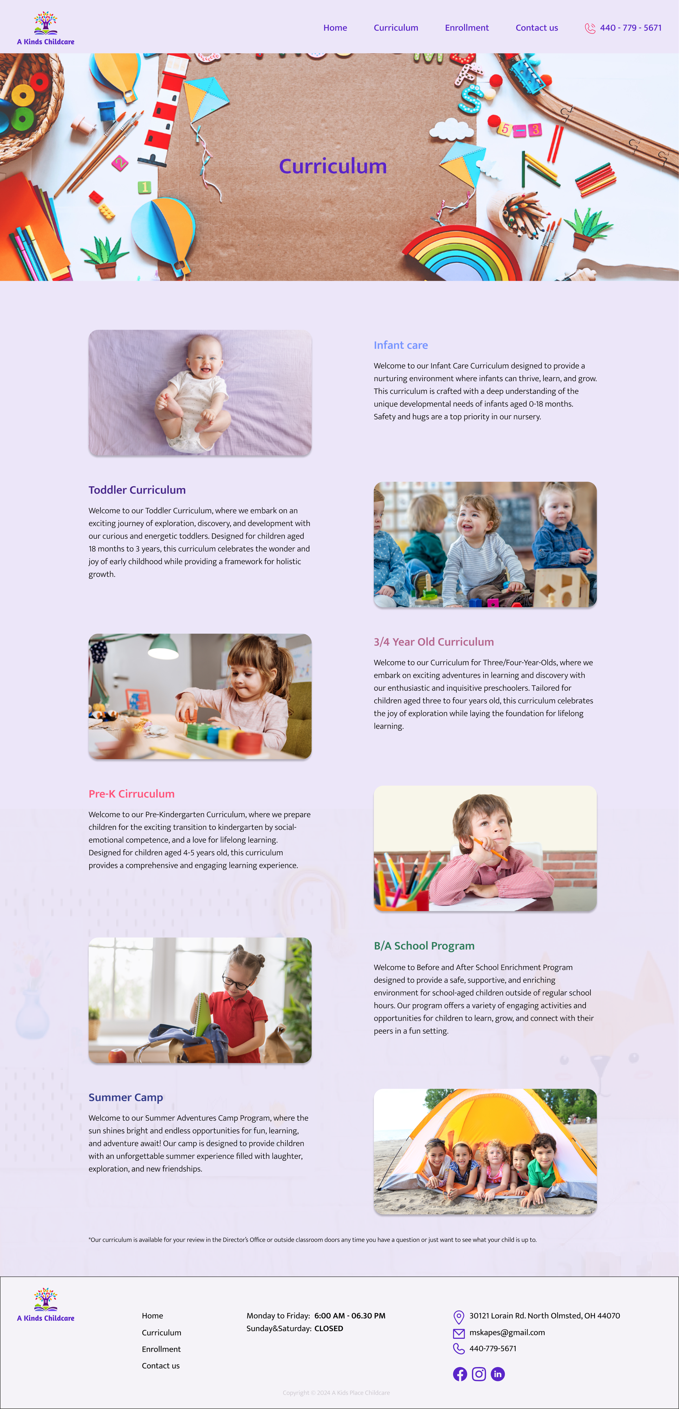
The composition of the kindergarten website is designed to be both engaging and informative, ensuring that visitors can easily find the information they need while feeling welcomed by the warm environment. The layout includes essential blocks that provide a comprehensive overview of the kindergarten's offerings and atmosphere. Images of children emphasizes the fun and nurturing environment of the kindergarten.
Colours
The design incorporates warm purple colours, creating a welcoming and cheerful atmosphere. This colour palette is used consistently throughout the site to evoke feelings of warmth, and friendliness.
Typography
The website uses Mukta typography to ensure readability and reflect the playful, nurturing environment of the kindergarten.
Buttons
Buttons on the kindergarten website are designed to be both functional and visually appealing. The dark purple color of Buttons contrasts well with the warm purple background and other design elements, making the buttons easy to spot.
Feel free to explore my projects, and don not hesitate to leave your thoughts and comments.
My Behance page: https://www.behance.net/annapolishchuk5